One thing we’ve learnt about #COVID stories:
Often something that looks too scary to be true isn’t quite true when you look at the small print.
Often something that looks too good to be true isn’t quite true when you look at the small print.
Often something that looks too scary to be true isn’t quite true when you look at the small print.
Often something that looks too good to be true isn’t quite true when you look at the small print.
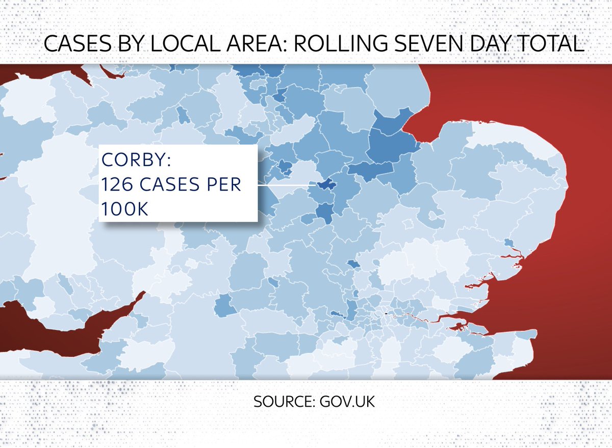
There have been a few scary stories in recent weeks about “hotspots” of #COVID19 around the UK.
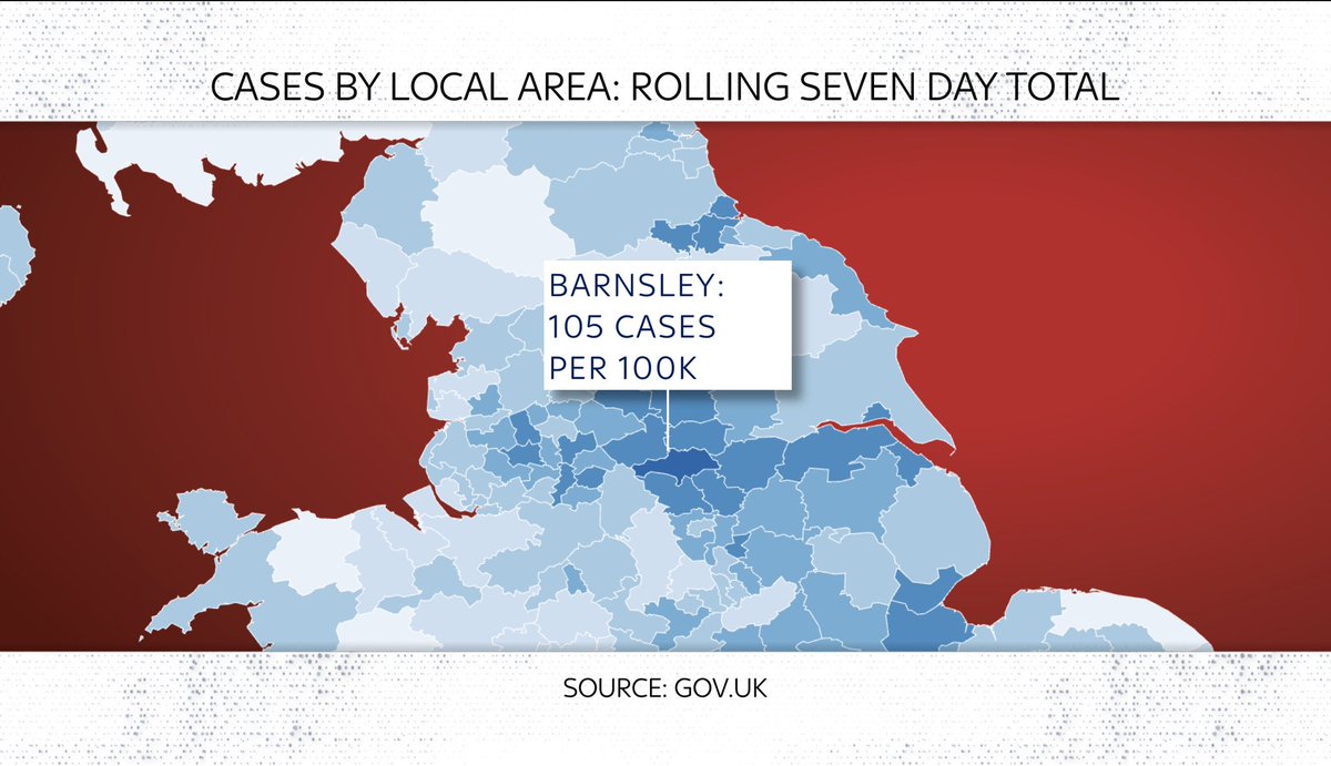
Partly inspired by maps like this (this one from @PHE_uk) which compare local case levels with the national avg. The reddest area here is Barnsley
Partly inspired by maps like this (this one from @PHE_uk) which compare local case levels with the national avg. The reddest area here is Barnsley

One problem with heatmaps is that while they do a good job of depicting regional variation, they don’t give you much context.
And they can look more dramatic when the national avg is low (as it is right now). So.
Here are three “hotspots”: Clackmannanshire, Corby & Barnsley:
And they can look more dramatic when the national avg is low (as it is right now). So.
Here are three “hotspots”: Clackmannanshire, Corby & Barnsley:

Look at actual case levels and you see 3 v different stories:
Barnsley had a surge in autumn
Corby avoided the autumn peak but had a massive surge in Jan
Clackmannanshire v different again. No big surge but small bounces (prob local clusters)
As of now, cases falling in each area
Barnsley had a surge in autumn
Corby avoided the autumn peak but had a massive surge in Jan
Clackmannanshire v different again. No big surge but small bounces (prob local clusters)
As of now, cases falling in each area
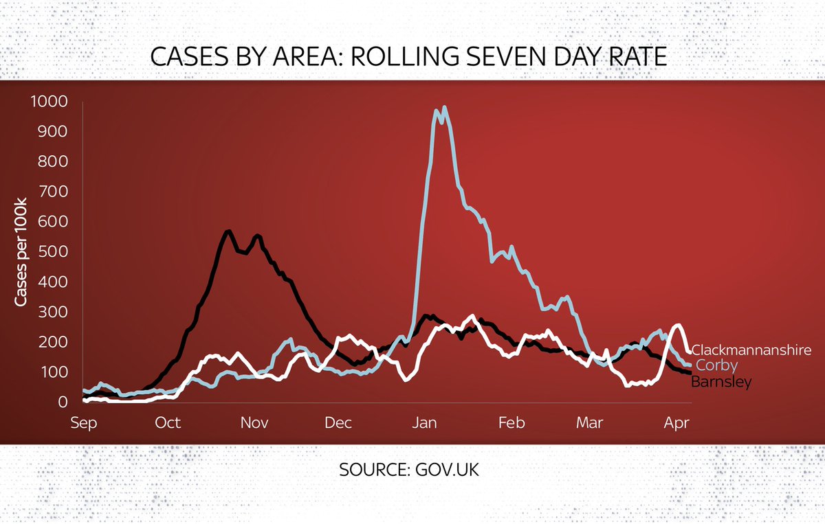
Now, there may well be hotspots in the future. These things can spiral quickly. But I’m not sure these would currently meet anyone’s definition of dangerous hotspots.
That said, even when you take a step back and look at the national picture sometimes things can be distorted.
That said, even when you take a step back and look at the national picture sometimes things can be distorted.
Consider this viral tweet from the @spectator yesterday. Is it true that the UK has had the biggest peak-to-now fall in #COVID cases?
Well, yes if you just look at the figures and ignore the small print. But if you look at the small print?
Not quite...
Well, yes if you just look at the figures and ignore the small print. But if you look at the small print?
Not quite...
https://twitter.com/spectator/status/1381230844606607361
The @spectator table is based on figs on cases per million over the most recent 7 days, taken from @OurWorldInData, which are in turn taken from CSSE Johns Hopkins who in turn compile figs reported by each country.
Use those numbers and UK cases per m do indeed fall 97.4%! BUT...
Use those numbers and UK cases per m do indeed fall 97.4%! BUT...

Here’s the thing: go into the @OurWorldInData spreadsheet and look closely at daily case numbers and here’s what you find: a -4.8k figure for the UK dating from Friday.
What happened? The UK removed some old positive test results. It was barely reported, but here’s the note:
What happened? The UK removed some old positive test results. It was barely reported, but here’s the note:
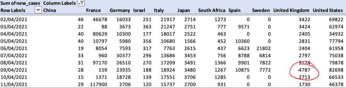

Remove that negative number (which is anyway a statistical adjustment to HISTORIC cases) from the rolling 7 day average and UK cases per million go up from 22.7 to 38.8.
This number is prob a better picture of where the UK is.
It’s a MASSIVE improvement on recent months.
This number is prob a better picture of where the UK is.
It’s a MASSIVE improvement on recent months.
But alas this piece of small print means the headline on the @spectator piece is not quite right.
The UK is actually not in first but in second place in this table.
Since when you use the adjusted case rate the peak-to-now fall is actually about 95.6%.
This is still AMAZING.
The UK is actually not in first but in second place in this table.
Since when you use the adjusted case rate the peak-to-now fall is actually about 95.6%.
This is still AMAZING.

None of this is intended as a criticism of the @spectator’s excellent data hub or indeed @OurWorldInData’s excellent database and charts.
But sometimes the small print is so small no-one notices. And sometimes that has a bearing on the numbers (even if only barely)...
But sometimes the small print is so small no-one notices. And sometimes that has a bearing on the numbers (even if only barely)...
Still: the overall picture in the UK remains really promising. Cases falling fast, as are hospitalisations. On basis of my rough and ready dot plot which completes the SPI-M projections from Feb, things are still looking good.
Real question is how these look 1/2 months from now
Real question is how these look 1/2 months from now

Here’s a video we made abt this last night.
NB: most other broadcasters try to steer clear of deep data analysis and charts like these.
They think viewers will switch off.
Not @SkyNews, who care about this stuff and think their viewers do too.
NB: most other broadcasters try to steer clear of deep data analysis and charts like these.
They think viewers will switch off.
Not @SkyNews, who care about this stuff and think their viewers do too.
• • •
Missing some Tweet in this thread? You can try to
force a refresh