Surprised by pushback to Boris Johnson’s comments that restrictions have played a key role in reducing UK Covid rates.

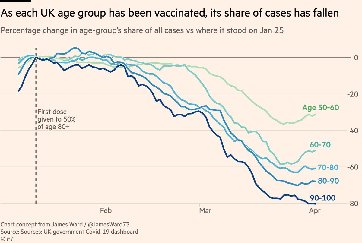
Why do people think rates have fallen among unvaxxed groups?

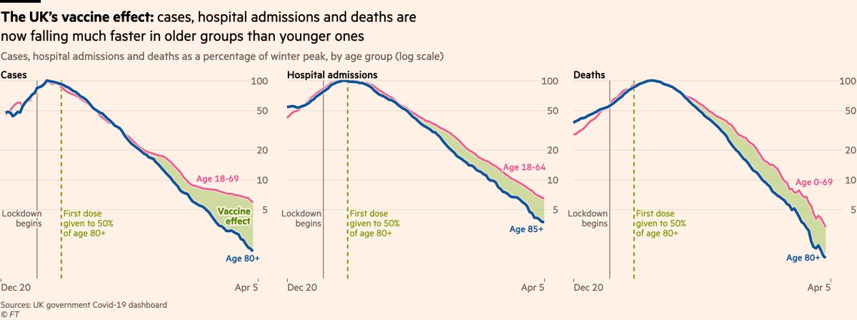
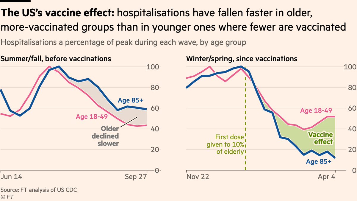
I always felt "lockdown effect" was implicit in these charts, but here it is explicitly labelled
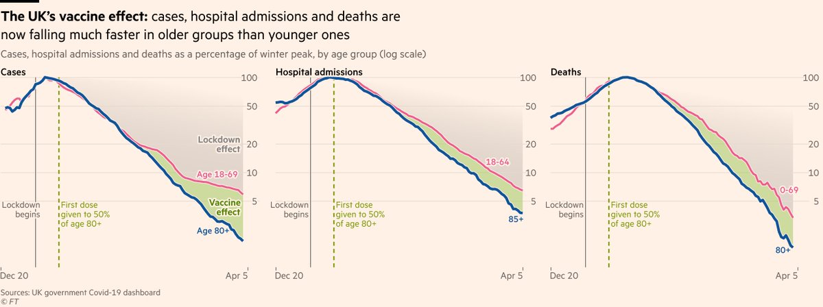
Of course, it’s very difficult to know exactly how big the lockdown effect is for several reasons, but we can now see from dozens of other countries how B.1.1.7 sends rates rising without restrictions, even among the age groups who have been mostly vaccinated.
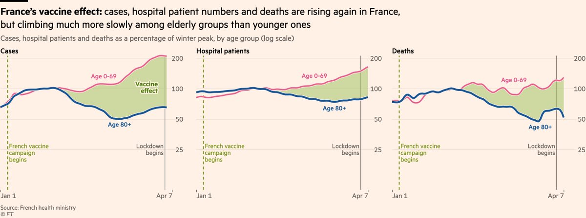
See France:
Same is now clear in the US, too:

With minimal restrictions in much of the US, hospitalisations have been rising again among under-50s as B.1.1.7 has taken hold.

Vaccines produce the gap between those lines, but without restrictions in place, the lines can bend back upwards.
And the impact of restrictions in the UK isn’t even new information. @ChrisGiles_ and I wrote about it two months ago when it was already clear lockdown was having an impact at least as large as vaccinations ft.com/content/6d4ff1…
None of this is to diminish the brilliance of vaccines, which remain absolutely ace. They’re already doing a fantastic job, and when they push us over the line to herd immunity that’s a total game-changer.

Once you lock in herd immunity, restrictions become a thing of the past.
But we’re not there yet, and we were absolutely nowhere near there when UK rates began falling in January, which is why it’s so clear that it was restrictions that first sent rates downwards, with vaccines then joining the party and accelerating that decline.
Back to this chart, reasons the size and shape of the "lockdown effect" is unclear include:
• Vaccines reduce transmission (). This means they can reduce rates among the unvaccinated
• Naturally acquired immunity is also a help on the way down
But it really shouldn’t need saying that with a highly infectious virus spreading through the population (as it was in UK around Christmas), curtailing our mixing with others indoors has had a huge impact on reducing case rates, above and beyond the boost provided by vaccines.

• • •

Missing some Tweet in this thread? You can try to force a refresh
 

Keep Current with John Burn-Murdoch

John Burn-Murdoch Profile picture

Stay in touch and get notified when new unrolls are available from this author!

Read all threads

This Thread may be Removed Anytime!

PDF

Twitter may remove this content at anytime! Save it as PDF for later use!

Try unrolling a thread yourself!

how to unroll video
  1. Follow @ThreadReaderApp to mention us!

  2. From a Twitter thread mention us with a keyword "unroll"
@threadreaderapp unroll

Practice here first or read more on our help page!

More from @jburnmurdoch

9 Apr
NEW: big international Covid data thread, focusing on the contest between vaccines & variants

First to the UK, where things are looking very good. The vaccine effect is still crystal clear, with more than 10,000 lives already estimated to have been saved assets.publishing.service.gov.uk/government/upl…
And critically, rates of cases, hospitalisations and deaths are all falling among both the most and least vaccinated age groups.

Those straight blue lines represent constant rates of decline among the most-vaccinated, completely unaffected by the reopening of schools.
It’s not just the very elderly who are benefiting, either. This chart (concept from @JamesWard73) shows that as the UK’s vaccination rollout has progressed down through the age groups, so has the vaccine effect. It’s amazing how clear the pattern is.
Read 25 tweets
7 Apr
EU regulator: AstraZeneca vaccine should continue to be used across all age groups theguardian.com/politics/live/…

UK regulator: under-30s should be offered an alternative jab to AstraZeneca (but those who have had first AZ jab should get a second AZ jab)
Both orgs are clear that the specific blood clotting side-effect is extremely rare, and the vaccine has been proven highly effective, so the benefits of the AstraZeneca vaccine still outweigh the risks for the vast majority of people.
So UK decision is based more on the other side of the coin: that Covid mortality risk is also very low for under-30s, so the balance of two low risks becomes less clear-cut.
Read 4 tweets
6 Apr
NEW: just updated our excess deaths figures, including data into April

It’s abundantly clear that Latin America is the hardest-hit region in the world, with the five highest excess death rates globally. The UK is 21st out of 48 countries, and the US 24th

ft.com/coronavirus-la…
Note the underlying patterns. It can be easy for people in the US and UK to think Covid is almost gone, but excess deaths are climbing again in Brazil, Bolivia and Peru to name just three countries.

You can get all of the raw data here: github.com/Financial-Time…
The grim toll of Europe’s third wave is also clear. The Czech Republic, Italy, Slovakia, Bulgaria and Poland have all climbed above the UK into the global top 20.
Read 5 tweets
18 Mar
It’s rare to see a lorry complete the full bingo card of illegal & potentially lethal manoeuvres in one go, but this just might do it.

But sure, do go on about how cyclists are the real scourge of the roads...
And this comes just two days after another cyclist was killed in a hit-and-run collision with a lorry.

Your regular reminder that HGVs are involved in 15% of fatal crashes in London, despite making up just 3% of traffic.
Incidentally, one of the highlights of my third lockdown was a driver leaping out of his van and coming over to bump his forehead against mine, footballer style, because I had the temerity to walk across a side road that he wanted to speed out of.
Read 4 tweets
18 Mar
NEW: I saved this one up for the US morning, because it’s a big "good Covid news" moment for our friends across the Atlantic

A "vaccine effect" is now clear in US data, with hospitalisations falling faster among the old (mostly vaccinated) than the young ft.com/content/78bb2c…
This divergence can’t just be explained by the elderly being more cautious: we did the same analysis for the second wave last summer/fall, and back then rates among the old actually fell slower & less far.

Now they’re falling faster. What’s changed? They’ve been vaccinated 💉💉
Hospitalisations are clearest sign of vaccine doing its work, but we can see similar patterns in cases & deaths if we make the same comparison:

Second wave, no vaccines: rates fell slowly & less far among the old

Today, with vaccines: rate of decline among elderly has caught up
Read 5 tweets
10 Mar
@LyricalFalls Sorry but this take is so tiresome.

In dataviz, painting as honest & clear a picture as possible is about showing as much context as poss, not a zero y-axis.

Here, 20 years of context are carefully built up to show typical range, then we see how 2020-21 has diverged from that.
@LyricalFalls Extending the y-axis to zero would make the picture less clear. That’s all it would do. No added clarity. No added information.
@LyricalFalls Every tiny design detail in this chart is about maximising information and minimising risk of misinterpretation.

Gradually showing the context, changing the lower extent of the chart to make clear it’s not a hard floor, using light gridlines instead of a dark baseline.
Read 7 tweets

Did Thread Reader help you today?

Support us! We are indie developers!


This site is made by just two indie developers on a laptop doing marketing, support and development! Read more about the story.

Become a Premium Member ($3/month or $30/year) and get exclusive features!

Become Premium

Too expensive? Make a small donation by buying us coffee ($5) or help with server cost ($10)

Donate via Paypal Become our Patreon

Thank you for your support!

Follow Us on Twitter!