Having trouble picking a color palette for your #Rstats visualization? Well here's a MEGA thread about all the ways you can choose a palette! 🧵[1/22]
We'll start off with the classics. First, you can use the palettes that are already a part of R's base code (keep in mind that these palettes were not necessarily designed to be colorblind-friendly)
[2/22]
[2/22]

The next classic set of palettes comes from {RColorBrewer}. You can use the command display.brewer.all(colorblindFriendly = TRUE) to see which palettes are colorblind-friendly.
(A guide to this package: datanovia.com/en/blog/the-a-…)
[3/22]
(A guide to this package: datanovia.com/en/blog/the-a-…)
[3/22]

Another very popular package used for visualizations is {viridis}. The great thing about these palettes is that they're ALL colorblind friendly.
(Documentation: cran.r-project.org/web/packages/v…)
[4/22]
(Documentation: cran.r-project.org/web/packages/v…)
[4/22]

Now onto some lesser-known packages. This one is starting to gain popularity in the community: {wesanderson}. This package has a variety of palettes inspired by Wes Anderson films which are all colorblind-friendly.
(Documentation: github.com/karthik/wesand…)
[5/22]
(Documentation: github.com/karthik/wesand…)
[5/22]

Another package which was inspired by the wesanderson package is {ghibli} which has palettes inspired by Studio Ghibli movies which are also all colorblind-friendly. PonyoMedium is one of my favorites!
(Documentation: ewenme.github.io/ghibli/)
[6/22]
(Documentation: ewenme.github.io/ghibli/)
[6/22]

The package {ggsci} contains color palettes inspired by colors used in scientific journals (FYI, these palettes may not be the best choice when trying to create visualizations that are colorblind/printer/photocopy-friendly)
(Documentation: cran.r-project.org/web/packages/g…)
[7/22]
(Documentation: cran.r-project.org/web/packages/g…)
[7/22]

Get palettes that are used by Open Analytics (link: openanalytics.eu) using the package {oaColors}
(Documentation: cran.rstudio.com/web/packages/o…)
[8/22]
(Documentation: cran.rstudio.com/web/packages/o…)
[8/22]
The Python package 'seaborn' has some great color palettes, including a color-blind friendly one. You can load these colors in manually using this R code from GitHub: github.com/timelyportfoli…
[9/22]
[9/22]

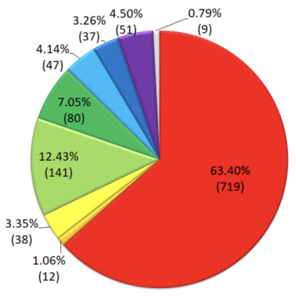
None of these preset palettes tickle your fancy? Make your own! There are a variety of packages and websites that can help you do this.
(Pictured: example of a visualization I made with a custom color theme)
[10/22]
(Pictured: example of a visualization I made with a custom color theme)
[10/22]

If you don't want to use HEX codes, R has 657 built-in color names. See this cheatsheet for more information: nceas.ucsb.edu/sites/default/…
[11/22]
[11/22]

Generate some random colors using the package {randomcoloR} where you can specify things like hue and brightness. Here are a couple examples: hue="red" and luminosity="light"
(Documentation: github.com/ronammar/rando…)
[12/22]
(Documentation: github.com/ronammar/rando…)
[12/22]


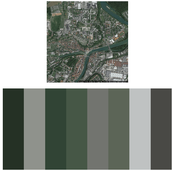
Making an elevation map and want it to look like the actual place it's from? Use the package {earthtones} to derive a color palette from a particular location on Earth
(Documentation: cran.r-project.org/web/packages/e…)
[13/22]
(Documentation: cran.r-project.org/web/packages/e…)
[13/22]
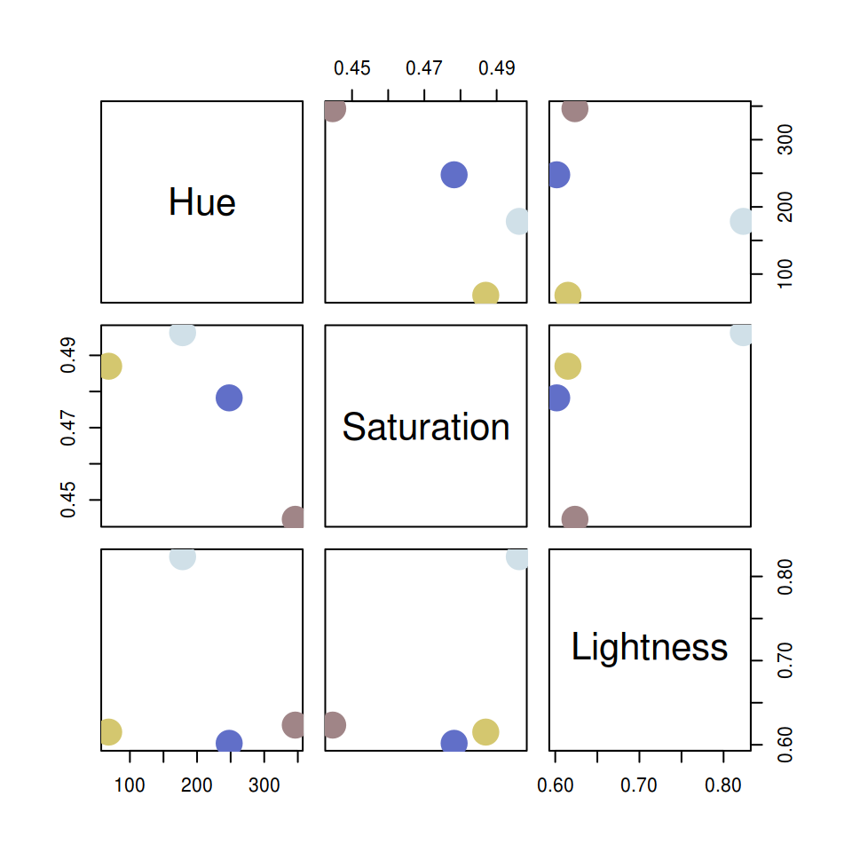
Use the package {qualpalR} which, when given a number of colors (n) and an HSL color space, provides n colors which maximize smallest pairwise color differences.
(Documentation: github.com/jolars/qualpalr)
[14/22]
(Documentation: github.com/jolars/qualpalr)
[14/22]
Use colors from the i want hue website (link: medialab.github.io/iwanthue/) with the R package {hues}
(Documentation: github.com/johnbaums/hues)
[15/22]
(Documentation: github.com/johnbaums/hues)
[15/22]

Another really interesting/cool way to build a custom color palette is to generate one from an image, which you can do thanks to the package {paletteR}
(Documentation: github.com/AndreaCirilloA…)
[16/22]
(Documentation: github.com/AndreaCirilloA…)
[16/22]

Use palettes from the website COLOURlovers.com with the R package {colourlovers}
(Documentation: github.com/andrewheiss/co…)
[17/22]
(Documentation: github.com/andrewheiss/co…)
[17/22]

You can also create a palette on the website Data Color Picker (link: learnui.design/tools/data-col…) which generates palettes for you with lots of options, including viewing the palette on a dark background, and selecting a single-hue or divergent palette.
[18/22]
[18/22]
REGARDLESS of which method you use, please keep the colorblind community in mind. There are numerous tools out there to test whether your color palette is colorblind-friendly, I'll provide a couple that I use.
[19/22]
[19/22]
My personal favorite is the Viz Palette tool (link: projects.susielu.com/viz-palette) created by Elijah Meeks and Susie Lu.
[20/22]
[20/22]

There is also an R package {colorblindR} that simulates colorblindness on R figures.
(Documentation: github.com/clauswilke/col…)
[21/22]
(Documentation: github.com/clauswilke/col…)
[21/22]
I hope this thread inspired you to branch out and use fun color palettes! Happy plotting!
[22/22]
[22/22]
• • •
Missing some Tweet in this thread? You can try to
force a refresh