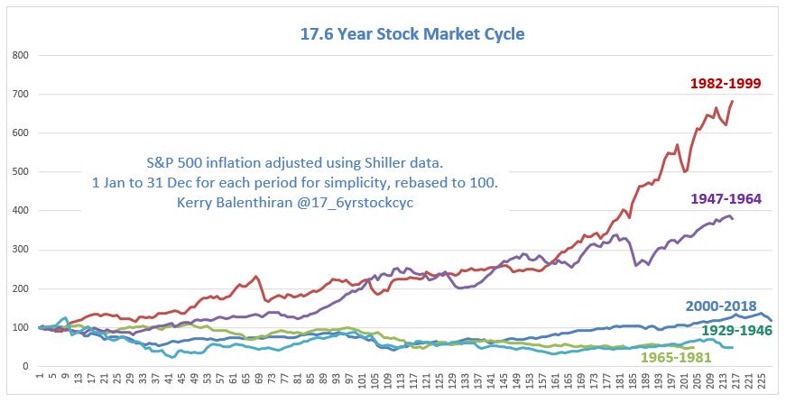
We are still in a stocks bull market. This S&P500 chart shows the alternating secular cycles. In the thread below I'll show the different gains in each period.
I know 2000-2017 doesn't look like a bear market BUT... $spx $spy #sp500 #spx $es_f #stocks #cycles
THREAD 👇1/
I know 2000-2017 doesn't look like a bear market BUT... $spx $spy #sp500 #spx $es_f #stocks #cycles
THREAD 👇1/

The underperformance during 2000-2017/8 and the other 17.6 year secular bear markets is easy to see in the inflation adjusted data.
2/
2/

The real return of stocks was only just positive from 2000 to 2017 and there were better returns to be had elsewhere.
Both nominal and real performance are shown in the table below, and whichever way you look at it, the difference is clear.
3/
Both nominal and real performance are shown in the table below, and whichever way you look at it, the difference is clear.
3/

Fourier analysis of stock market data confirms that a full cycle (top to top/bottom to bottom) of approximately 35 years does exist.
Extracted from paper by Mathieu Bouville papers.ssrn.com/sol3/papers.cf…
4/

Extracted from paper by Mathieu Bouville papers.ssrn.com/sol3/papers.cf…
4/


Changing investment strategy depending on the different conditions has a massive impact on compounded gains.
Full explanation of my switching strategy is here investorschronicle.co.uk/2013/09/19/sha…
5/
Full explanation of my switching strategy is here investorschronicle.co.uk/2013/09/19/sha…
5/

• • •
Missing some Tweet in this thread? You can try to
force a refresh


