
Okay, gonna start a thread where I compare "cool concept stairs"/DIY stair fails to data visualization.
You make fancy custom charts? Guess what? They are probably an accessibility liability. Use standards.
See Fig. A (the alt on each image will be a bonus roast explanation):
You make fancy custom charts? Guess what? They are probably an accessibility liability. Use standards.
See Fig. A (the alt on each image will be a bonus roast explanation):
https://twitter.com/FrankElavsky/status/1396887982905376775

If you're using a low contrast/minimalist design, many users won't be able to see what is important! There is a minimum ink you should use in your data to ink ratio:
4.5:1 contrast ratio for text and 3:1 contrast ratio for geometries (non-text).
4.5:1 contrast ratio for text and 3:1 contrast ratio for geometries (non-text).

Speaking of contrast, make important elements even higher contrast. Create a hierarchy using size, boldness, or color contrast to guide the user through each step in your graphic.
Test and validate the whole graphic and all its little components work in harmony.
Test and validate the whole graphic and all its little components work in harmony.

We (the creators of charts) might visually gestalt a pattern non-sequentially. We are trained in our own process.
But folks with cognitive disabilities, rushed executives, screen reader and keyboard-only users (etc) need a straight path.
"Provide and guide" w/ sequential access
But folks with cognitive disabilities, rushed executives, screen reader and keyboard-only users (etc) need a straight path.
"Provide and guide" w/ sequential access

Your interactive features are not very robust.
People with disabilities need to be able to use that brush filter somehow. Even sighted, mouse-using experts can easily misuse them.
Use standard UI elements (before and alongside fancy ones) to perform complex interactions.
People with disabilities need to be able to use that brush filter somehow. Even sighted, mouse-using experts can easily misuse them.
Use standard UI elements (before and alongside fancy ones) to perform complex interactions.

You might be tempted to create something cool out of a combination of other things (mashing different chart types together or solving multiple tasks in a single interactive chart, etc)...
but use clear, standard experiences first before inventing an over-featured, flimsy, mess.
but use clear, standard experiences first before inventing an over-featured, flimsy, mess.

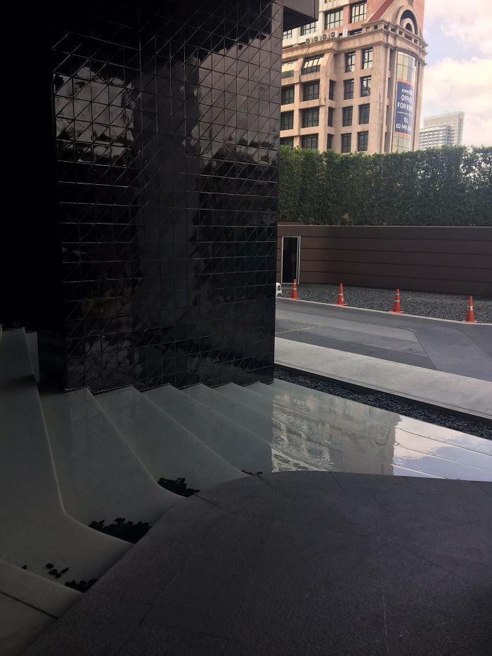
Speaking of interactive features... don't make something that looks like it is interactive when it actually isn't! (This image is actually a waterfall, not stairs.)
Use semantic html when creating anything interactive! And of course: remove interactive features that do nothing
Use semantic html when creating anything interactive! And of course: remove interactive features that do nothing
Lastly (and most important): please don't add accessibility too late. It will be so obvious that it wasn't part of your original design. While better than not doing it, you'll bloat your experience and make things look amateurish.
Start doing accessibility now!
Start doing accessibility now!

• • •
Missing some Tweet in this thread? You can try to
force a refresh


