
Learn how to avoid common mistakes when designing forms.
18 cards with practical examples 👇
18 cards with practical examples 👇
Try to avoid multi column layouts.
It's easier for your eyes to go through the form if it's a one-column layout.
It's easier for your eyes to go through the form if it's a one-column layout.

This layout is also acceptable.
But the labels should be placed next to inputs to avoid Z-pattern.
But the labels should be placed next to inputs to avoid Z-pattern.

You can put related inputs in the same row.
It not multiple-columns. It's like having one input that we break into separate.
So it's not bad, on the contrary, it's considered a good practice.
It not multiple-columns. It's like having one input that we break into separate.
So it's not bad, on the contrary, it's considered a good practice.

If you have a large form, make input sections.
Also, check out a very nice pattern from @steveschoger
Also, check out a very nice pattern from @steveschoger
https://twitter.com/steveschoger/status/905830324139155458

There is no rule that you should always take all the available space on the screen.
Use reasonable width for inputs. This will help users understand what kind of data you ask from them.
Use reasonable width for inputs. This will help users understand what kind of data you ask from them.

Developers tend to hide hints under question marks.
Sometimes it's alright. But if possible, show the hints right away.
Don't ask users to make additional clicks/hovers to see what you've hidden under the icons.
Sometimes it's alright. But if possible, show the hints right away.
Don't ask users to make additional clicks/hovers to see what you've hidden under the icons.

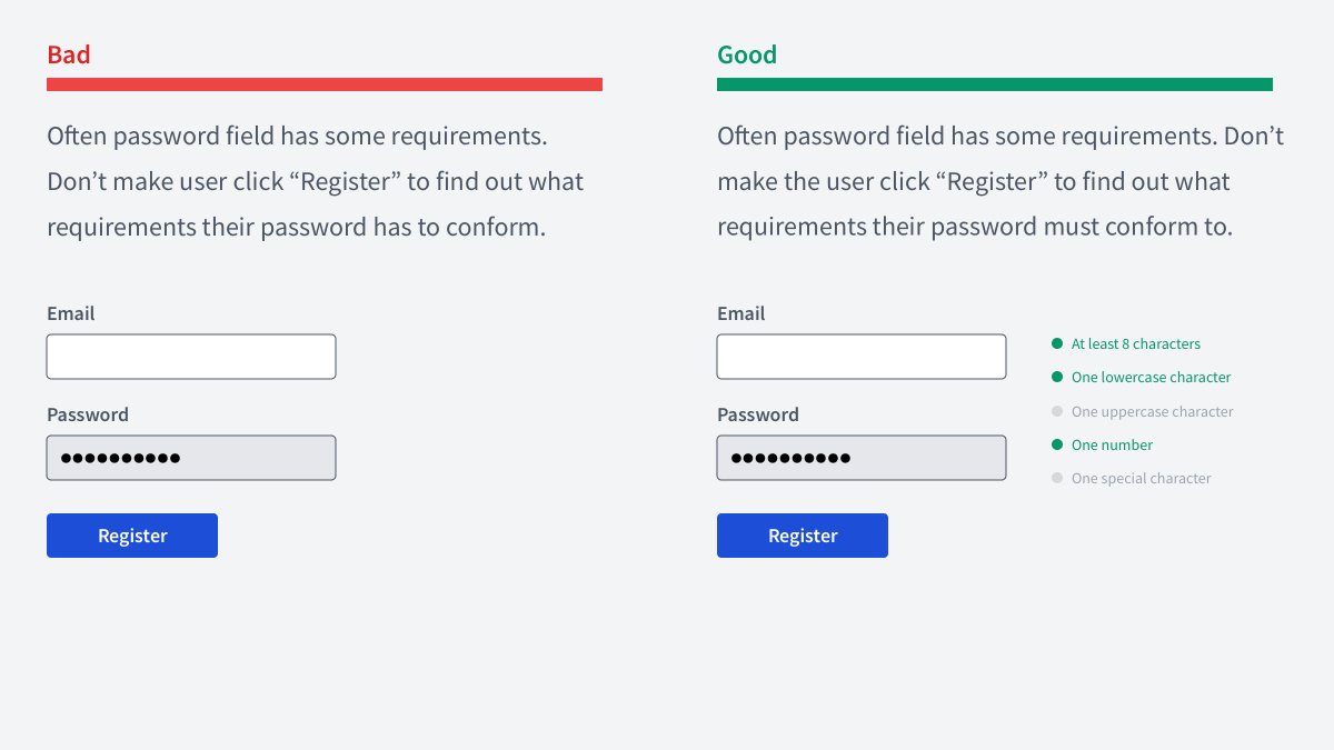
Password inputs often have a lot of rules.
Show them right away and tell users how well they do.
A nice example of this is @Mailchimp sign up form login.mailchimp.com/signup/
Show them right away and tell users how well they do.
A nice example of this is @Mailchimp sign up form login.mailchimp.com/signup/
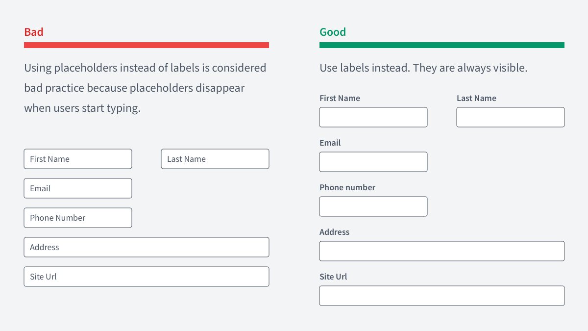
Don't use placeholders as labels 🙅♂️
As soon as users start typing they disappear. And users should remember what the field is.
Plus after they've completed the form, they cannot check if they've filled it correctly.
Minimize cognitive load!
nngroup.com/articles/minim…
As soon as users start typing they disappear. And users should remember what the field is.
Plus after they've completed the form, they cannot check if they've filled it correctly.
Minimize cognitive load!
nngroup.com/articles/minim…
Show validation errors near the inputs they belong to.
Don't put it somewhere at the bottom, or at the top.
Otherwise, users will have to match an error with its corresponding input.
Also, check out WHEN to show validation errors in this tweet:
Don't put it somewhere at the bottom, or at the top.
Otherwise, users will have to match an error with its corresponding input.
Also, check out WHEN to show validation errors in this tweet:
https://twitter.com/vponamariov/status/1380182211576664067

If you have a dropdown with up to 5-7 options, it'd be better to show them right away.
Pros:
🔸Reduce the number of clicks
🔸Users will see all available options right away
Pros:
🔸Reduce the number of clicks
🔸Users will see all available options right away

Don't use default file inputs.
They're ugly 🤮
They're ugly 🤮

Make your labels clear and succinct. Avoid unnecessary redundancy.

Validation is cool, but you can help users avoid making mistakes.
Related thread:
Related thread:
https://twitter.com/vponamariov/status/1391749534825558018

Consider positive feedback as well as negative. Especially for complex forms.

If you have a show/hid password icon, use a separate space for it.
Otherwise, it might interfere with password managers.
Otherwise, it might interfere with password managers.

Don't ask users to repeat their passwords.
🔸Provide show/hide password button
🔸If they made a mistake, you should have the reset password by email feature
🔸Provide show/hide password button
🔸If they made a mistake, you should have the reset password by email feature

It's a good practice if you explain to users why do you ask them all that information.
This will increase the chance they'll provide the info.
This will increase the chance they'll provide the info.

If your form is complex, don't be afraid to make a wizard out of it.
It'd better have the form divided into separate pages, rather than showing all the inputs at once.
It'd better have the form divided into separate pages, rather than showing all the inputs at once.
https://twitter.com/vponamariov/status/1366791289493192704

• • •
Missing some Tweet in this thread? You can try to
force a refresh


