What is the single most perfect and pure example of cancel culture?
And why?
Only rule is no politicians.
I might nominate Gina Carano. Loses a huge show and spin-off for a sort of(?) political post, when her co-star posted largely the same exact thing on the left and faced no repercussions. (That last part is good).
The media keeps reporting "only 26%" of the country is vaccinated. While technically true, it's only true if you include kids (who are not eligible for the vaccine), and if you don't include people who have already received one shot. 1/
Most of those people will be getting their 2nd shot eventually (obviously), some already have, and even if they never do, the protection from one shot is more effective than we would have dreamed any vaccine could be a year ago. 2/
The most important numbers are... in order: 1. People 65+ with at least one shot
-- which is now up to 80.6%!!! 2. People 18+ with at least one shot, a group that just became fully eligible this week
-- and it's already at 51.5%!!!
3/
We're raising money for small businesses who are trying to make it through the pandemic. We're telling a few of the thousands of stories out there. You can donate if you're able glennbeck.com/blog/casualtie…
The government shut downs have been a big part of the horrible situations these business owners are facing. But, even when they're allowed to be open, people don't want to come out in the same numbers. It's a difficult problem to solve in every way.
Yesterdays COVID death toll was 3,400. For perspective, each day this happens COVID is the number one cause of death in America. 3,400/day is about the daily total of heart disease and all cancers combined. This sort of pace is likely to continue for many weeks to come.
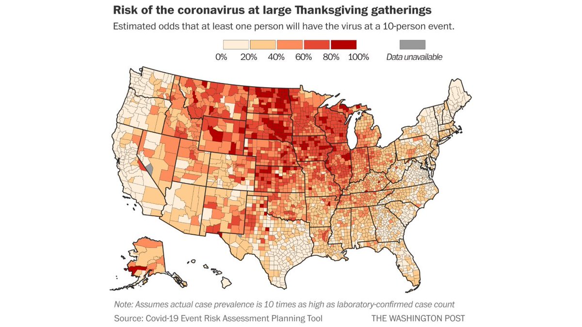
A thread on this viral map, which attempts to paint a very scary picture: depending on where you live, it is almost certain someone at your Thanksgiving gathering will have COVID. Look at all that red! But, the map has massive problems. 1/
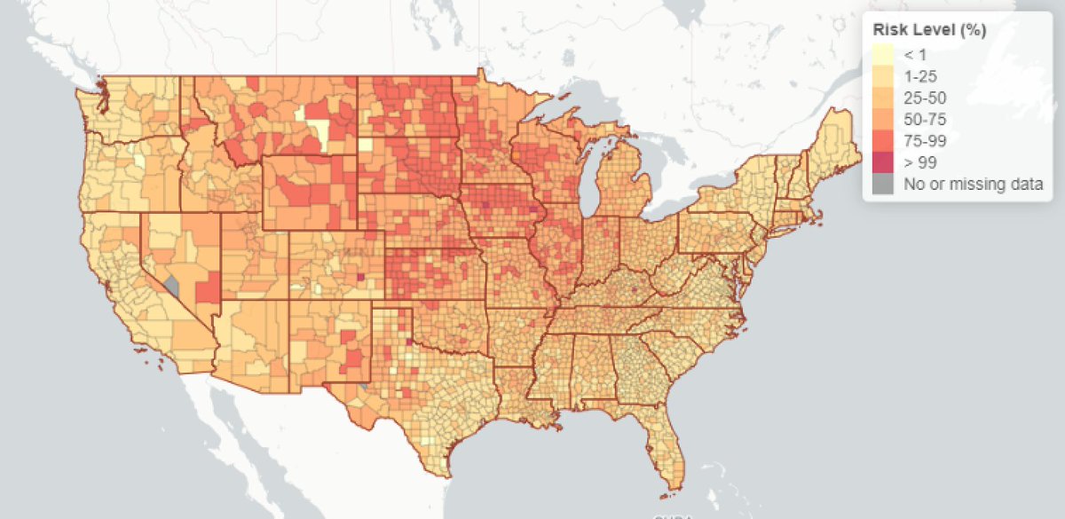
The map comes from the Washington Post, but it is based on the COVID-19 Event Risk Assessment Planning tool from GA Tech. The goal of which is to show what the chances are of having a COVID positive person attend a gathering. A worthwhile project. covid19risk.biosci.gatech.edu 2/
Here is the Washington Post map from the actual data source. First of all, notice anything different? 3/
For most of the pandemic, Belgium has had the worst death per million rate of any somewhat populous nation. (San Marino was always number 1, population 33k. Peru recently passed Belgium.)
So, Belgium already had a really bad first wave. The second wave does not look good. Deaths have barely started to climb, but things do seem out of control at the moment.