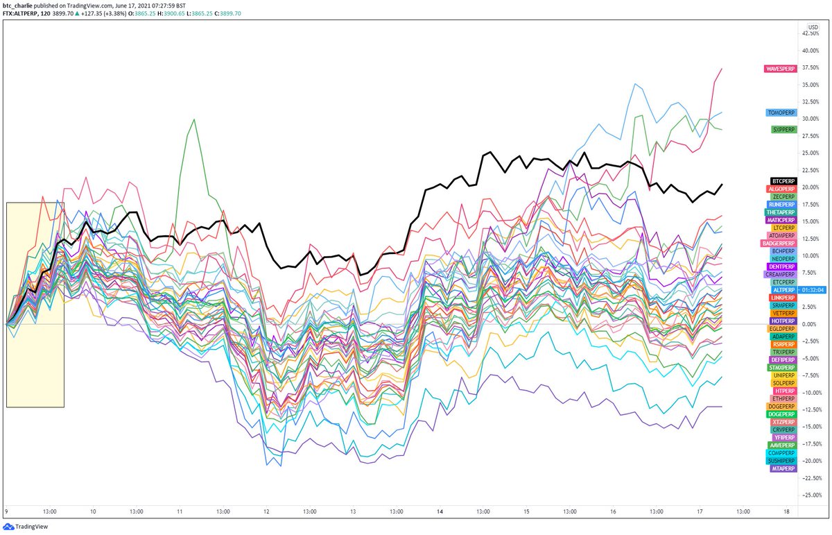
* Thread - Using Spaghetti to gauge when to risk on/off with $ALTS *
Gauging Altcoin reactions to large #Bitcoin moves is actually easier than you think. Let's take these 4 $BTC dip and run through.
RT's appreciated.
(1/6)
Gauging Altcoin reactions to large #Bitcoin moves is actually easier than you think. Let's take these 4 $BTC dip and run through.
RT's appreciated.
(1/6)
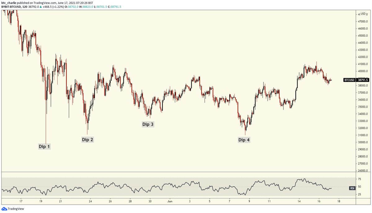
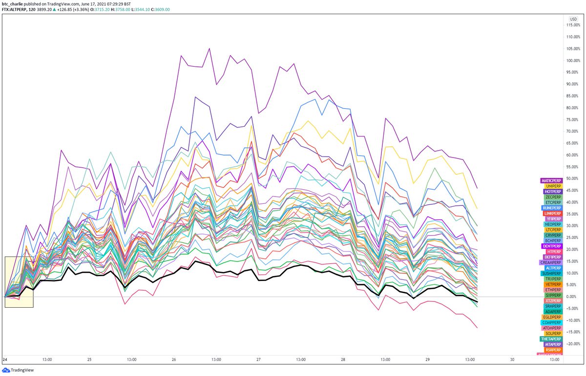
Dip 1: Looking at the initial reaction, you can see pretty explicitly that the market was not risk-on with alts. This was one of the main reasons I continued playing shorts on alts and looking for further downside.

Dip 2: Now from our revised chart starting point, you can see a different distribution. Starting off, around 80% of the alts are performing better than BTC. This is a good sign for getting risk-on with alts, as you can see from their continued performance.
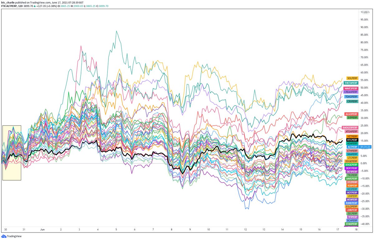
Dip 3: Similar to Dip 2, in that almost immediately you can see ~80% of alts bouncing harder than BTC.
Translation: the market is still in “dip buying” mode on alts, and altcoin volatility will almost certainly always exceed BTC.
Translation: the market is still in “dip buying” mode on alts, and altcoin volatility will almost certainly always exceed BTC.
Dip 4: “This time it’s different”. It is.
Of these four periods, this has been my worst trading alts. It almost looks as though the market wasn’t “expecting” a forth dip, and now is undecided whether to risk on/off on alts leading to chop.
Around 50/50 split - i.e. unclear.
Of these four periods, this has been my worst trading alts. It almost looks as though the market wasn’t “expecting” a forth dip, and now is undecided whether to risk on/off on alts leading to chop.
Around 50/50 split - i.e. unclear.
In summary these comparisons are a lot more powerful than you might originally assume.
An objective and simple “should I be risk on or off?” for $ALTS rule might be “>70% of Alts recovering after a dip”.
If you enjoyed it, RT’s appreciated. 🍻
An objective and simple “should I be risk on or off?” for $ALTS rule might be “>70% of Alts recovering after a dip”.
If you enjoyed it, RT’s appreciated. 🍻
P.S. I do not trade exclusively off this; it just gives me confluence for my trading execution and points to whether I should be in alts or not; and which alts.
Video showing how to set it up here:
Video showing how to set it up here:
https://twitter.com/btc_charlie/status/1405161521685184517?s=20
• • •
Missing some Tweet in this thread? You can try to
force a refresh