The latest #REACT survey (interim Rd 13) has been published and shows a big jump in infection levels, particularly amongst men.⚽️
Overall levels 🔼from 0.15% to 0.59%, and within Rd 13 doubling time is put at 6 days, (R=1.87).
Rates are 3x higher in the unvaccinated.
1/
Overall levels 🔼from 0.15% to 0.59%, and within Rd 13 doubling time is put at 6 days, (R=1.87).
Rates are 3x higher in the unvaccinated.
1/

Starting with the overall data - this interim report is very up to date, running to the 5th July (Wow! Speedy work @imperialcollege), and you can see the quadrupling of levels since Round 12.
The previous chart shows how they judge that the increase is accelerating.
2/
The previous chart shows how they judge that the increase is accelerating.
2/

Between rounds 12 and 13, R is put at 1.32 (doubling time 15 days), but within round 13 it is estimated at 1.87, with a doubling time of just 6 days. These latter estimates do have wider CI's though.
3/
3/

The main point of interest with Round 13 is that men appear to be around 50% more likely currently to test positive.
It's not hard to think of a reason why that might be the case. #itscominghome.
4/
It's not hard to think of a reason why that might be the case. #itscominghome.
4/

The other key point is that those who are unvaccinated are three times more likely to test positive, with those having one dose in between.
Note though that even the fully vaccinated rate has quadrupled since Round 12.
5/
Note though that even the fully vaccinated rate has quadrupled since Round 12.
5/

The age analysis is very predictable, with levels much higher in those under 25. Even at the oldest ages there have been increases, although proportionately less at the 75+ group.
6/
6/

All regions are up substantially, but there has been an eightfold increase in London (from 0.13% to 1.08%), taking it above the NW which had previously been highest.
7/
7/

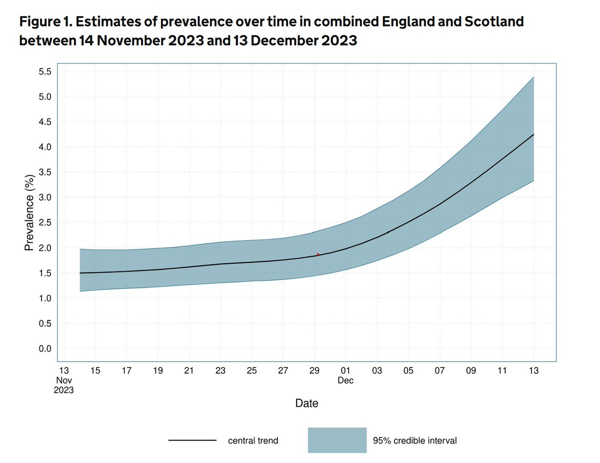
Finally, here's the overall chart of infection levels. Note that the end of the graph suggests a level close to 1.0%, which is higher than the 0.59% quoted for the Round. That's because 0.59% is an average, and so the rate at the end will be higher when rates are rising.
8/
8/

REACT is one tool used to chart infection levels along with the weekly ONS survey, PHE daily data, and ZOE.
Like the ONS data, a key strength is its random sampling approach. It can sometimes be criticised for being out of date, but with data to Sunday, not this time.
9/
Like the ONS data, a key strength is its random sampling approach. It can sometimes be criticised for being out of date, but with data to Sunday, not this time.
9/
Thanks to all the researchers at @ImperialCollege, its partners at @IpsosMORI, and also all who take part in it, without which it wouldn't be possible.
Report here:
imperial.ac.uk/medicine/resea…
10/10 END.
Report here:
imperial.ac.uk/medicine/resea…
10/10 END.
• • •
Missing some Tweet in this thread? You can try to
force a refresh


