Among the many things you *wouldn't* learn from reading this infographic is that the net worth of the bottom half of the wealth distribution is up 144% since the first quarter of 2008 while that of the top 1% is up 122% nytimes.com/interactive/20…
Since the end of 2019 the net worth of the bottom half is up 30.3% while that of the top 1% is up 20.7%, according to the Fed's distributional accounts federalreserve.gov/releases/z1/da…
And yes it's awful that the bottom half of the wealth distribution controls only 2% of the wealth, but the damage was done in the 1990s and 2000s, not the last decade Image
There are many ways to slice the wealth data, and I'm not sure my optimistic take from a couple of months ago is right. But there's lots of evidence that doesn't fit the story that Fed policy over the past decade has increased inequality bloomberg.com/opinion/articl…

• • •

Missing some Tweet in this thread? You can try to force a refresh
 

Keep Current with Justin Fox

Justin Fox Profile picture

Stay in touch and get notified when new unrolls are available from this author!

Read all threads

This Thread may be Removed Anytime!

PDF

Twitter may remove this content at anytime! Save it as PDF for later use!

Try unrolling a thread yourself!

how to unroll video
  1. Follow @ThreadReaderApp to mention us!

  2. From a Twitter thread mention us with a keyword "unroll"
@threadreaderapp unroll

Practice here first or read more on our help page!

More from @foxjust

30 Jul
It looks like the NYC murder totals are about to start showing declines relative to 2020 (although definitely not 2019) bloomberg.com/opinion/articl… Image
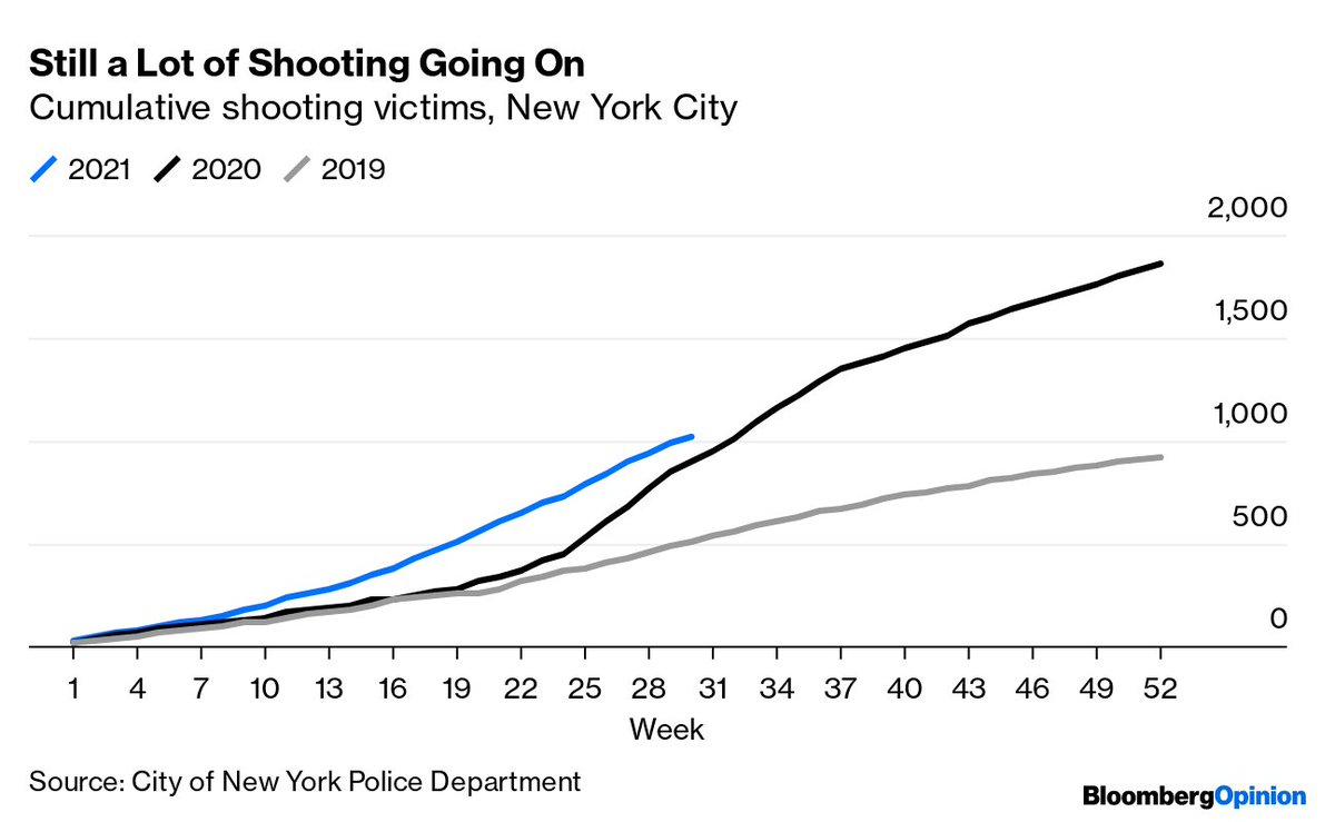
Shootings will start coming in below the 2020 numbers before long too, if current trends continue, although the undershoot won't be nearly as big bloomberg.com/opinion/articl… Image
Elsewhere, murders are still up 14.5% YTD in the 74 cities that @Crimealytics and @IT4Policy track, although the rate of increase has been dropping as the comparison period becomes last summer rather than the spring 2020 lockdowns datastudio.google.com/embed/reportin…
Read 4 tweets
28 Jul
You feeling sleepy yet? bloomberg.com/opinion/articl… Image
These data, from the American Time Use Survey, include naps and "spells of sleeplessness" and generally come in about an hour higher than other sleep estimates, but the upward trend holds for all age groups under 65 and is probably for real bloomberg.com/opinion/articl… Image
In a study based on ATUS data through 2016, two @PennMedicine researchers found that late-night reading and TV watching had declined as sleep hours went up academic.oup.com/sleep/article/…
Read 6 tweets
18 Jun
Make a log chart of U.S. mortality rates by age group going back to 1900, and something really disturbing stands out bloomberg.com/opinion/articl… Image
Mortality rates for older Americans had been headed mostly downward for a century until Covid-19 (although 55-to-64-year-olds had seen a slight mortality increase over the past decade) Image
Younger kids' mortality rates have plummeted, and kept declining right through the pandemic (although 5-to-14-year-olds haven't had a great decade) bloomberg.com/opinion/articl… Image
Read 10 tweets
6 May
So there's this weird thing that happens when housing prices go up in cheap places and down in expensive ones bloomberg.com/opinion/articl…
Yes, rents are still a lot lower in Florida than California. But when compared to local wages, they stop looking so cheap bloomberg.com/opinion/articl… Image
Go through all metro areas for which @ApartmentList has rent estimates and @BLS_gov has median wage data, and the least-affordable list is admittedly still quite California-heavy bloomberg.com/opinion/articl… Image
Read 5 tweets
3 May
As always, I offer answers to your most pressing questions, such as "where do those flowers come from?" bloomberg.com/opinion/articl… Image
While Colombia and Ecuador dominate U.S. flower imports, they still trail the Netherlands in global exports bloomberg.com/opinion/articl… Image
It used to be that most cut flowers in the U.S. came from greenhouses near big cities, with New York and Pennsylvania the top two producers lib-usda-05.serverfarm.cornell.edu/usda/AgCensusI… Image
Read 10 tweets
9 Apr
Yes, the story is a *lot* different if you go back farther than 2010, but for the past 1/5/10 years the part of the U.S. wealth distribution with the fastest-growing net worth is the bottom half bloomberg.com/opinion/articl…
The Great Recession and its immediate aftermath were disastrous for the less-affluent half of America, but the past decade has been tons better bloomberg.com/opinion/articl…
The bottom half's comeback doesn't look as nearly impressive when expressed as a percentage of total U.S. household wealth, but it's still been a sustained recovery bloomberg.com/opinion/articl…
Read 10 tweets

Did Thread Reader help you today?

Support us! We are indie developers!


This site is made by just two indie developers on a laptop doing marketing, support and development! Read more about the story.

Become a Premium Member ($3/month or $30/year) and get exclusive features!

Become Premium

Too expensive? Make a small donation by buying us coffee ($5) or help with server cost ($10)

Donate via Paypal Become our Patreon

Thank you for your support!

Follow Us on Twitter!

:(