
📣📣 UPDATED COUNTY-LEVEL VAXX THREAD (last one for a month as vaxx rates have slowed to the point these aren't changing much anymore):
ALABAMA:
ALABAMA:

ALASKA (as always, they're all over the map, literally):

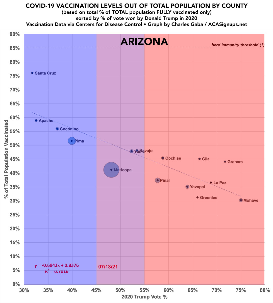
ARIZONA:
(R^2: 0.7016)
(R^2: 0.7016)
ARKANSAS...vaccination rates on the left, new case rates on the right. Not pretty.


CALIFORNIA.
Yes, R^2 is up to 0.7661.
Yes, the R^2 has been gradually *increasing* in nearly every state.
Yes, R^2 is up to 0.7661.
Yes, the R^2 has been gradually *increasing* in nearly every state.

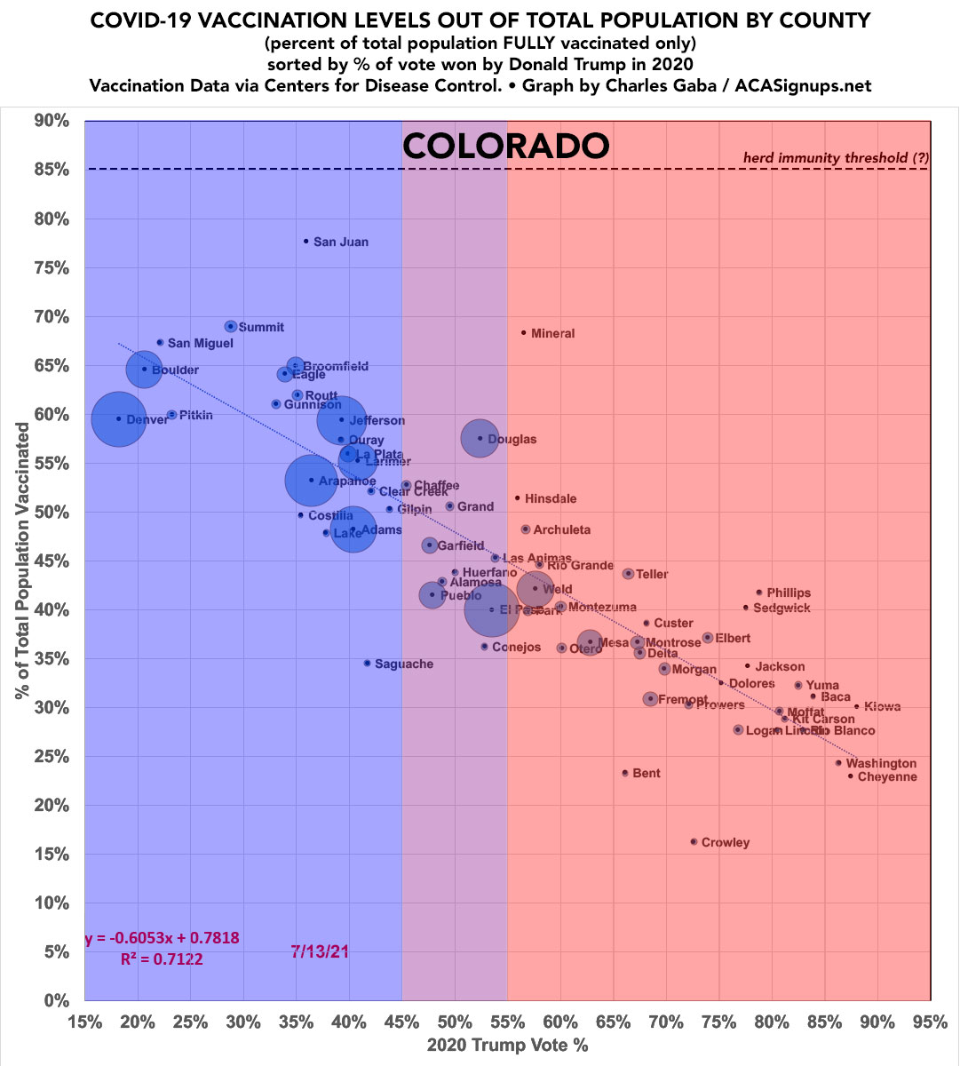
COLORADO.
Another high R^2: 0.7122.
Another high R^2: 0.7122.
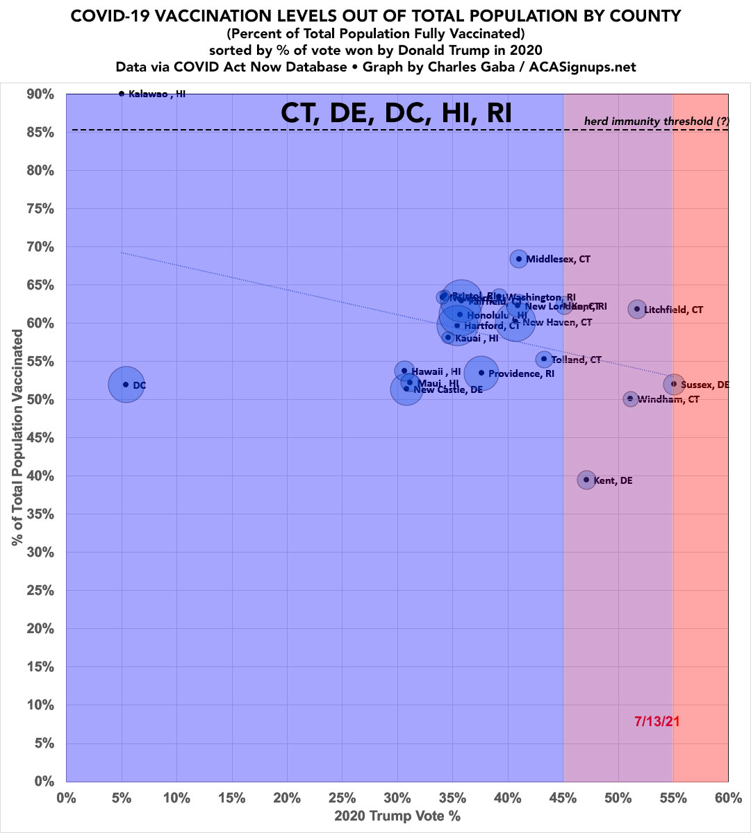
CONNECTICUT, DELAWARE, DC, HAWAII & RHODE ISLAND (none more than a handful of counties so there's not much point in graphing them separately; I lumped them together anyway for completeness).
Kalawao County, Hawaii has actually vaxxed ALL of of their...86 residents.
Kalawao County, Hawaii has actually vaxxed ALL of of their...86 residents.
FLORIDA:
(Sumter County is home to The Villages, the massive MAGA retirement community.)
(Sumter County is home to The Villages, the massive MAGA retirement community.)

RE. FLORIDA NEW CASE RATES:
This is what FL looks like...but since they're only reporting county-level data WEEKLY now, it's up to a week out of date. Their recent surge therefore isn't reflected here...yet.
This is what FL looks like...but since they're only reporting county-level data WEEKLY now, it's up to a week out of date. Their recent surge therefore isn't reflected here...yet.

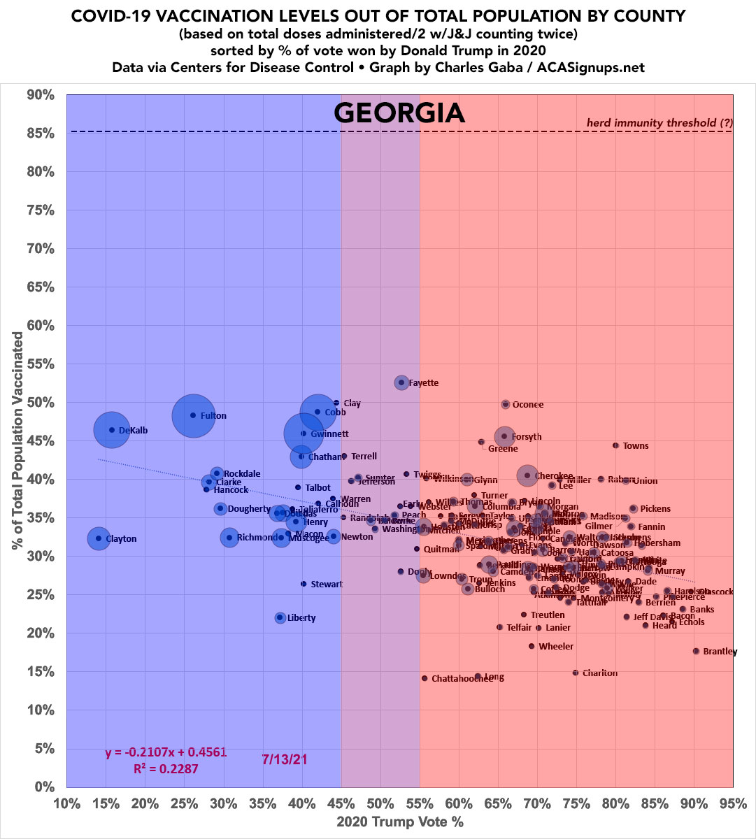
GEORGIA.
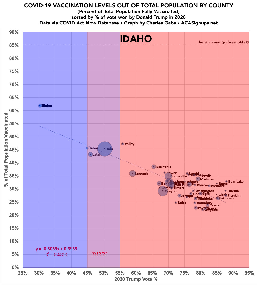
IDAHO. Another high R^2 state:
ILLINOIS. Jo Daviess County is the big outlier; if anyone knows why, feel free to comment.

INDIANA.

IOWA.

KANSAS. Anyone know if there's something special or unusual about Graham County?

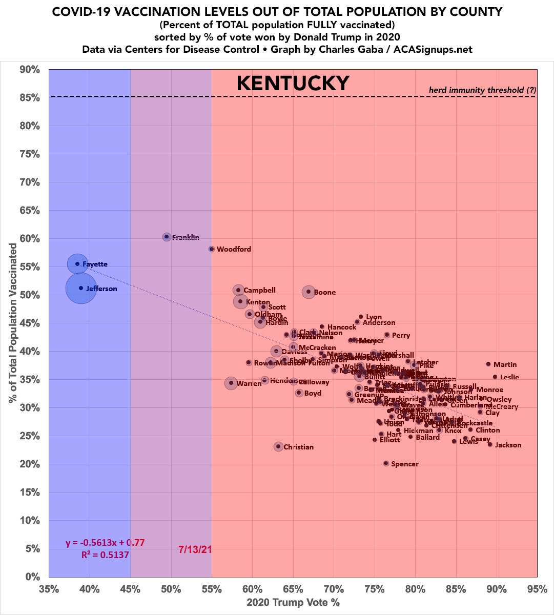
KENTUCKY.
LOUISIANA. Outlier West Feliciana is home to the LA State Penitentiary, which *may* explain their high vaxx rate? (6,300 prisoners, 1,800 staff, total county population just 15,600)?

MAINE.
Yes, you're reading that correctly: R^2 is 0.8135.
Yes, you're reading that correctly: R^2 is 0.8135.

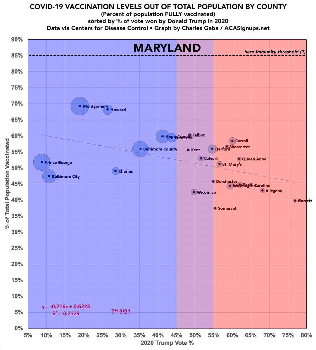
MARYLAND.
MASSACHUSETTS.
Yes, every single county is blue.
Re. Dukes/Nantucket: The vaxx data for both of these is very odd, likely due to the nature of each. CDC puts them at an absurdly low ~2% but city/village-level data says it's over 90%. I'm going with the latter.
Yes, every single county is blue.
Re. Dukes/Nantucket: The vaxx data for both of these is very odd, likely due to the nature of each. CDC puts them at an absurdly low ~2% but city/village-level data says it's over 90%. I'm going with the latter.

MICHIGAN (my home state!).
I've separated Detroit from the rest of Wayne County to illustrate how much discrepancy there can be even at the county level.
It'd be awesome to do this by zip code but there's 41,600 of them nationally...
I've separated Detroit from the rest of Wayne County to illustrate how much discrepancy there can be even at the county level.
It'd be awesome to do this by zip code but there's 41,600 of them nationally...

MINNESOTA.

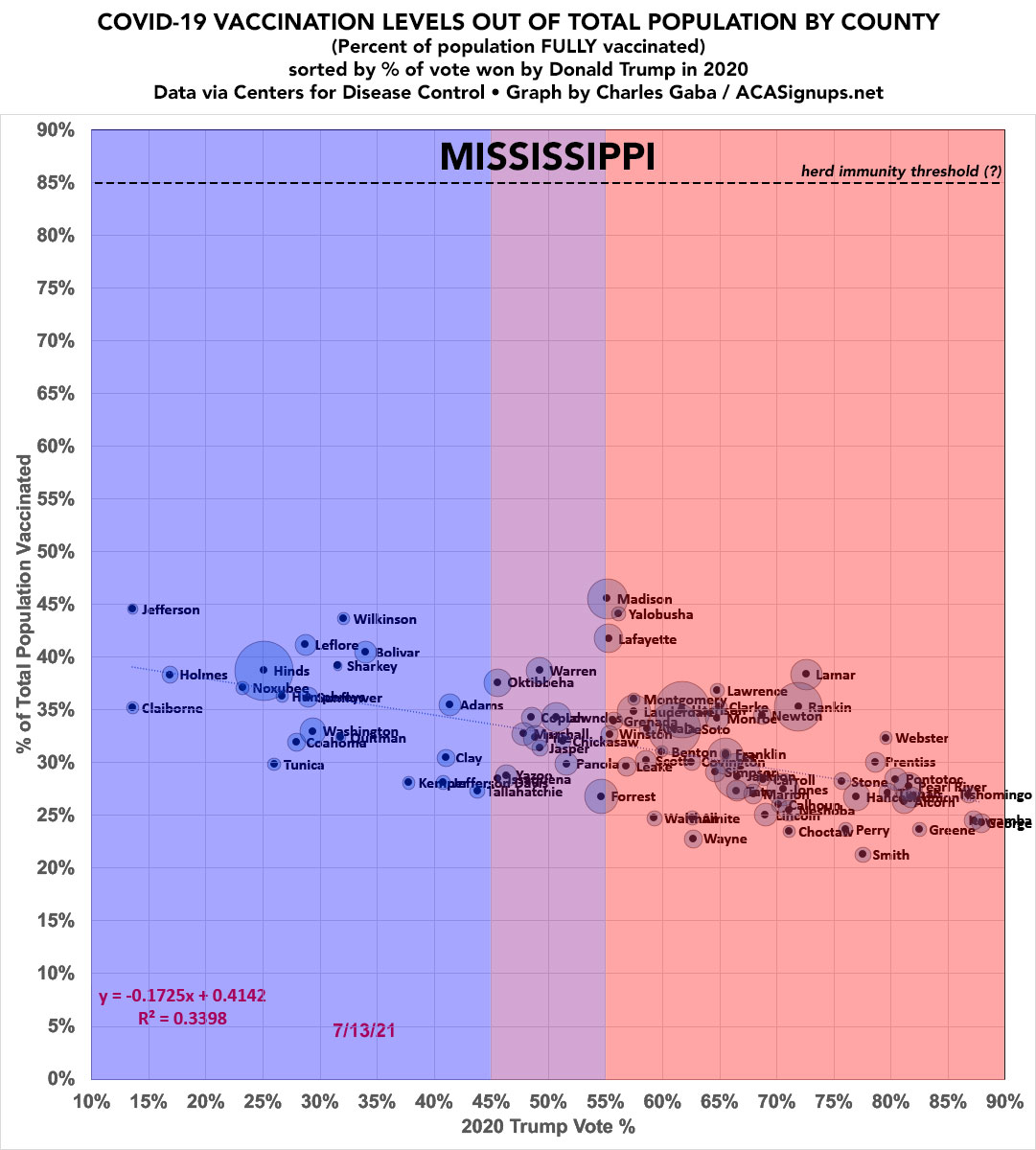
MISSISSIPPI.
Only 1 county has cracked 45%.
Only 1 county has cracked 45%.
MISSOURI.
Vaxx rates on the left.
New case rates on the right. 😳😳
Vaxx rates on the left.
New case rates on the right. 😳😳


MONTANA.
R^2: 0.7112.
And yes, there's a fascinating pattern re. which states are showing a steep slope/high R^2 vs. which states aren't, which I'll get to downthread...
R^2: 0.7112.
And yes, there's a fascinating pattern re. which states are showing a steep slope/high R^2 vs. which states aren't, which I'll get to downthread...

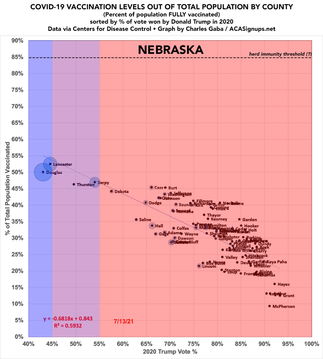
NEBRASKA.
That's correct: McPherson County voted over 90% for Trump and is less than 10% vaccinated.
That's correct: McPherson County voted over 90% for Trump and is less than 10% vaccinated.
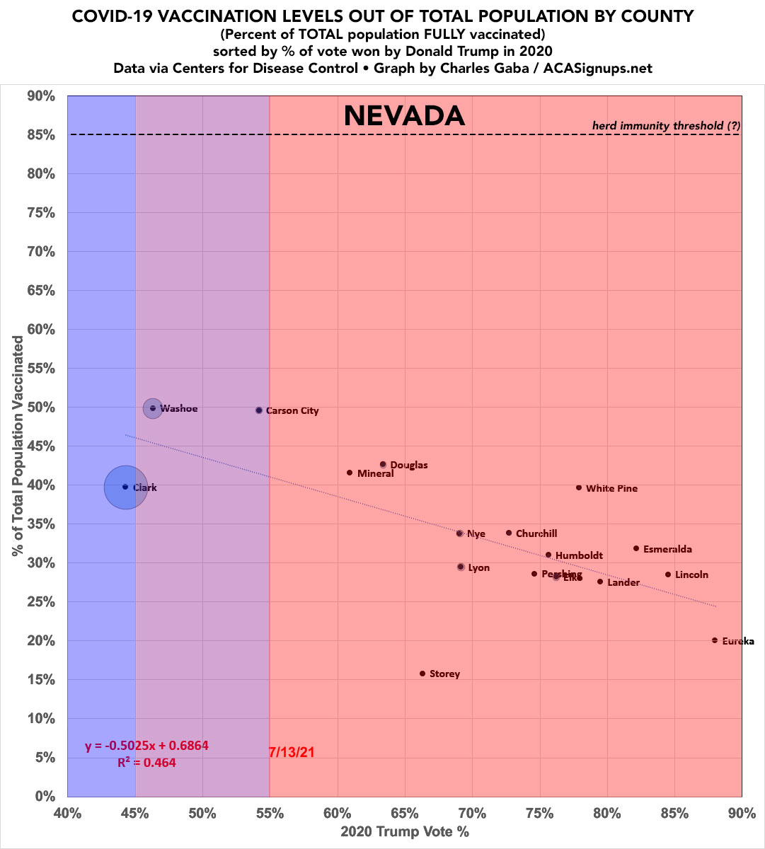
NEVADA.
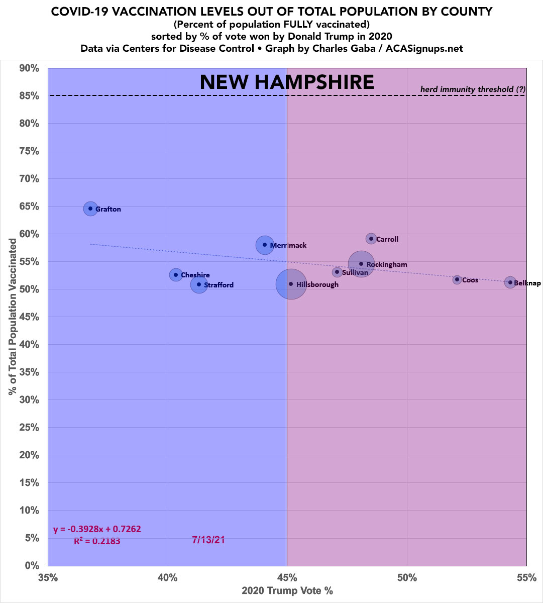
NEW HAMPSHIRE.
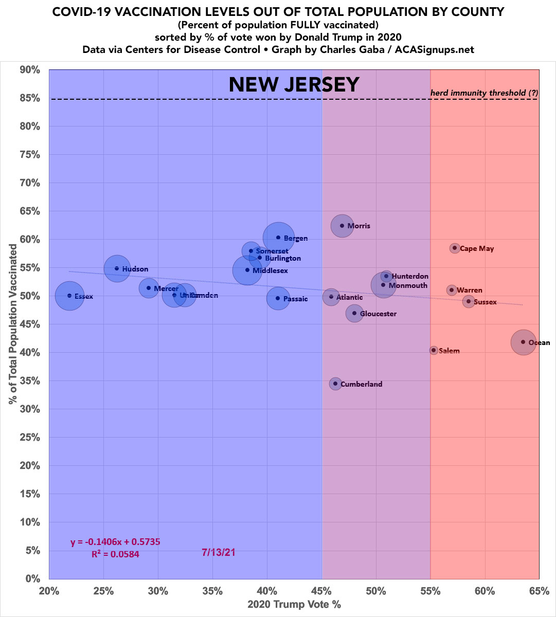
NEW JERSEY.
NEW MEXICO.
R^2: 0.7185. Starting to see the pattern yet?
Los Alamos: Science!
R^2: 0.7185. Starting to see the pattern yet?
Los Alamos: Science!

NEW YORK.
Brooklyn & The Bronx need to get it together.
Hamilton County is the least-populated county east of the Mississippi. Someone told me what the deal was here re. their outlier status but I forgot.
Brooklyn & The Bronx need to get it together.
Hamilton County is the least-populated county east of the Mississippi. Someone told me what the deal was here re. their outlier status but I forgot.

NORTH CAROLINA: Like Alaska, literally all over the map. Anyone want to remind me what's up with Martin County?

NORTH DAKOTA.
Slope County has 750 residents. 68 of them are vaccinated.
Sioux County has 4,200 residents, and is 82% Native American.
Slope County has 750 residents. 68 of them are vaccinated.
Sioux County has 4,200 residents, and is 82% Native American.

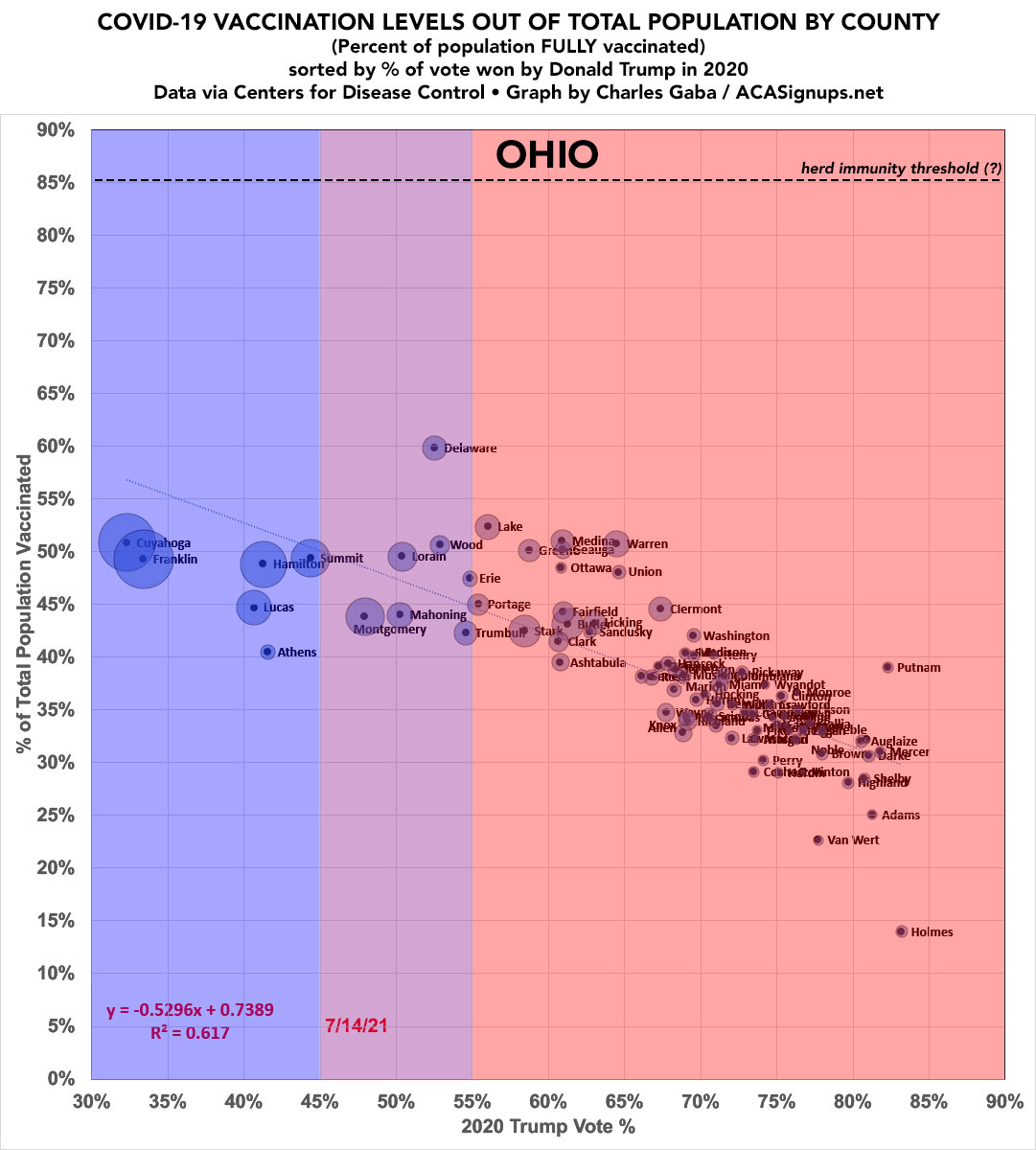
OHIO.
OKLAHOMA.
Again, only 1 county over 45% vaxxed.
Again, only 1 county over 45% vaxxed.

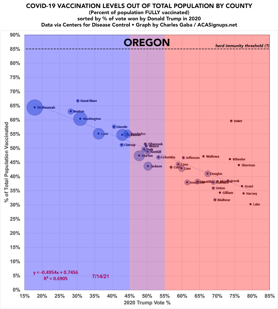
OREGON.
R^2: 0.6905.
Baker County is the outlier.
R^2: 0.6905.
Baker County is the outlier.
PENNSYLVANIA.
Philly needs to get it together quickly.
Philly needs to get it together quickly.

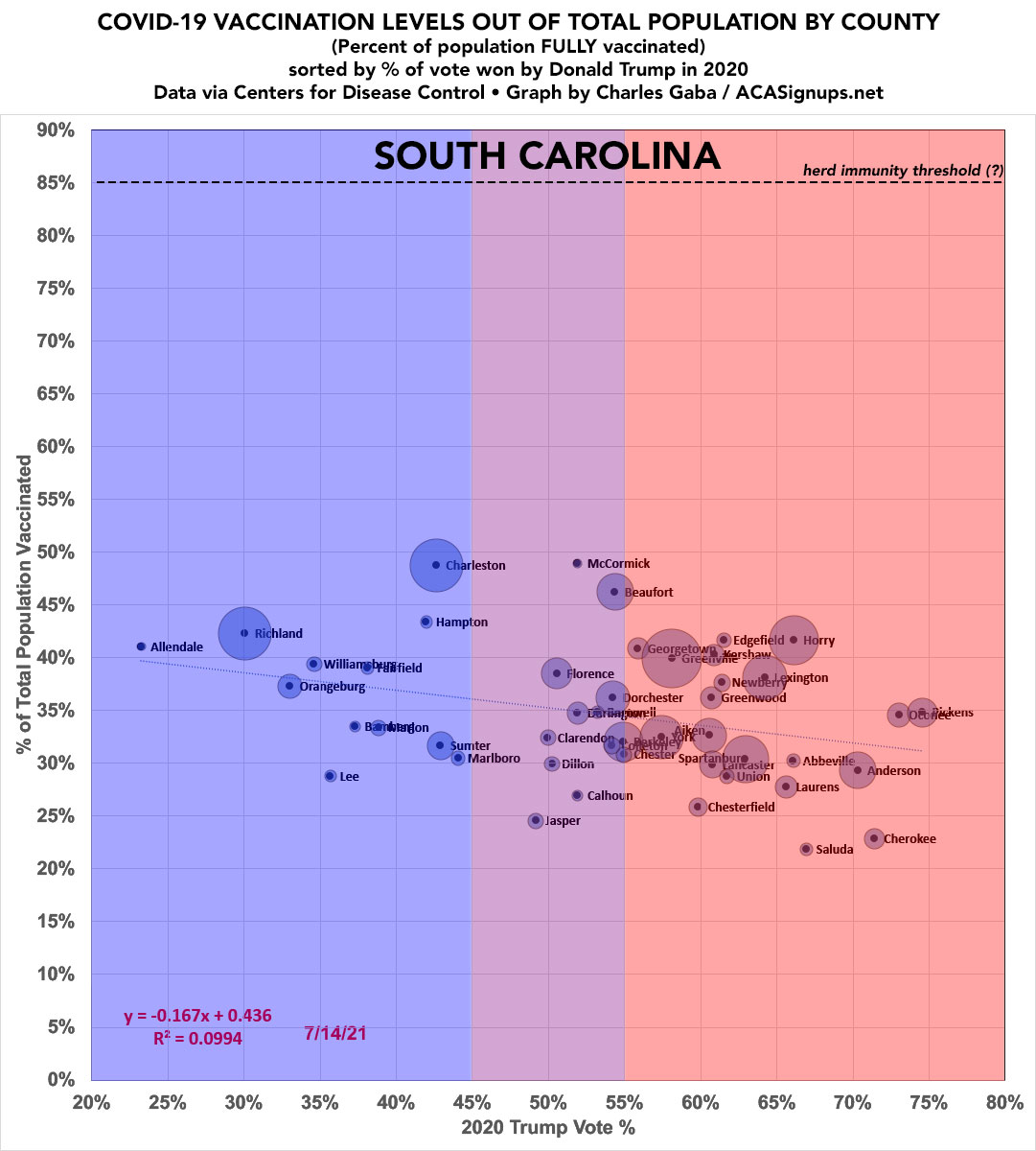
SOUTH CAROLINA.
SOUTH DAKOTA.
WARNING: SD's data is only 83% complete.
Having said that...a *second* deep red McPherson County under 10%. Huh.
There's only 3 McPherson Counties in the U.S. All three are deep red. Two of them are less than 10% vaxxed (the third is 40%, in Kansas).
WARNING: SD's data is only 83% complete.
Having said that...a *second* deep red McPherson County under 10%. Huh.
There's only 3 McPherson Counties in the U.S. All three are deep red. Two of them are less than 10% vaxxed (the third is 40%, in Kansas).

TENNESSEE.
Vaxx rates on the left, new case rates on the right.
While TN has been making all the wrong types of COVID news the past week or so, the #DeltaVariant surge seems to be pretty minor and evenly distributed *so far* at the county level...but so is the vaxx rate.
Vaxx rates on the left, new case rates on the right.
While TN has been making all the wrong types of COVID news the past week or so, the #DeltaVariant surge seems to be pretty minor and evenly distributed *so far* at the county level...but so is the vaxx rate.


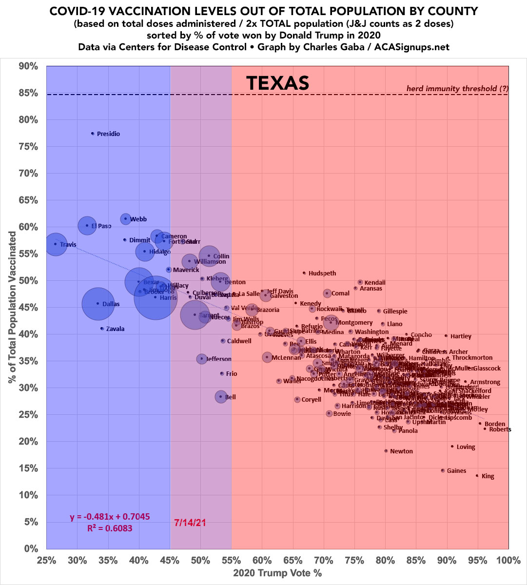
TEXAS.
Holy smokes: R^2 over 0.6 with 254 counties.
Presidio County continues to kick ass.
King County...not so much.
Holy smokes: R^2 over 0.6 with 254 counties.
Presidio County continues to kick ass.
King County...not so much.
UTAH.
R^2: 0.7268.
Summit County leads the way. Juab...trails.
R^2: 0.7268.
Summit County leads the way. Juab...trails.

VERMONT.

VIRGINIA. CDC data is too incomplete for some states so I use @COVIDActNow data for those. For some reason they don't include Manassas Park or Manassas City, however, so I have to use the state health dept. website for them. Huh.

WASHINGTON STATE.
R^2 0.7123.
R^2 0.7123.

WEST VIRGINIA.

WISCONSIN.

WYOMING.
R-squared? 0.8542.
R-squared? 0.8542.

PUERTO RICO.
They don't vote for President in the general election and I know nothing about internal PR politics, so I'm just ranking their municipalities from lowest to highest-vaxxed for completeness.
They don't vote for President in the general election and I know nothing about internal PR politics, so I'm just ranking their municipalities from lowest to highest-vaxxed for completeness.

AS NOTED ABOVE, you may have noticed that some states have low correlation trendlines (R^2) while others are extremely high...and some have nearly flat lines while others are very steep.
This pattern seems to be REGIONAL in nature, as I wrote last week:
acasignups.net/21/07/15/while…
This pattern seems to be REGIONAL in nature, as I wrote last week:
acasignups.net/21/07/15/while…
I broke the 48 contiguous states (+DC) out into 7 geographic regions:
--DEEP SOUTH
--REST OF SOUTH
--MID-ATLANTIC
--NEW ENGLAND
--MIDWEST
--MOUNTAIN WEST
--WEST COAST
(Neither Hawaii nor Alaska seemed to fit in anywhere)
--DEEP SOUTH
--REST OF SOUTH
--MID-ATLANTIC
--NEW ENGLAND
--MIDWEST
--MOUNTAIN WEST
--WEST COAST
(Neither Hawaii nor Alaska seemed to fit in anywhere)
The results are fascinating.
The Southern states generally show a shallow slope and low correlation...as does New England...but for very different reasons.
The Midwest and Mid-Atlantic show mid-level slopes and correlations, appropriately enough...
The Southern states generally show a shallow slope and low correlation...as does New England...but for very different reasons.
The Midwest and Mid-Atlantic show mid-level slopes and correlations, appropriately enough...
...but the Mountain West and West Coast states have VERY steep slopes and R^2 factors of over 0.7 across over 400 counties!
I have my own theories about all of this, but this thread is way too long already so feel free to comment below!
I have my own theories about all of this, but this thread is way too long already so feel free to comment below!
Meanwhile, if you find my work useful and want to support it, you can do so here, thanks! acasignups.net/support
UPDATE: Here's what the 12 Western states look like combined (West Coast, Mountain West and Texas)...a full 1/3 of the total U.s. population:

• • •
Missing some Tweet in this thread? You can try to
force a refresh


