
I started designing a typeface called Really Sans about 2 years ago. It is now available at @lettermatic_abc.
I am going to try something new today: a twitter thread about the underlaying ideas in Really Sans.
What goes into a typeface design?
I am going to try something new today: a twitter thread about the underlaying ideas in Really Sans.
What goes into a typeface design?
There are a lot of Sans Serif typefaces. Why does the world need another one? This question is asked of any new entry to the genre.
There is a very clear reason, for me, as to why Really Sans exists.
There is a very clear reason, for me, as to why Really Sans exists.
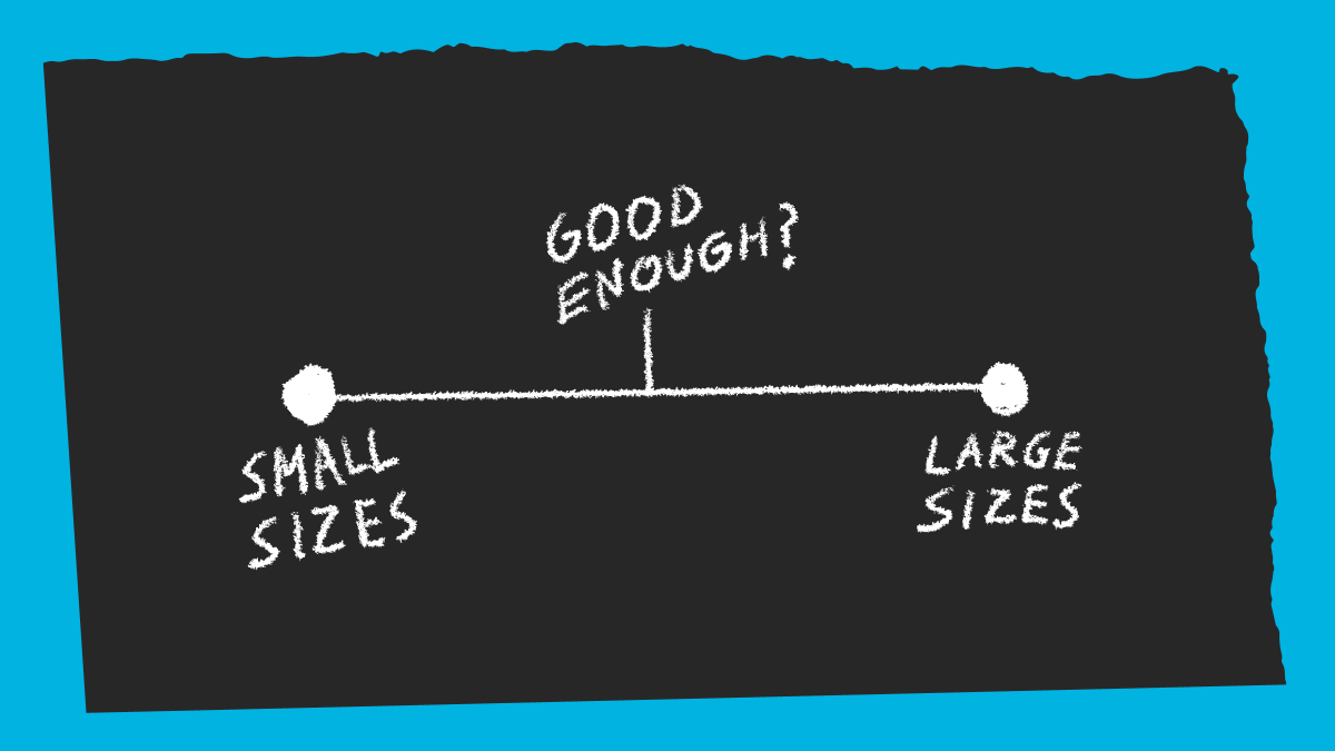
Really Sans is a typeface in two halves - Large and Small. These refer to the fonts being designed for use at large and small point sizes; a common term for this is 'optical size'.
But how does optical size... work?
But how does optical size... work?
For a long period of time, typefaces were cut into metal by 'punch cutters'. Each letterform was a physical piece of metal called a 'sort'. That's where we get the term 'out of sorts'; it’s a reference to running out of letters in a type case.
(Types of Typefaces, Leiberman).
(Types of Typefaces, Leiberman).


Punch cutters would cut each glyph by hand. If you needed another point size of type, they had to begin again, cutting that new size as a physical object. In the process, they carefully adjusted the drawing of the glyph so that it was ideal for reading at that size.


Many famous typefaces once had optical sizes, even in the 20th century. For instance, this is Futura metal type (via Intertype) at 10 points and at 14 points. By equalizing their x-heights we can compare the way the fonts were modified to suit specific point sizes.
Fast forward to digital fonts. We can change the size of fonts just by selecting a point size from a menu. Digital calculations are done in a fraction of a second, and we can see the results. It's kind of easy to forget what a miracle this is, compared to past technologies.
But when we change the point size of a digital font, we're just proportionately scaling the same drawing. The optical size considerations of the past are not at play, and we aren't benefitting from the careful consideration of the past 'punch cutters'.
The issue with ‘scaling the same drawing’ is very much present in icon design. Designers know that careful consideration is necessary to make an icon that is legible at tiny sizes. The same concept is directly applicable to typeface design.
(icons here from a 1984 NYC hospital)
(icons here from a 1984 NYC hospital)


What has happened in the digital era is that many famous typefaces have essentially been converted to digital technology by taking the 'middle' of the existing optical size range, and making that the ONLY version.
You end up with fonts that... sort of work in text? And sort of work in headlines? They often don't excel in either capacity, and compromises are made in both contexts.
I wanted Really Sans to be a sans serif typeface with optical size. No compromises. I pictured a design in two halves – fonts designed specifically for large sizes, and fonts designed specifically for small sizes.
I started asking myself... what is a large point size sans serif? And I realized there is a precedent for this – the voice of 1970s advertising headlines, and the work of people like Herb Lubalin, Ed Benguiat, Tom Carnase, and Tony DiSpigna.
These designers made typefaces that consistently had very tight spacing and very large x-heights. This concept of proportion is, to a large extent, what ties together the letterforms from this era.
(shown here: 1970s type specimens from ITC, Photo-Lettering, and Compugraphic)
(shown here: 1970s type specimens from ITC, Photo-Lettering, and Compugraphic)


Really Sans is a sans serif typeface with two optical sizes. The small optical size works for text. The large optical size revives the tone of the 1970s headlines. The goal was to incorporate the optical size considerations of the past, and re-imagine them for contemporary use.

Really Sans Large takes influence from the 1970s. It has tight spacing, and a large x-height. It is charming, and friendly, and to borrow a term from sign painting, it has 'eye appeal'. It has styles that get very light, and it has very bold styles too.

Really Sans Small takes all of those details, and adjusts them into a design intended specifically for running text. The x-height and ascender/descender lengths are adjusted to match a readers expectation for what text should look like.

Really Sans Small has spacing that is adjusted specifically for running text. The exact amount of space between letters is crucial to an enjoyable reading rhythm, and Really Sans makes no compromises on the texture of its small optical size.
Really Sans Small has less weights because these are the ones that are useful to readers at small sizes. It does not try to suggest that 'hairline' weights work at text sizes, because they simply don't.

Really Sans Large is more geometric and round. It's wider, and things that are circular are closer to a real circle. In comparison, Really Sans Small has circular forms that are narrower, and more economical on the page.

Really Sans is not a single set of fonts, trying their best to look nice at large sizes, and at small sizes. Instead Really Sans proposes that these typographic demands are best satisfied by a pair of designs working in unison.
I am proud to have been able to work with @danellecheney and @heather_cran on Really Sans, they care about Really Sans as much as I have. We all get along and work well together… I guess that's why @lettermatic_abc exists!
I have more to say about Really Sans, but that's probably plenty for today. If you have questions about this typeface, I'd be happy to answer. And please try it for yourself at: lettermatic.com/fonts/really-s…
The kind replies to this thread have made this a very happy morning for me. 😀🔤
@jesawyer Granted I was only equipped with translation software, but I was very proud of myself when I picked 'Großtechnisch' for this type specimen of the 'large' optical size, given I am told this means 'large-scale' in German.
• • •
Missing some Tweet in this thread? You can try to
force a refresh


