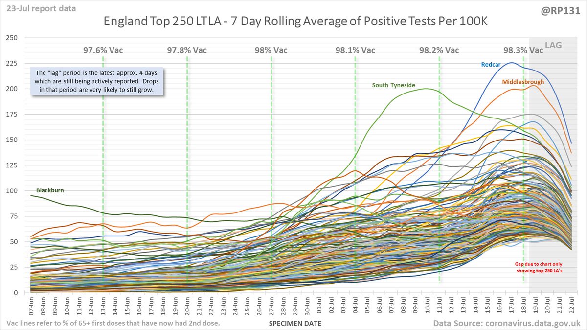
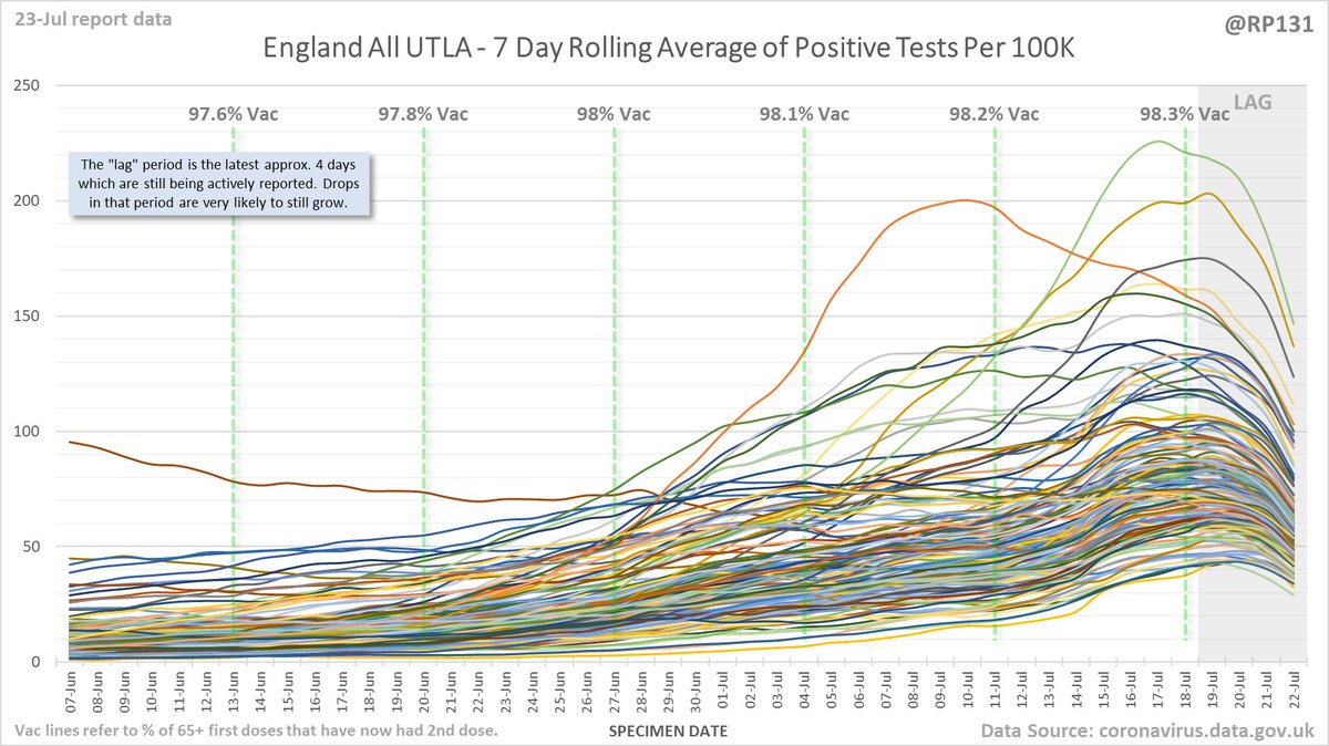
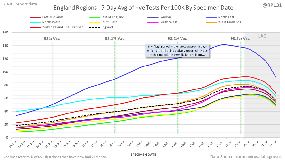
#covid19uk - Detailed positive tests thread. The majority of this thread is a set of views of rolling 7 day average positives per 100K by specimen date. Starting with England regions: 
Some of the more detailed content from this thread has been moved to an external page to try and make the twitter updates a bit more manageable. You can still see the full version here: …ddatashare.s3-eu-west-1.amazonaws.com/Detail/Detail_…
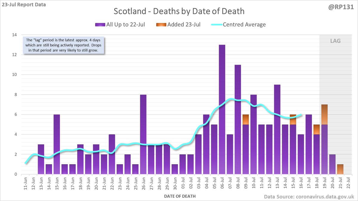
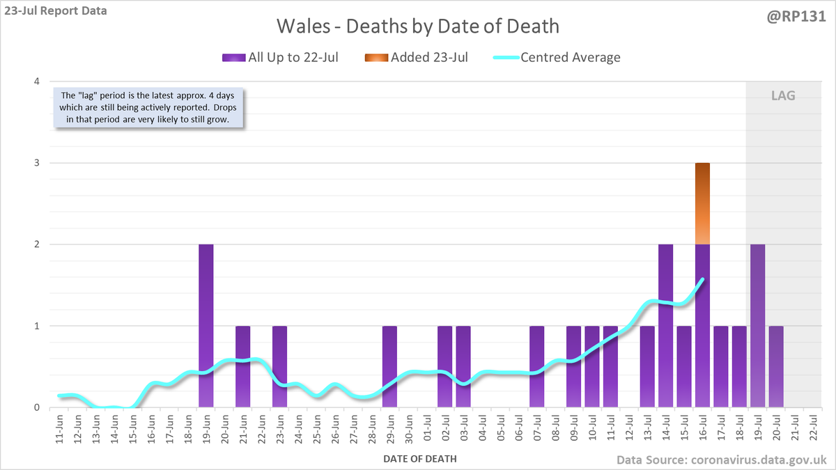
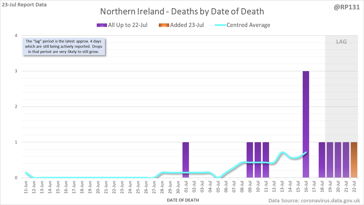
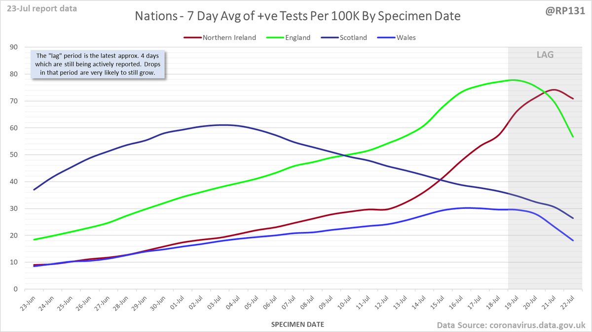
UK nations:
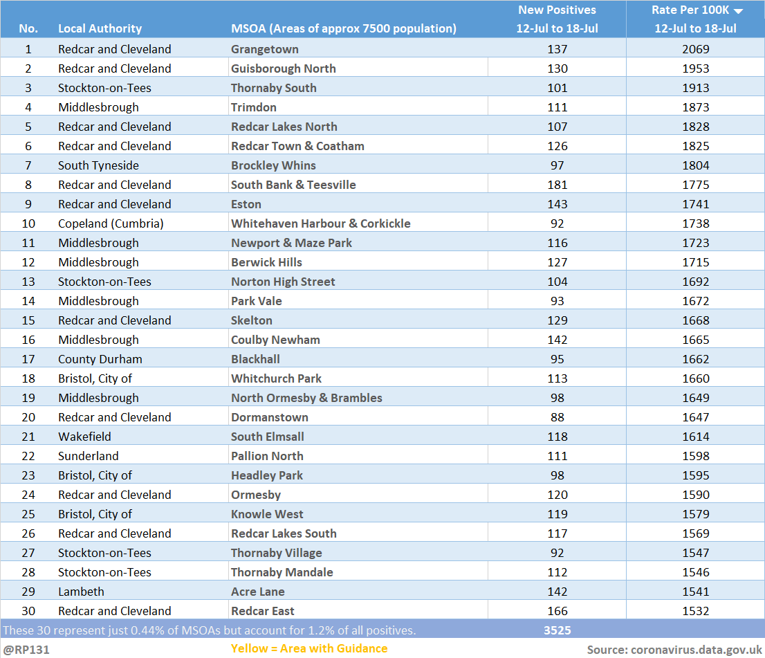
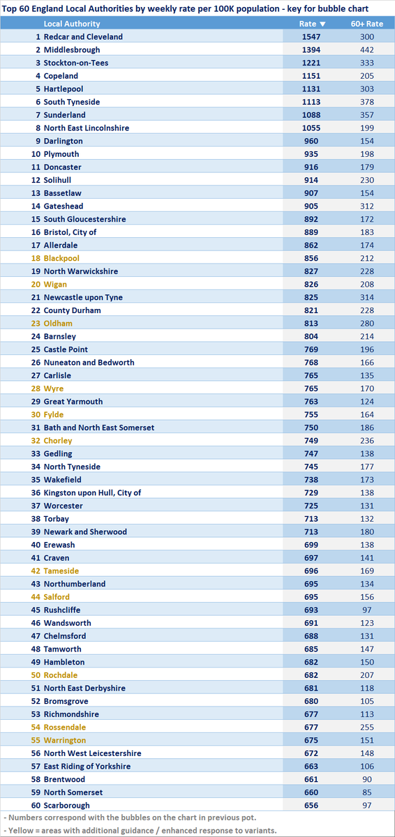
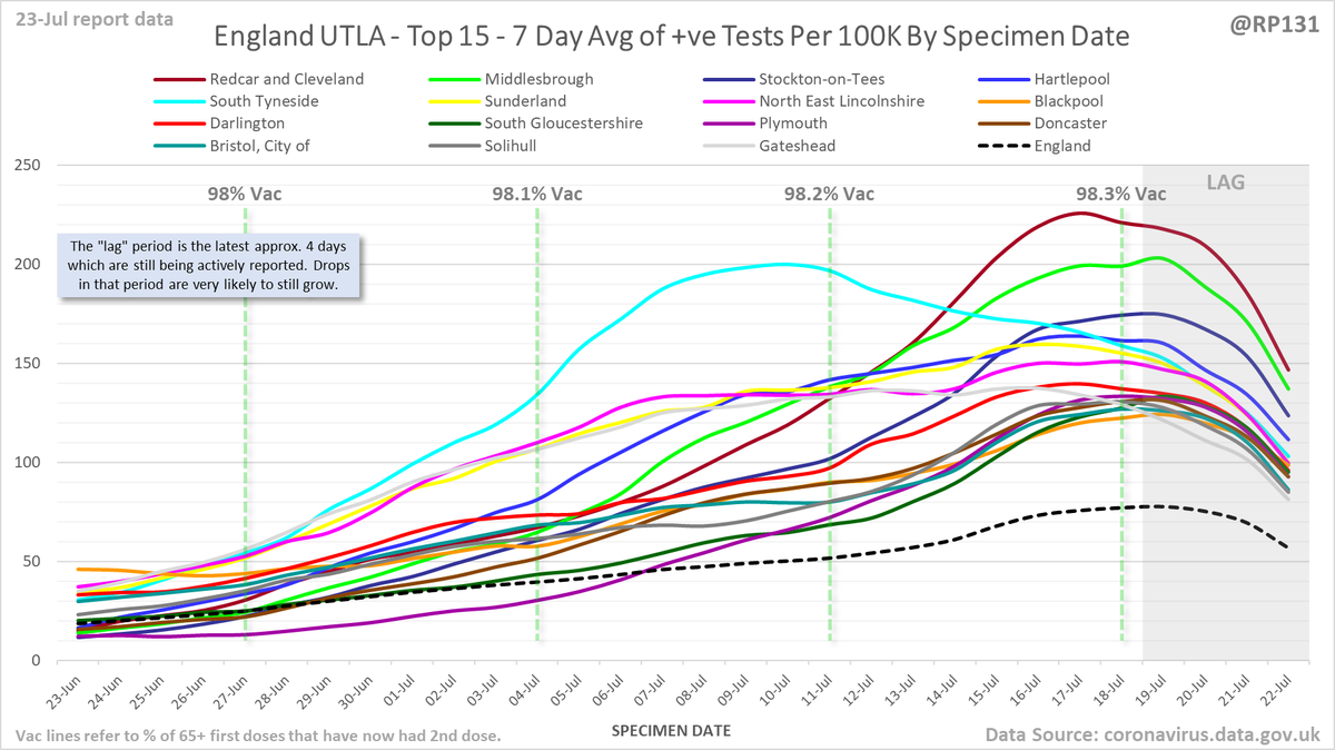
Top 15 of just Upper Tier Local Authorities in England:
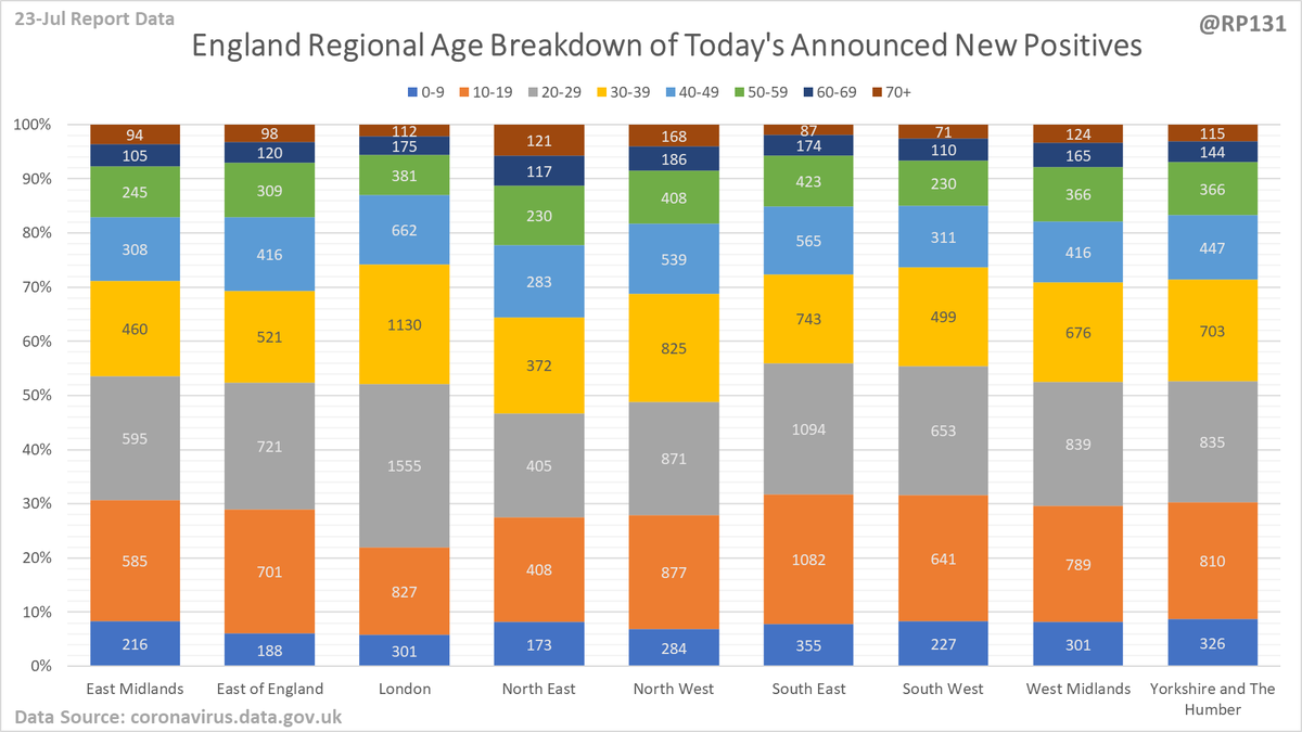
Regional / age distribution of today's newly announced positives for England.
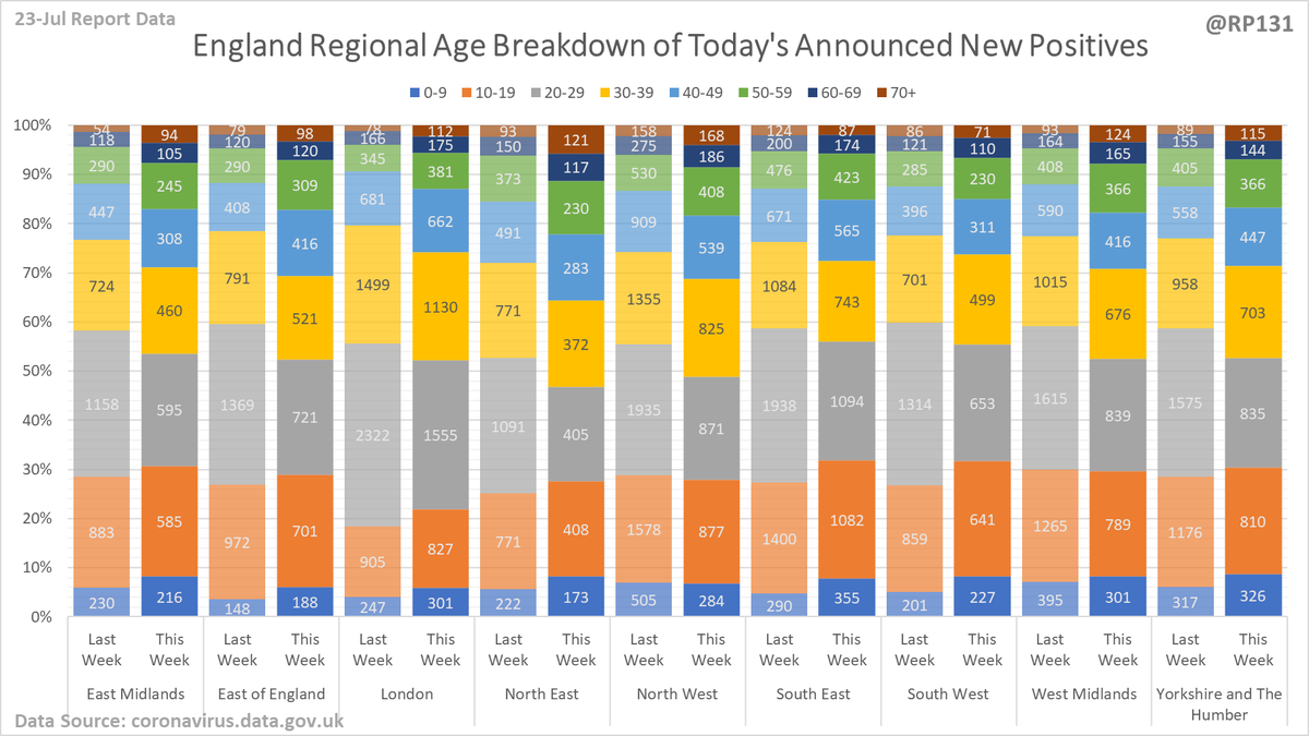
Plus to see how it's shifting, here's the same values but with the same day last week for comparison:
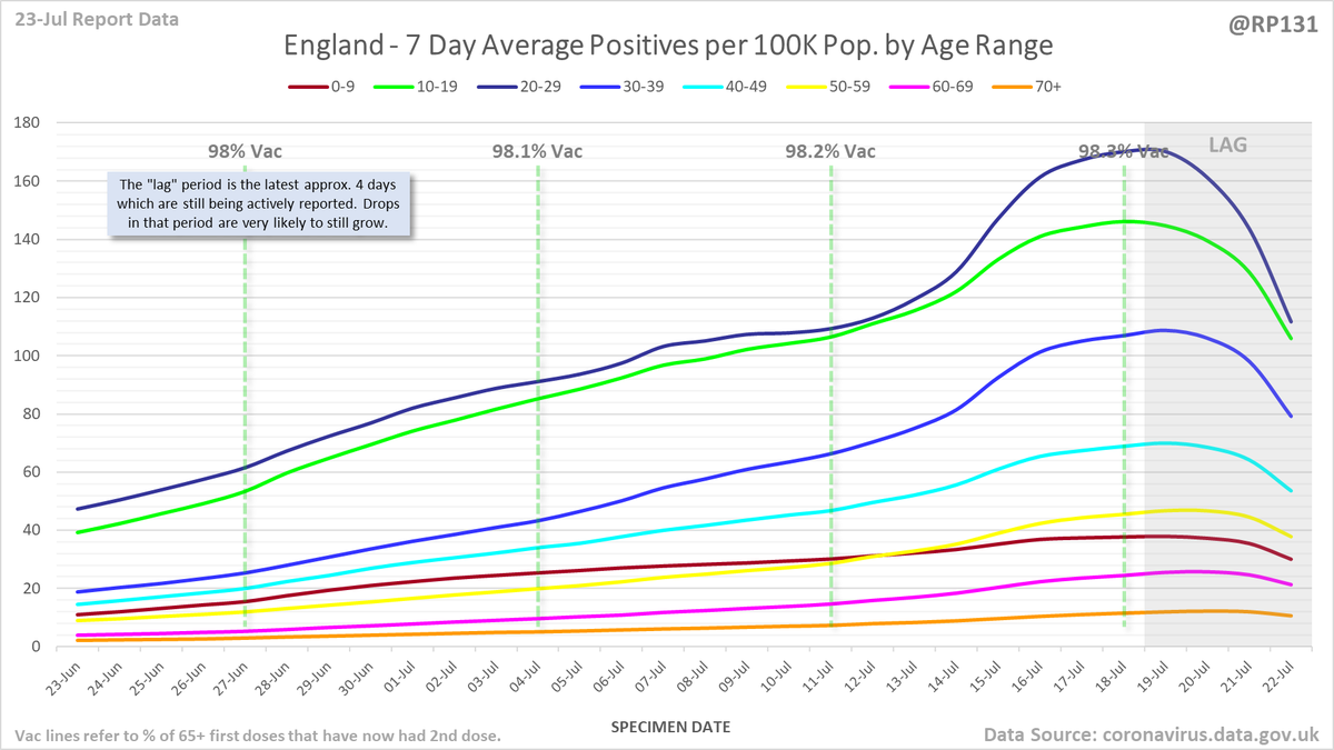
England rolling average positives (per 100K population) by age range:
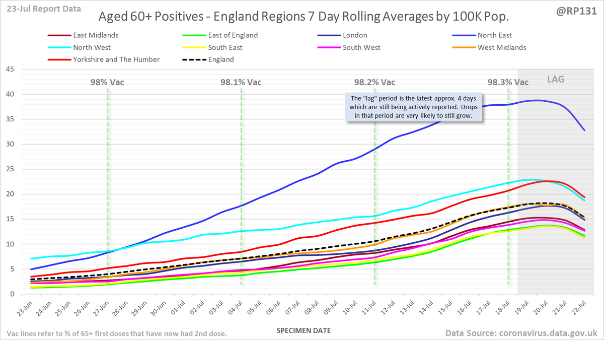
England regional rolling average positives (per 100K population) in the 60+ age range:
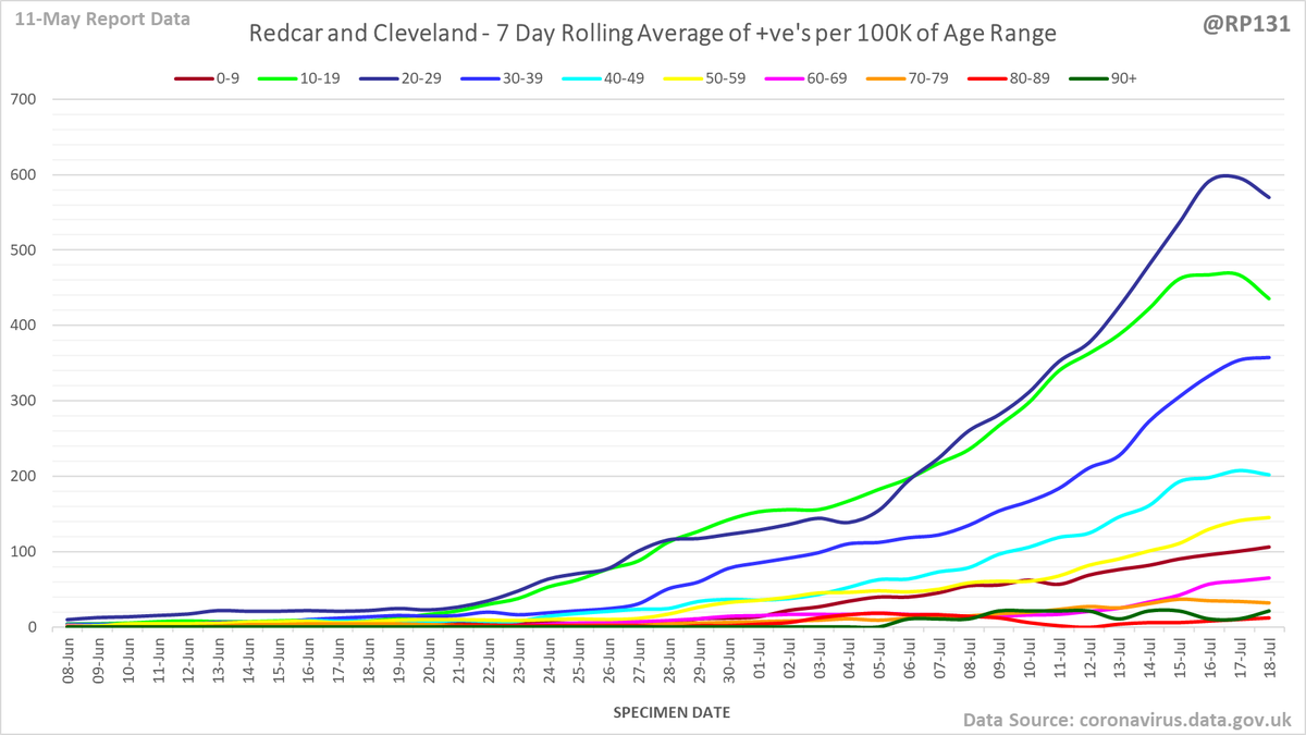
Age breakdown chart for Redcar and Cleveland (current top LA). Rolling average of positive tests by specimen date per 100K population of each age range.
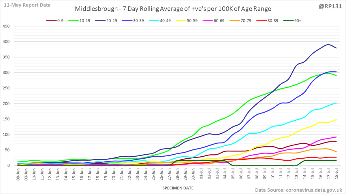
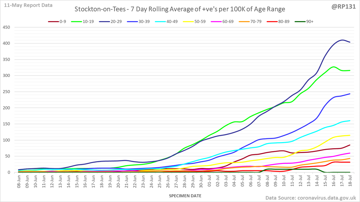
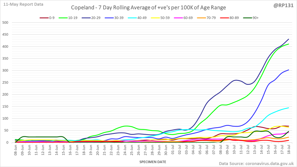
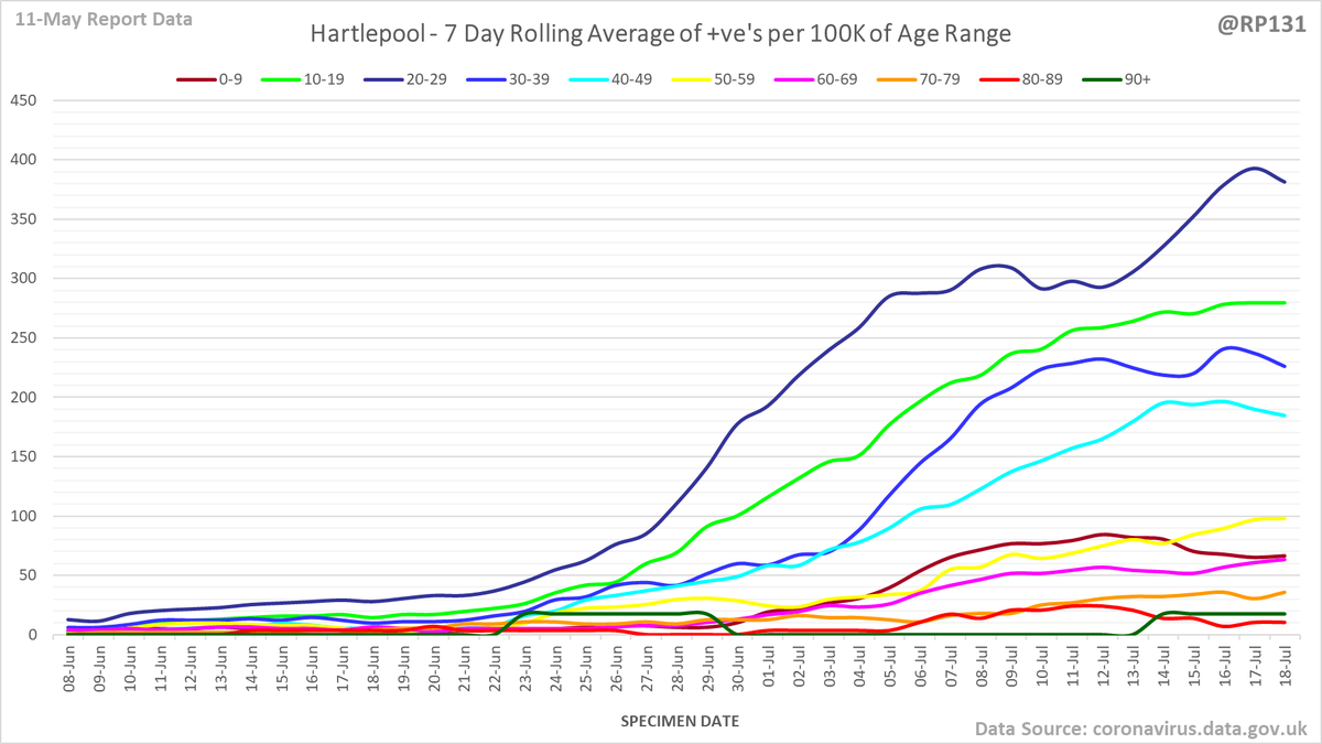
Also age breakdown charts for rest of top 5: Middlesbrough, Stockton-on-Tees, Copeland and Hartlepool.
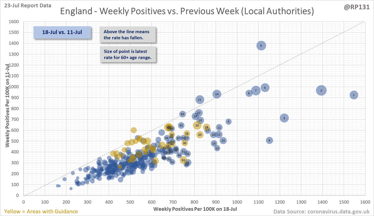
Rolling weekly comparison of totals up to 3 days ago. This chart is useful to see the relative movements of the local authorities towards the top of the list.
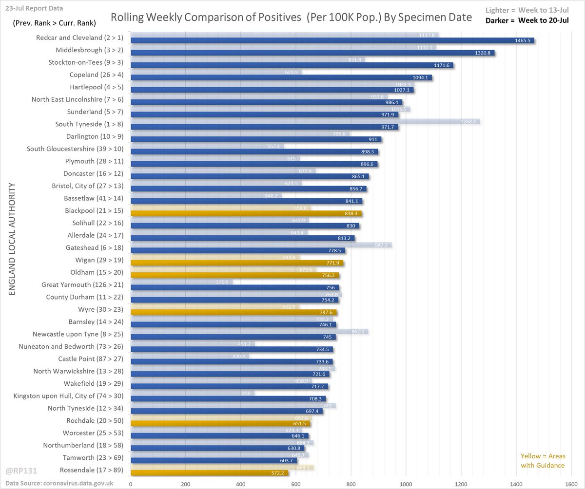
Full version of these LA compare charts here:
Weekly (Rates): …ddatashare.s3-eu-west-1.amazonaws.com/Week_20210723.…
Weekly (Actual): …ddatashare.s3-eu-west-1.amazonaws.com/WeekActual_202…
Daily (7 Day Avg Rates): …ddatashare.s3-eu-west-1.amazonaws.com/Day_20210723.h…
Weekly (Rates): …ddatashare.s3-eu-west-1.amazonaws.com/Week_20210723.…
Weekly (Actual): …ddatashare.s3-eu-west-1.amazonaws.com/WeekActual_202…
Daily (7 Day Avg Rates): …ddatashare.s3-eu-west-1.amazonaws.com/Day_20210723.h…
• • •
Missing some Tweet in this thread? You can try to
force a refresh