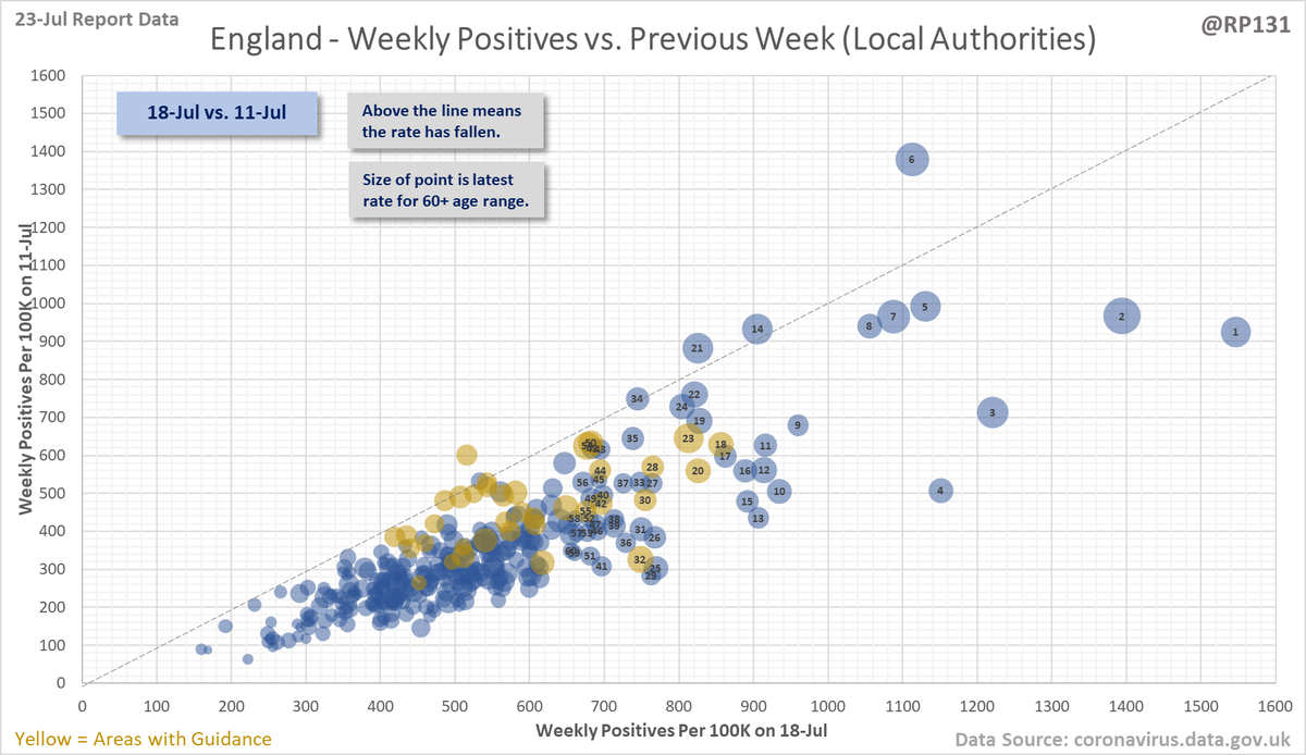
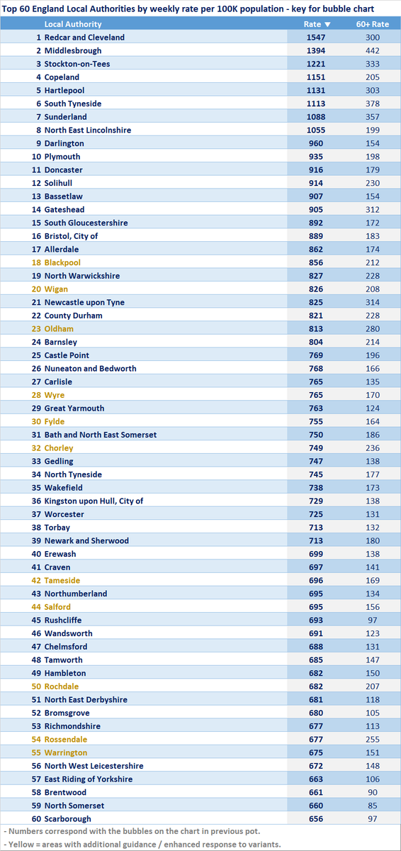
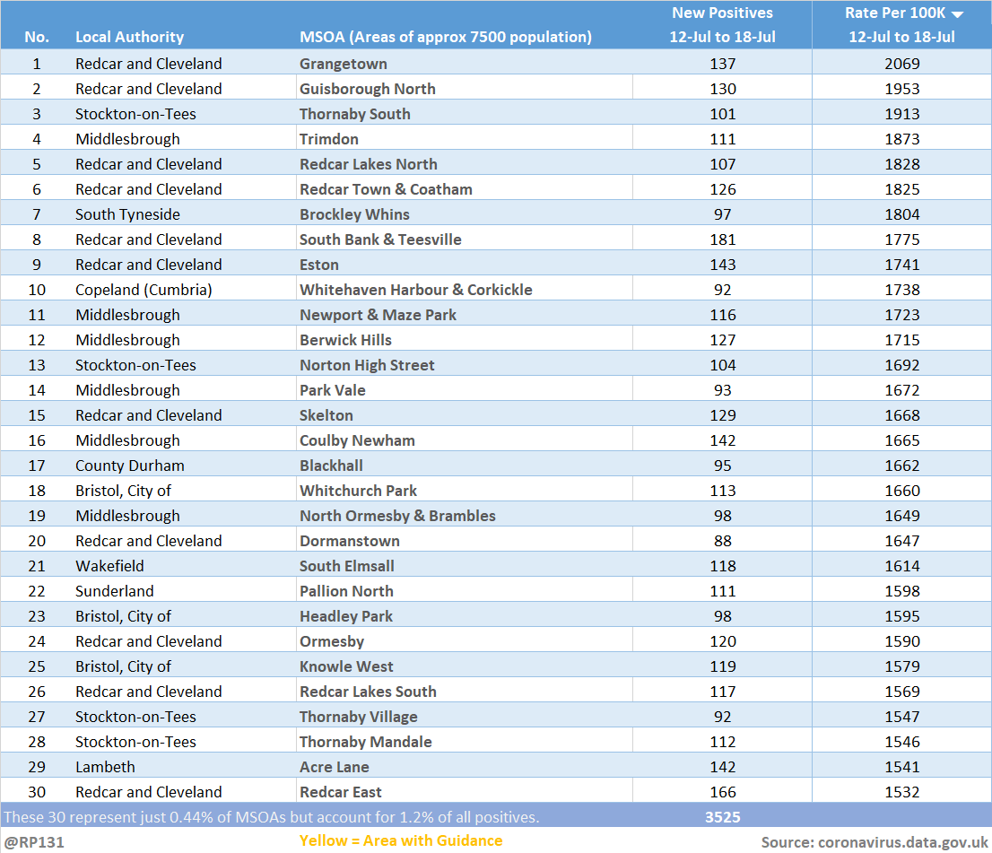
Hopefully we'll see the recent drops in Redcar LA data filter through to MSOA numbers in the next few days.
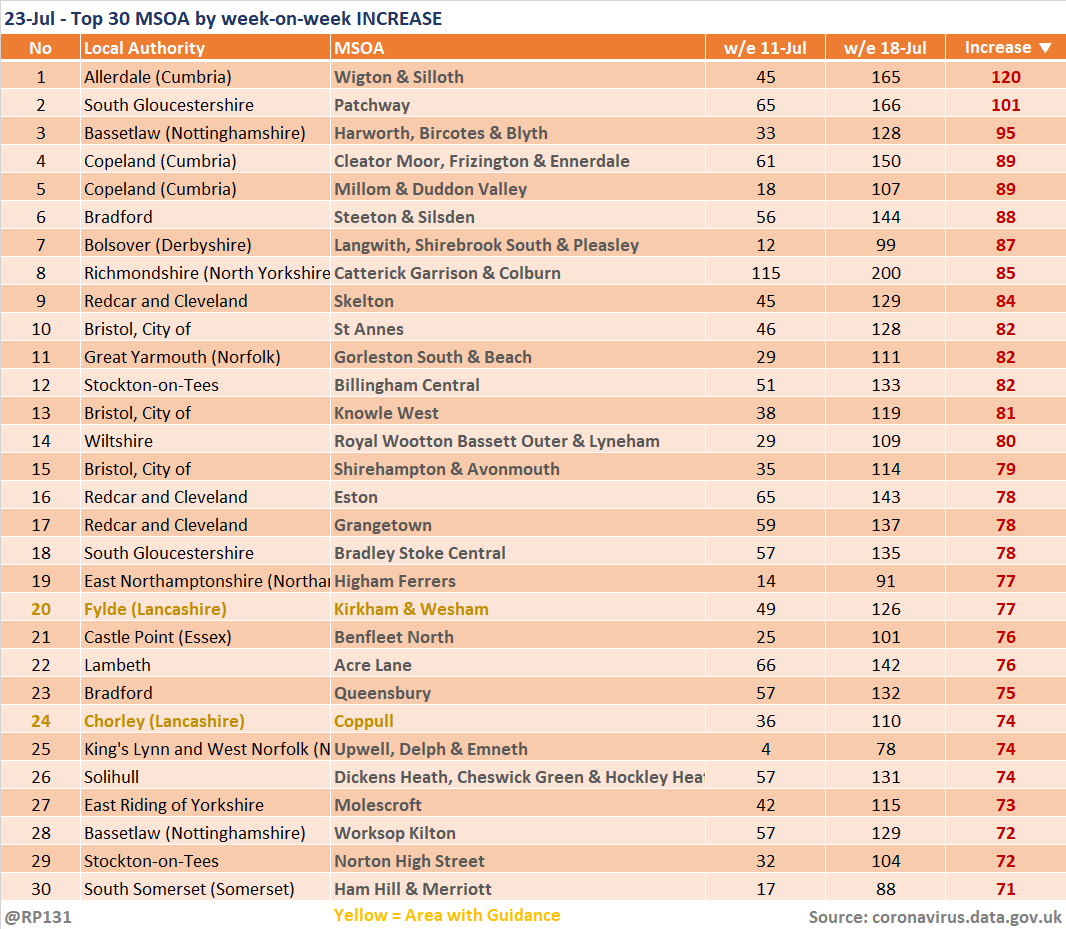
Updated (23-Jul) table of top 30 MSOAs (by rate) based on latest numbers in today's report.
Updated (23-Jul) table of top 30 MSOAs (by rate) based on latest numbers in today's report.
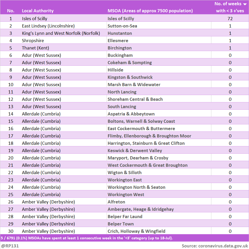
Bringing back the view of how many weeks the MSOAs have been in the suppressed 'less then 3 +ves in the last week' category. Since they don't allow us to distinguish between zero / 1 / 2, we generally consider it to mean zero. Link to full table in reply below.
Full versions available here, by:
Count: …ddatashare.s3-eu-west-1.amazonaws.com/MSOA_20210723.…
Rate: …ddatashare.s3-eu-west-1.amazonaws.com/MSOA_Rate_2021…
LA: …ddatashare.s3-eu-west-1.amazonaws.com/MSOA_LA_202107…
Weeks: …ddatashare.s3-eu-west-1.amazonaws.com/MSOA_Weeks_202…
Count: …ddatashare.s3-eu-west-1.amazonaws.com/MSOA_20210723.…
Rate: …ddatashare.s3-eu-west-1.amazonaws.com/MSOA_Rate_2021…
LA: …ddatashare.s3-eu-west-1.amazonaws.com/MSOA_LA_202107…
Weeks: …ddatashare.s3-eu-west-1.amazonaws.com/MSOA_Weeks_202…
Breakdown of the number of consecutive weeks (up to the latest report day) that MSOAs have been in the lowest '< 3' category.
E.g. up to 18-Jul, 0.07% of England MSOAs have gone at least a week with fewer than 3 new positive tests per week.
E.g. up to 18-Jul, 0.07% of England MSOAs have gone at least a week with fewer than 3 new positive tests per week.
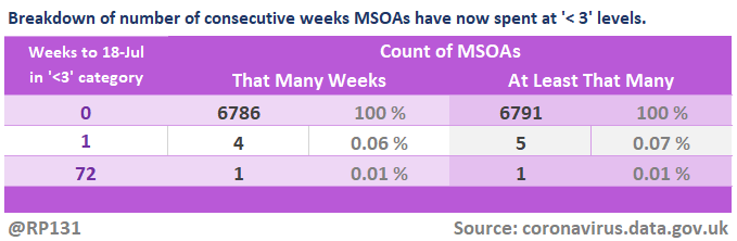
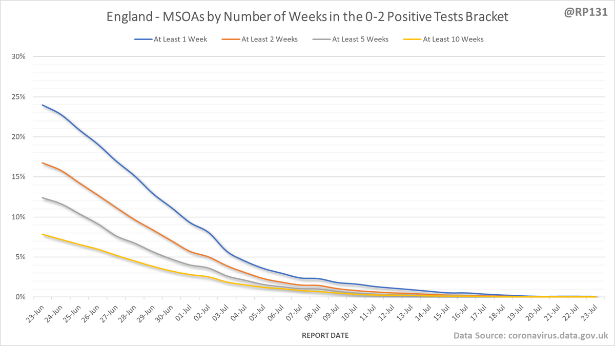
Chart to show how this measure of number of weeks in bottom bracket has progressed over time.
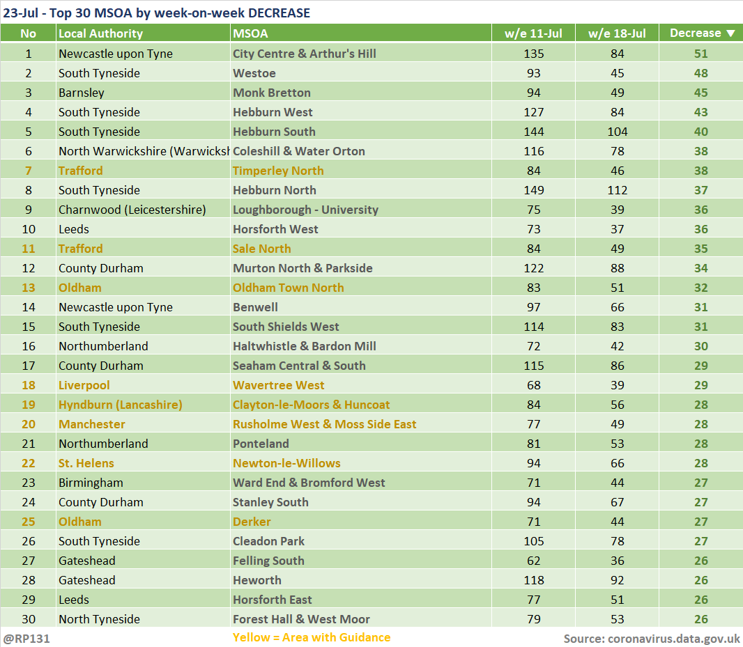
And the pair of tables to show top 30 MSOAs by week-on-week increases and decreases.
• • •
Missing some Tweet in this thread? You can try to
force a refresh