"This is Bad Schandau, which was at the centre of the recent floods in Germany. It seems former floods have been far worse in the 18th & 19th centuries." 5/
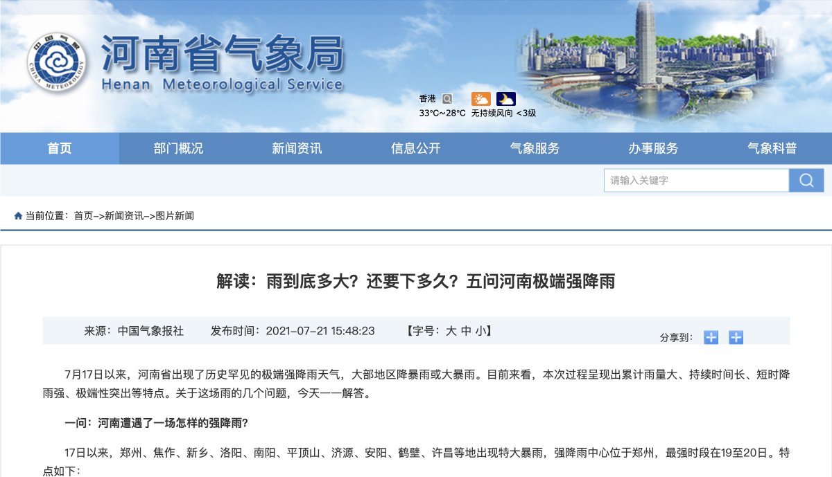
As to flooding in China, the local met office reports that August 1975 flooding was essentially the same. ha.cma.gov.cn/xwzx/tpxw/2021… 6/
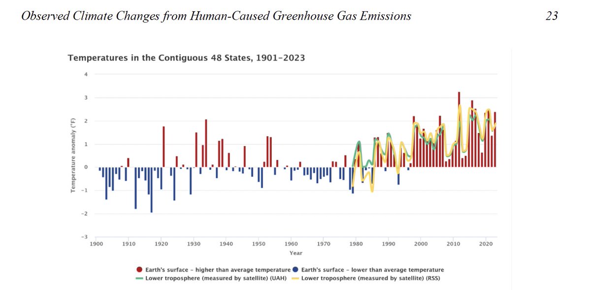
Don't forget that the June 2021 average global temp was below the 30-year average...
... about the same temp as 1987 when atmospheric CO2 was at the climate bedwetter-determined global ideal level of 350 ppm.
Not possible to blame any sort of weather on 'global warming.' 7/
Outrageous climate hoax: The pathetic pretext for the @theNASEM climate report against the Trump EPA proposal to rescind the endangerment finding is last year's flooding caused by Hurricane Helen, the Los Angels wildfires and the July 4 Texas flooding. Claimed emissions and/or "climate" links to these events were been easily debunked when these events occurred.
No surprise: The rigged @theNASEM report concludes that the Obama EPA's 2009 endangerment finding for greenhouse gases "was accurate, has stood the test of time and is now reinforced by even stronger evidence."🙄🙄🙄 2/
153 years of climate irony: This graph in the new @theNASEM endangerment finding report is fake:
1. The underlying data sources are different for every year. There were relatively few temperature stations in the early 20th century and many more now. Moreover, almost half of today's temperature data are guesstimated, not measured.
2. As there is no physical thing as "average US temperature" and the imaginary metric is guesstimated, the graph presents no estimates of uncertainty or margins of error.
3. It is quite ironic that on the day the Washington, DC-based NAS tries to pass this off as science, today's global warming in WashDC will be 10°F cooler than 153 years ago on September 17, 1872. 3/
I will be going through the new MAHA Report page-by-page in a single thread. Stay tuned. 1/ nytimes.com/interactive/20…
This chart from the MAHA Report (p. 6) is apparently intended to support the claim that: "The health of American children is in crisis."
Fact Check:
1. Bait and Switch. The chart compares life expectancy vs. per capita health expenditure among developed countries . It says nothing about the health of children or that their health is in crisis.
2. Other Country Fallacy. The chart doesn't even really support its ostensible purpose -- i.e., to show that Americans are less healthy despite spending the most on health care. We have a much larger, and much more ethnically and economically diverse population than the other developed countries. We spend more for the same health care because we can afford to pay more. Consider, for example, the rationale behind President Trump's Executive order on prescription drugs, issued to fix the problem of Americans subsidizing global drug prices. We pay more because we can afford it. We also have more ready access to health care. That costs money and it's why people from around the world come to the US for health care vs. being stuck on a waiting list in, say, Canada or the UK. We are different than other countries.
3. Data Quality. The chart's source, "Our World in Data", is a UK non-profit. I don't know how reliable its charts are. I don't know how accurate the statistics are. And I'm quite sure "Our World in Data" charts do not satisfy the White House Office of Management and Budget's (OMB) stringent requirements on data quality used to set policy. 2/
This page from the MAHA Report (p. 8) is intended to support the notion that: "America's children are facing an unprecedented health crisis."
Fact Check:
1. The highlighted study published in 2025 stands for the proposition that our children are getting sicker. It is a survey of children's health for the period 1999-2018. academicpedsjnl.net/article/S1876-…
2. The problem with the study is that it is a mere survey based on self-reported data. Children or their parents were asked to check boxes on whether the child had ever been diagnosed with any of at least 30 (often vague) conditions. There was no verification of the diagnoses.
3. Here's what study authors had to say: "Several limitations should be considered when interpreting our findings. First, we rely on self or caregiver report of chronic conditions and functional limitations rather than verifiable medical diagnoses, which is subject to recall bias, which may be differential across the age threshold (as parent report is primary used for ages ≤17 whereas ages ≥18 is primarily self-report). Moreover, our data limit ascertainment of CC to those who have been diagnosed, potentially biasing against identification in those with poor access to care. Second, the low prevalence of specific conditions limits our ability to explore disparities and trends for each individual condition, as does NHIS design limitations that result in inconsistent assessment of some conditions across years...."
4. This study is best described as garbage-in/garbage out polling nonsense. 3/
Norwegian statistics bureau throws cold water on emissions-driven global warming hysteria.
"We find that the effect of man-made CO2 emissions does not appear to be strong enough to cause systematic changes in the temperature fluctuations during the last 200 years."
More from the Norwegian statistics bureau:
All four previous interglacial periods were warmer than today, while CO2 at pre-industrial levels.
The Red Pope swings and misses at the origin of warming and emissions:
1. The current warming trend began at the bottom of the Little Ice Age in the late 1600s.
2. Recent warming began with the series of El Ninos that began in 1980.
3. We are in an El Nino year now.
4. As to emissions, warming precedes emissions. It gooses the natural carbon cycle. See Vostok ice cores and this -
5. Only 12% or so of atmospheric CO2 is manmade. 8/
The Red Pope just makes it up:
1. There is no way to say that the temperature rise since the 1970s is the fastest in 2,000 years.
2. There was little if any urban heat island effect 2,000 years ago and no satellites.
3. Then there's this: "Dansgaard-Oeschger events are rapid N. Hemisphere temp jumps of up to 15°C in Greenland that repeatedly occurred w/i a few decades during the last ice age."
4. Climategate revealed that temperature targets like 1.5°C are just 'plucked out of thin air' and are not science.
5. No one knows what the global temperature in 1850 was.
6. 'Ocean acidification' is a myth. The oceans may have become slightly less basic, but that is not more acidic. Two is not more negative than three.'
7. There is no evidence of any effects from any ocean pH change.
8. Norther Hemisphere snow cover is trending up. 9/
The Red Pope imagines the fake 97% 'climate consensus' is science and attacks capitalism.
1. Recent warming correlates with El Ninos, not emissions.
2. Consensus is not science. And the 97% consensus is bogus.