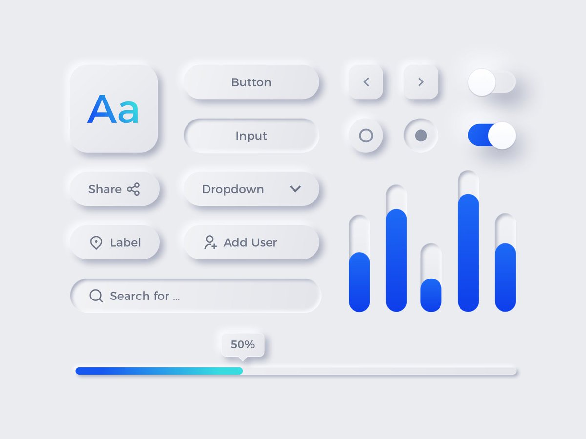
Who remembers when this was going to be the top design trend of the year
Who needs accessibility and contrast when you can finally justify going back to gray-on-gray aesthetics
There's one of these every year (thankfully few stick around), seemingly to create job security for designers who don't know how to do UX
I'm hoping this means we've finally broken the cycle

Just realized that in neumorphic interfaces, 50% is about 30%

• • •

Missing some Tweet in this thread? You can try to force a refresh
 

Keep Current with Pavel A. Samsonov

Pavel A. Samsonov Profile picture

Stay in touch and get notified when new unrolls are available from this author!

Read all threads

This Thread may be Removed Anytime!

PDF

Twitter may remove this content at anytime! Save it as PDF for later use!

Try unrolling a thread yourself!

how to unroll video
  1. Follow @ThreadReaderApp to mention us!

  2. From a Twitter thread mention us with a keyword "unroll"
@threadreaderapp unroll

Practice here first or read more on our help page!

More from @PavelASamsonov

22 Jul
Adaptive expert: can apply skills to a wide variety of situations
Rote expert: memorized how to do a series of tasks correctly

UX, Product, and related disciplines suffer from the replacement of the former with the latter, but rote expertise isn't suited to design problems.🧵
This is especially clear with something like Scrum, where all problems are solved by applying the same patterns, regardless of whether they are suitable. But it's appealing as a worldview to novice PMs because training in Scrum ceremonies is much easier than learning how to PM.🧵
Rote expertise is what leads these PMs and designers to scorn user research. When all you have is a hammer, there's no reason to evaluate the appropriateness of using a nail. Just draw the Sacred Artifacts (persona, user journey, wireframes) and then go make a Design System.🧵
Read 7 tweets
14 Jun
The fidelity of your design artifacts needs to match the fidelity of your research insights. Getting ahead of your knowledge with beautiful mockups that rest entirely upon assumptions is AT BEST wasted work, and at worst burns design's credibility with stakeholders.
1/🧵
Without research, the value of anything you're drawing is purely speculative. But it doesn't look like it to non-designers - without being immersed in the use case, all they see is "the design is done." They will expect to see that thing built.
2/🧵
When new evidence suggests that this design is not the right solution, it will be a struggle to convince stakeholders that changes need to be made. Even if product hasn't already started cutting tickets and scheduling work - the first design sticks firmly in people's minds.
3/🧵
Read 6 tweets
13 Jun
Labor market: *realizing that their labor is underpaid*

VCs: Forget about that nonsense and do work for free instead, your boss will definitely appreciate it honest Image
You know what happens when you work weekends?

Everyone knows that you're the sap who will work weekends. That's it. You don't get ahead by doing more of the same work. You get ahead by making your impacts more visible, and good luck doing that when everyone's living their lives.
Instead of spending more time working, spend more time looking at why you need to work those extra hours, and attack the root cause. You'll cut the chaff and spend 40 hours a week on high-impact work, instead of 56 hours on nonsense other people have saddled you with.
Read 6 tweets
7 Jun
"Don't worry about edge cases or errors, this is an MVP" is a very dangerous line of thought that I usually hear from people used to designing for stakeholder demos, rather than production releases.
A demo for a stakeholder, especially a "user proxy", is a very different path from normal use. Any scenario has to contrive a path through every single one of the stakeholder's pet features, so usually it's a checklist approach instead. "We added XYZ like you asked, see?"
In reality, the "as a user I want to use X feature" user story doesn't cut the mustard - and without designing for plausible scenarios, the product ends up being entirely unusable.

If you're not designing for recovery from exceptions, you're not designing a viable product.
Read 4 tweets
26 May
When the PM insists that everything needs to go above the fold Image
When the ease of completing a task is measured only in the number of clicks required Image
When the developers insist that the bug is an edge case and doesn't need to be solved before the release
Read 19 tweets
7 Apr
The business: hey we need you to draw some wireframes for this engagement

Me: Do we have a scope for the problem? How are the user's existing tools failing them? Are we resourced to answer these questions?

The business: nah it's ok they can be low fidelity wireframes
Design artifacts are not the deliverable. They just document the design decisions, and design decisions must be rooted in user research.

If you can't draw a direct line from the artifact to how the decisions it documents will be informed, you won't produce anything of value.
Before someone sets pencil to paper, it's really easy to think you have something while remaining pleasantly vague. Only when you need to render the artifact do you realize that there's no there there. It's up to the designer to say "hang on, I can't do anything with this."
Read 12 tweets

Did Thread Reader help you today?

Support us! We are indie developers!


This site is made by just two indie developers on a laptop doing marketing, support and development! Read more about the story.

Become a Premium Member ($3/month or $30/year) and get exclusive features!

Become Premium

Too expensive? Make a small donation by buying us coffee ($5) or help with server cost ($10)

Donate via Paypal Become our Patreon

Thank you for your support!

Follow Us on Twitter!

:(