
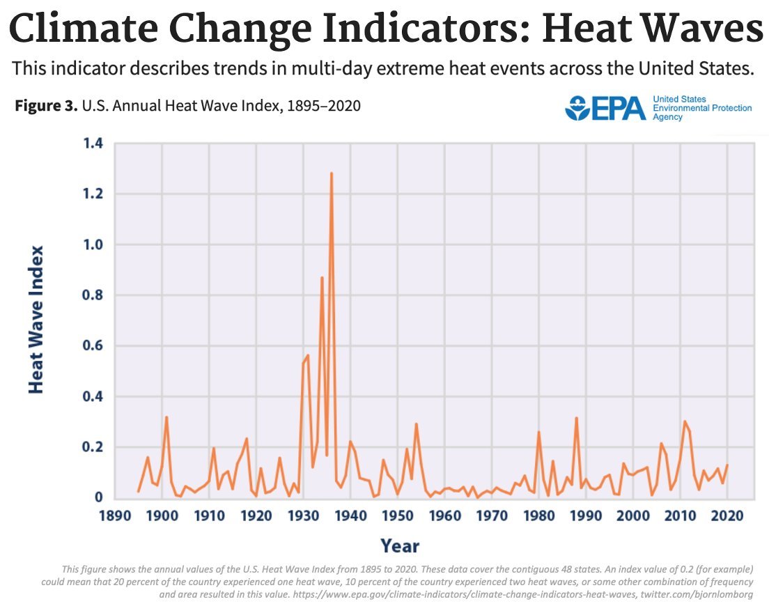
One of the things you learn as a scientist is the ability to look at a plot and think, "that just doesn't look right." That's the feeling I got when I saw this plot that Lomborg is currently pushing. 
Here's the tweet:
https://twitter.com/BjornLomborg/status/1410961865862258695?s=20
This just doesn't look right. The 1930s were hot in the U.S., but not that hot. And the 2010s barely show up. The first clue something is amiss was that the quantity plotted is "Heat Wave Index". That's mysteriously vague, so I decided to figure out exactly what this was.
If you go the EPA website, it references a 2008 CCSP report, which references a 1999 BAMS paper: journals.ametsoc.org/view/journals/…
Here we find that the "heat wave index" counts the occurrence of 4-day heatwaves of temperatures exceeding a 1-in-10 year recurrence.
There's nothing intrinsically wrong with this definition, but it sure seems arbitrary. Why 4 days? Why 1-in-10 events?
When doing science, you should always be worried that arbitrary decisions (e.g., thresholds in an index) will give you arbitrary results.
When doing science, you should always be worried that arbitrary decisions (e.g., thresholds in an index) will give you arbitrary results.
So the question is: if you change your definition of "heat wave", would you get a different answer?
Let's find out. The most obvious thing to do is to just count the number of hot days.
Let's find out. The most obvious thing to do is to just count the number of hot days.
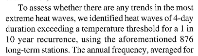
Let's take Berkeley Earth's gridded daily maximum land temperature over the (approx.) continental US.
For each grid cell, find the 95th-percentile temperature from the entire time series (1880-2020) and then count the number of days each year that exceed that.
For each grid cell, find the 95th-percentile temperature from the entire time series (1880-2020) and then count the number of days each year that exceed that.
Then, for each year, we count the number of exceedances in all grid cells in the domain. This is what the time series looks like for the U.S. Yes, the 1930s were hot, but hot days occur more frequently in the 2010s.
So what's going on? This is what we call cherry picking. Cherry picking is when you analyze a small amount of data to reach a conclusion that the full data set does not support.
There are really two cherry picks here. First is the choice of an obscure (and frankly weird) metric. This metric almost certainly gives an answer that is opposite to what a more exhaustive set of metrics would show.
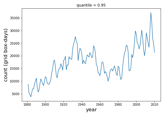
The other cherry pick is only looking at the U.S. Let's look at the plot for the entire northern hemisphere mid-latitudes (29N-60N). The occurrence of hot days explodes after about 1980.
There are lots of papers that correctly estimate heatwaves. E.g., check out this paper by @sarahinscience and S. Lewis. This is where I got the idea to use the Berkeley daily data.
nature.com/articles/s4146…
nature.com/articles/s4146…
tl;dr: This is classic cherry picking: the plot cherry picks an unusual metric and also cherry picks a particular region. Examining the full data set shows the opposite of what's claimed.
Temperatures and heatwaves are certainly worse today than in the 20th century.
Temperatures and heatwaves are certainly worse today than in the 20th century.
In addition, other types of extreme weather are also definitely getting worse. Zero debate about that.
https://twitter.com/AndrewDessler/status/1184526507802349569?s=20
Next time someone shows this plot, please respond with this thread.
Important additional info by the expert, @RARohde:
https://twitter.com/RARohde/status/1429108539960745994?s=20
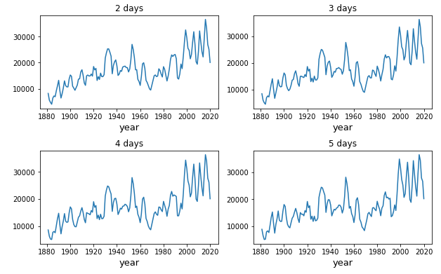
.@BjornLomborg asked about heat waves instead of just the raw number of hot days.
Here's the times series of occurrence heat waves warmer than the 95th percentile of heat waves for heat waves of 2-5 days (where the temperature of a heat wave is the minimum daily temperature).
Here's the times series of occurrence heat waves warmer than the 95th percentile of heat waves for heat waves of 2-5 days (where the temperature of a heat wave is the minimum daily temperature).
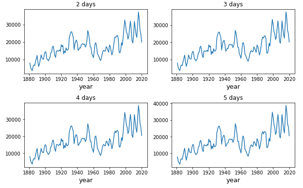
Here's the occurrence heat waves warmer than the 95th percentile, where the temperature of a heat wave is the average temperature.
For the last two tweets, the y-axis is the sum of days over all grid boxes over the (approx.) continental US.
For the last two tweets, the y-axis is the sum of days over all grid boxes over the (approx.) continental US.
It's clear that Lomborg's defense will be "I was just using a plot off the EPA website." But there are lots of plots on that page and he picked the *one* that presented the message he likes.
https://twitter.com/BjornLomborg/status/1429122271009021954?s=20
That's a weak response. If you know anything about climate then you know the plot looks off and you owe your audience a minimal amount of due diligence before tweeting it out.
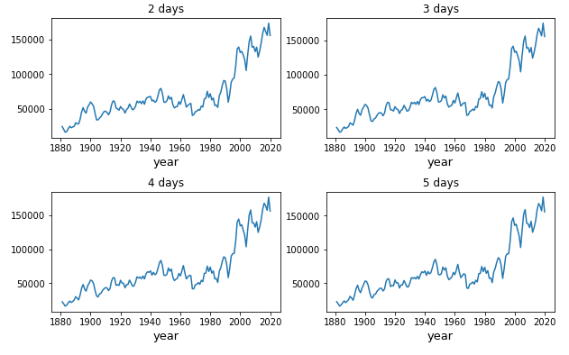
just for completeness: here are the multi-day heat waves for the entire NH mid-lats. This plot uses the minimum Tmax during a time span as the temp of the heat wave. Plotted here is the occurrence of heat waves > 95th percentile.
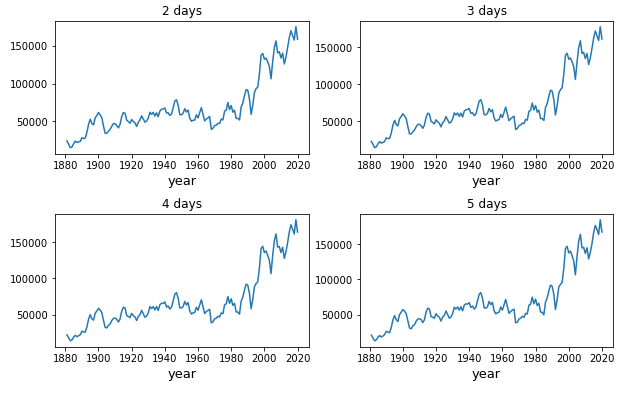
This plot uses the average temperature of the time span as the temp of the heat wave. Again, plotting time series of occurrence of heat waves > 95th percentile. Y axis is grid cells times days.
• • •
Missing some Tweet in this thread? You can try to
force a refresh


