What lies ahead for the secular rotation between growth and value, large and small? Hard to say. We are at the point in the super-cycle where, on a 10-year rate of change basis, the incumbent style leaders tend to peak. (THREAD)
But that’s on a 10-year rate of change basis. So, the large growers could keep running while the second derivative moderates, in line with the historical analog. The same thing happened from the October 1998 low (LTCM) to the dot.com peak in 2000. /2
I guess it all comes down to cash flows and who produces it, as well as how much of it is returned to shareholders via dividends and buybacks. /3
The chart below shows that the percentage of sales that has been returned to shareholders has been quite stable during this New Nifty 50 era. /4
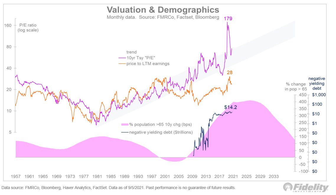
My thesis is that the combination of (a) aging boomers searching for yield, (b) ultra-low nominal yields & negative real yields, and (c) the ability of the big growers to generate excess cash flows (and return it to shareholders), has created the current regime. /5
The chart below illustrates the point. Judging by current demographic trends, monetary policy, and the share buyback machine of the big growers, it doesn’t look like this is going to end any time soon. /END

• • •

Missing some Tweet in this thread? You can try to force a refresh
 

Keep Current with Jurrien Timmer

Jurrien Timmer Profile picture

Stay in touch and get notified when new unrolls are available from this author!

Read all threads

This Thread may be Removed Anytime!

PDF

Twitter may remove this content at anytime! Save it as PDF for later use!

Try unrolling a thread yourself!

how to unroll video
  1. Follow @ThreadReaderApp to mention us!

  2. From a Twitter thread mention us with a keyword "unroll"
@threadreaderapp unroll

Practice here first or read more on our help page!

More from @TimmerFidelity

13 Sep
I used to be a “mean reverter.” These days, I’m more chill, following the math & trusting the market gods. Typically, I try to stay on the right side of the secular trend & use that trend as context to navigate the market’s inflection points. (THREAD)
Without context, most indicators are reduced to a coin toss. /2
To be sure, there are times when screaming excesses are evident but those signals are fairly rare. Most of the time, the signals are much smaller, meaning the risk of being out of the market—and missing out on compounding magic—is greater than being caught in a squall. /3
Read 4 tweets
10 Sep
The dominance of the mega-cap growers in this cycle explains the behavior of the overall market. With just the five largest stocks comprising 23% of the market’s value, the S&P 500 continues to plow through. (THREAD)
That's why my expectation in recent months for a 2010-style mid-cycle correction was wrong. Yet another reminder to focus on the long-term. /2
If we look just at value (see chart below), the 2010 analog looks OK. Not as much downside, but a stealthy correction nonetheless. /3
Read 4 tweets
9 Sep
While this has been an usual market cycle going into and coming out of the lockdown, in many ways this cycle has followed in the footsteps of most. Below is the current market cycle relative to the average cycle since the 1920s. (THREAD)
In the chart above: on the left we have the S&P 500 total return; in the middle we have earnings (including earnings estimates through 2022); and on the right we have the trailing P/E multiple. /2
The current cycle is like ones in the past in that price bottoms first, then earnings follow a few quarters later. During that window, valuations soar, only to come back down when earnings start carrying the load. /3
Read 5 tweets
9 Sep
What makes this super-cycle different from the early 1970s and late 1990s? The valuation gap between the top 50 performers in the S&P 500 and the bottom 450 is not nearly as extreme now as it was in past cycles. (THREAD)
The top 50 currently trade at a 28.5x trailing multiple, whereas the bottom 450 trade at 24.3x. That four-point premium is nothing compared to the 90-point premium that occurred at the peak in the mid-1970s and in 2000. /2
The bottom line? The seven-year dominance by the big growers has been justified by their earnings. /3
Read 4 tweets
3 Sep
This rookie’s take on Ethereum, part 2: ETH is going through an upgrade (aka EIP 1559, Ethereum 2.0, London Hard Fork) and will be moving from a Proof of Work model (PoW) to Proof of Stake (PoS). (THREAD)
The bullish narrative is that this will limit ETH’s future supply growth as coins get staked (and taken out of circulation) and fees get burned. It could lead to a more pronounced disinflation (the “triple halving” per @SquishChaos). /2
It’s not that ETH’s supply growth was running amok before ETH 2.0 (it wasn’t), but the lack of certainty about future supply has kept ETH at a discount to BTC. BTC’s price-per-million-addresses is 1,226x, while ETH is at 51x. /3
Read 9 tweets
2 Sep
This rookie’s take on Ethereum. (THREAD)
Ethereum (ETH) came onto the scene in 2015 through an ICO (initial coin offering) and has rocketed up the food chain. Whereas Bitcoin came into existence through new mining, Ethereum was launched with 72 million pre-mined coins. /2
Some people think of Ethereum as Bitcoin back in the earlier days (2017). The analog chart below shows that it’s easy to see why. For this chart I simply pushed Ethereum’s price history back four years (same price scale). h/t @RaoulGMI /3
Read 11 tweets

Did Thread Reader help you today?

Support us! We are indie developers!


This site is made by just two indie developers on a laptop doing marketing, support and development! Read more about the story.

Become a Premium Member ($3/month or $30/year) and get exclusive features!

Become Premium

Too expensive? Make a small donation by buying us coffee ($5) or help with server cost ($10)

Donate via Paypal Become our Patreon

Thank you for your support!

Follow Us on Twitter!

:(