One of the questions I often get in response to my modelling threads (such as last Thursday’s below) is: what does this imply for levels of hospital occupancy with covid? Unfortunately I don’t have a good model of hospital stay dynamics, but helpfully...
…I know a man who does, and @nicfreeman1209 very generously offered to convert my various scenarios for weekly admissions into a corresponding occupancy forecast. So what follows is very much a collaboration on the analysis, but the policy commentary is all mine.
Essentially, Nic’s model uses the known data for hospital admissions and occupancy to estimate a distribution of how long people stay in hospital with covid – here’s some discussion on an earlier version:
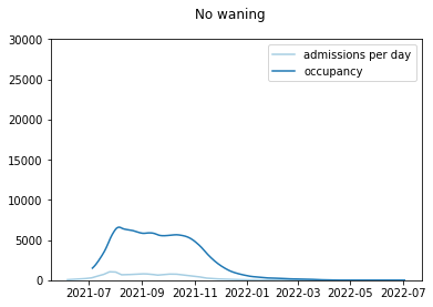
And if we take that distribution and apply it to my admissions curve with no waning, we get something like this. Note the occupancy stays around its current level (a bit over 6k covid patients in England) and then falls away during November. That would be a good outcome.
As we know, putting some immunity waning into the model makes things worse. Let’s start with a relatively slow waning assumption – this still sees a fall away in late autumn, but with a resurgence to around double the current covid occupancy in early 2022.
With a moderate (i.e. slightly faster) level of waning, we get less of a fall, and more of a peak – reaching around 20k covid patients at worst. That’s higher than the level in April 2020, although still some way short of the peak we saw (c. 34k) in January 2021.
With even faster waning, we don’t get a higher peak, but more of a double-peak – with local maxima in late autumn, and then again in early 2022. So this might increase the risk of operational burnout, even if capacity is not stretched any further than in the other scenarios.
But that’s the bad news. What about the good news i.e. booster vaccinations? And yes, those do help. As we saw in my thread, boosters for the most vulnerable groups (JCVI 1-4) do reduce the total admissions, but perhaps with a slightly higher peak in admissions and occupancy:
And by continuing to boost other adults (JCVI 5-9, and 18-50s) at a slower pace, we can reduce the total admissions further, and bring the peak occupancy back down to under 15k patients. (as noted elsewhere, I'm not addressing the ethical questions on the merits of doing this)
So I guess the positive story here, such as it is, is that even in my more pessimistic scenarios, hospital occupancy of covid patients doesn’t approach the levels we saw back in January – although it could get close to or maybe even exceed the April 2020 peak.
And we need to remember that covid is not the only factor: in this coming winter we may face added pressures from flu and other respiratory diseases which were mostly absent in the winter of 2020/21, and we also have a much bigger backlog of less-urgent care to handle.
So I’m not presenting these figures with a feeling of “don’t worry it’ll all be fine”. But more a sense of “depending on what happens with waning and boosters, this could still be very challenging, even if the raw numbers don’t look as bad as they did in January”.
And, as I’ve noted before, that’s not an argument for an autumn lockdown or anything like it. But more a request for continued caution, awareness, and sensible contingency planning. It will be interesting to hear what Boris has to say on that front this week. /end

• • •

Missing some Tweet in this thread? You can try to force a refresh
 

Keep Current with James Ward

James Ward Profile picture

Stay in touch and get notified when new unrolls are available from this author!

Read all threads

This Thread may be Removed Anytime!

PDF

Twitter may remove this content at anytime! Save it as PDF for later use!

Try unrolling a thread yourself!

how to unroll video
  1. Follow @ThreadReaderApp to mention us!

  2. From a Twitter thread mention us with a keyword "unroll"
@threadreaderapp unroll

Practice here first or read more on our help page!

More from @JamesWard73

9 Sep
Apologies to those of you who’ve been waiting for a model update: I’ve been slowed down a bit by work, start-of-term chaos with the kids, and by trying to organise an U13 girls rugby team. But it’s finally here in its glorious 25-tweet thread detail. Hope you enjoy…. 1/25
The July iteration of my model did an OK job of predicting (at least in “ballpark” terms) the level of hospital admissions over the last couple of months – in fact it’s almost spot-on right now, albeit maybe in the same way that a stopped clock is correct twice a day. 2/25
But that model won’t be a good guide to what happens over the autumn and winter, because it’s missing two significant drivers: waning immunity, and booster vaccinations. So I’ve upgraded the model to include those factors, and am ready to give you the results. 3/25
Read 25 tweets
9 Sep
I know, I’m meant to be doing that modelling thread (it will come later this evening!). But first I got distracted by today’s release of data from @PHE_uk – thanks to the amazing @kallmemeg and the team there. The main point of interest in today’s report has been …
… the release of data on cases, hospitalisations and deaths split by vaccine status. In particular Table 4 of the report has caused some consternation as it suggests case rates are higher in vaccinated groups than unvaccinated, for age groups 40-79.
There are some real reasons why we might expect vaccine effectiveness to have declined – including the impact of delta, and waning of immunity over time. But there are also a number of potential confounders and distortions here, including:
Read 12 tweets
30 Aug
I spent a bit of time yesterday building immunity waning into the model, which is one of those bits of code I hope no-one ever sees (because it’s a massive hack), but it seems to be working OK so 🤷‍♂️. Now all I need is some numbers to go in the waning rate assumptions! 🧵
And that’s where I could use some help. The way the model works is as follows: as well as the classic compartments for fully susceptible (S) and recovered and immune via prior infection (R), I also have states for immune by vaccination (V) and partially immune (P).
People in state P are able to get infected, and to pass the disease on, but are unable to get severe disease (so won’t be hospitalised, or die). So in terms of waning, I’ve set things up with three different waning processes: R to P, V to P, and P to S, as illustrated below:
Read 8 tweets
28 Aug
England case data is looking moderately encouraging, with case ratios (compared to same day last week) dipping below 1 even on my adjusted curve which removes the Boardmasters spike – see orange line below. Note that last day will be adjusted up, but is unlikely to go over 1. 🧵
As a result, my estimate of R in England also dips below 1 (but only just… to 0.99) for the first time since early August.
I’m conscious that the case rates in over-40s are still growing, which isn’t ideal, and may mean that hospital admissions continue to grow as well. The hope is that, as in previous cycles, it’s the younger groups that move first, and then drag the other ones along.
Read 5 tweets
26 Aug
Three points as a postscript to the @boardmasters saga:
1. My final estimate of the number of reported covid cases from infections at Boardmasters is just under 9,000 (note this is restricted to the 15-19yo age group, as that’s where there’s a clear signal at regional level) 🧵 Image
2. While the Boardmasters spike was artificially increasing reported weekly case ratios for England last week, it is now artificially depressing them (as last week’s spike is now the baseline we’re measuring against) – note the adjusted orange line is now above the blue. Image
Without the spike, the case ratio for England would have been almost exactly flat for specimen dates 17th-20th Aug, suggesting an underlying trend with R = 1. So if people tell you English cases are falling, they may be literally correct, but I’d not celebrate too fast.
Read 10 tweets
24 Aug
I’ve been promising to update my comparison of how the July model projections are going. So here it is. As you can see, the model (orange line) did quite well in predicting admissions for the first couple of weeks (in mid/late July), but missed the sudden decline in cases… 🧵
…that happened after the Euros, and so the actuals fell below the projection (good news). More recently, the gap has been closing, but that’s for the (bad) reason that hospitalisations have started to rise again, while my model was projecting a gentle decline.
A couple of notes on the other models shown here:
1. I think we may have done LSHTM a slight favour by selecting their non-waning model for comparison, when their (more conservative) waning model was probably more their real central case.
Read 13 tweets

Did Thread Reader help you today?

Support us! We are indie developers!


This site is made by just two indie developers on a laptop doing marketing, support and development! Read more about the story.

Become a Premium Member ($3/month or $30/year) and get exclusive features!

Become Premium

Too expensive? Make a small donation by buying us coffee ($5) or help with server cost ($10)

Donate via Paypal Become our Patreon

Thank you for your support!

Follow Us on Twitter!

:(