
The State of the European Union address turns 10 tomorrow 🎂 and I’ve worked on #SOTEU communication since 2015.
After branding and developing visuals for six SOTEUs, here's a little peek at we learned, how we evolved and how we improved 👇
After branding and developing visuals for six SOTEUs, here's a little peek at we learned, how we evolved and how we improved 👇

Setting the scene: SOTEU 2015.
President @JunckerEU's first speech. The refugee crisis, the economy, the Greek crisis, Britain, Ukraine, climate change… delicate topics, huge challenges and no a small amount of European soul-searching.
President @JunckerEU's first speech. The refugee crisis, the economy, the Greek crisis, Britain, Ukraine, climate change… delicate topics, huge challenges and no a small amount of European soul-searching.

Balancing these themes/political context, we stayed close to traditional EU symbols and colours for a sense of unity and identity.
Design team was involved at a later stage and drip-fed info.
What still makes me cringe: the crooked scanned letter of intent.
Design team was involved at a later stage and drip-fed info.
What still makes me cringe: the crooked scanned letter of intent.

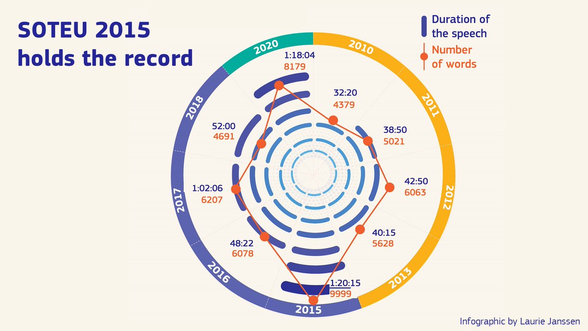
2015 was an ambitious SOTEU in many ways.
It was the first published (and formatted, god help us) in all EU languages.
It included the first progress report on the Commission's priorities.
It also set another record - the longest SOTEU so far!
It was the first published (and formatted, god help us) in all EU languages.
It included the first progress report on the Commission's priorities.
It also set another record - the longest SOTEU so far!
Setting the scene: SOTEU 2016.
This one struck a more positive tone: Europe protecting, empowering, defending citizens.
We stepped up our game on the visual side with a more polished, cohesive and modern approach.
This one struck a more positive tone: Europe protecting, empowering, defending citizens.
We stepped up our game on the visual side with a more polished, cohesive and modern approach.

What else was new this year?
👉 bite-size infographics for print, social media
👉 overlays and info on speech broadcast
👉 editable templates for easy translation for our offices across EU
👉 designers worked closely with speechwriters from early on
👉 bite-size infographics for print, social media
👉 overlays and info on speech broadcast
👉 editable templates for easy translation for our offices across EU
👉 designers worked closely with speechwriters from early on

A speechwriter thinks about the speaker, audience, content, tone and context.
And as those responsible for visuals, we do too - we just think about it slightly differently!
Here are some things we consider (feel free to add your own!) 👇
And as those responsible for visuals, we do too - we just think about it slightly differently!
Here are some things we consider (feel free to add your own!) 👇

Setting the scene: SOTEU 2017.
The speech focused on values, the future of the EU, democracy and rule of law, the progress achieved.
It is one of the most watched and talked about SOTEU speeches.
And we continued the visual narrative on the future of Europe...
The speech focused on values, the future of the EU, democracy and rule of law, the progress achieved.
It is one of the most watched and talked about SOTEU speeches.
And we continued the visual narrative on the future of Europe...

In early 2017, the origami bird had become the symbol of the future of Europe.
It covered buildings, factsheets, presentations and videos and redefined the SOTEU branding.
Keeping the visual thread showed that the speech was part of a broader conversation - and a bigger story.
It covered buildings, factsheets, presentations and videos and redefined the SOTEU branding.
Keeping the visual thread showed that the speech was part of a broader conversation - and a bigger story.

SOTEU 2017 saw new content added (and new challenges - such as visualising mountains of data!):
👉 policy tracker
👉 better regulation figures
👉 infringement cases
👉 economic development
👉 much more
I must admit some pages are a bit ambitious. I dare you to look at page 77.
👉 policy tracker
👉 better regulation figures
👉 infringement cases
👉 economic development
👉 much more
I must admit some pages are a bit ambitious. I dare you to look at page 77.

Despite this mountain of data, our social media visuals prized crisp clarity.
✅ shorter messages
✅ simplified/visually adapted content
✅ mini-explainers
✅ earlier teaser content
We worked much closer with the social media team to create content that matched audience needs.
✅ shorter messages
✅ simplified/visually adapted content
✅ mini-explainers
✅ earlier teaser content
We worked much closer with the social media team to create content that matched audience needs.

Setting the scene: SOTEU 2018.
Big themes this year - trade, climate, security, Africa, Brexit, the future of Europe.
The birds make a comeback, but adapter to softer, rounded mosaic shapes.
Big themes this year - trade, climate, security, Africa, Brexit, the future of Europe.
The birds make a comeback, but adapter to softer, rounded mosaic shapes.

SOTEU book reaches an impressive 176 pages - packed with data visuals and infographics.
Another addition: pack of factsheets on themes and separate publication on Citizen Dialogues.
Big job, big team: 7 Commission DGs contributed designers to the SOTEU 2018 graphic team.
Another addition: pack of factsheets on themes and separate publication on Citizen Dialogues.
Big job, big team: 7 Commission DGs contributed designers to the SOTEU 2018 graphic team.

With more detail in documents, 2018 saw a push for providing simple, explanatory content across EU:
✅ improved editable templates for multilingualism
✅ toolkit of visual material shared early on
All helped Commission present a more unified face on social media all over EU.
✅ improved editable templates for multilingualism
✅ toolkit of visual material shared early on
All helped Commission present a more unified face on social media all over EU.

The speeches were shorter, but the publications were longer!
One can only image what a 2019 SOTEU would have looked like...
Any guesses why SOTEU 2015 and SOTEU 2018 included the authorised speech and the transcript?
One can only image what a 2019 SOTEU would have looked like...
Any guesses why SOTEU 2015 and SOTEU 2018 included the authorised speech and the transcript?

Setting the scene: SOTEU 2020.
President @vonderleyen's first SOTEU addressed COVID response, building back better.
A new age in visual communication:
🎨 digital first
🎨 multimedia content
🎨 bold colours and high contrast
🎨 minimalist graphics that carry meaning.
President @vonderleyen's first SOTEU addressed COVID response, building back better.
A new age in visual communication:
🎨 digital first
🎨 multimedia content
🎨 bold colours and high contrast
🎨 minimalist graphics that carry meaning.

We are particularly proud of this one - it represented a departure in style for a new presidency.
Shorter, punchier social media animation.
Strong preference for photos over illustrations - giving a sense of life and reality.
An uncluttered design, with a lot of white space.
Shorter, punchier social media animation.
Strong preference for photos over illustrations - giving a sense of life and reality.
An uncluttered design, with a lot of white space.

And I think that the audiences we've been targeting appreciate the work we've been putting in (and the content too of course!)
Here are a few figures on last year's reach and viewership thanks to the Commission’s #DataCrunch.
Here are a few figures on last year's reach and viewership thanks to the Commission’s #DataCrunch.

And finally... 🥁
#SOTEU 2021!
On which I’ll be burning the midnight oil…
😘 a sexy new colour palette
🌬️ a fresh set of visuals
💪 a bold graphic style
#SOTEU 2021!
On which I’ll be burning the midnight oil…
😘 a sexy new colour palette
🌬️ a fresh set of visuals
💪 a bold graphic style

SOTEU is a huge effort that draws on comms specialists/experts from all over EC. Every team has its story - and that's ours!
Hope you enjoyed a look under the hood of the graphic design team's work.
And I hope you tune in tomorrow - at the v least for the beautiful overlays...
Hope you enjoyed a look under the hood of the graphic design team's work.
And I hope you tune in tomorrow - at the v least for the beautiful overlays...

• • •
Missing some Tweet in this thread? You can try to
force a refresh


