Did you ever want to learn how to read ROC curves? 📈🤔
This is something you will encounter a lot when analyzing the performance of machine learning models.
Let me help you understand them 👇
This is something you will encounter a lot when analyzing the performance of machine learning models.
Let me help you understand them 👇

What does ROC mean?
ROC stands for Receiver Operating Characteristic but just forget about it. This is a military term from the 1940s and doesn't make much sense today.
Think about these curves as True Positive Rate vs. False Positive Rate plots.
Now, let's dive in 👇
ROC stands for Receiver Operating Characteristic but just forget about it. This is a military term from the 1940s and doesn't make much sense today.
Think about these curves as True Positive Rate vs. False Positive Rate plots.
Now, let's dive in 👇
The ROC curve visualizes the trade-offs that a binary classifier makes between True Positives and False Positives.
This may sound too abstract for you so let's look at an example. After that, I encourage you to come back and read the previous sentence again!
Now the example 👇
This may sound too abstract for you so let's look at an example. After that, I encourage you to come back and read the previous sentence again!
Now the example 👇
We are building a self-driving car and want it to stop at red traffic lights 🚦
(You saw this coming, right 😁?)
We build a classifier to determine if the car should STOP (light is 🔴 or 🟡) or PASS (light is 🟢). I'm using just 2 classes here to make the example simpler.
👇
(You saw this coming, right 😁?)
We build a classifier to determine if the car should STOP (light is 🔴 or 🟡) or PASS (light is 🟢). I'm using just 2 classes here to make the example simpler.
👇
Now we ask the model - should the car stop at the 🚦?
There are 4 possible cases
▪️ Light is 🔴, model says STOP - True Positive
▪️ Light is 🔴, model says PASS - False Negative
▪️ Light is 🟢, model says PASS - True Negative
▪️ Light is 🟢, model says STOP - False Positive
👇
There are 4 possible cases
▪️ Light is 🔴, model says STOP - True Positive
▪️ Light is 🔴, model says PASS - False Negative
▪️ Light is 🟢, model says PASS - True Negative
▪️ Light is 🟢, model says STOP - False Positive
👇
Given many examples from our validation/test set, we can compute the following metrics:
▪️ True Positive Rate (TPR) - how good is our model telling us correctly to stop.
▪️ False Positive Rate (FPR) - how often does our model tell us wrongly to stop
To get a feeling for it 👇
▪️ True Positive Rate (TPR) - how good is our model telling us correctly to stop.
▪️ False Positive Rate (FPR) - how often does our model tell us wrongly to stop
To get a feeling for it 👇

A high TPR means that we stop at most 🔴 lights.
A low TPR means that we often miss 🔴 lights and pass.
A high FPR means that we often confuse 🟢 lights for 🔴 and wrongly stop.
A low FPR means that we don't have many false stops.
So, we want a high TPR and low FPR, right? 👇
A low TPR means that we often miss 🔴 lights and pass.
A high FPR means that we often confuse 🟢 lights for 🔴 and wrongly stop.
A low FPR means that we don't have many false stops.
So, we want a high TPR and low FPR, right? 👇
Evaluating a model on a validation/test dataset will give us exactly one TPR and FPR value. Here an example of a (not so good) classifier:
▪️ TPR = 95%
▪️ FPR = 1%
Wait, but this is just one point on the TPR vs. FPR plot above. So, how do we get the curve now?
👇
▪️ TPR = 95%
▪️ FPR = 1%
Wait, but this is just one point on the TPR vs. FPR plot above. So, how do we get the curve now?
👇
Machine learning classifiers usually don't simply output a class, but they tell you the probability of each class being the correct one.
You can then define a threshold based on which you decide. For example, stop at a light only if the classifier is 99% sure. Or 90%? 80%?
👇
You can then define a threshold based on which you decide. For example, stop at a light only if the classifier is 99% sure. Or 90%? 80%?
👇
We can now try many different values of the threshold and evaluate on our validation/test dataset.
Every time we will get different values for TPR and FPR and we can put them on the ROC plot. This is how we get our curve!
So let's look at different thresholds 👇
Every time we will get different values for TPR and FPR and we can put them on the ROC plot. This is how we get our curve!
So let's look at different thresholds 👇
Here is an example plot. Look at the 3 points I marked on it to see the fundamental trade-off between FPR and TPR.
1️⃣ TPR = 20%, FPR = 2% - setting a high threshold (we want to be really sure before stopping), we won't have many FPs, but we will also miss many real 🔴.
👇
1️⃣ TPR = 20%, FPR = 2% - setting a high threshold (we want to be really sure before stopping), we won't have many FPs, but we will also miss many real 🔴.
👇
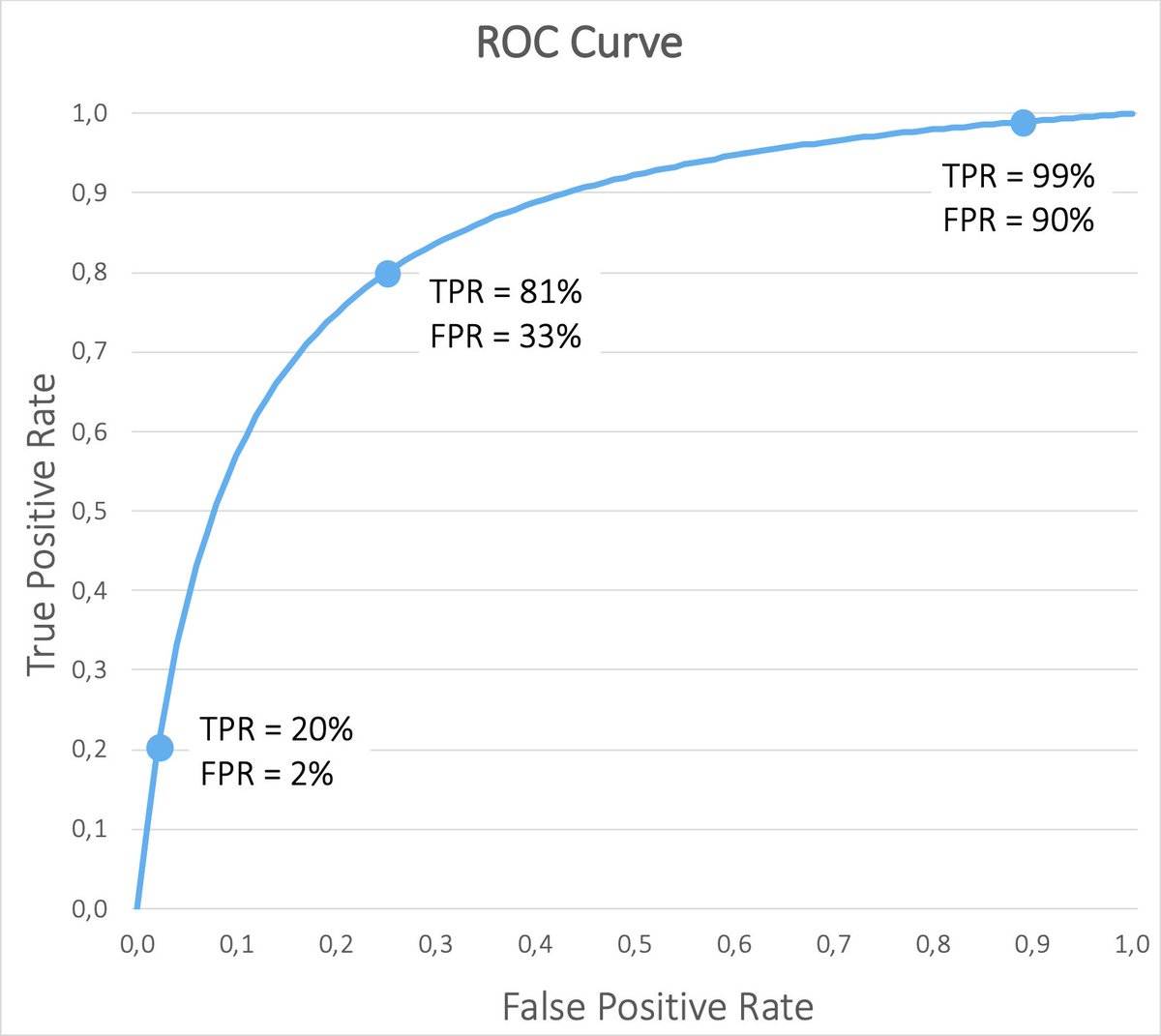
2️⃣ TPR = 81%, FPR = 33% - decreasing the threshold improves the detection rate, but now we also have many false detections of 🔴.
3️⃣ TPR = 99%, FPR = 90% - a model with a very low threshold will detect almost all 🔴, but will wrongly classify most 🟢 as 🔴 as well.
👇
3️⃣ TPR = 99%, FPR = 90% - a model with a very low threshold will detect almost all 🔴, but will wrongly classify most 🟢 as 🔴 as well.
👇
Changing the threshold will only change the trade-off not make our model better.
However, this is still an important step when you are tuning the model for a specific application. For self-driving cars, it is **very** Important to not run the red lights - you need high TPR!
👇
However, this is still an important step when you are tuning the model for a specific application. For self-driving cars, it is **very** Important to not run the red lights - you need high TPR!
👇
We can, however, train another model using more data, more parameters, better optimization. But how do we tell that it is really better and not just finding a different trade-off point?
The new ROC curve should be closer to the upper left corner of the graph! 👇
The new ROC curve should be closer to the upper left corner of the graph! 👇

A better ROC curve means that we can choose thresholds that give us the same TPR for both classifiers, but the better one will have less FPR.
Alternatively, for the same FPR, the better classifier will have a higher TPR.
👇
Alternatively, for the same FPR, the better classifier will have a higher TPR.
👇
There is one problem, though - in the reality, ROC curves are much noisier. At some points, the curve of one model may be higher, but at others lower. So which one is better in this case?
See this image from a real evaluation (credit to Wikipedia). Which one is best?
👇
See this image from a real evaluation (credit to Wikipedia). Which one is best?
👇

To get a single number summarizing the whole ROC curve, we can compute the Area under the Curve (AOC).
This will again be a number between 0 and 1 and expresses the probability of the model to rank a random positive example higher than a random negative example.
👇
This will again be a number between 0 and 1 and expresses the probability of the model to rank a random positive example higher than a random negative example.
👇

Summary 🏁
To recap quickly:
▪️ ROC curves visualize the trade-off between TPR and FPR
▪️ The curve is created by varying an internal decision threshold
▪️ Models with a curve closer to the upper left corner are better
▪️ Use the Area under the Curve to get a single metric
To recap quickly:
▪️ ROC curves visualize the trade-off between TPR and FPR
▪️ The curve is created by varying an internal decision threshold
▪️ Models with a curve closer to the upper left corner are better
▪️ Use the Area under the Curve to get a single metric
I regularly write threads like this to help people get started with Machine Learning.
If you are interested in seeing more, follow me @haltakov.
If you are interested in seeing more, follow me @haltakov.
This is a good point! So what you say is that it this kind of applications you want to minimize the False Positives, so it is important to have a good TPR already at the beginning of the ROC curve?
https://twitter.com/PGSwartz/status/1438236244505473029?s=20
Yes, great point! I plan to write more about the precision/recall curve since it is useful in other cases as well. For example in the case of object detection, where TN don't really make sense.
https://twitter.com/ComPeterScience/status/1438336220703166469
• • •
Missing some Tweet in this thread? You can try to
force a refresh