We've studied MANY parameters proving Spain's 5th wave was a completely Human Artifact, let's see one more and it's consequences:
Unfitting between cases and deaths, both created artificially and intentionally to LOOK like an outbreak.
Bad intention, lame performance
Unfitting between cases and deaths, both created artificially and intentionally to LOOK like an outbreak.
Bad intention, lame performance

There's a way to calculate true infections from death data
Basically, there's an statistical known chance to die for each X day after death. If you do it for every death, you'll find the statistical lethal infections at their time
The True Curve
Method ⤵️
Basically, there's an statistical known chance to die for each X day after death. If you do it for every death, you'll find the statistical lethal infections at their time
The True Curve
Method ⤵️
https://twitter.com/plaforscience/status/1259240546754859008?s=19
In red, official 5th wave deaths
Green, lethal infections to produce them with the known infection/death timing
Full epidemic will be a parallel elevation of this green curve.
Height depends on 1/lethality but shape (trends, peak, bending points) remain exactly the same.
Green, lethal infections to produce them with the known infection/death timing
Full epidemic will be a parallel elevation of this green curve.
Height depends on 1/lethality but shape (trends, peak, bending points) remain exactly the same.

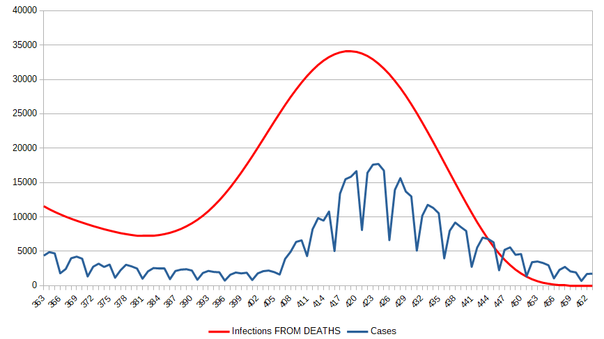
True epidemic escalated Curve (red), forced by official death data, can be compared to official cases series (blue)
First and main incoherence is BEGINNING date.
If deaths are true, epidemic should have begin rising by the end of MAY.
Official Cases only rose in JULY's 1st days
First and main incoherence is BEGINNING date.
If deaths are true, epidemic should have begin rising by the end of MAY.
Official Cases only rose in JULY's 1st days

For having the supposed death toll, epidemic should have turned up, with Nature signature smoothness, ONE FULL MONTH before the abrupt cases growth.
Do you know what began to growth dramatically at July?
Oh, yes, politically decided number of tests.
Do you know what began to growth dramatically at July?
Oh, yes, politically decided number of tests.
https://twitter.com/plaforscience/status/1437689935721603072?s=19
Another problem is height.
We've used, in the 1st graph, Spain's full Pandemic mortality.
Height obtained, with ~35K true daily infections Vs the ~16K officially detected can be explained by only partial detection.
But we have to consider vax mortality reduction, haven't we?
We've used, in the 1st graph, Spain's full Pandemic mortality.
Height obtained, with ~35K true daily infections Vs the ~16K officially detected can be explained by only partial detection.
But we have to consider vax mortality reduction, haven't we?

For the officially declared death number and timing, vaccines effectivity, and vaccinated population percentages, resulting infection curve should look like this, peaking at a shocking 350K daily cases.
It would DWARVE 1st wave real infections.
Definitely, an Impossible.
It would DWARVE 1st wave real infections.
Definitely, an Impossible.

So, we have absolutely incompatible death/cases series, and deaths/vax death protection.
Add this wave (after 1½ year & FOUR outbreaks, in Spanish melting AUGUST) must be WORSE than 1st to produce noted death, but went undetected for 1 FULL MONTH
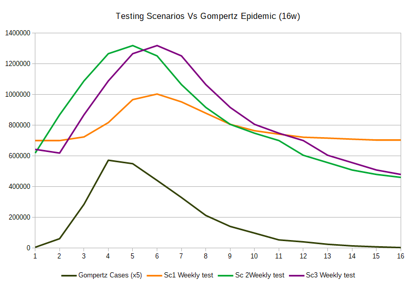
And, magically, it matches tests
Add this wave (after 1½ year & FOUR outbreaks, in Spanish melting AUGUST) must be WORSE than 1st to produce noted death, but went undetected for 1 FULL MONTH
And, magically, it matches tests
What we see is a very dirty, and quite lame, Frankenstein man-made wave.
The childish mechanism is a controlled increase/decrease testing curve, at epidemic shape, and, 2 weeks later, u know, change death criteria for including huge numbers of all-causes deaths into Covid toll
The childish mechanism is a controlled increase/decrease testing curve, at epidemic shape, and, 2 weeks later, u know, change death criteria for including huge numbers of all-causes deaths into Covid toll
It satisfies the ignorants and fuels media, but falls as a joke at maths:
1st mistake, epidemic waves occur way more harmonically, with infections growing ~3 weeks prior to deaths
Covid Faith expects 2, also manipulators lack knowledge to anticipate properly nature soft changes
1st mistake, epidemic waves occur way more harmonically, with infections growing ~3 weeks prior to deaths
Covid Faith expects 2, also manipulators lack knowledge to anticipate properly nature soft changes
Apart from speeding death, wave faking is NOT a question of just adding death to toll: people died!
2nd mistake is not considering WHEN those people die, and how many, are compatible with the rest of the narrative (lethality&vax effectivity), as if ANY death bump meant the same
2nd mistake is not considering WHEN those people die, and how many, are compatible with the rest of the narrative (lethality&vax effectivity), as if ANY death bump meant the same
The WORST consequence is that this (so lame at the very first contact with math analysis) manipulation CAN'T BE CASUAL
It sadly reflects a VERY CROOKED POLITICAL INTENTION: keeping fear alive and force youngsters into vaccine
They didn't even hide it

It sadly reflects a VERY CROOKED POLITICAL INTENTION: keeping fear alive and force youngsters into vaccine
They didn't even hide it
https://twitter.com/plaforscience/status/1434612188430356483?s=19

Even if you are a covidliever, double, triple vaxed, proud masked, restrictions fan, I'm sure that you'd
really DISLIKE being manipulated.
If you're SO concerned by Covid, you must join us demanding science now, stopping gross manipulation and asking accountability for it.
really DISLIKE being manipulated.
If you're SO concerned by Covid, you must join us demanding science now, stopping gross manipulation and asking accountability for it.
• • •
Missing some Tweet in this thread? You can try to
force a refresh


