i recorded a talk for jamstackconf.com — about whether you should build multi-page apps (MPAs) or single-page apps (SPAs). spoiler: the answer is 'neither'. or 'both', depending on your definitions.

here's the condensed tweet thread version:
i sometimes get exasperated at the get-off-my-lawn mentality of people who reflexively deride SPAs, but the truth is they're kind of right: SPAs have ruined the web. the median MPA is better than the median SPA. Image
but MPAs have significant drawbacks. you end up writing two codebases (one to render HTML, one for any client-side interactions), and you can't do things like persistent elements, client-side state management, transitions, etc. frankly, these are table stakes for modern apps. Image
modern meta-frameworks like Next, Nuxt and SvelteKit have converged on solutions to the problems of both MPAs and SPAs. you can get the best of both worlds, with none of the drawbacks. Image
well, almost. if you're adamantly anti-JS, these frameworks won't hold much appeal. but i think the winds are blowing in JavaScript's favour: we're moving more work to the edge — think Cloudflare Workers, Deno Deploy, Netlify Edge Handlers — which means V8. which means JS.
anyway, we need a name for these sorts of apps if we're to be able to see past the MPA/SPA cultural divide. my efforts to come up with an acronym for something better than a SPA were in vain... ImageImageImage
...so instead i've started referring to them as #transitionalapps. it comes from the interior design school that combines elements from traditionalist and modernist camps. Image
some people will disagree that this is the best way to build apps. i address a few objections in the talk, including the idea that 'docs' and 'apps' are entirely separate things that warrant different technological approaches. they're not; they're the poles of a spectrum. Image
in the last part of the talk i give a quick demo of SvelteKit, showing how you can use it to build portable apps with pre-rendered JS-free static content, dynamically SSR'd pages with rich interactivity, and everything in between — even within a single app. Image
but this isn't about a specific technology. it's about figuring out how to build robust, accessible, pleasant user experiences that take full advantage of the web's nature. if we use less tribal thinking and more critical thinking, we can get there. /fin

• • •

Missing some Tweet in this thread? You can try to force a refresh
 

Keep Current with Rich Harris

Rich Harris Profile picture

Stay in touch and get notified when new unrolls are available from this author!

Read all threads

This Thread may be Removed Anytime!

PDF

Twitter may remove this content at anytime! Save it as PDF for later use!

Try unrolling a thread yourself!

how to unroll video
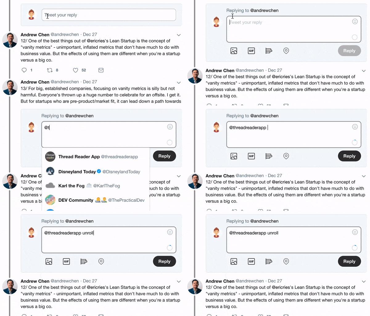
  1. Follow @ThreadReaderApp to mention us!

  2. From a Twitter thread mention us with a keyword "unroll"
@threadreaderapp unroll

Practice here first or read more on our help page!

More from @Rich_Harris

27 Jun 20
The more I use HEY, the more I think it makes the case for 'modern' SSR'd SPA-ish development, rather than the Rails+Turbolinks+Stimulus model. I realise it's v1, but there are some rough edges that will be hard to fix, that you just don't expect to see in an app in 2020.
One example: if you have lots of unreads (which I always do 🙃), you might scroll to find a specific one, which causes additional emails to load (it starts with 30). Open it, navigate back, and your scroll position is lost — you're back at the top with the initial 30. That's bad.
Overall, it's certainly not an unpleasant app to use, and I'm glad that we have an example of a real, non-trivial product that has so little JS and scores so well on Lighthouse — this is the benchmark that JS-forward frameworks and their users should aspire to beat.
Read 5 tweets
12 May 20
I don't like this trend.

I know a lot of you are going to turn Reply Guy on me, but I don't think it's good for humanity for everyone to work from home. Thread:
When I moved to London, then NYC, I knew almost no-one. I was able to form deep, meaningful friendships largely because I worked in offices with people. I can maintain those pre-existing relationships now, but I think I'd struggle to form similar new ones if we all WFH'd.
I get that not everyone enjoys their coworkers' company. I'm sorry if that applies to you! But I really think a lot of WFH evangelists chronically underestimate the harm to the fabric of society if people were to become even more isolated after Covid than we were before.
Read 5 tweets
30 Nov 19
Several people have asked me to make a @sveltejs version of this interesting demo that's doing the rounds, which purports to show how fast React can be with 'scheduling'. Let's take a look!
@sveltejs (bear with me here, Twitter isn't letting me upload these videos...)
@sveltejs On the left, we have the React version, running in prod mode. On the right, Svelte (in dev mode, because I forgot to build it. Oh well.) Notice the huge gap in the React version whenever you change the count. With Svelte? Honey badger don't care.
Read 8 tweets
26 Oct 19
My talk from @jscamp, "The Return of 'Write Less, Do More'" is up on YouTube:

It's a 30 min talk on @sveltejs, and why less code = fewer bugs — kind of a sequel to "Rethinking Reactivity" () Here's a summary thread:
'Write Less, Do More' is the jQuery slogan. jQuery changed my life: I was working at a newsroom in South London, trying to learn to code so I could do e.g. fancy interactive dataviz like the big guys were doing, and I doubt I would have succeeded without it.
As it happens, 'write less' is one of the very few rules for writing *prose* that almost everyone agrees on. Every word should be doing work. It's not just about respecting readers' time — it helps you write prose that is *correct*. Flabby prose creates space for bullshit.
Read 14 tweets
29 Sep 19
Today we published an important article on child sexual abuse imagery. Content warning: graphic descriptions of child sexual assault. This is the first part of a months-long investigation by @mhkeller and @gabrieldance nytimes.com/interactive/20…
@mhkeller @gabrieldance Quick thread about the visual elements of the story. We open with an avalanche of images that document the abuse, provided by the Canadian Center for Child Protection, obscured using a technique devised to protect both the abused and the analysts who work with the material.
@mhkeller @gabrieldance We felt it was important not to shy away from showing this material, horrific as it is, since it's central to understanding the story. Straight away, though, it presents a technical challenge: How can we load and render thousands of images almost immediately upon page load?
Read 13 tweets
8 May 19
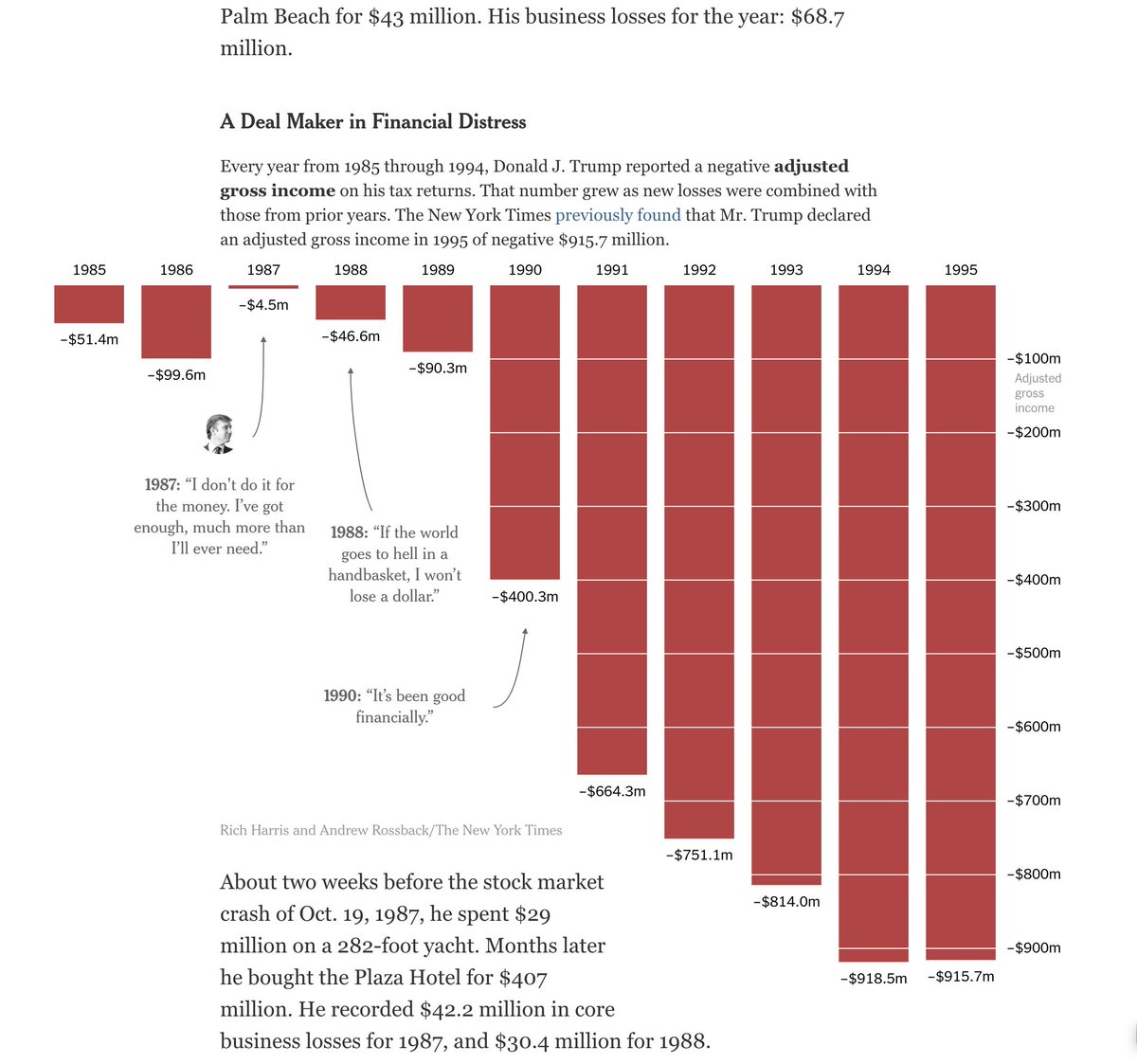
Let's say your Pulitzer Prize-winning colleagues have unearthed new tax information about the president, and need you to make a bar chart to illustrate their findings. Bar charts are easy, right? But there's a catch. nytimes.com/interactive/20…
By the mid-90s, the losses are large enough that to do them justice would take more vertical space than we can allow for the chart. So we decide to let the bars break out of the chart boundary and into the text.
That part's easy enough, but now we need to displace the text somehow. The text is coming from the CMS; I have no control over it. By default, it will run across the bars, which is obviously no good. But we *can* add CSS to the page.
Read 4 tweets

Did Thread Reader help you today?

Support us! We are indie developers!


This site is made by just two indie developers on a laptop doing marketing, support and development! Read more about the story.

Become a Premium Member ($3/month or $30/year) and get exclusive features!

Become Premium

Too expensive? Make a small donation by buying us coffee ($5) or help with server cost ($10)

Donate via Paypal Become our Patreon

Thank you for your support!

Follow Us on Twitter!

:(