Would a rotation from growth to value benefit non-US equities? In principle, yes, but the earnings picture for MSCI EAFE (Europe, Australasia and Far East) and EM (and especially China) suggests some caution. (THREAD)
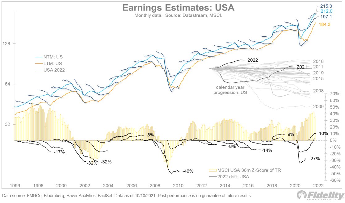
The chart above, and the ones below, use the Datastream “squiggles” series for consensus earnings estimate progression by calendar year. The estimates run from the February before the calendar year to the February after. /2
The top panel above shows the dollar estimates and the bottom panel shows the progression from the start of each squiggle. The yellow bars show the 36-month Z-score of the MSCI USA total return. /3
In the US chart above, you can see that estimates typically start too high and then progress down from there. The market is generally unfazed by this, except at cyclical inflection points. /4
Now look at EAFE. The bottom panel shows earnings estimate drift relative to the US, overlaid against the Z-score of relative return. Note the correlation between relative earnings and relative performance. Get the earnings right, and the performance will likely follow. /5
And here is the same chart but for Emerging Markets (EM). Again, we see a very clear relationship between relative earnings revisions and relative performance. /6
Note that the dollar EPS estimates above are still at or below the peak levels from 2010. The same is true for EAFE. It shows just what an earnings machine the US has been over the years. /7
And finally, here is China. The relative earnings progression has imploded relative to the US. The inset shows that 2021 and 2022 are among the worst years ever for relative revisions. /8
We often focus on valuation discounts when choosing non-US equities over the US, but these charts show that it’s the earnings that we must solve for. Price follows earnings, period. /END

• • •

Missing some Tweet in this thread? You can try to force a refresh
 

Keep Current with Jurrien Timmer

Jurrien Timmer Profile picture

Stay in touch and get notified when new unrolls are available from this author!

Read all threads

This Thread may be Removed Anytime!

PDF

Twitter may remove this content at anytime! Save it as PDF for later use!

Try unrolling a thread yourself!

how to unroll video
  1. Follow @ThreadReaderApp to mention us!

  2. From a Twitter thread mention us with a keyword "unroll"
@threadreaderapp unroll

Practice here first or read more on our help page!

More from @TimmerFidelity

14 Oct
Will market leadership change back to value since rates are on the move? Long-duration growth stocks are convex to interest rates, and the relative performance of cyclicals/value stocks (especially financials and energy) is positively correlated to rising yields. (THREAD)
So, in theory, if bond yields rise to a new equilibrium (I’m guessing 2% for the 10-year), then value should take over for now. /2
I doubt the latest employment report will dissuade the Fed from starting its taper soon, so that suggests that in 2022 the bond market could be facing the opposite supply/demand dynamic as in 2021. /3
Read 4 tweets
13 Oct
The market is in mid-cycle and is following a typical pattern. This chart shows earnings growth in light blue and P/E growth in pink. The blue bars extend into 2022 because they include current estimates. (THREAD)
See the pattern? First, the market bottoms, then earnings typically bottom a few quarters later. In between those two inflection points is a big expansion in the P/E multiple. /2
From there, the P/E ratio peaks on a rate-of-change basis, then earnings growth goes positive, then the change in the P/E ratio turns negative, and then earnings growth peaks. /3
Read 5 tweets
12 Oct
Price follows earnings, except at the tails. Very negative earnings growth tends to produce positive returns (red dots below on the left), because this usually occurs at market bottoms. This chart illustrates earnings growth (horizonal) and the S&P 500 return (vertical). (THREAD)
On the other hand, very positive earnings growth does not seem to be correlated (see the pink dots on the right in the chart above). /2
Historically, when earnings growth is above 30%, the regression line for earnings vs. price is flat as a pancake. Investors don’t reward extremely high earnings growth because it tends to be unsustainable. That's what happened in 2018 following the tax cuts. /3
Read 4 tweets
11 Oct
Gaining ground: Bitcoin is back up to around $55k, which is still $10k below its all-time high of $64,870 but marks a significant improvement from the summer lows of $30k. What’s interesting here? (THREAD)
This rally has come with little fanfare & doesn’t seem driven by momentum chasers. As we see, the percentage of coins held by short-term “tourists” is down to just 15%, below levels seen at bottoms. This tells me there could be room to run if momentum chasers pile in. /2
In terms of price momentum, Bitcoin’s move doesn’t seem excessive. Below, the bitcoin/gold ratio along with its de-trended Bollinger Bands, measuring the number of standard deviations from its trend. /3
Read 5 tweets
8 Oct
Where are we headed on the correlation between stocks and bonds? With some renewed upward pressure on bond yields, there's a tug-of-war between nominal R-star (The Fed’s published R* rate plus the current 2-year inflation rate) and monetary velocity. (THREAD)
As you can see above, the 10-year yield is somewhere in between those two. Will monetary velocity pick up and follow nominal R* higher, or will the current inflation spike be transitory and bring nominal R-Star back down? It’s one of the existential questions of the day. /2
My guess is that yields will rise cyclically, but remain in a secular down-trend, driven mostly by demographics. But I do think that inflation will be somewhat higher over the next 10 years than it has been over the past decade, driven by wages and housing. /3
Read 7 tweets
29 Sep
Time to debunk that laziest of bubble arguments: the market-cap-to-GDP ratio.
It's severely lacking as a valuation metric. The ratio doesn't consider interest rates, which are at multi-year lows. It also does not consider operating margins, which are at multi-year highs. /2
Most importantly, comparing the S&P 500 to US GDP does not account for the fact that US large caps have become more and more global over the years. So let’s fix it. /3
Read 6 tweets

Did Thread Reader help you today?

Support us! We are indie developers!


This site is made by just two indie developers on a laptop doing marketing, support and development! Read more about the story.

Become a Premium Member ($3/month or $30/year) and get exclusive features!

Become Premium

Too expensive? Make a small donation by buying us coffee ($5) or help with server cost ($10)

Donate via Paypal Become our Patreon

Thank you for your support!

Follow Us on Twitter!

:(