And we are live from Windows!
After a sqlite database adjustment, the app seems to work without major issues on Windows as well.
@GroovinChip macos_ui feels like an intruder here 🙃
After a sqlite database adjustment, the app seems to work without major issues on Windows as well.
@GroovinChip macos_ui feels like an intruder here 🙃

Fixed the program name and icon after some searching around, so the window bar and taskbar show up properly. 

Splitting the app into two different paths for each platform (in main.dart):
➡ a MacosApp() when the platform is macOS.
➡ a FluentApp() when we are on Windows.
The first major step to bring Windows (Fluent UI) design to the app.
#flutterdev
➡ a MacosApp() when the platform is macOS.
➡ a FluentApp() when we are on Windows.
The first major step to bring Windows (Fluent UI) design to the app.
#flutterdev

Then each widget should have an alternate Windows-specific layout and design. 🖌
Starting with small widgets, like buttons:
Starting with small widgets, like buttons:

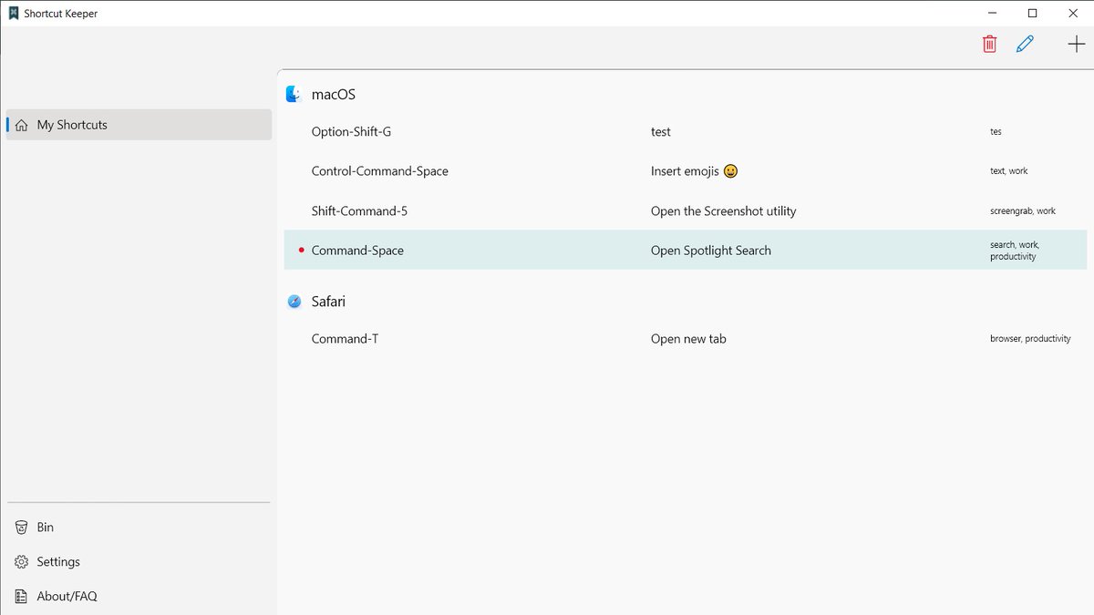
And here are the first comparison screenshots for Windows (in progress, of course) and macOS!
The home screen:

The home screen:

and the Delete dialog, following the platform norms for which side the main action button ("Delete") is positioned (left for Windows, right for macOS): 


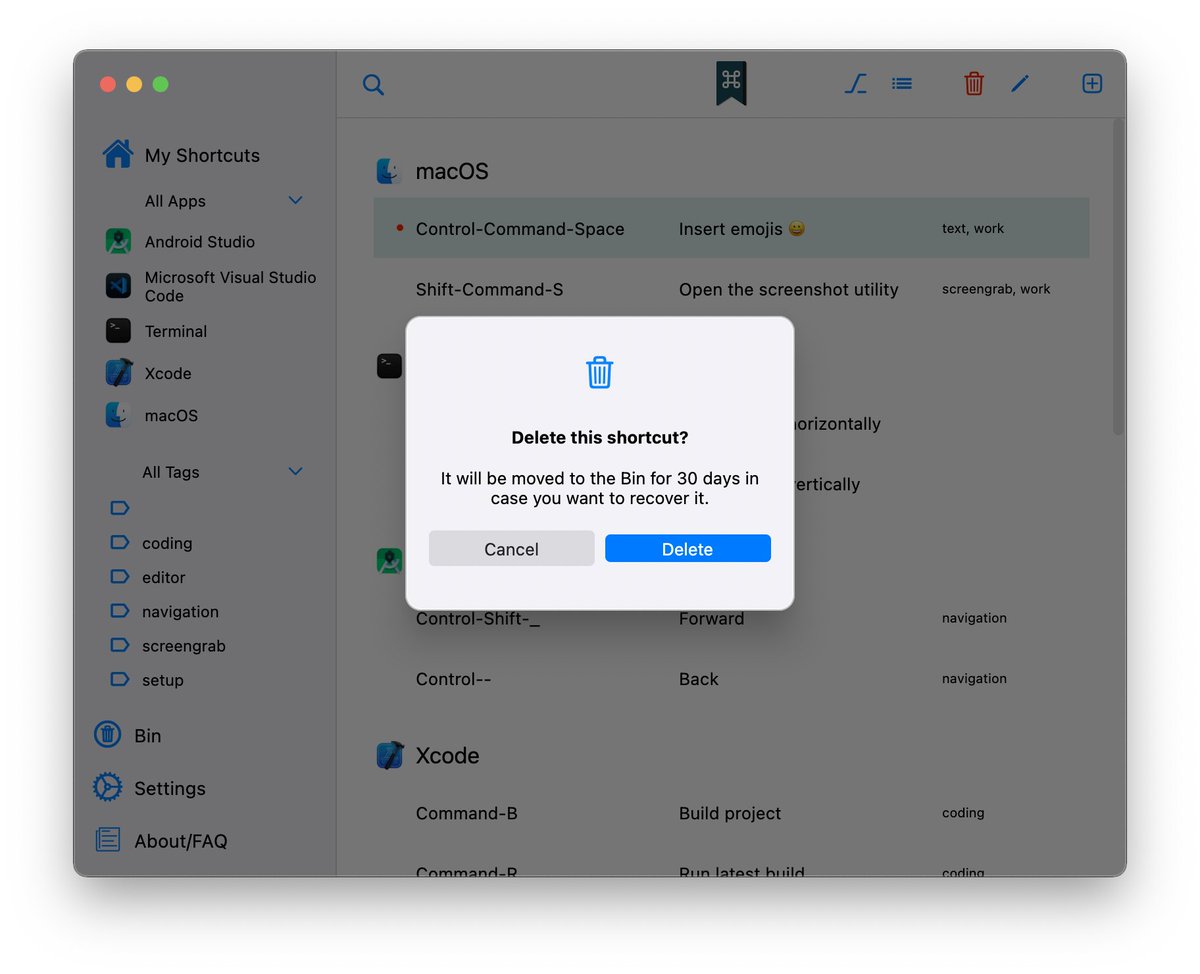
Adapting the UI to Windows made possible with @bdlukaadev 's awesome Fluent UI package!
pub.dev/packages/fluen…
pub.dev/packages/fluen…
A lot of progress made with the sidebar and the main UI of the app.
Still need to adapt it to Windows buttons,app icons, etc.
Looking better every day!

Still need to adapt it to Windows buttons,app icons, etc.
Looking better every day!


We now have:
- a new custom top bar (where the minimize, maximize, and close buttons are),
- and a redesign of the command bar (add, edit, delete, and display option buttons),
to better match Fluent design's norms.
- a new custom top bar (where the minimize, maximize, and close buttons are),
- and a redesign of the command bar (add, edit, delete, and display option buttons),
to better match Fluent design's norms.

Really happy with the result, being almost identical to the command bar guidelines from Windows Fluent design's gallery: 

Flutter: Vertical viewport was given unbounded height
Me:
Me:
After adding the search field, the top part of the app's UI is almost complete!
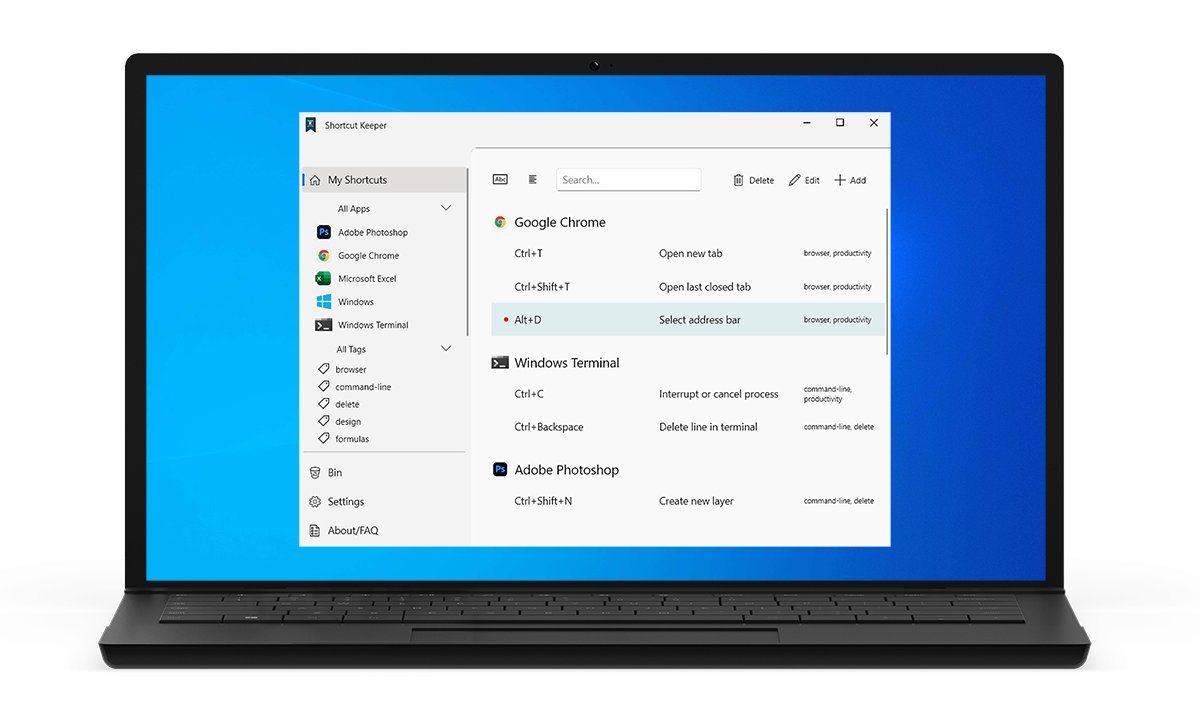
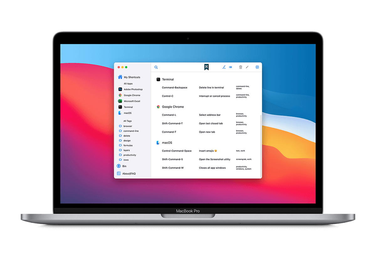
Here is a quick contrast between the macOS and Windows UI:
#flutterdev #Flutter

Here is a quick contrast between the macOS and Windows UI:
#flutterdev #Flutter


and @ShortcutKeeper now has a Windows executable in full functionality! 
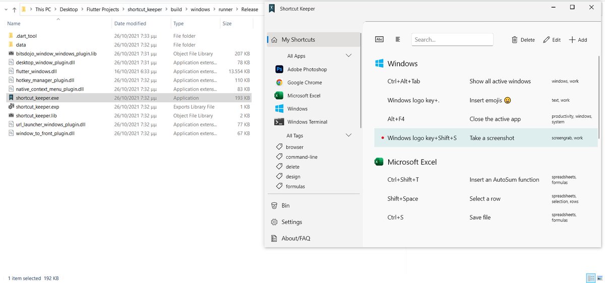
@ShortcutKeeper There is also a different logo for the Windows version, as the Command key symbol would not make sense here. 


@ShortcutKeeper Here are some screens from the Windows version: 


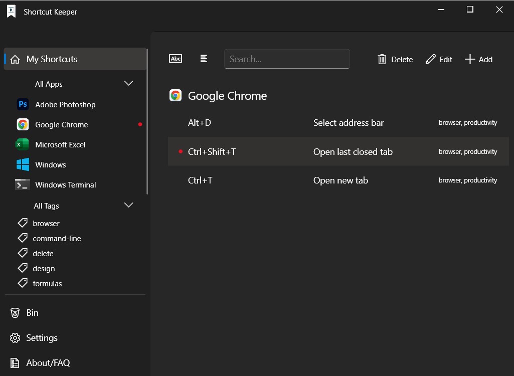


Operation port @ShortcutKeeper to Windows, almost complete now!
What's left is creating the Msix installer and deploying the app to Microsoft Store.🦾
#flutter #flutterDev
What's left is creating the Msix installer and deploying the app to Microsoft Store.🦾
#flutter #flutterDev

• • •
Missing some Tweet in this thread? You can try to
force a refresh


