Orwell2024🏒 Profile picture
Oct 27, 2021 7 tweets 6 min read Read on X
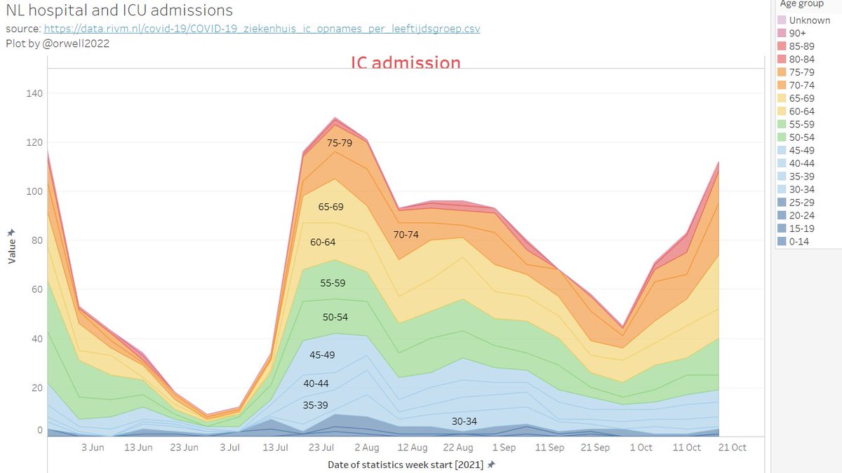
1/ NL hospital and ICU admissions

Find here a vizualisation of the NL data. This are all admission.

We don't have this infromation available for #Covid by age nor for C19 vaccination status by age.
@rivm @hugodejonge Please publish this data.
@rivm @hugodejonge 2/ Let's zoom in on the latest months. The numbers in the age group < 30 years is vanish small. But this is the so called unvaccinated "at risk" group. It's already obvious from this that the statement from Hugo:

"the unvaccinated are flooding the hospitals"

is impossible!
3/ Let's further zoom in on ICU:

People below 30 (so the dominating unvaccinated group) are NOT in ICUs.

The vast majority (80%) is above age 50. But this group is almost fully (~90%) vaccinated.

There is some magic going on if 90% of patient are unvaccinated.
4/ What is the vaccination level by age? Around 90% above age of 50. All statements regarding that 90% of ICU occupancy are unvaccinated is mathematically impossible and not credible @hugodejonge. Please publish the above requested data.
5/ Let's show the < 29 years only. And those are all cause admissions. Children, teens and students are "stealing" the ICU places?

Please explain this @hugodejonge. They are at risk and need protection? No. But this is not new. And I'm sure that you are clever enough to know.
6/ I saved the dashboard in Tableau public.

Also this comparison 0-25 years versus all on the same y-axis scale makes it even further clear how flawed the push to vaccinate the below 25 is.

public.tableau.com/views/NLhospit…
7/ I am adding the UK data for comparison, as I have pointed out that this type of data is what @rivm @hugodejonge have to publish.

65% hospitalisations 81% deaths vaccinated in UK.

Courtesy @mr_Smith_Econ @Humble_Analysis

Source data: assets.publishing.service.gov.uk/government/upl…

@annstrikje

• • •

Missing some Tweet in this thread? You can try to force a refresh
 

Keep Current with Orwell2024🏒

Orwell2024🏒 Profile picture

Stay in touch and get notified when new unrolls are available from this author!

Read all threads

This Thread may be Removed Anytime!

PDF

Twitter may remove this content at anytime! Save it as PDF for later use!

Try unrolling a thread yourself!

how to unroll video
  1. Follow @ThreadReaderApp to mention us!

  2. From a Twitter thread mention us with a keyword "unroll"
@threadreaderapp unroll

Practice here first or read more on our help page!

More from @orwell2022

Jun 29
Stockholm downtown: Where’s the UHI correction?

QCU = raw data
QCF = adjusted data

Same numbers.

C A N -- Y O U -- S E E -- IT

Fredrik? Show us.
We can’t see it.

Where exactly is the downward adjustment of 2C-4C? That's the bias you have in 2025. Image
We can also do from SE raw. And we can also show how rural stations look. Frederik does like them. Climate agenda is measured in downtowns of the capitals? Image
Not sure if it’s normal that amateurs now have to lecture academics…?

The downtown station logs hourly=no need for even Ekholm, no need for re-sampling. Does Frederik even know what we mean? Nothing is adjusted. Also PHA leaves it as is as it only detects breakpoints (not UHI). Image
Read 5 tweets
Jun 27
1/ +++🚨BREAKING🚨+++

Yes. Hausfather & Berkeley Earth are pushing it.
But it’s not a measurement. Not one station shows that.
It’s what you get when you aggregate rot over time.

On the left: 8 pristine USCRN sites. Same y-scale.
Now look what they did.👇 Image
2/ 🚨 BREAKING 🚨

We overlay. Do you see it now?

👉 They erased the real past.
👉 They had no data to do so.
👉 It's pure statistical deception—and wrong.

How? All exposed in the Wickham et al. (2013) audit thread.🧵

Image
3/ AI to fraud is what DNA was to criminals.

Not optional. Not stoppable.

🧠 Fraud — exposed
📺 MSM — vanished
📄 Journals — obsolete
🎓 Academia — imploded
🏰 Ivory towers — rubble

Resistance is pointless.

github.com/orwell2024/usc…
orwell2024.github.io/GHCN-tools/Wic…
Read 6 tweets
Jun 23
1/ Weil’s beliebt ist: Hohenpeissenberg-Daten – fallen zwar schon nach BU-Filter raus, aber gut: Dr. Connolly war schlau.

Oben: Wie stark sich die Temperatur verändert hat.
Unten: Wie „unrund“ die Messwerte wurden – Entropie der Kommazahlen (h/t Connolly) Image
2/ Was wir hier sehen: Die Datenreihe ist ein Komposit (sehr beliebt, wenig seroes, in der Klima-„Wissenschaft“).
Die Messmethode (und mehr) hat sich verändert – von analogen zu digitalen Sensoren. Die Entropie der Nachkommastellen zeigt das – deutlich.
Image
3/ Diese Wetterstation ist NICHT standortstabil:
praktisch 100 % vom Menschen genutzte Fläche.

🟥 MODIS Urban (Klasse 13)
🟧 MODIS Agrarfläche (12 + 14)
🩸 GHSL Bebauung (2020)

Wer hier „Klima messen“ sagt, betreibt Täuschung.
Blamage für DWD.

Image
Read 12 tweets
Jun 22
1/ The result is simply wrong.
There are 2 stations there — we can compare.
🟥Red: Carlwood
🟩Green: Gatewick
We clearly see the overshoot.
Moreover: They’re using subhourly spikes (error) from a single, low-inertia sensor.
Total incompetence. Image
2/ Using TMAX from a low-quality single urban sensor is already peak incompetence.

But they go further — they take the spikes.
Even top-tier stations like USCRN show 2–3°C error at peak forcing.
USCRN uses triple sensors — worst spikes get voted out.

Image
3/ The UK has nothing like the USCRN triple-sensor setup.

So when two nearby stations disagree, the right move is simple:
Discard the implausible one — in this case, Charlwood.
What does the agenda-captured @metoffice do?
They run with the error.
They hoax the public.
ISO9001🤡 Image
Image
Read 6 tweets
Jun 12
1/ Back to Japan temperature trends.

We now add a smaller town: Suttsu. Still not truly rural nor stable site, but better.

We now show:
🟥 Kyoto
⬛️ Tokyo
🟦 Suttsu

Can you see it?

They then aggregate urban-biased data (rot) like this and call it “global temperature.” Image
2/ Here it is: Suttsu.

Not a high-quality reference site like
Valentia Observatory (Ireland) or h-USCRN sites.

But: Lower urban bias than cities like Kyoto or Tokyo. It starts to show the well known flatliner we see at stable sites. Image
Image
3/ To see it better, here’s 4 months side by side:

🟥 Kyoto
⬛️ Tokyo
🟦 Suttsu

This is man-made. The T trend is just unrelated to climate. It measures the site and environment change. Suttsu as expected least impacted. But it still is. Image
Read 17 tweets
May 27
The red areas are fully man-made—built or cultivated.
You cannot measure climate anywhere near them.
And MODIS still misses a lot.
In reality, it’s worse.

When we inspected what @BerkeleyEA calls “rural”?
Almost all those stations are worthless Image
Imagine a field looks like it does on the left…alive.
And later, like the right. Dead and brown.
Still think you'll measure the same 2m temperature?
Or might that just—possibly—have a major impact as the surroundings changed? GPT estimates 3C. It's not wrong. Image
Image
Image
We now combine MODIS 🟥 and P2023A 🟪 (10m resolution).

Look: MODIS misses entire urban zones— Ireland. Or Liverpool.

And yet @hausfath and @BerkeleyEarth built their “rural” claims on MODIS junk.
Shameful deception.
The paper needs a retraction.
Image
Read 6 tweets

Did Thread Reader help you today?

Support us! We are indie developers!


This site is made by just two indie developers on a laptop doing marketing, support and development! Read more about the story.

Become a Premium Member ($3/month or $30/year) and get exclusive features!

Become Premium

Don't want to be a Premium member but still want to support us?

Make a small donation by buying us coffee ($5) or help with server cost ($10)

Donate via Paypal

Or Donate anonymously using crypto!

Ethereum

0xfe58350B80634f60Fa6Dc149a72b4DFbc17D341E copy

Bitcoin

3ATGMxNzCUFzxpMCHL5sWSt4DVtS8UqXpi copy

Thank you for your support!

Follow Us!

:(