
📣📣 THREAD: Last week I posted the *county-level* COVID vaccination rates of all 50 states by partisan lean.
TODAY, I'm posting the county-level COVID *death rates* of all 50 states by partisan lean.
Note: These don't include a small # whose county of residence is unknown. 1/
TODAY, I'm posting the county-level COVID *death rates* of all 50 states by partisan lean.
Note: These don't include a small # whose county of residence is unknown. 1/
https://twitter.com/charles_gaba/status/1462791646798561284
--I'm posting the vaxx graphs side by side with the death rate graphs for easy comparison.
--Death rates for all counties are since 6/30/21, since a) that's roughly when the Delta wave started in the U.S. and b) every American 12+ had ample ability to get vaxxed by that point.
--Death rates for all counties are since 6/30/21, since a) that's roughly when the Delta wave started in the U.S. and b) every American 12+ had ample ability to get vaxxed by that point.
ALABAMA: Not much of a pattern in death rates...but also not much of one in vaxx rates (basically, vaxx rates are low across the board): 


ALASKA: Both graphs are kind of all over the map, but then again, Alaska has some very unusual geography and demographics:


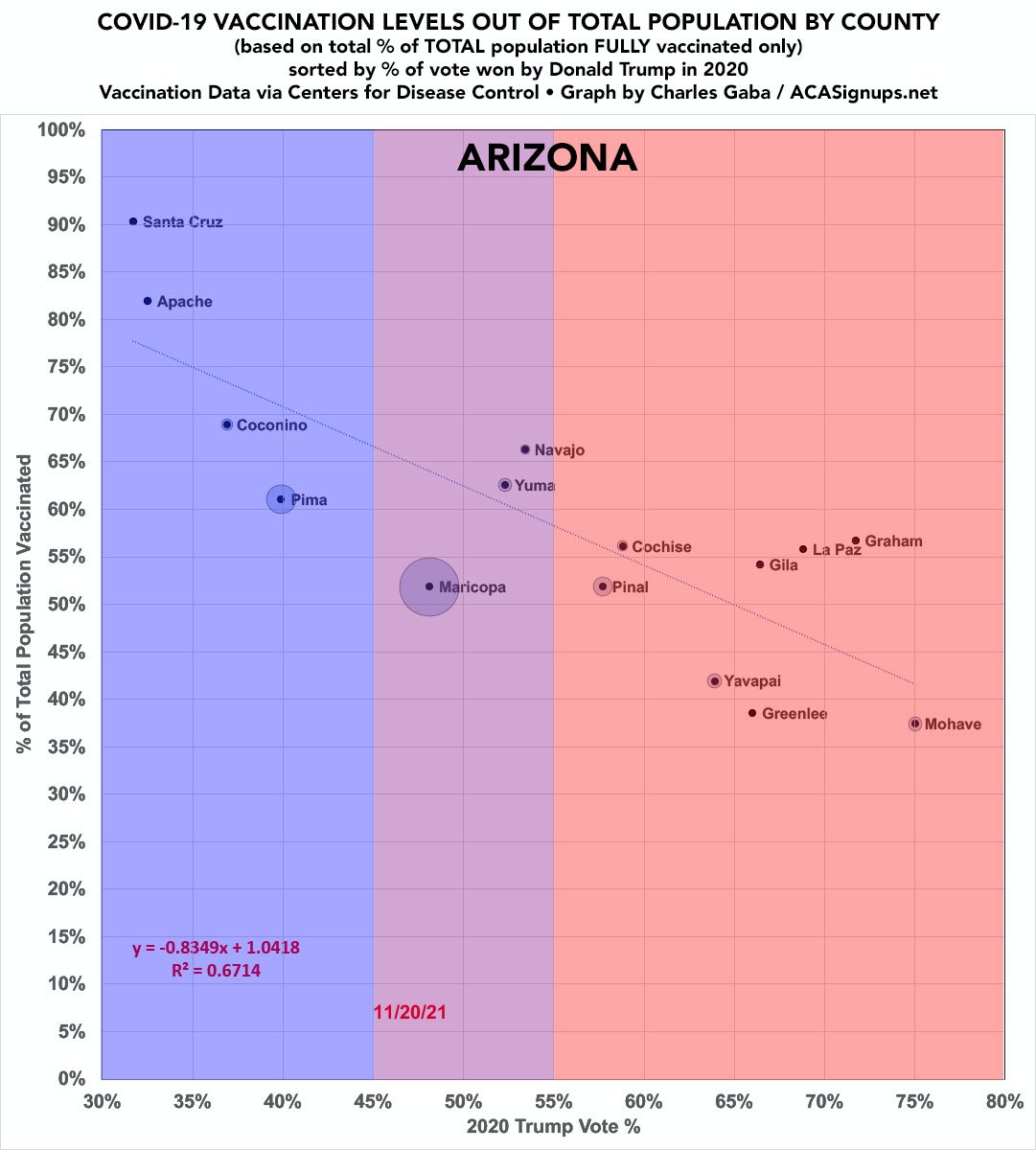
ARIZONA: Heeeeere we go: As the vaccination rates steadily go down, the death rates steadily go up. Of course 60% of AZ's population is in one county which I'm sure skews the results:

ARKANSAS: Again, not much of a pattern in vaxx rates...so not much of one in death rates:


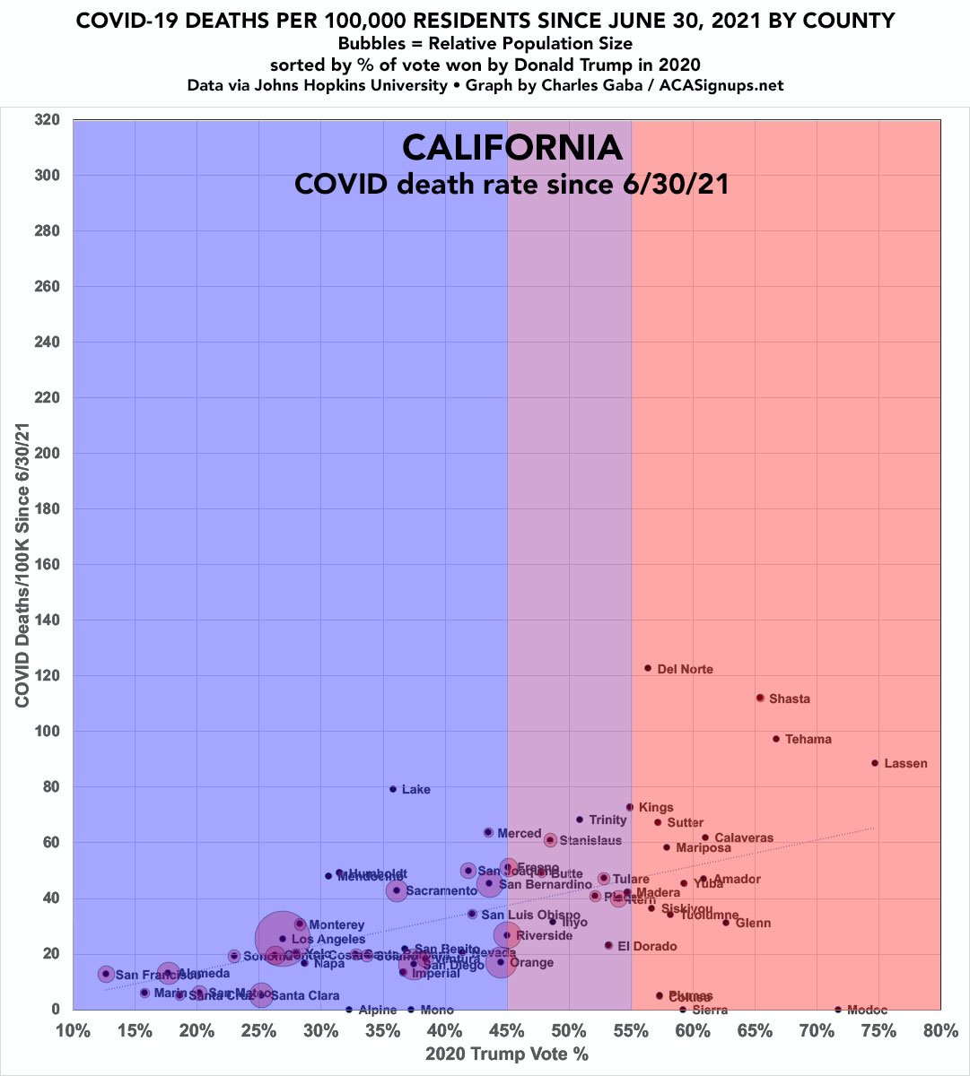
CALIFORNIA: A clear pattern on the left...and a pretty clear pattern on the right.
#GetVaxxed #GetBoosted #MaskUp
#GetVaxxed #GetBoosted #MaskUp

COLORADO. Again, aside from a few small outliers, looks like a pretty clear connection.


CONNECTICUT, DELAWARE, DC, HAWAII, RHODE ISLAND: As always, I'm lumping all 5 together because none have more than a handful of counties individually; included for completeness. Even so, there's still a slight mirror effect.


FLORIDA: As I've noted repeatedly, Miami-Dade County's *death rate* since June seems to be pretty much in line w/what I'd expect; it's their alleged *vaccination rate* which seems to be a huge outlier...likely due to "vaccine tourism."


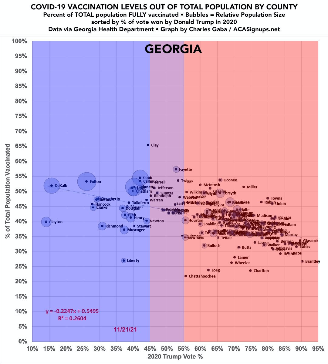
GEORGIA. The Peach State has a HUGE number of counties given its size (only Texas has more of them, but it's much larger in both population & land area).

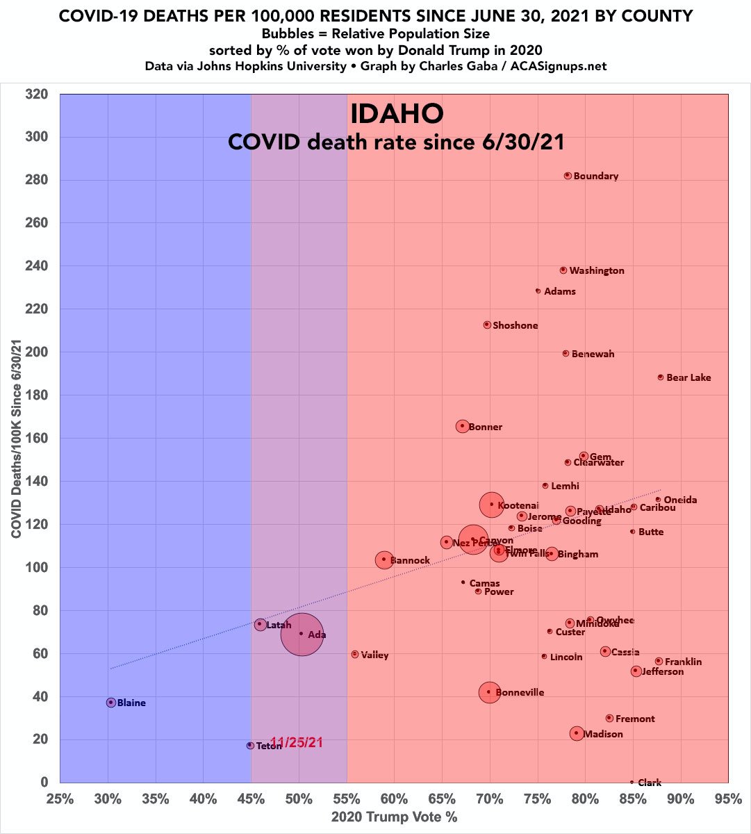
IDAHO.


INDIANA:


IOWA:


KANSAS:


KENTUCKY: Anyone starting to notice a pattern?


LOUISIANA:


MAINE: Notice how even with only a small downward slope on the left it's still matched by a similar upward slope on the right?


MARYLAND:


MASSACHUSETTS:


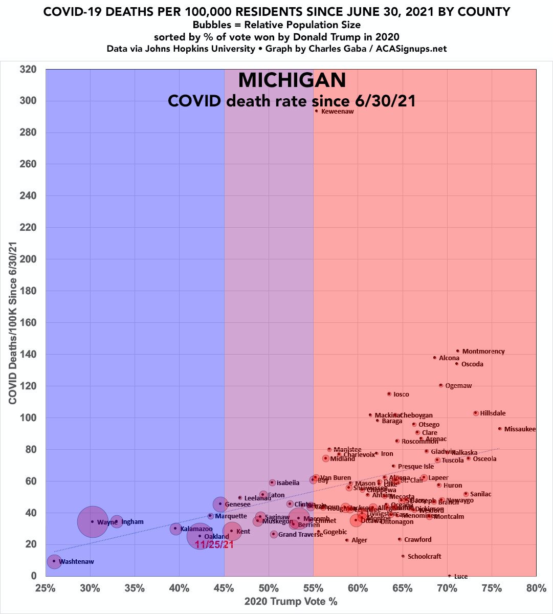
MICHIGAN (my home state). Detroit makes up nearly 40% of Wayne County.

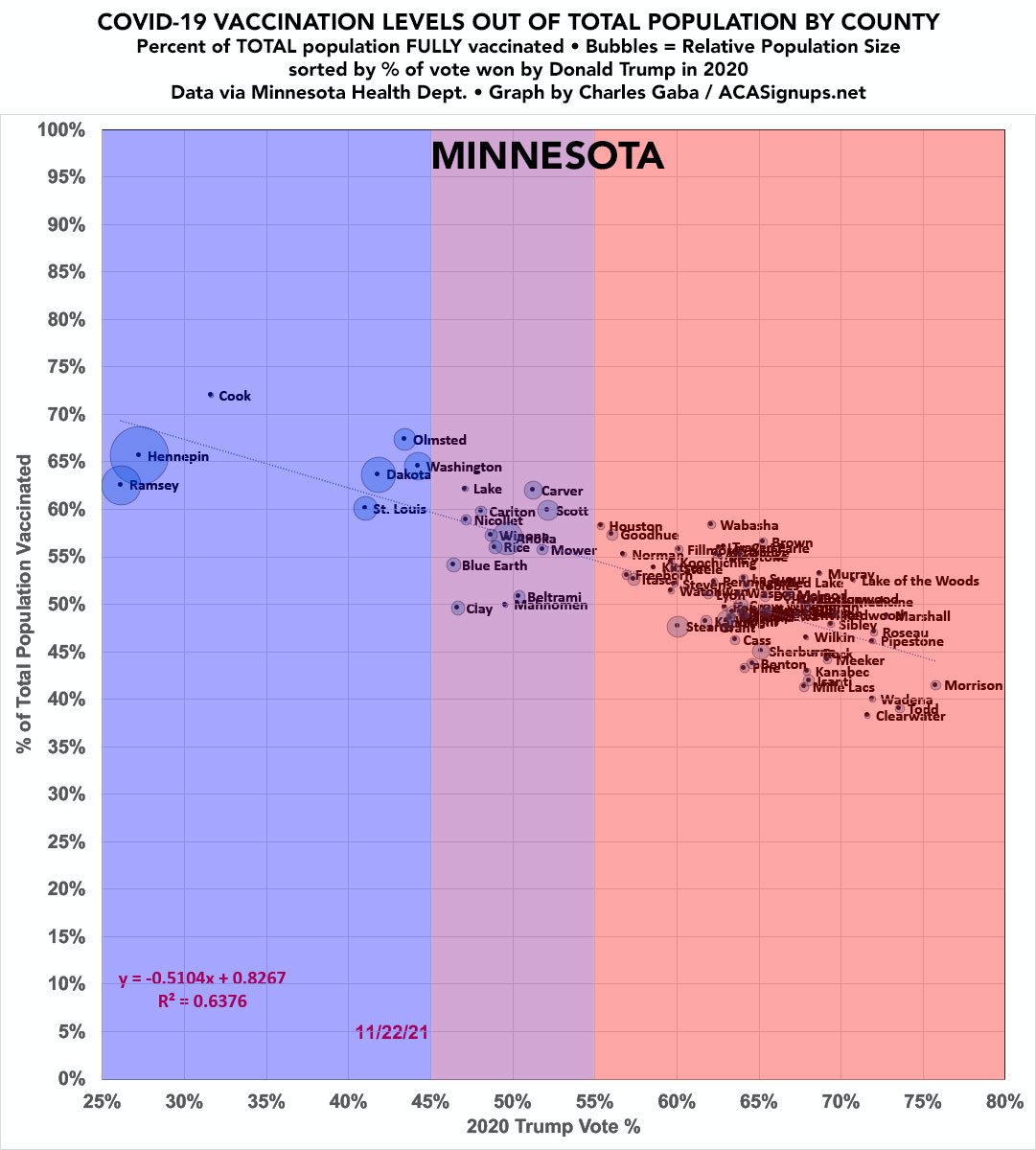
MINNESOTA:

MISSISSIPPI.
COVID has killed 1 out of every 289 Mississippi residents to date.
COVID has killed 1 out of every 289 Mississippi residents to date.


MISSOURI. Whoa. 👀


MONTANA.


NEBRASKA. The state stopped reporting ALL county-level case/death data as of 6/30; since then they've kind of/sort of started again...the NY Times has somehow managed to keep track of it:


NEVADA. Like Arizona, the bulk of Nevada's total population can be found in a single county.


NEW HAMPSHIRE. Notice how the vaccination rate line is nearly level...yet there's *still* a small upslope on the death rate. Lack of masking in the redder NH counties?


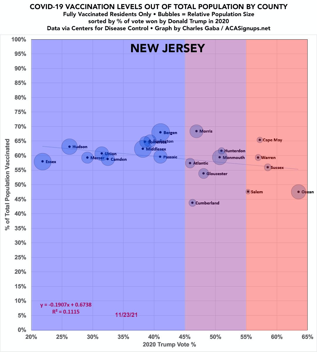
NEW JERSEY: See New Hampshire above.

NEW MEXICO.


NEW YORK. BRAVO! Check out the NYC boroughs on the right side:


The rest of the states will have to wait until later this afternoon...stay tuned!
📣 OK, I'm back...picking up again with:
NORTH CAROLINA:
NORTH CAROLINA:


NORTH DAKOTA:


OHIO. Welp.


OKLAHOMA:


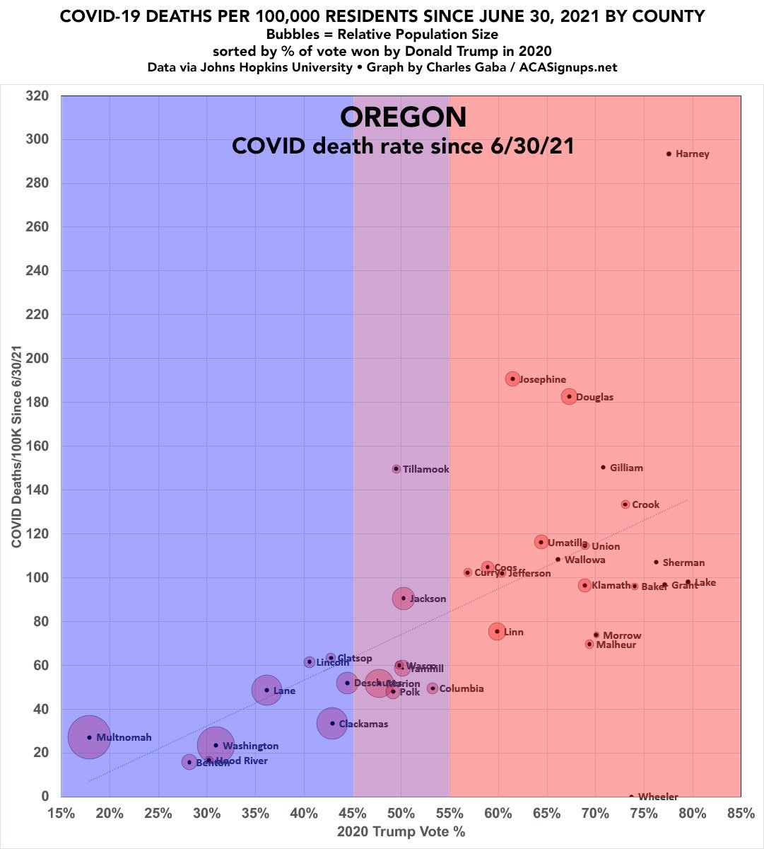
OREGON. It doesn't get any clearer than this.
(And I've been informed that the CDC data consistently has Baker County's vaxx rate way too high for some reason anyway.)
(And I've been informed that the CDC data consistently has Baker County's vaxx rate way too high for some reason anyway.)


SOUTH CAROLINA:


SOUTH DAKOTA.


TENNESSEE:


TEXAS: COVID appears to be messing with you...especially the counties which aren't getting vaccinated.


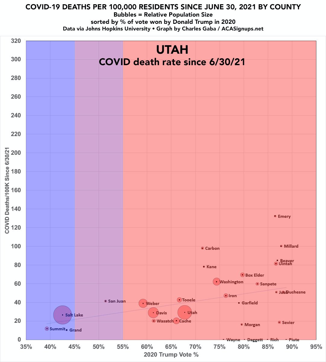
UTAH:

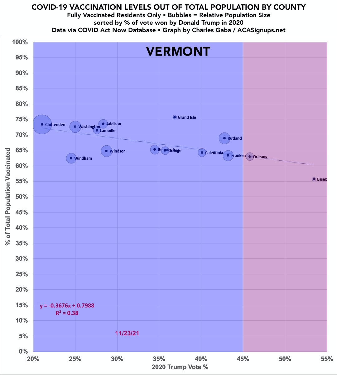
VERMONT:

VIRGINIA:


WASHINGTON STATE:


WEST VIRGINIA. At one time WV led the nation in vaccinating its population. That time is long gone; it now trails every other state *and* territory.


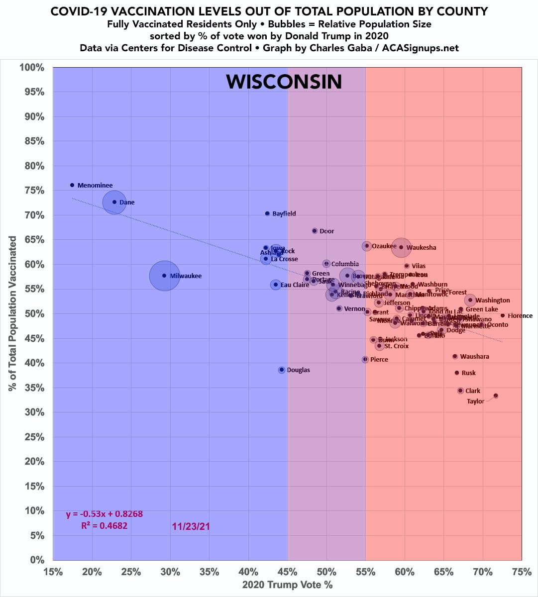
WISCONSIN:

WYOMING:


⚠️ PUT ALL 3,144 COUNTIES TOGETHER AND HERE'S AMERICA* IN ONE IMAGE:
*(50 states + DC; U.S. territories not included)
*(50 states + DC; U.S. territories not included)

If you'd like to support my work you can do so here, thank you: acasignups.net/support
P.S. for those claiming I’m “cherry-picking” by starting on 6/30/21, here’s the history since the start of the pandemic. TL; DR: yes, urban blue counties were slammed much harder in the first wave. Since then rural Red America caught up & bypassed it: acasignups.net/21/11/17/red-s…
• • •
Missing some Tweet in this thread? You can try to
force a refresh


