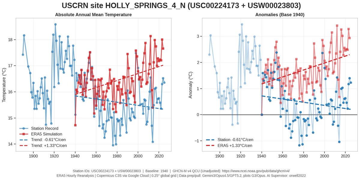
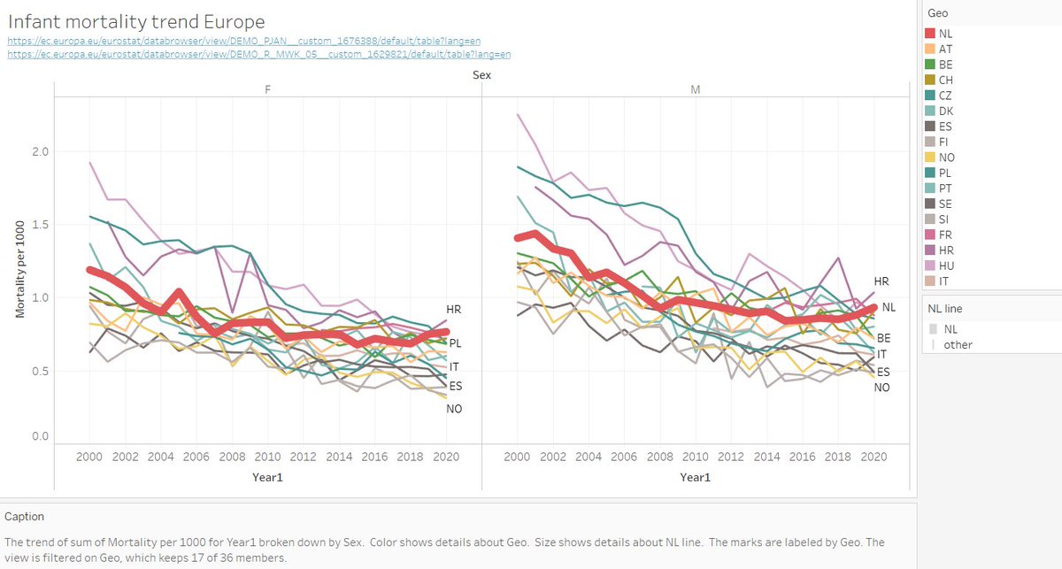
1/ Europe infant mortality trend. Let's have a look how NL compares with other peers.
Not so good.
Note that this is dominated by the 0-1 year group. But unfortunately, the population is only available by 0-5 years. So by averaging death_Y_LT5 / pop_LT5 we dilute a bit.
2/ Let's add some more countries. Romania and Bulgaria are on the way to leave NL behind.
I'm wondering what the plan is in NL @hugodejonge? Becoming the last soon?
3/ How does 2020 look like compared to peers?
4/ We can add the less rich countries.
5/ Lastly, let's see year 2000.
6/ NL doesn't seem to have the priorities right. Billions are spent in testing, hiring police and lockdown subventions instead of investing in healthcare. @RIVM_vDissel public.tableau.com/app/profile/or…
7/ Infanit mortality is dominated by the 0-1 year old. But unfortunately, mortality is only available in one 0-4 year bin while the population is available by 1 year. So by averaging death_Y_LT5 / pop_LT5 we dilute a bit. The real mortality for the 0-1 years is thefore ~4-5x.
A +14 W/m² total solar increase over 50 years is realistic. Japan alone shows +20 W/m². That’s 10× larger than the minuscule additional CO₂ forcing (~1W). And nearly 50× greater than the impact of sunspot cycles (±0.5 W).
Japan has one of the best measurement data. The analysis is clear. The brightening amount to almost 20 W. That is a lot. But the main and dominant effect is still urbanization, which makes up to 6°.
Link 1: the brightening. It explains why the climate scam likes to start in the maximum smog dimming period of 1970. It is a shameless bad faith deception. The effect is ball part of +1°C. In dry areas up to 3°C.
UAH is a model inference, not a measurement. It can’t be tested, yet many treat it like real raw. Calling that a ‘measurement’ is wrong. Neither Lindzen nor us take it seriously. It starts in a cold period, with no long-term data — adjusted, multi mission stitched SW composite.🚮
UAH is not measurement — it’s model-driven inference. Satellites detect radiance, not temperature. The ‘trend’ is built through weighting functions, drift corrections, and stitched instruments. It’s untestable, synthetic, and not suitable for long-term climate baselines.
It’s astonishing how confidently some treat satellite-based inferences as god in heaven like truth. These are SW model outputs, not reliable measurements. Treating them as accurate fact is scientifically indefensible. If you do so, expect your credibility to be challenged.
London is glowing today. Wide urban heat plume. Not “climate change.” Just real estate and concrete. The effect is visible. Quantifiable. Known. This should be a good study day to quantify UHI in more detail once the IR satellite pictures come in.
2/ We start low tech. Actually nothing more is needed. There is over 6°C urban heat. It's embarrassing to pretend today's 33°C are comparable to 100 years ago. Subtract 6–8°C for UHI and you get... 25–27°C. Welcome back to reality.
3/ Nighttime, Tmin. Watch how they flatten the colors. You’re not supposed to notice the 7°C UHI. We unflatten the colors. Look again: you see it now?
We can also do from SE raw. And we can also show how rural stations look. Frederik does like them. Climate agenda is measured in downtowns of the capitals?
Not sure if it’s normal that amateurs now have to lecture academics…?
The downtown station logs hourly=no need for even Ekholm, no need for re-sampling. Does Frederik even know what we mean? Nothing is adjusted. Also PHA leaves it as is as it only detects breakpoints (not UHI).
Yes. Hausfather & Berkeley Earth are pushing it.
But it’s not a measurement. Not one station shows that.
It’s what you get when you aggregate rot over time.
On the left: 8 pristine USCRN sites. Same y-scale.
Now look what they did.👇
2/ Was wir hier sehen: Die Datenreihe ist ein Komposit (sehr beliebt, wenig seroes, in der Klima-„Wissenschaft“).
Die Messmethode (und mehr) hat sich verändert – von analogen zu digitalen Sensoren. Die Entropie der Nachkommastellen zeigt das – deutlich.