Anti-vaxxers have been going wild over this paper from several HART members. But it misses a blindingly obvious explanation for the odd looking ONS data, ignores the data definitions, then manipulates the data to falsely claim the vaccines cause a (non-existent) spike in deaths!
https://twitter.com/MartinNeil9/status/1466814347762671628
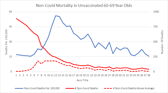
The data oddity that caught their eyes is a bump in deaths per 100,000 in unvaccinated people in each age group, soon after that group starts being vaccinated.
But as the overall mortality rates show, there is NO spike in deaths during the vaccine rollout.
So what's going on?

But as the overall mortality rates show, there is NO spike in deaths during the vaccine rollout.
So what's going on?


The paper's authors wrongly believe the vaccines are killing us, so they present the data like this.
I replicated this graph from the raw ONS data, and it is correct. BUT it has an obvious explanation that doesn't involve claiming the ONS is deliberately miscategorising deaths!
I replicated this graph from the raw ONS data, and it is correct. BUT it has an obvious explanation that doesn't involve claiming the ONS is deliberately miscategorising deaths!

Let's plot that graph another way. Instead of looking at the % of people in the 60-69 age group who were vaccinated each week, let's look at the % of them who are still in the unvaccinated group at the end of each week.
Here it is for 1st doses. Can you see what's going on yet?
Here it is for 1st doses. Can you see what's going on yet?

It's even clearer for 2nd doses.
When death rates in each age group peak, the population that's taking place in is small.
Death rates in unvaccinated 60-69 year olds peaked when only 8.3% of people in that age group were unvaccinated.
For single dosed people it's 2.5% or less!
When death rates in each age group peak, the population that's taking place in is small.
Death rates in unvaccinated 60-69 year olds peaked when only 8.3% of people in that age group were unvaccinated.
For single dosed people it's 2.5% or less!

This is a relatively small and unrepresentative group, which will be biased towards people who were too ill to get vaccinated at the time.
Which probably explains why their death rates appear higher. Just 180 "extra" deaths a week produces that huge bump in death rates.
Which probably explains why their death rates appear higher. Just 180 "extra" deaths a week produces that huge bump in death rates.

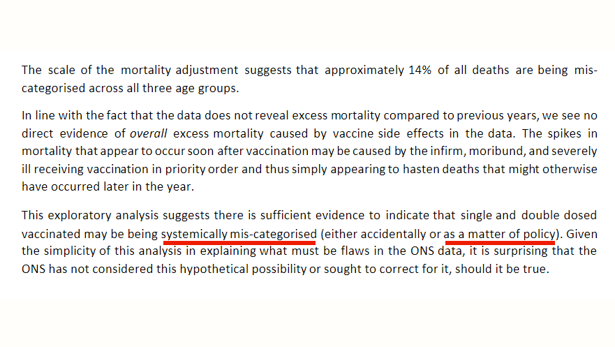
Of course, HART instead assume the data is faulty, and (having failed to read the data definitions, as usual) conclude that the vaccination status of people who die is systematically miscategorised.
In fact, the definitions show the categories do exactly what it says on the tin:

In fact, the definitions show the categories do exactly what it says on the tin:


HART then go a step further though. This has Joel Smalley’s grubby fingerprints all over it, as it creates a completely artificial baseline that assumes people die at a constant rate all year (!), and arbitrarily assigns every "excess" death in the unvaccinated to the vaccinated! 

This produces an alarming looking graph that claims there's a HUGE spike in non-covid death rates immediately after vaccination.
Which is, of course, complete and utter nonsense. Absolutely nothing in the ONS data they're using supports this false claim.
Which is, of course, complete and utter nonsense. Absolutely nothing in the ONS data they're using supports this false claim.

In fact, using the method described in the paper, I can't replicate this graph. If I conveniently ignore any negative "excess" deaths it generates, I get a close match up to about week 12, but after that they do something else to the data that isn't described in the paper. 🤔 

Regardless, if you look at the REAL overall non-covid death rate for all people in this age group (the black line in my graph below), you can see there are NO spikes, even though the individual subpopulations (due to selection bias) go up and down dramatically.
No excess deaths.
No excess deaths.

Once again, Joel Smalley has conjured up non-existent excess deaths by creating a fake baseline and then manipulating the data to give the answer he wants.
This is far from the first time he's done this. Why do @MartinNeil9 & @profnfenton work with him?
This is far from the first time he's done this. Why do @MartinNeil9 & @profnfenton work with him?
https://twitter.com/_johnbye/status/1365650853252771843?t=DZh9r29BTRjHfMEmWcqrDQ&s=19
Having missed an obvious explanation for a data oddity and fabricated data to fit their anti-vax narrative, the authors then accuse the ONS of systematically miscategorising deaths based on vaccination status, possibly "as a matter of policy"!
It's real tin foil hat level stuff.
It's real tin foil hat level stuff.

It's a puzzle that @qmul continue to ignore @MartinNeil9 and @profnfenton's increasingly blatant anti-vax output and links to cranks and conspiracy nuts.
At this point they're either deliberately misleading people or just plain incompetent.
Neither is a good look for academics.
At this point they're either deliberately misleading people or just plain incompetent.
Neither is a good look for academics.
PS: they also claim the ONS's population data is wrong.
But as the paper says, "populations move between age groups as people have birthdays".
They forgot that this includes people who turned 10, who are then added to the data.
This process ends 10 years after the 2011 census:
But as the paper says, "populations move between age groups as people have birthdays".
They forgot that this includes people who turned 10, who are then added to the data.
This process ends 10 years after the 2011 census:

• • •
Missing some Tweet in this thread? You can try to
force a refresh


