
Why does everything feel like the world is falling apart, yet the stock market has looked like this since 2009?
Well, here's a thread w/ some interesting charts that will help you understand: what you see is NOT what you get.
1/
Well, here's a thread w/ some interesting charts that will help you understand: what you see is NOT what you get.
1/

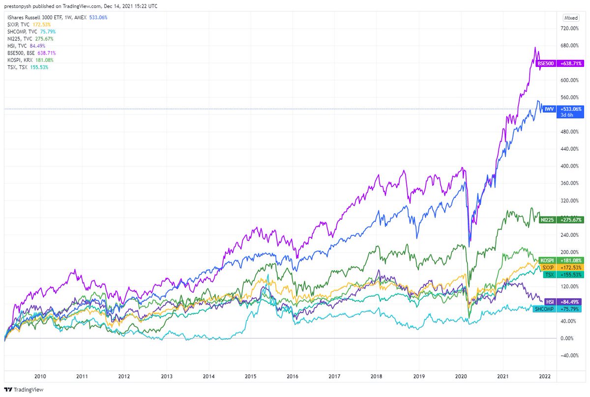
Let's start by looking at how the major stock indexes around the world have recovered since 2009.
Shown below, in the order they appear on the chart:
India 638%
USA 533%
Japan 275%
Korea 181%
Europe 172%
Canada 155%
Hong Kong 84%
China 75%
But...
Shown below, in the order they appear on the chart:
India 638%
USA 533%
Japan 275%
Korea 181%
Europe 172%
Canada 155%
Hong Kong 84%
China 75%
But...
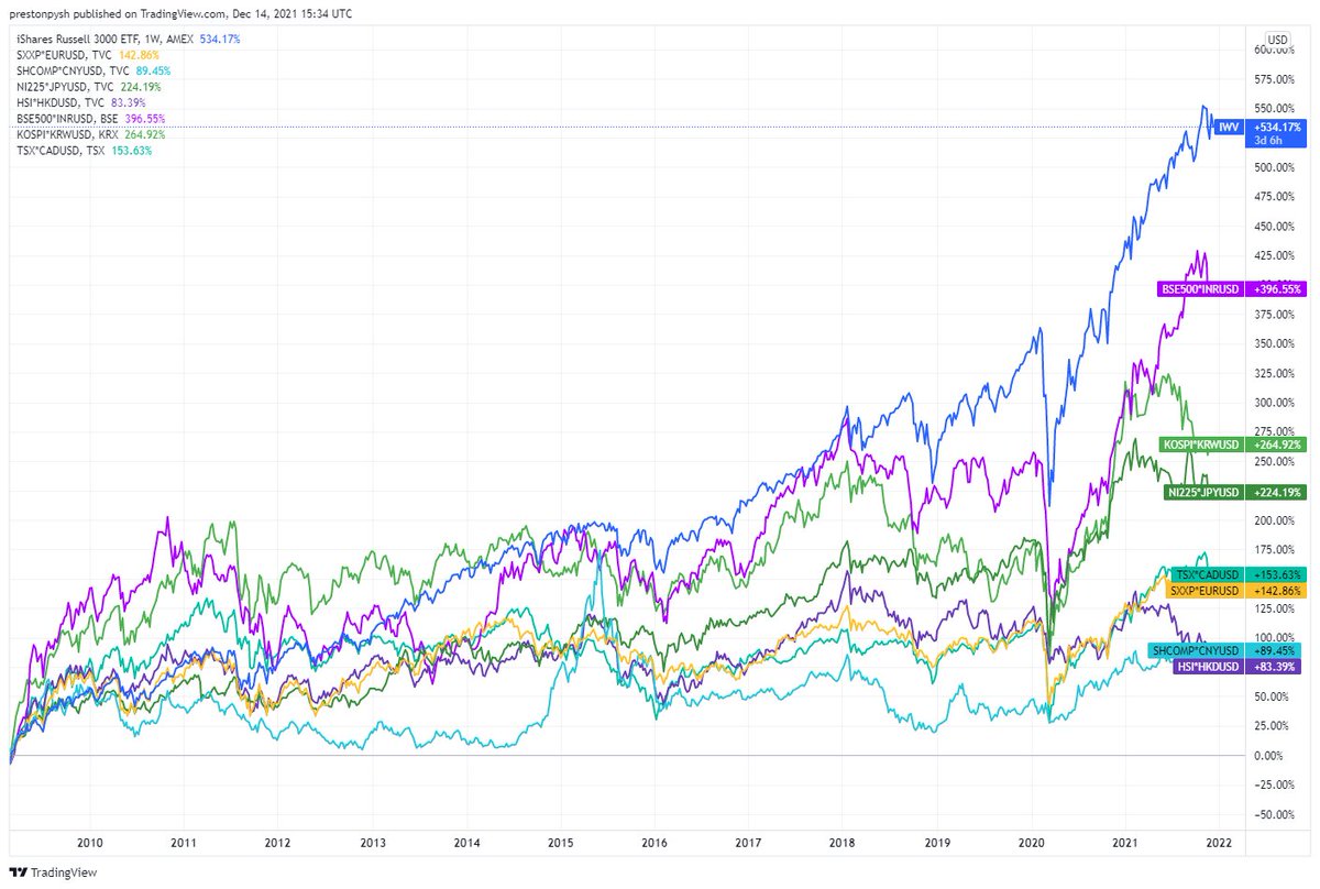
Those were different currencies. This chart now standardized for a common currency (USD). So, here's the same chart, but with every index in dollar terms.
USA 533%
India 396%
Korea 264%
Japan 224%
Canada 153%
Europe 142%
China 89%
Hong Kong 83%
But...
USA 533%
India 396%
Korea 264%
Japan 224%
Canada 153%
Europe 142%
China 89%
Hong Kong 83%
But...
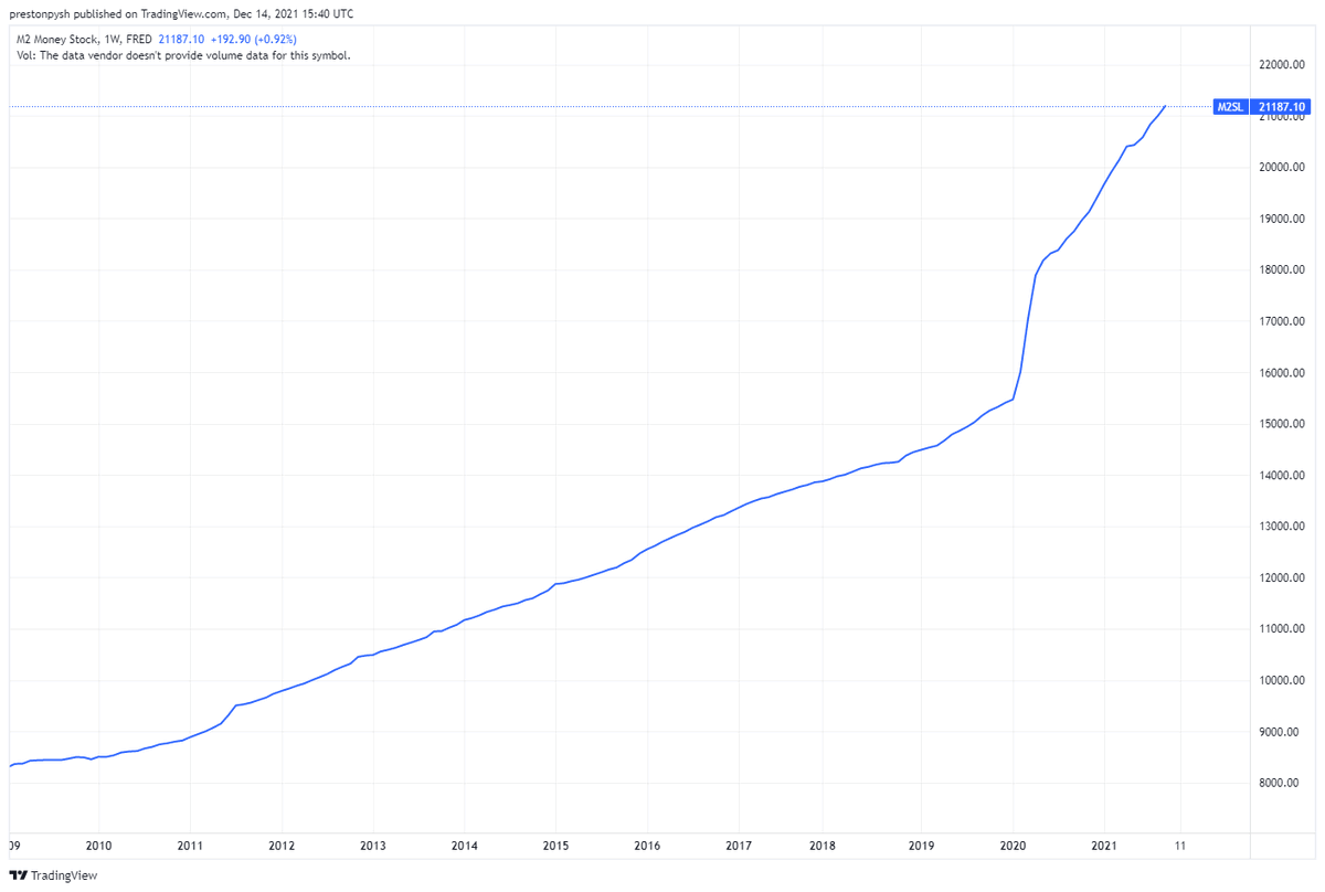
Now that we have everything in dollar terms, what if the dollar itself is also changing over time? For instance, if we look at the M2 currency supply, how has it changed since 2009. Well, below is a chart of the M2 currency supply debasing (growing in supply) since 2009. So...
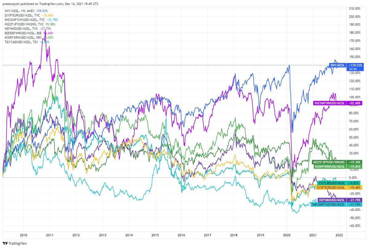
What would that make the chart look like if we adjust for M2? Well here it is: global indexes, converted into dollars, and normalized for M2.
USA 139%
India 92%
Japan 19%
Korea 19%
Canada -6%
Europe -10%
Hong Kong -27%
China -31%
So....
USA 139%
India 92%
Japan 19%
Korea 19%
Canada -6%
Europe -10%
Hong Kong -27%
China -31%
So....
All those lines can make it hard to understand which indexes are REALLY driving the markets. Can we market weight each line so it represents it's share of the overall economy? For instance, look at this chart from 2018 with the proportional sizes of each of these indexes...
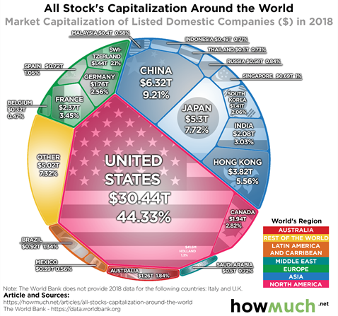
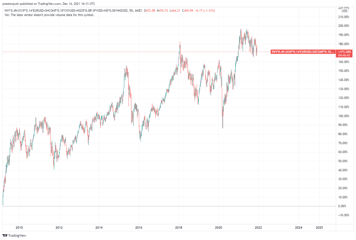
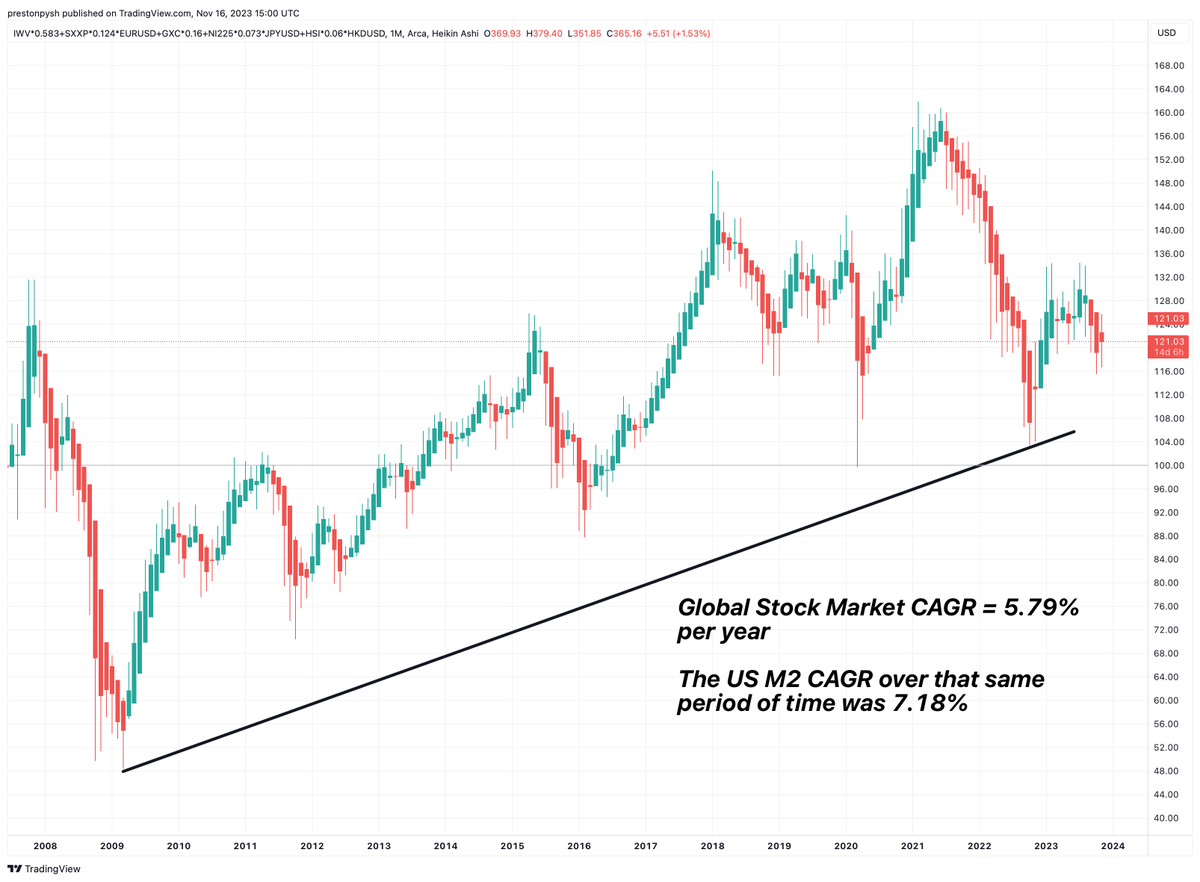
Well, we can. Below is a consolidation of the top 80% of global indexes into a single line, market weighted for the size it represents in the global economy (all in USD terms). As you can see, the global market is up 171%.
But...
But...
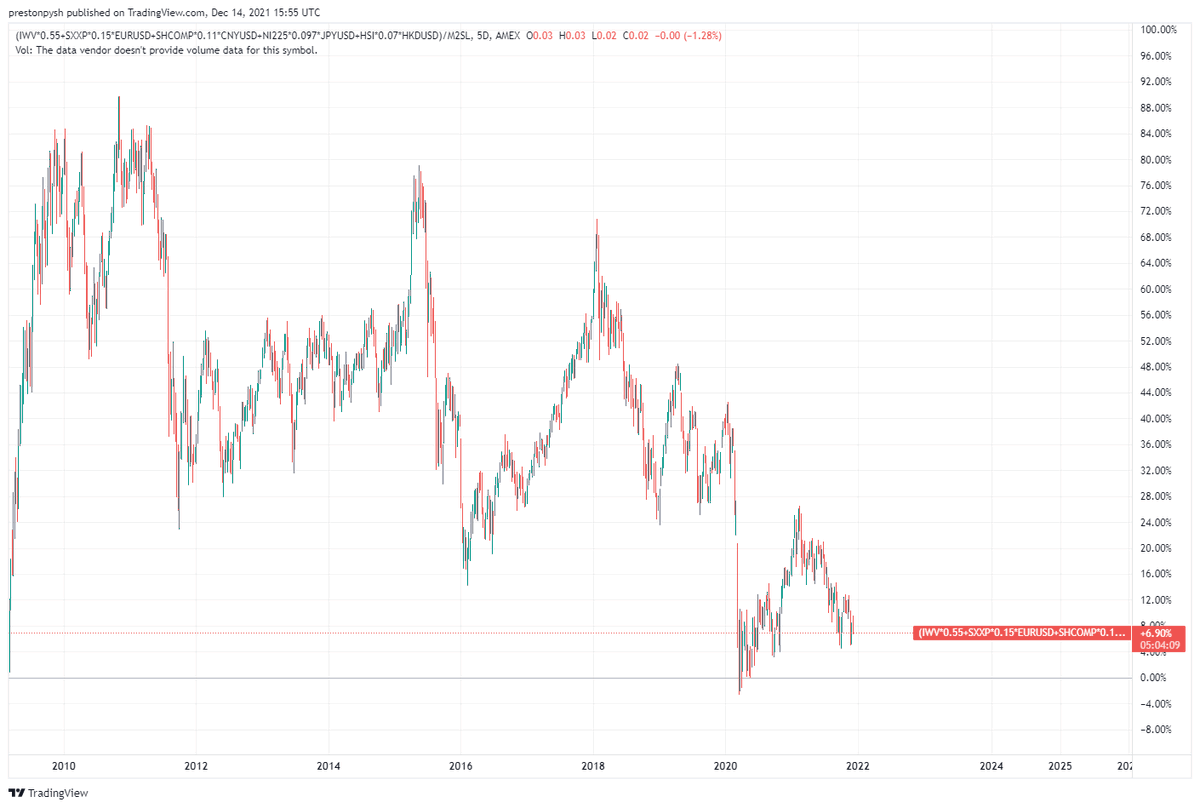
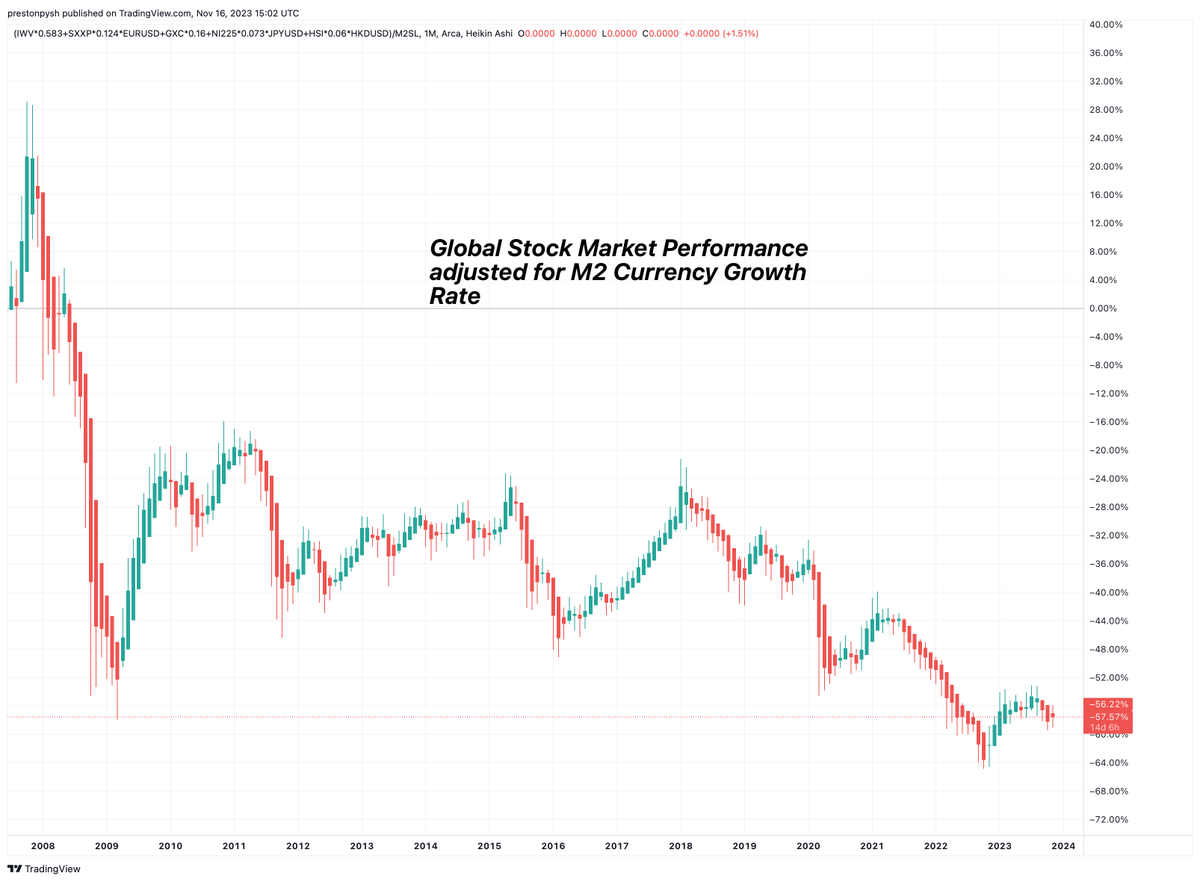
Let's not forget to adjust that consolidated global chart and account for dollar debasement (M2 money supply growth). Oh, here's THAT chart.
up...6.9%.....Since the 2009 bottom - 12 years ago.
So what's the point?
up...6.9%.....Since the 2009 bottom - 12 years ago.
So what's the point?
The point is this. Central banks are trying to do everything possible to keep the global economy afloat. Through their constant manipulation of the currency supply, they are obliterating the middle class & adding immeasurable systematic risk to the system. These actions...
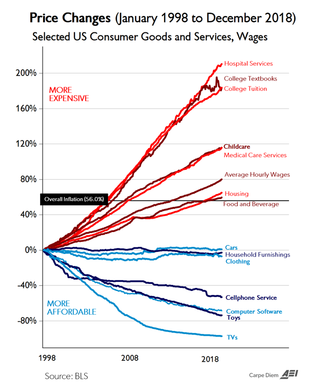
are pushing more and more equity into the hands of the few while causing the rest to go deeper into debt, while owning nothing that generates free cash flow. The prices of any labor intensive service keeps skyrocketing because of these manipulative policies (BTW old chart below)
So what can you expect? Volatility. And lots of it. And if you think it'll be predictable, good luck. Predicting cascading credit impairment is akin to predicting avalanches (complex systems). I own #Bitcoin because it's the one thing they can't manipulate or control.
Remember it's not about nominal fiat gains. It's about protection and growing buying power. If there's one thing I'm confident of, it is this: the manipulative actions of central banks will continue to accelerate and fiat debasement will keep getting worse. Plan accordingly.
**Update To Thread**
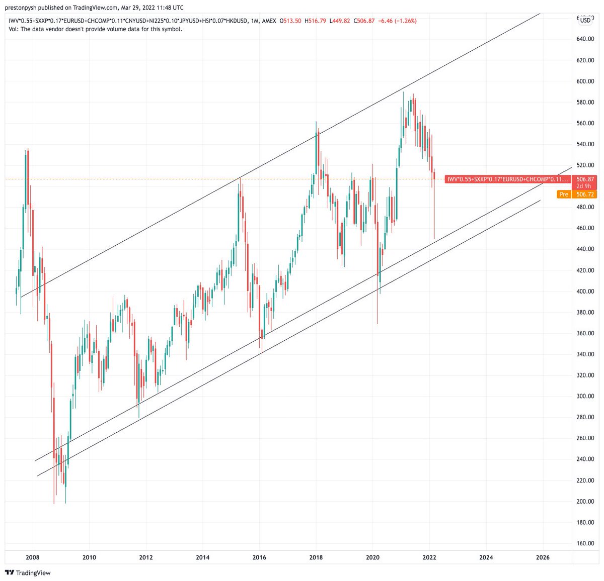
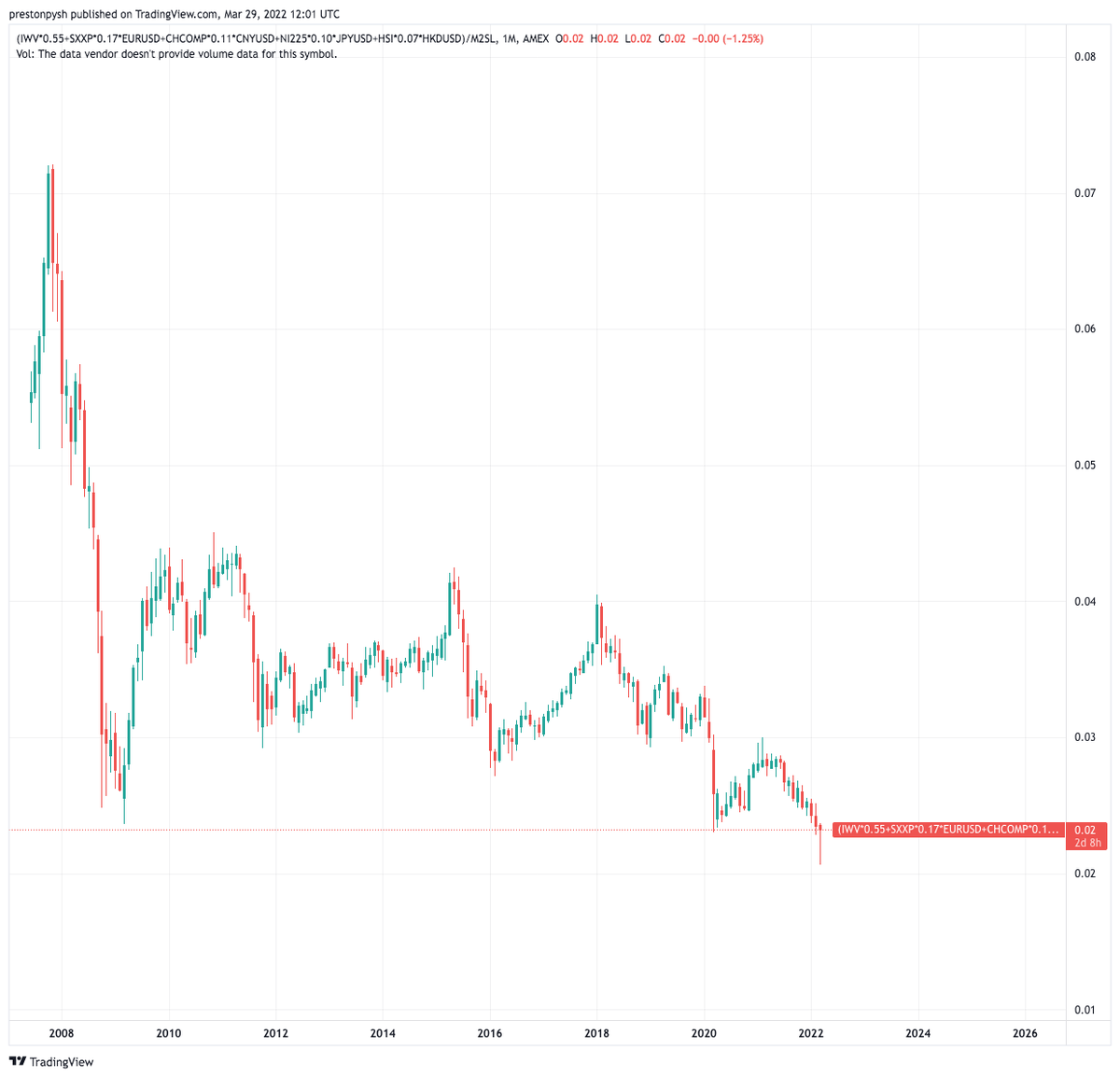
Here are all the major global stock markets (in USD terms) combined into a single chart & weighted for their relative size. The second chart is the same thing but normalized for the growth in the M2 currency supply.
Check out that current monthly bar!
Here are all the major global stock markets (in USD terms) combined into a single chart & weighted for their relative size. The second chart is the same thing but normalized for the growth in the M2 currency supply.
Check out that current monthly bar!
**Update To Thread**
Here are all the major global stock markets (in USD terms) combined into a single chart & weighted for their relative size. The second chart is the same thing but normalized for the growth in the M2 currency supply.
Here are all the major global stock markets (in USD terms) combined into a single chart & weighted for their relative size. The second chart is the same thing but normalized for the growth in the M2 currency supply.
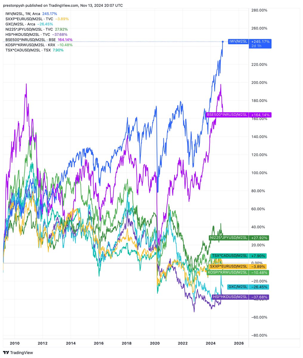
**Update to Thread from 2021**
Global Stock Market Performance since 2009 after adjusting for Global M2 currency debasement.
USA 245%
India 164%
Japan 28%
Korea -10% (29% worse than in 2021)
Canada 8%
Europe -4%
Hong Kong -38% (11% worse than in 2021)
China -26%
Global Stock Market Performance since 2009 after adjusting for Global M2 currency debasement.
USA 245%
India 164%
Japan 28%
Korea -10% (29% worse than in 2021)
Canada 8%
Europe -4%
Hong Kong -38% (11% worse than in 2021)
China -26%
• • •
Missing some Tweet in this thread? You can try to
force a refresh


