1/ ASMR: A closer look on the Balkan.
Age adjusted seasonal mortality ranking over 3 years.
Reminder: Displayed are 3 flu seasons, not calendar years.
2018: 1.7.2018-30.6.2019
2019: 1.7.2019-30.6.2020
2020: 1.7.2012-30.6.2021
Age adjusted seasonal mortality ranking over 3 years.
Reminder: Displayed are 3 flu seasons, not calendar years.
2018: 1.7.2018-30.6.2019
2019: 1.7.2019-30.6.2020
2020: 1.7.2012-30.6.2021
https://twitter.com/orwell2022/status/1473674830444650502

2/ All of the Balkan countries show the spike in season 2020, so July 2020 - June 2021.
Interesting.
We may need to expand on the hypothesis laid out by @hmatejx to understand this as Croatia really isn't known for having done hard lockdowns like the Slovenian neighbours.
Interesting.
We may need to expand on the hypothesis laid out by @hmatejx to understand this as Croatia really isn't known for having done hard lockdowns like the Slovenian neighbours.

3/ This is how 2021 (weeks 1-43) currently ranks.

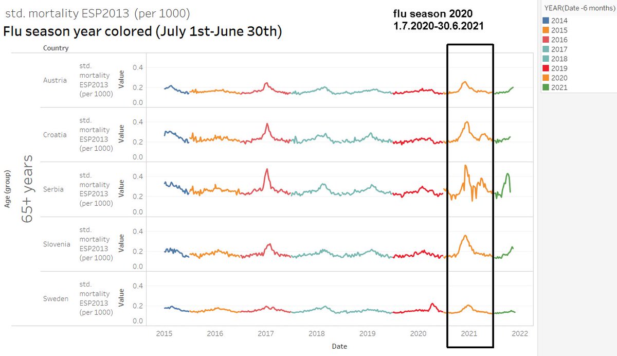
4/ A look on the raw data. We can see here, how all of the Balkan countries and Austria were hit (root cause tbd.) in the 2nd winter season.

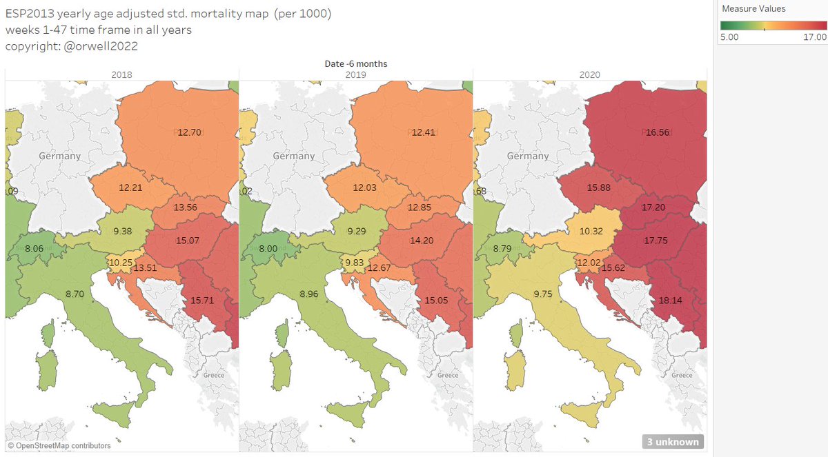
5/ Now adjusted seasonal ASMR mortality maps over 3 years.
Displayed are 3 flu seasons.
2018: 1.7.2018-30.6.2019
2019: 1.7.2019-30.6.2020
2020: 1.7.2012-30.6.2021
We need to understand this. Ideas?
Smoking? Habits? Genetics? Or just GDP per capita?
Displayed are 3 flu seasons.
2018: 1.7.2018-30.6.2019
2019: 1.7.2019-30.6.2020
2020: 1.7.2012-30.6.2021
We need to understand this. Ideas?
Smoking? Habits? Genetics? Or just GDP per capita?

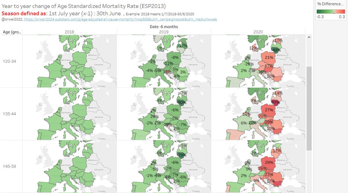
6/ A closer look to the Slavic countries on a relative season to season change. This level of Y2Y ASMR change is significant.

7/ East Europe by age group now.
This is interesting. The excess goes through all age groups it seems.
Note: red colors start above +7%.
This is interesting. The excess goes through all age groups it seems.
Note: red colors start above +7%.

• • •
Missing some Tweet in this thread? You can try to
force a refresh