How fast will #Omicron drop after peaking? Turns out, it's not so obvious. A thread on the shape of epidemics. 1/25 

You might think that if an epidemic curve goes up quickly, then it will come down quickly. We (@LHDnets, @all_are, & me) did too. And, it can! For example, replacing sick workers can drive accelerating disease spread and decline. 2/25 nature.com/articles/nphys… 

Our intuition is that this worker replacement effect is a BIG deal for the isolation time debate. The tl;dr of the @NaturePhysics paper above is that the local social network matters A LOT & how exactly we replace workers matters A LOT. More soon on this. 3/25 

But wait, why did I say epidemic "curve" instead of just epidemic🤔🤔🤔 4/25
Why? Because there are LOTS of "things" that can make an epidemic curve go up faster and not all of them tell you how fast the disease is really spreading. We (@LHDnets, @_jgyou, & I) studied this using complex contagions (don't worry, I'll explain). 5/25 nature.com/articles/s4156… 

Simple vs. complex contagions: We think most biological pathogens (we're looking at you SARS-CoV-2) are simple; meaning, if you're talking with someone and they have #COVID19 the chance you get infected only depends on whether you're susceptible and they're infectious. 6/25
Just because something is "simple" does not mean it isn't complicated. And many things that are quite complicated are not complex. 7/25
So what's a complex contagion? We think these most often show up in social media. The chance that my mom (@ScarpinoBetty) finally starts playing Wordle depends on whether I'm playing Wordle, and on how many of her other social contacts are playing. Hold on, there's more... 8/25
Importantly, we need the probability that my mom starts playing Wordle to "stats-speak" depend on the number of her social connections that are playing. The simplest (sorry) model is that she plays Wordle with Pr=0 if <5 of her friends are playing & Pr=1 if >=5 are playing. 9/25
The model I just described is very nearly what social and network scientists call the "voter" model. 10/25
Ok, what does this have to do with #Omicron??? Well, it turns out that one reason an epidemic *curve* might go up quickly is because testing is biased, meaning our data are biased. And we for sure know testing is biased right now. 11/25
https://twitter.com/svscarpino/status/1473694784590172164?s=20
The epidemic curve we "see" is a reflection of testing. Slow testing early, followed by rampant testing later, can cause what that looks like *explosive* growth. When testing is better later, we "see" more cases and the epidemic seems to last longer. 12/25
https://twitter.com/svscarpino/status/1472708907772657667?s=20
It turns out that we can model this weird testing process using a complex contagion model even if the underlying disease itself is "simple." For the epistemologists in the room, yes this does keep me up at night. 13/25
But, I don't think this is really what's going on. Yes, testing is biasing our data and yes we're forcing teachers back to work before they're fully recovered, but I'm guessing these aren't the main effects. Here's why I'm really worried cases might not drop very fast. 14/25
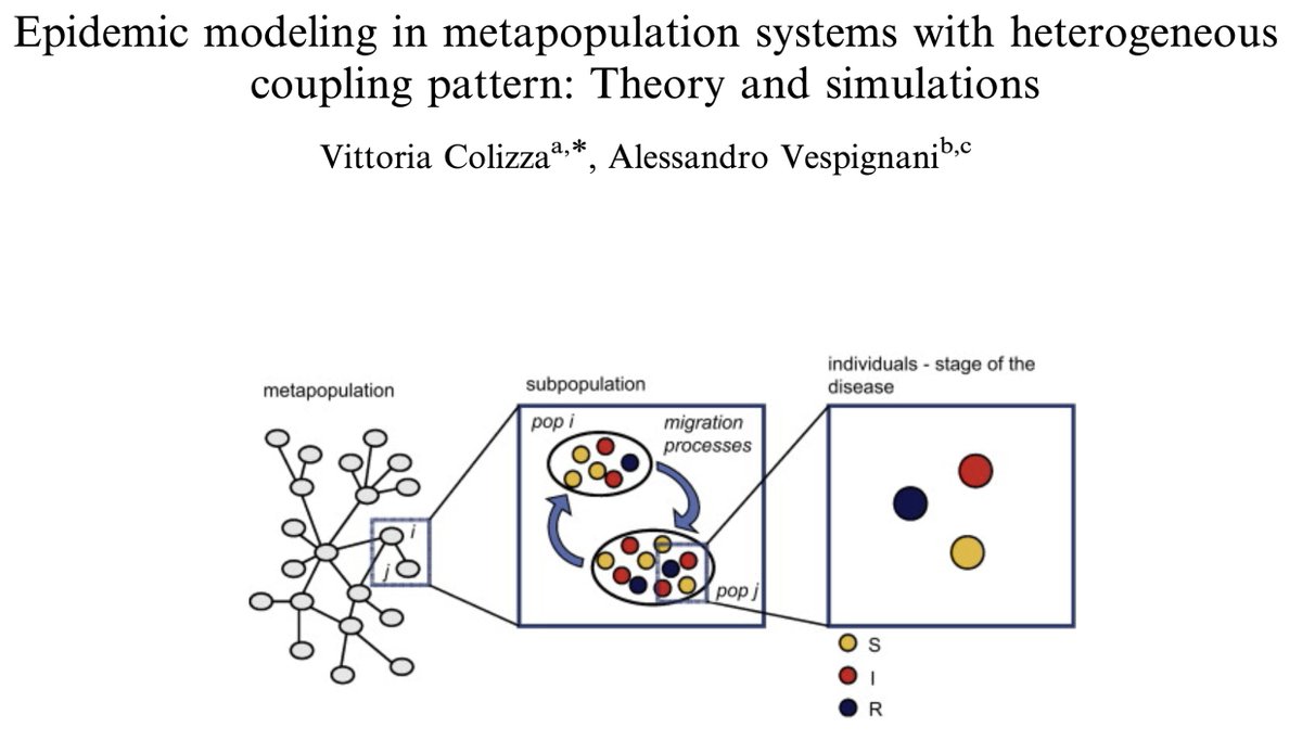
There's a second way epidemics can be complex (this is work pioneered by scientists like @alexvespi, @vcolizza, @alainbarrat, @peterdodds, @duncanjwatts, Prof. Lisa Sattenspiel, and colleagues). We live in a network of inter-connected cities & towns, termed metapopulations. 15/25 

In such a meta-populations, epidemics can surge in the mega-cities, spill over into the suburban areas, eventually reach rural towns, and repeat, and repeat, and repeat. 16/25 


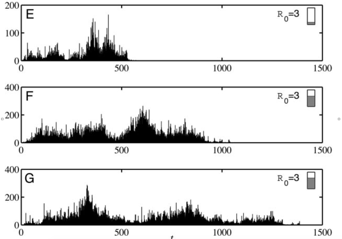
Close your eyes... think of 100 (mostly) separate epidemics happening in neighborhoods across New York City. Now imagine we pile all those curves on top of each other (as one does with most epi data). 17/25
The result will be a huge increase in cases as the most densely populated neighborhoods spike, followed by a long trailing wave of cases across the less dense neighborhoods. Now, scale this up to NY State, the US, the globe! 18/25
We (@MOUGK and me et al.) showed that the structure of our societies matter immensely for #COVID19 epidemic curves and lead to different shaped epidemics in urban vs. rural areas. 19/25 nature.com/articles/s4159…
In one of my favorite papers, Profs. Lisa Sattenspiel and D. Ann Herring, show a similar effect during the 1918 flu pandemic using log book data from the Hudson's Bay Company in Canada. 20/25 jstor.org/stable/41465622 

All these shifting "models" and aggregated data and general complexity is what led @lordgrilo and me to write a paper showing there are hard limits to outbreak forecasting. Luckily these limits are almost always weeks or months into the future. 21/25 nature.com/articles/s4146…
Ok, let's bring this home. We know #Omicron is spreading like a rocket. But, we also know that data get aggregated into states and countries. This means most of the signal is driven by whichever cities are experiencing the biggest outbreaks (e.g., NYC or London). 22/25
In the US, the big east coast cities will peak this week or next. We will then see a big drop in cases. However, other parts of the US that experience all contagions later (from fashion in Indiana to #Omicron in Oklahoma) will still be going up. 23/25
https://twitter.com/svscarpino/status/1481249265741672450?s=20
The result will be a much slower drop off in the number of cases than we would expect given the sharp rise. This is what's happening in South Africa :sigh: 24/25 

The take home? We need locally relevant data, in real-time. And, we need these data to inform decision makers, from nations to neighborhoods. Or said differently, this problem is why I joined @RickABright, @PPI_Insights, and @RockefellerFdn 25/25
https://twitter.com/RockefellerFdn/status/1481028049428783104?s=20
• • •
Missing some Tweet in this thread? You can try to
force a refresh


