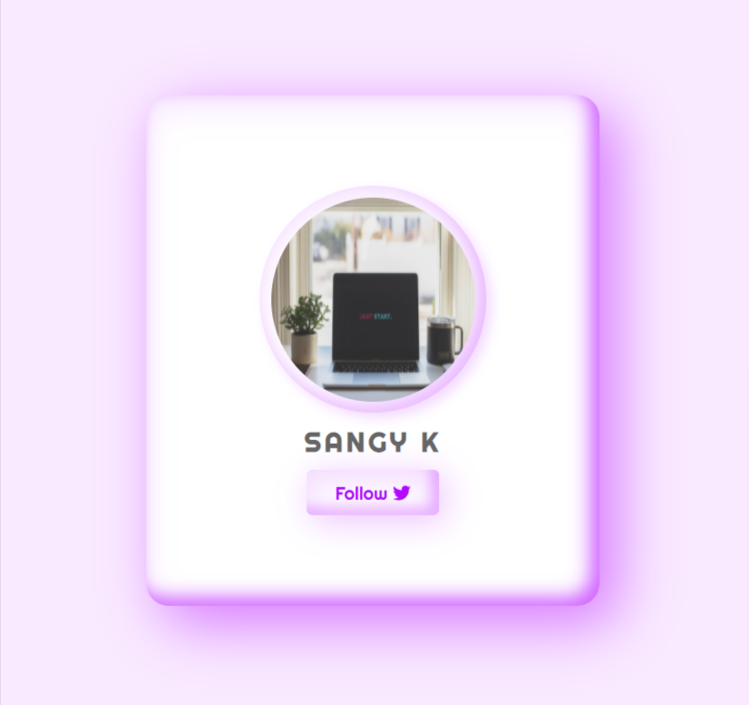
⚡ How to create a Claymorphism CSS Card, a new CSS Trend in 2022 🌄🔥🔥
#100DaysOfCode #Developer #design #CSS3
👇
#100DaysOfCode #Developer #design #CSS3
👇

Claymorphism can be
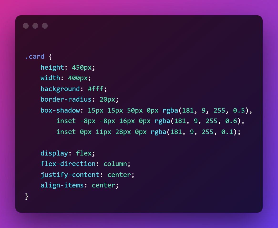
✅ created using a combination of inner and outer shadows
✅ create more depth against the background using one large shadow
✅two inner shadows giving a 3d effect
👉one corner lighter shadow,
👉diagonally opposite is a darker shadow
✅ created using a combination of inner and outer shadows
✅ create more depth against the background using one large shadow
✅two inner shadows giving a 3d effect
👉one corner lighter shadow,
👉diagonally opposite is a darker shadow
📌 CSS
➡ 2 colours, light pastel colours produces a great claymorphic effect.
➡ lighter background so that the depth is clearly visible - RGB(249, 234, 255)
➡ border-radius to give more 3d kind of effect

➡ 2 colours, light pastel colours produces a great claymorphic effect.
➡ lighter background so that the depth is clearly visible - RGB(249, 234, 255)
➡ border-radius to give more 3d kind of effect


➡ Use the same colour for both inner and outer shadow.
➡ Outer shadow should be darker than an inner shadow to give the depth
➡ Inner shadow - reduce the alpha value for lighter tones
➡ Outer shadow should be darker than an inner shadow to give the depth
➡ Inner shadow - reduce the alpha value for lighter tones
➡ Add Styles to image, text and link.
➡ Add shadows to them to get a more clay-like 3d effect
⚡ Full Code,


➡ Add shadows to them to get a more clay-like 3d effect
⚡ Full Code,


🔥 That's it! We have created a claymorphic 3d card
⚡ Follow @sangyk_dev for more web dev content
🥂 Retweet the first tweet to inspire others.
⚡ Follow @sangyk_dev for more web dev content
🥂 Retweet the first tweet to inspire others.
https://twitter.com/sangyk_dev/status/1484192038317096960
• • •
Missing some Tweet in this thread? You can try to
force a refresh


