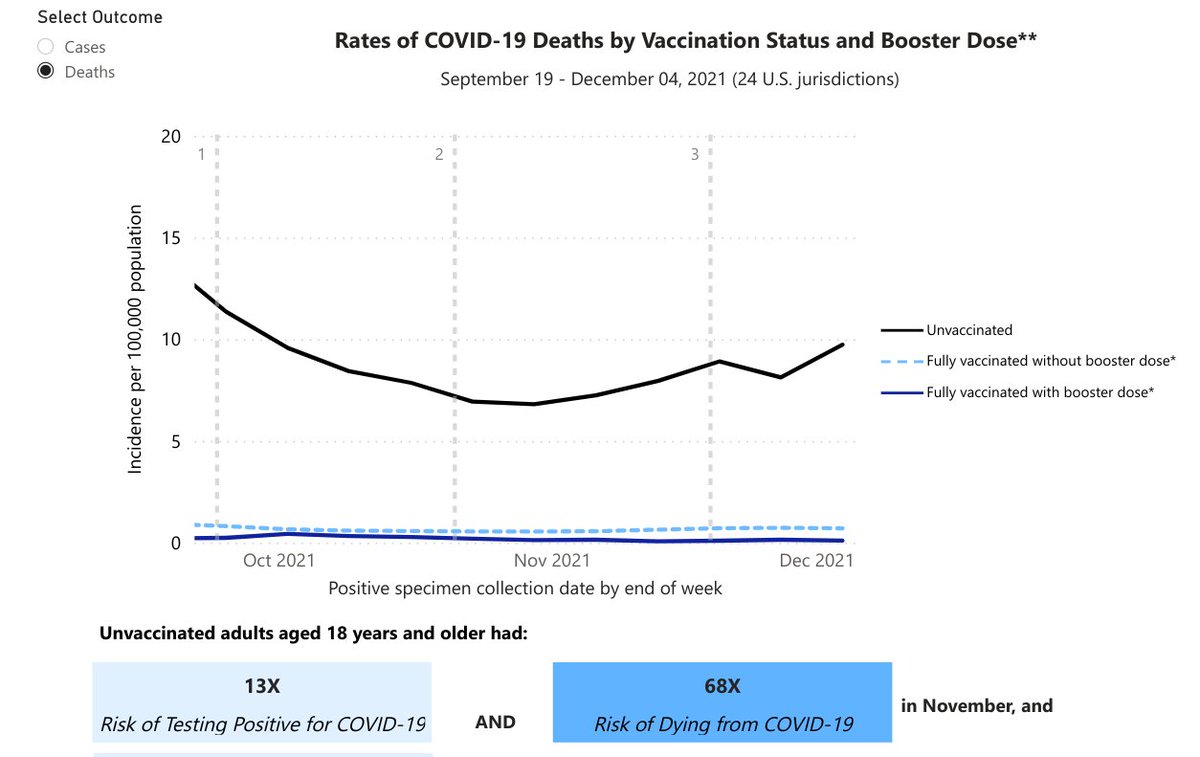
Kyle Lamb Profile picture
Feb 6 4 tweets 1 min read
UK surveillance last 4 weeks, deaths within 28 days of a positive test by age group: fully vaccinated with 3+ doses vs. fully unvaccinated

80+ (4.4x)
70-79 (8.3x)
60-69 (10.3x)
50-59 (10.7x)
40-49 (6.0x)
30-39 (3.7x)
18-29 (5.0x)

Better? Absolutely! 97x better? NO Image
Why UK surveillance is vastly superior to CDC data (which is "passive and voluntary" from jurisdictions and is not standardized). Their disclaimer:

"...the numerator and the denominator come from the same source and there is a record of each individuals vaccination status."
This is critical. If you look at CDC data on vaccination rates, they acknowledge that "unknown" status is being included in unvaccinated. UK data actually remove unknowns when doing rate comparisons.

• • •

Missing some Tweet in this thread? You can try to force a refresh
 

Keep Current with Kyle Lamb

Kyle Lamb Profile picture

Stay in touch and get notified when new unrolls are available from this author!

Read all threads

This Thread may be Removed Anytime!

PDF

Twitter may remove this content at anytime! Save it as PDF for later use!

Try unrolling a thread yourself!

how to unroll video
  1. Follow @ThreadReaderApp to mention us!

  2. From a Twitter thread mention us with a keyword "unroll"
@threadreaderapp unroll

Practice here first or read more on our help page!

More from @kylamb8

Feb 6
A tale of two graphs: one is the CDC that shows 68x chances of dying overall for fully unvaccinated in Nov. compared to people with 3+ doses. UKHSA, meanwhile, shows between 3x-11x difference for deaths within 28d of + test for last 4 weeks based on age group.

1/2 ImageImage
CDC disclaimer: an "unvaccinated person" includes anyone that "has not been verified to have received a COVID-19 vaccine."

UKHSA disclaimer, meanwhile, counts only those with a record of vaccination status and includes data from the same source for both numerator and denominator ImageImage
UK's data is far more reliable because they make this important adjustment.
Read 5 tweets
Jan 29
The idea that omicron is much more mild is no longer in question. The evidence has been overwhelming showing 70-90% reduction in severe illness and mortality.

1/
A study by Kaiser Permanente in California found a 91% reduction in deaths among omicron cases vs. delta using SGTF failure as presumption of omicron.

2/

medrxiv.org/content/10.110…
Through Dec. 31, UKHSA had recorded just 75 deaths among 212,019 omicron cases (0.04% fatality rate). They have since discontinued omicron surveillance.

3/

gov.uk/government/pub…
Read 7 tweets
Jan 29
A tale of two groups of cities: the ones people are flying to visit and the ones they're not.

Rate of change in destination enplanements for airports of at least 100,000 enplanements in 2019 in Florida, Texas, California, and New York for Jan-Oct 2021 vs. same months 2019.
What you're seeing is that 7 of these 60 airports are higher in the first 10 months of 2021 than they were in the same months in 2019... all 7 of which were in Florida. Florida (red) and Texas (orange) make up most of the upper half.
Collectively, Florida airports are 10.6% lower in 2021 through October than they were in 2019. Texas -21.3%, California -41.3% and New York -46.3%. The national total is down 28.2%.
Read 4 tweets
Jan 27
Another 'expert' that hopes you don't realize surgical masks are not respiratory protection. Yes, they are meant to keep patients protected against coughs, sneezes, large droplets, bacteria, etc. They are absolutely not nor have they ever been respiratory protection vs. viruses.
Just to keep reminding people, below is a graph from the CDC in early 2020, which I believe can still be found on their site.

"Does NOT provide the wearer with a reliable level of protection from inhaling smaller airborne particles and is not considered respiratory protection." Image
SARS-CoV-2, the virus that causes COVID-19, is a "small airborne particle."

The average particle, 0.1 microns, is 97% smaller than the standard surgical mask pore (3 microns).
Read 4 tweets
Jan 27
Best kickers in the NFL this year with ≥10 makes by net expected probability ratio. Expected accuracy is 3YD rolling averages for all NFL attempts from 2010-19. Formula is total makes / net probability * 100.

1) J. Tucker
2) D. Carlson
3) R. Patterson
4 E. McPherson
5) Y. Koo
This is regular season only. If I add in playoff kicks, McPherson is up to No. 3.
Read 4 tweets
Jan 27
COVID-19 mortality rates are very much in line with overall, all-cause mortality rates by state with only a few major outliers, which appear to be seasonal and regional.

Here is a ratio of COVID-19 per capita deaths to 2019 all-cause per capita mortality grouped by BEA regions. Image
The formula is COVID-19 mortality, as measured by COVID-19 deaths in the Jan. 26 CDC update of provisional COVID-19 deaths by sex and age, divided by 2020 population estimates, multiplied by a factor of 3.3 to match 2019 all-cause mortality, divided by 2019 all-cause death rates.
In this chart, the ratio is multiplied by 100. So a 1.00 (or 100) means the ratio of COVID-19 deaths is perfectly in line with the rate of mortality for all causes in 2019.

Extreme geographic locations in the NE/NW are clear outliers, as are ones in the SW/border states.
Read 4 tweets

Did Thread Reader help you today?

Support us! We are indie developers!


This site is made by just two indie developers on a laptop doing marketing, support and development! Read more about the story.

Become a Premium Member ($3/month or $30/year) and get exclusive features!

Become Premium

Don't want to be a Premium member but still want to support us?

Make a small donation by buying us coffee ($5) or help with server cost ($10)

Donate via Paypal

Or Donate anonymously using crypto!

Ethereum

0xfe58350B80634f60Fa6Dc149a72b4DFbc17D341E copy

Bitcoin

3ATGMxNzCUFzxpMCHL5sWSt4DVtS8UqXpi copy

Thank you for your support!

:(