ChartsBTC Profile picture
Feb 21 7 tweets 4 min read
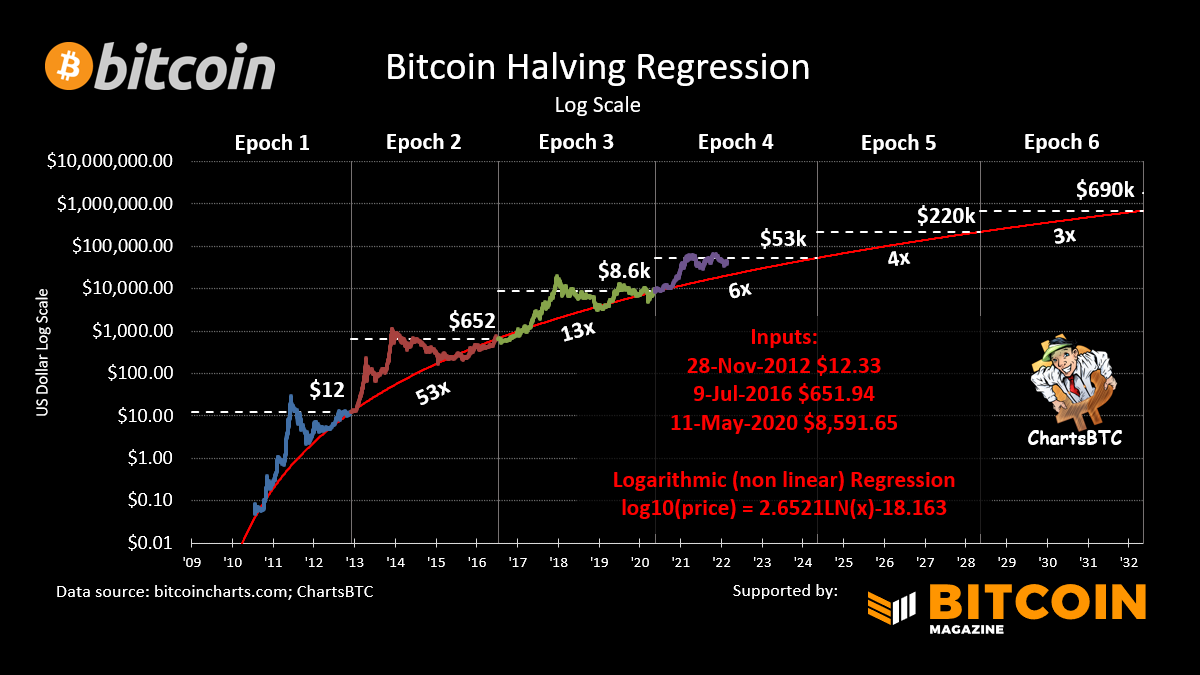
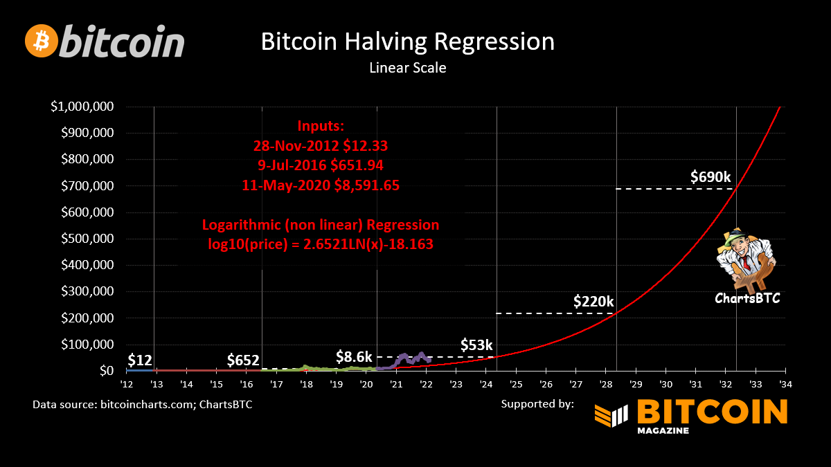
#bitcoin halving regression - There are many #bitcoin regression curves but what if we excluded the blow off tops and crashes and ran it only on just the 3 halving prices? This is the result.🧵 /1
It follows the lower bound of bitcoins price history surprisingly well. By definition, this type of model will show diminishing returns with an estimated increase of 6x this epoch, 4x next epoch and 3x for the one after that. /2
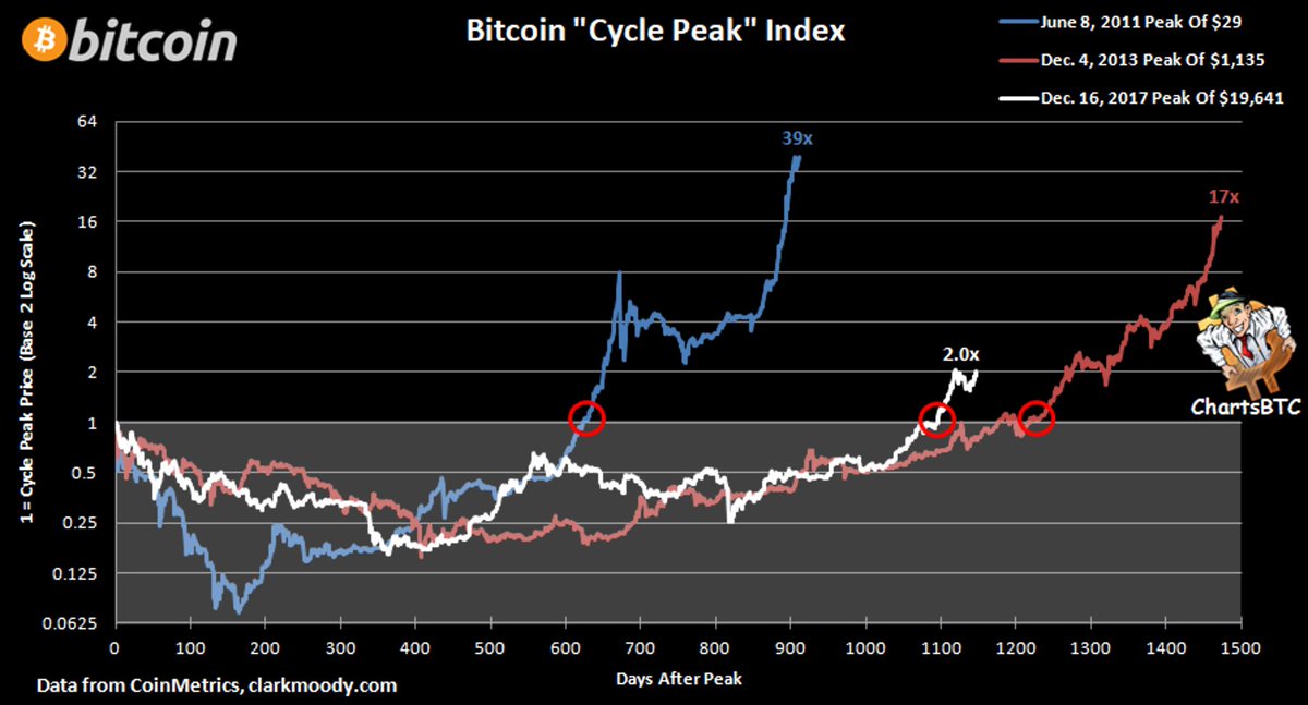
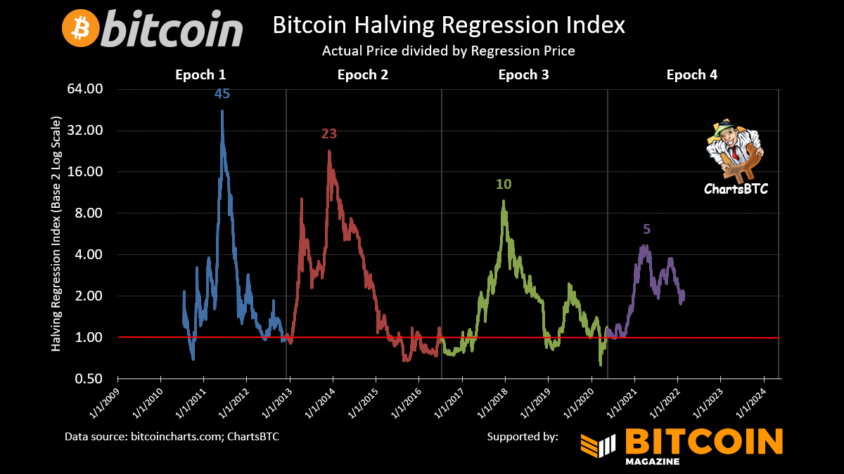
Dividing the curve by the actual price produces this result showing the peaks are getting less extreme. /3
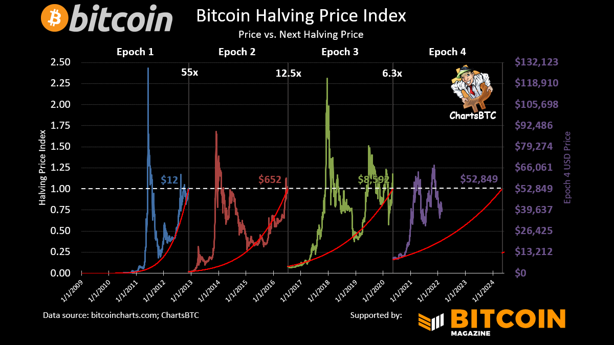
Dividing the actual price by the ending halving price creates this linear view of the epochs /4
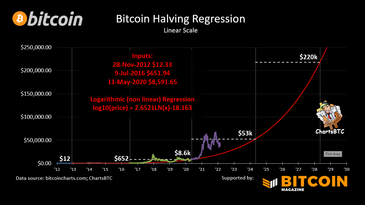
Here’s a linear scale version of the curve to blow the minds of your normie friends 😜 /5
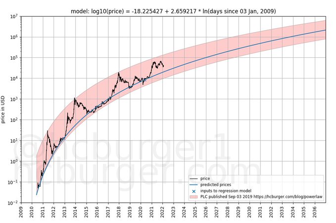
I’d like to give a huge thanks to @hcburger1 for his input. He also compared it to his model and it fit well. Give him a follow and check out his work… /6
medium.com/quantodian-pub…

medium.com/quantodian-pub…
Disclaimer time: I think this is an interesting reference point for a long term #bitcoin hodler like myself but that’s all. Congrats, you made it to the end! /7

• • •

Missing some Tweet in this thread? You can try to force a refresh
 

Keep Current with ChartsBTC

ChartsBTC Profile picture

Stay in touch and get notified when new unrolls are available from this author!

Read all threads

This Thread may be Removed Anytime!

PDF

Twitter may remove this content at anytime! Save it as PDF for later use!

Try unrolling a thread yourself!

how to unroll video
  1. Follow @ThreadReaderApp to mention us!

  2. From a Twitter thread mention us with a keyword "unroll"
@threadreaderapp unroll

Practice here first or read more on our help page!

More from @ChartsBtc

Apr 4, 2021
1/ Slicing and dicing the #bitcoin price history
TL;DR current cycle is above the prior cycle
2/ #bitcoin halving index (before & after) by block count
3/ #bitcoin halving index by days
Read 7 tweets
Apr 3, 2021
#bitcoin candles
#bitcoin 200 day simple moving average and mayer (mimble) multiple
#bitcoin price vs. 4 years prior
Read 5 tweets
Feb 28, 2021
#bitcoin New ATH Index
I've compared the cycles every way I can think of. This is the only one where the current cycle isn't significantly ahead of the 2017 cycle and it's still very bullish long term.
#bitcoin Cycle Peak Index
The prior chart aligns the break above the prior ATH (red circles).
#bitcoin Cycle Bottom Index
Read 5 tweets
Feb 6, 2021
#bitcoin new ATH index
#bitcoin prior cycle peak index
red circles show what the prior chart aligns
#bitcoin cycle bottom index
Read 5 tweets

Did Thread Reader help you today?

Support us! We are indie developers!


This site is made by just two indie developers on a laptop doing marketing, support and development! Read more about the story.

Become a Premium Member ($3/month or $30/year) and get exclusive features!

Become Premium

Don't want to be a Premium member but still want to support us?

Make a small donation by buying us coffee ($5) or help with server cost ($10)

Donate via Paypal

Or Donate anonymously using crypto!

Ethereum

0xfe58350B80634f60Fa6Dc149a72b4DFbc17D341E copy

Bitcoin

3ATGMxNzCUFzxpMCHL5sWSt4DVtS8UqXpi copy

Thank you for your support!

Follow Us on Twitter!

:(