
HERE WE GO!
2022 MLS Kit grading thread below ⬇️
2022 MLS Kit grading thread below ⬇️
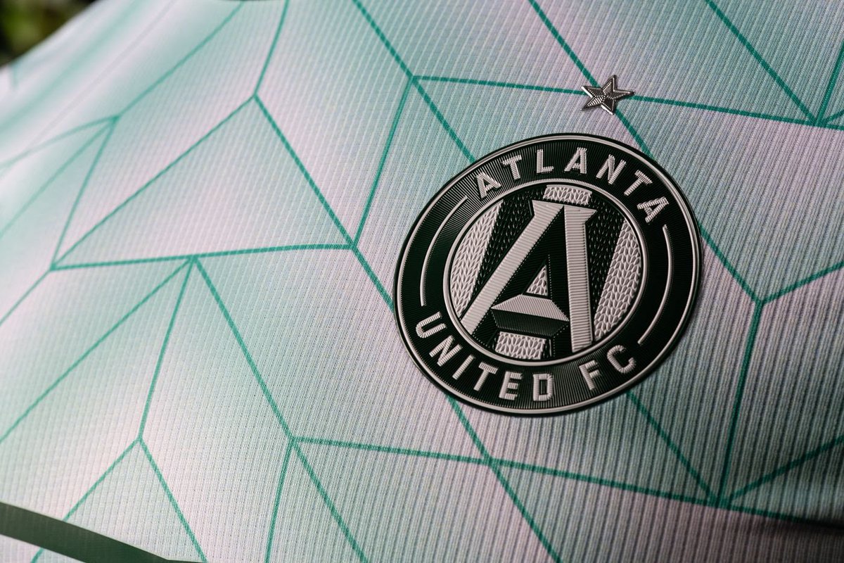
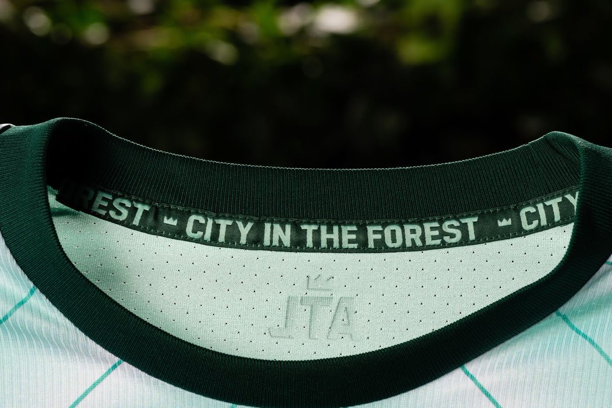
Atlanta United FC: A
The color, the pattern, the message. All absolutely incredible!
The fact that this jersey is 100% sustainable fabric and the team is helping the city plant trees? So so amazing. Well done 👏 #UniteAndConquer
The color, the pattern, the message. All absolutely incredible!
The fact that this jersey is 100% sustainable fabric and the team is helping the city plant trees? So so amazing. Well done 👏 #UniteAndConquer

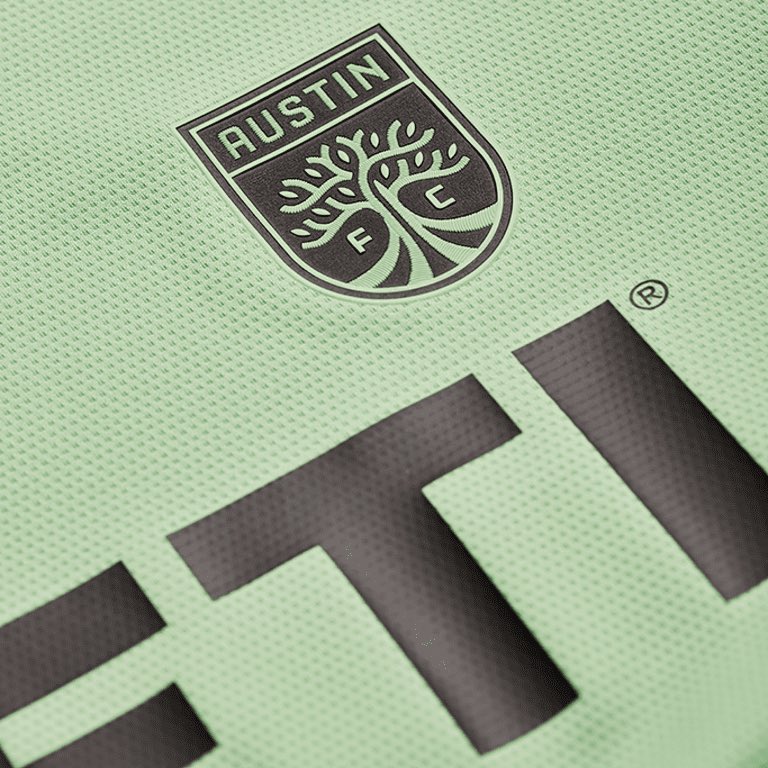
Austin FC: B+
The color is phenomenal, especially for an away kit. However, it’s pretty plain beside the unique color. Also wish it was more green to fit their verde color scheme. #AustinFC
The color is phenomenal, especially for an away kit. However, it’s pretty plain beside the unique color. Also wish it was more green to fit their verde color scheme. #AustinFC


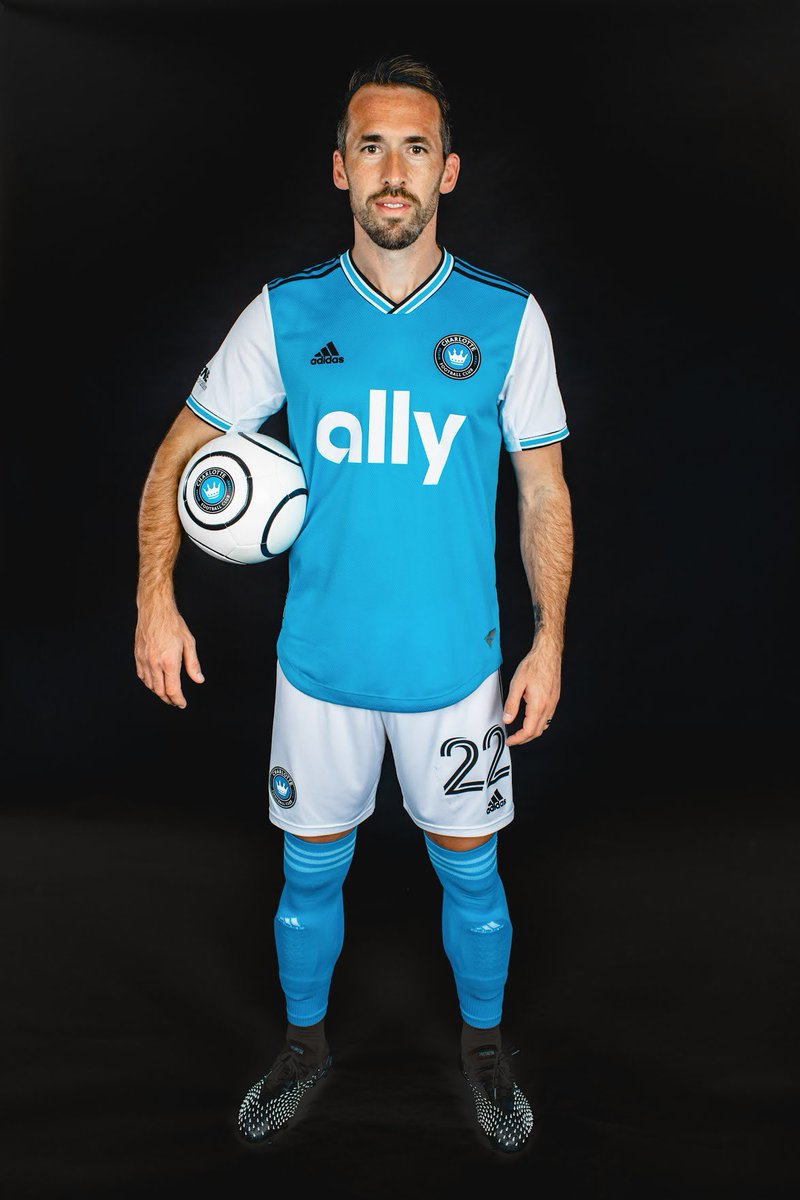
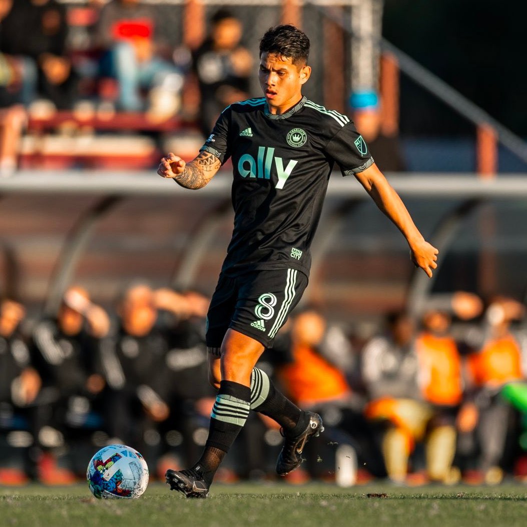
Charlotte FC home: B-
Honestly lackluster but it is the inaugural kit so I’ll let it slide. Definitely love the color and the trim. #ForTheCrown
Honestly lackluster but it is the inaugural kit so I’ll let it slide. Definitely love the color and the trim. #ForTheCrown

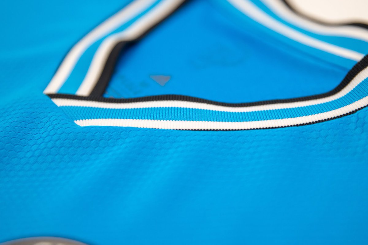
Charlotte FC away: A
We all love a black kit, and it’s the perfect canvas for the bright mint details on the collar and sleeves. Too bad fans have to pay $50 extra for that detail… #ForTheCrown
We all love a black kit, and it’s the perfect canvas for the bright mint details on the collar and sleeves. Too bad fans have to pay $50 extra for that detail… #ForTheCrown


Chicago Fire FC: B+
New crest LOOKS SO GOOD on a jersey
A symbol of hope from the Great Fire of 1871, the water tower is a great metaphor for what Chicago hopes to achieve this season.
Love the deep city meaning and the details, wish they were a little easier to read. #cf97
New crest LOOKS SO GOOD on a jersey
A symbol of hope from the Great Fire of 1871, the water tower is a great metaphor for what Chicago hopes to achieve this season.
Love the deep city meaning and the details, wish they were a little easier to read. #cf97


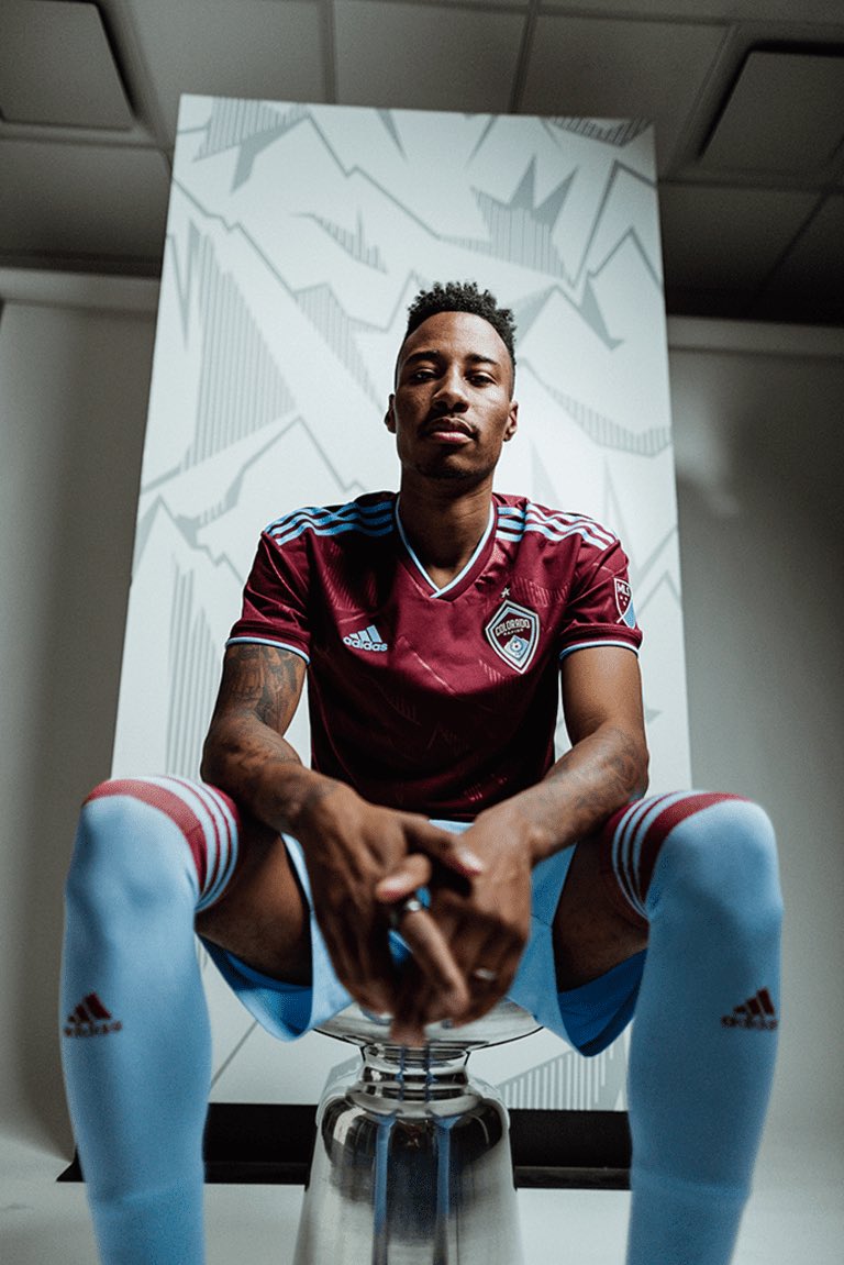
Colorado Rapids: B+
Love love love this concept, but Colorado is being just a LITTLE modest with the design. Make the mountains pop! It’s not visible unless it’s close up. #Rapids96
Love love love this concept, but Colorado is being just a LITTLE modest with the design. Make the mountains pop! It’s not visible unless it’s close up. #Rapids96


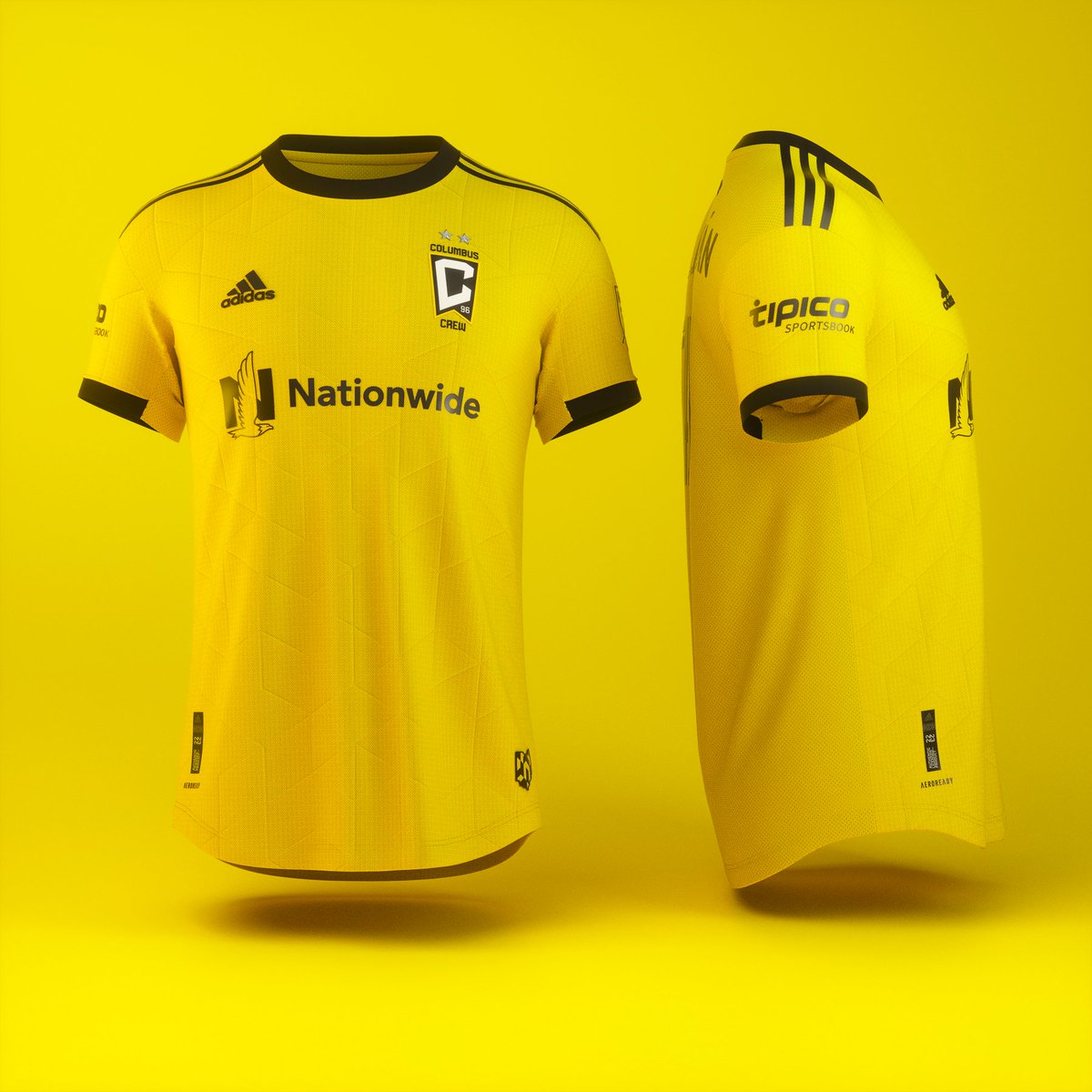
Columbus Crew: B-
Definitely nice to see Columbus back in a yellow kit, but that is it. It is a yellow kit. The details look nice, but not visible unless up close. I honestly like the new badge on the kit too. #Crew96
Definitely nice to see Columbus back in a yellow kit, but that is it. It is a yellow kit. The details look nice, but not visible unless up close. I honestly like the new badge on the kit too. #Crew96


DC United: B-
It is a pretty plain jersey to me. I know they were going for a jersey you can stylize and make your own, which I respect (hence the higher letter grade) but overall, pretty boring. #letsfly
It is a pretty plain jersey to me. I know they were going for a jersey you can stylize and make your own, which I respect (hence the higher letter grade) but overall, pretty boring. #letsfly


FC Cincinnati: B+
Really happy FC Cincy embraced the full orange for their home kit this season. It is vibrant and fun, and I absolutely love the subtle tribute to the city flag in the back. Silver stripes are a nice touch too. #AllForCincy
Really happy FC Cincy embraced the full orange for their home kit this season. It is vibrant and fun, and I absolutely love the subtle tribute to the city flag in the back. Silver stripes are a nice touch too. #AllForCincy


FC Dallas: B
I honestly have stared at this kit for a while and I still don't fully know how I feel about it. It is very similar to the past home kit, but definitely an upgrade. I like the shade of red as well. #DTID
I honestly have stared at this kit for a while and I still don't fully know how I feel about it. It is very similar to the past home kit, but definitely an upgrade. I like the shade of red as well. #DTID


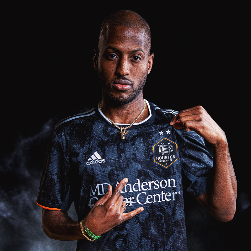
Houston Dynamo: A
Honestly one of my favorite Houston kits (and I've enjoyed a lot of them). This is a very unique look that relates to Houston in a different light. The matching monogram logo also looks incredible. #HoldItDown
Honestly one of my favorite Houston kits (and I've enjoyed a lot of them). This is a very unique look that relates to Houston in a different light. The matching monogram logo also looks incredible. #HoldItDown


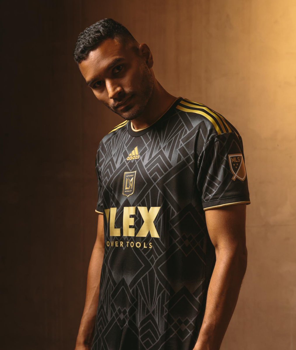
LAFC: A
When this kit was first leaked, I was not a fan, but looking at it on the players, IT IS FANTASTIC! The pattern reminds me of the 20s and Great Gatsby and it just makes the gold stand out.
Putting in the crest over the chest is just the cherry on top #LAFC
When this kit was first leaked, I was not a fan, but looking at it on the players, IT IS FANTASTIC! The pattern reminds me of the 20s and Great Gatsby and it just makes the gold stand out.
Putting in the crest over the chest is just the cherry on top #LAFC


LA Galaxy: B-
I really like the clean look of this, especially the details on the trim. However, it is pretty upsetting that the only thing that makes this kit special to the brand is only on the authentic kit, forcing fans to pay the extra $50. #LAGalaxy
I really like the clean look of this, especially the details on the trim. However, it is pretty upsetting that the only thing that makes this kit special to the brand is only on the authentic kit, forcing fans to pay the extra $50. #LAGalaxy


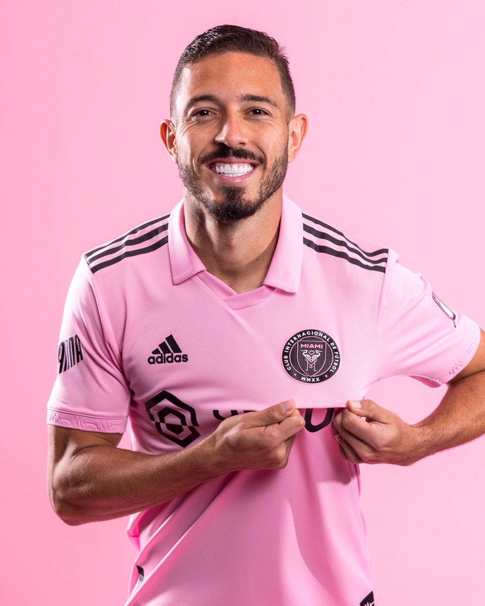
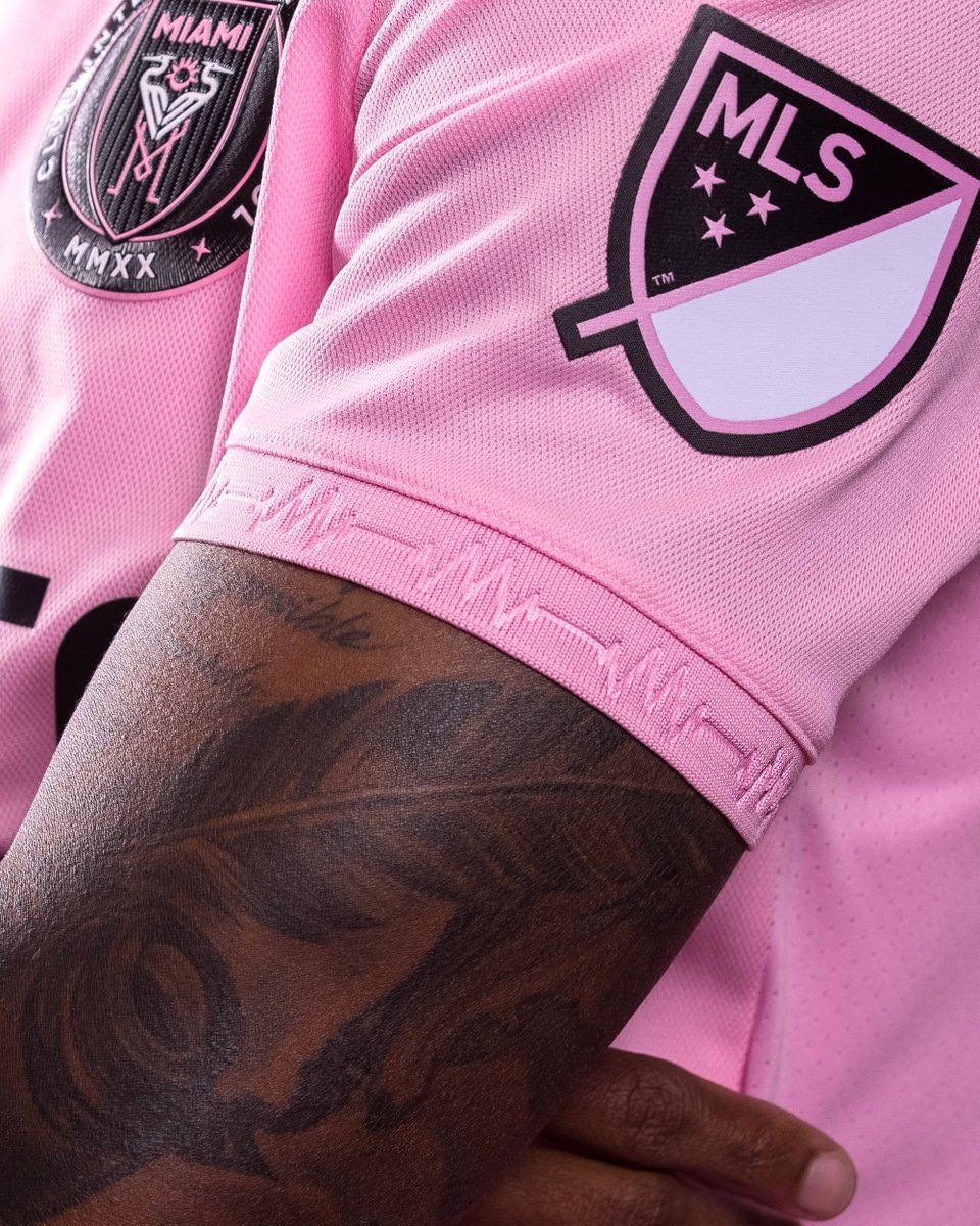
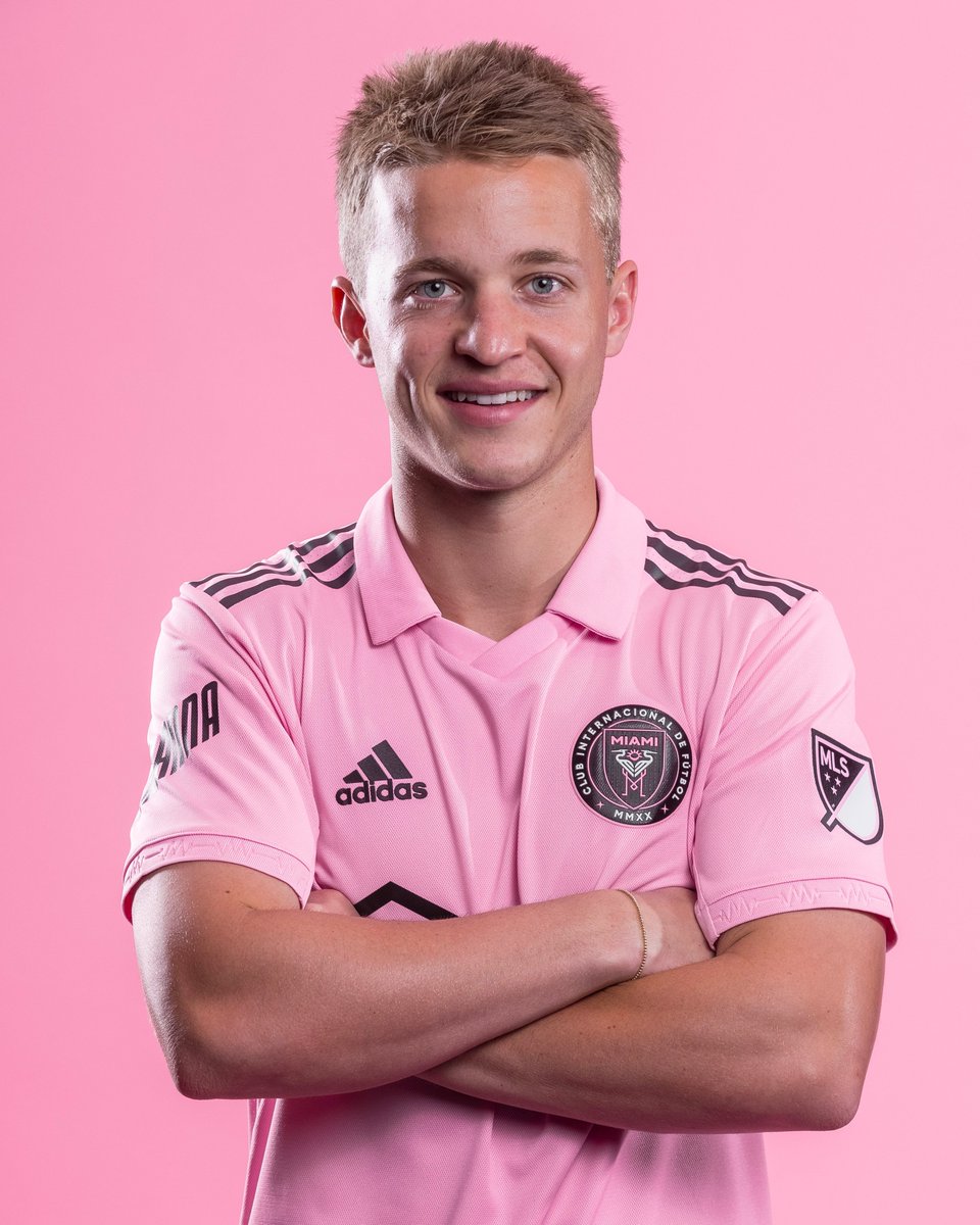
Inter Miami: B
Glad to see Miami finally embracing the pink kit. However, that's all it is, a pink kit with a collar (which I actually love). Wish there was a bit more detail but appreciate the heartbeat on the sleeve. #InterMiamiCF
Glad to see Miami finally embracing the pink kit. However, that's all it is, a pink kit with a collar (which I actually love). Wish there was a bit more detail but appreciate the heartbeat on the sleeve. #InterMiamiCF
Minnesota United: A-
Minnesota has one of the best color schemes in MLS and this kit beautifully justifies it. The icy blue stands out against the black and silver so well. It is a classy-looking kit that will be so easy to wear. #MNUFC
Minnesota has one of the best color schemes in MLS and this kit beautifully justifies it. The icy blue stands out against the black and silver so well. It is a classy-looking kit that will be so easy to wear. #MNUFC


CF Montreal: A
One of my favorite tops released this year. The marbling is absolutely beautiful and certainly stands out! Really fits the "blue in the veins" description they want to promote! Gorgeous work here. #CFMTL
One of my favorite tops released this year. The marbling is absolutely beautiful and certainly stands out! Really fits the "blue in the veins" description they want to promote! Gorgeous work here. #CFMTL


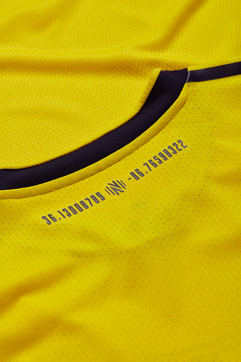
Nashville SC: B
I love the tribute to the Music City through the audio waves. The kit is perfect to open up their new stadium with the badge at the bottom and the coordinates of the field. It is a great city-tributed kit. #EveryoneN
I love the tribute to the Music City through the audio waves. The kit is perfect to open up their new stadium with the badge at the bottom and the coordinates of the field. It is a great city-tributed kit. #EveryoneN


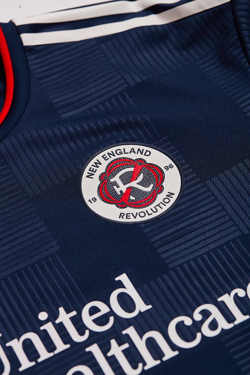
New England Revolution: B-
First of all, the new logo looks BEAUTIFUL on a kit. Besides that, this kit is pretty lackluster. I like the plaid pattern but it's barely visible in the photos, let alone on the pitch. #NERevs
First of all, the new logo looks BEAUTIFUL on a kit. Besides that, this kit is pretty lackluster. I like the plaid pattern but it's barely visible in the photos, let alone on the pitch. #NERevs


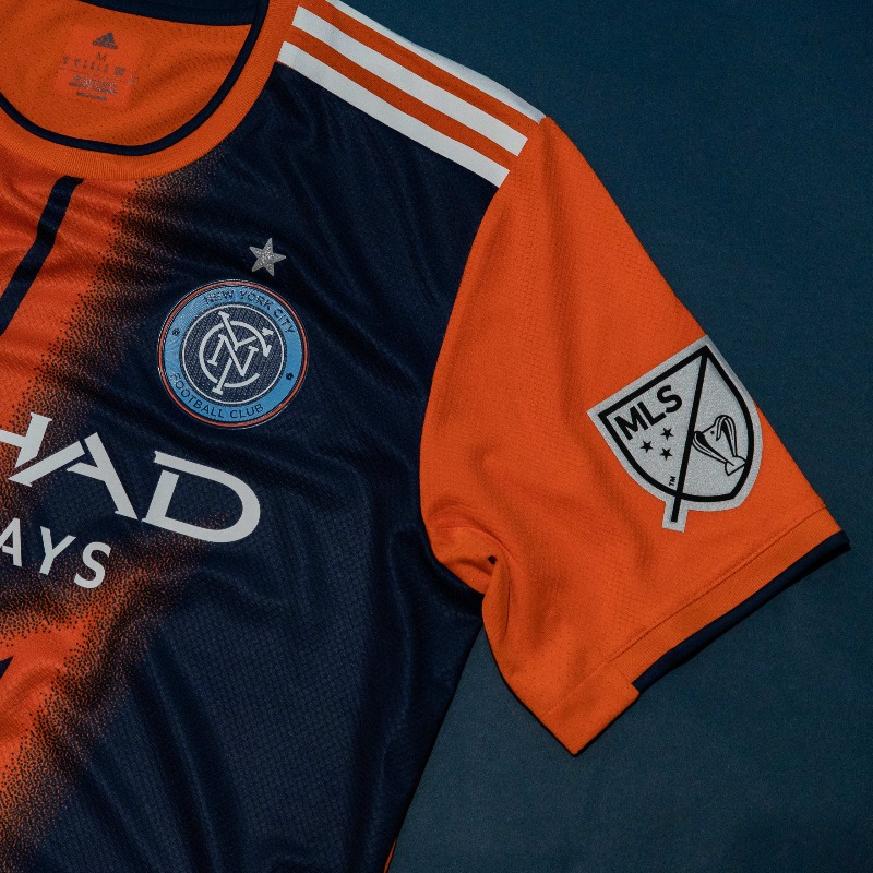
NYCFC: B
I'm giving this kit a B because the effort is there, but this kit is certainly ugly. I appreciate that the club was trying something different, which is very hard to do in this league, but I'm not a fan. #NYCFC
(also hi dads don't hate me @SoccerCooligans )
I'm giving this kit a B because the effort is there, but this kit is certainly ugly. I appreciate that the club was trying something different, which is very hard to do in this league, but I'm not a fan. #NYCFC
(also hi dads don't hate me @SoccerCooligans )


New York Red Bulls: B+
I think this kit is fun, and a better take on what they tried to do with an away kit a few years ago. I wish the pattern continued on to the back of the kit.
But why do they continue to do the tramp stamp on the back? #RBNY
I think this kit is fun, and a better take on what they tried to do with an away kit a few years ago. I wish the pattern continued on to the back of the kit.
But why do they continue to do the tramp stamp on the back? #RBNY


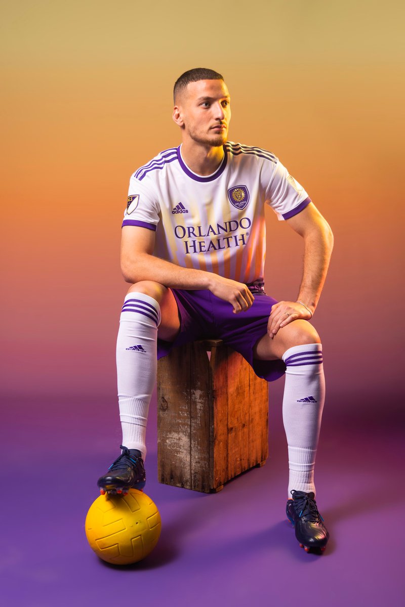
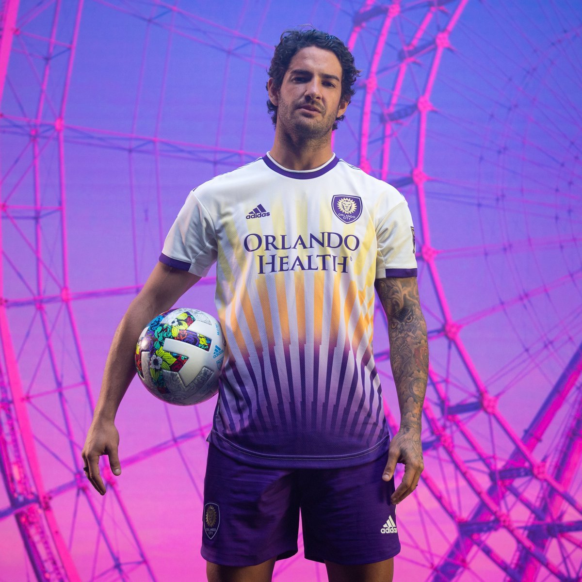
Orlando City: A-
A kit like you've never seen. A very beautiful take on the unique Florida sunset. It is truly one of a king and I am excited to see how it looks on the pitch! #OrlandoCity
A kit like you've never seen. A very beautiful take on the unique Florida sunset. It is truly one of a king and I am excited to see how it looks on the pitch! #OrlandoCity

Philadelphia Union: B+
I love that the Union finally brought back the stripe, a key aspect of home kits from its inaugural years. The addition of the light blue (the color of Sons of Ben), right through the crest, is a perfect touch for the fans. Also love the gold BIMBO #DOOP
I love that the Union finally brought back the stripe, a key aspect of home kits from its inaugural years. The addition of the light blue (the color of Sons of Ben), right through the crest, is a perfect touch for the fans. Also love the gold BIMBO #DOOP


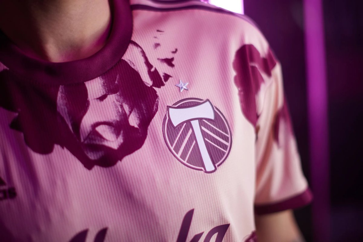
Portland Timbers: A
Honestly my favorite kit release this season. As someone who owns Thorn's black rose kit, I didn't think anyone could compete with it but this one does. It is a great tribute to the Rose City, and the color scheme is phenomenal. Love love love! #RCTID
Honestly my favorite kit release this season. As someone who owns Thorn's black rose kit, I didn't think anyone could compete with it but this one does. It is a great tribute to the Rose City, and the color scheme is phenomenal. Love love love! #RCTID


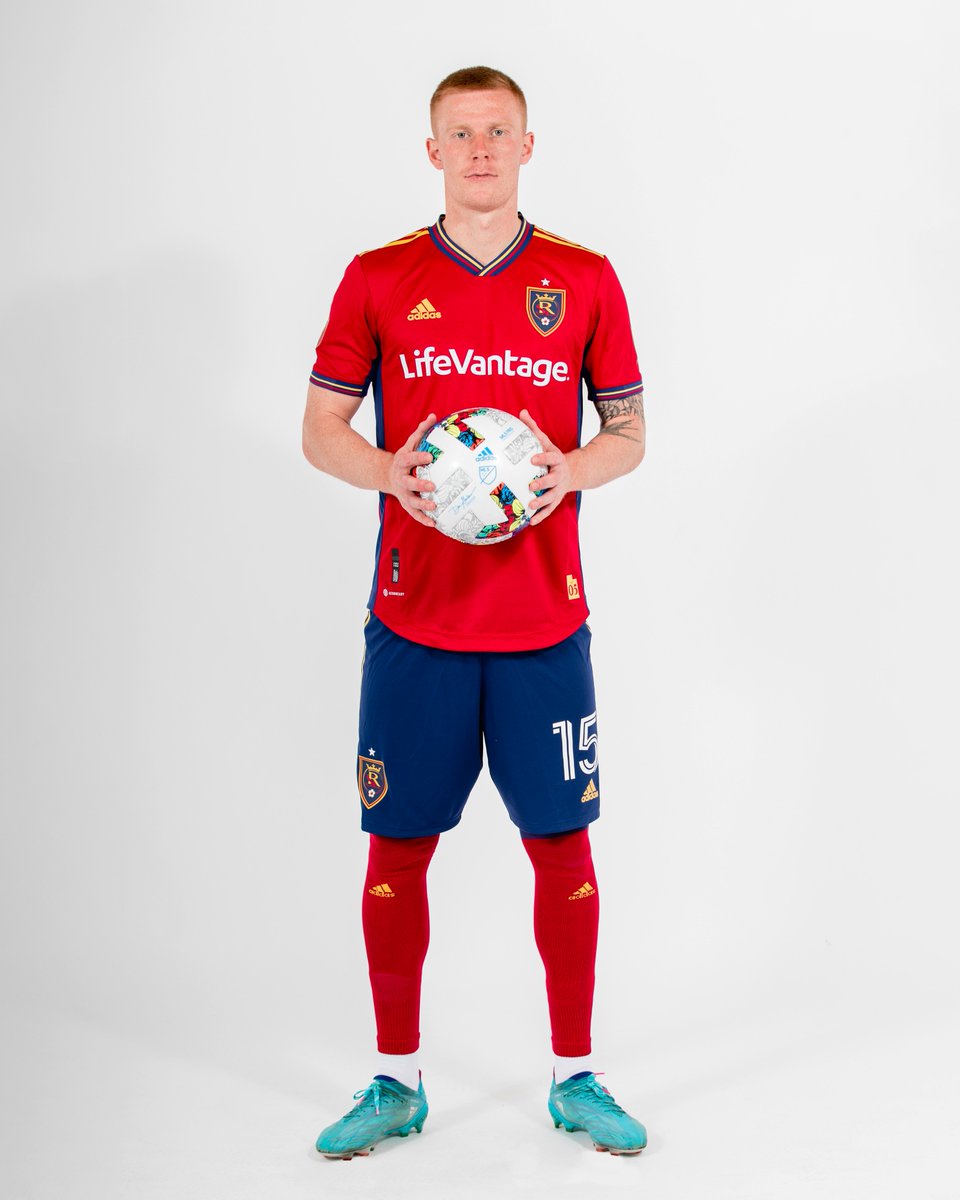
Real Salt Lake: B-
Honestly, this kit doesn't look much different from their previous home kit. I like the additional stripes of blue and yellow on the time. Other than that, it's quite mundane. #RSL
Honestly, this kit doesn't look much different from their previous home kit. I like the additional stripes of blue and yellow on the time. Other than that, it's quite mundane. #RSL


San Jose Earthquakes: C
The detailing on the side keeps this kit from earning an F. Everyone knows how much I despise the plain white away kits that have plagued MLS for years. This would be one of them if not for the interesting design on the side. #Quakes74
The detailing on the side keeps this kit from earning an F. Everyone knows how much I despise the plain white away kits that have plagued MLS for years. This would be one of them if not for the interesting design on the side. #Quakes74


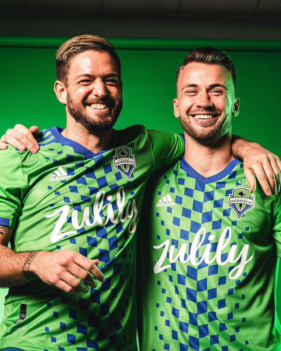
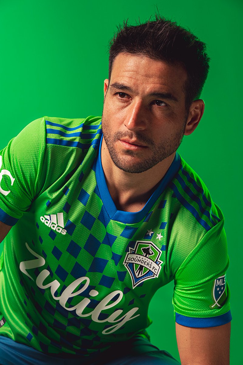
Seattle Sounders: A-
If I had rated this with the initial release, I probably would have graded it lower. However, seeing the kit being played in made it a lot more enjoyable. It's bright and eyecatching, just like the team wearing it. #Sounders
If I had rated this with the initial release, I probably would have graded it lower. However, seeing the kit being played in made it a lot more enjoyable. It's bright and eyecatching, just like the team wearing it. #Sounders

Sporting Kansas City: B-
I respect where SKC was going with this, and I appreciate the tribute, but it's pretty lackluster. I like the zip codes of the cities but it's hard to read. #SportingKC
I respect where SKC was going with this, and I appreciate the tribute, but it's pretty lackluster. I like the zip codes of the cities but it's hard to read. #SportingKC


Toronto FC: C
I don't get this kit. Half white, half gray. I don't see how it can be for the community by being two boring kit colors.
I also could barely find any photos of this kit, no posts promoting details. Makes it seem that the club doesn't even want it either #TFCLive
I don't get this kit. Half white, half gray. I don't see how it can be for the community by being two boring kit colors.
I also could barely find any photos of this kit, no posts promoting details. Makes it seem that the club doesn't even want it either #TFCLive

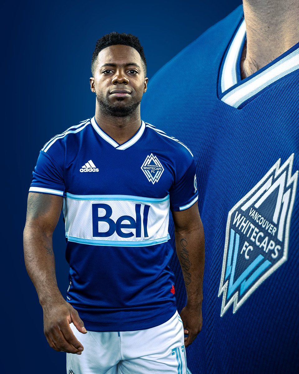
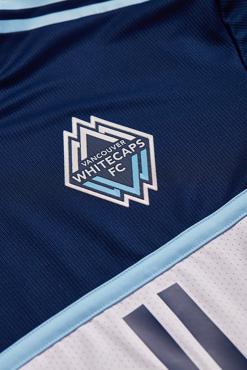
Vancouver Whitecaps: A-
Oo she's pretty! Absolutely adore this kit. The colors are vibrant, and it has such a clean look to it. It is the complete reverse of the away kit which is super fun and unique. Plus, white shorts with a dark top is a masterpiece. #VWFC
Oo she's pretty! Absolutely adore this kit. The colors are vibrant, and it has such a clean look to it. It is the complete reverse of the away kit which is super fun and unique. Plus, white shorts with a dark top is a masterpiece. #VWFC

Honestly am ecstatic to see the growth of kit designs across the league the past two seasons. I can not wait to see these kits take the field in just a few days 🤩
• • •
Missing some Tweet in this thread? You can try to
force a refresh


