
Some thoughts on the #dataviz discussion on how to show refugee flows on #maps.
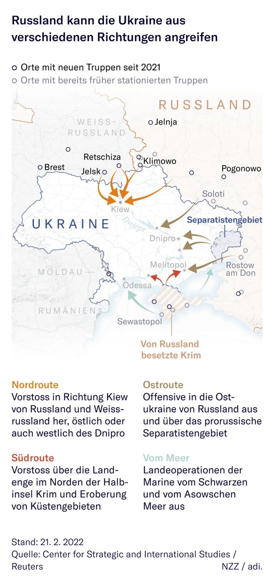
Form 1: Arrows *can* look like a war map – but I don’t think they have to. At @nzzvisuals we have used one kind of arrow to show invasion and another to show the flow of refugees.
Form 1: Arrows *can* look like a war map – but I don’t think they have to. At @nzzvisuals we have used one kind of arrow to show invasion and another to show the flow of refugees.

Form 2: Bubbles or Figures placed in the destination country have been brought up as a possible solution. They make the map look less threatening, but they do negate that there is movement happening and that this is actually a forceful event – especially for the people fleeing.


A combination of arrows and bubbles might be a good solution, as @infowetrust points out here:
https://twitter.com/infowetrust/status/1499162559663919105?s=20&t=bxo6k1Vfgnn1JnbUHO90cg
Form 3: Removing the arrow heads and changing the gradient to show more of a dispersing movement might be an option. What I like about this, is that the border crossings become more visible. It does, again, remove the idea of movement though.


Color: Color is incredibly important. We started with a red color to denote the seriousness of the event. But it looked incredibly frightening like that. So we switched to blue, which we use for all data that refers to Ukraine.


Scaling: I like the idea that we should be mindful of how we size the arrows, as described here in this great article: thecorrespondent.com/664/how-maps-i… I tried it with our original graphic and it does give quite a different impression.


Context through additional data is another idea described in the @The_Corres article. I would love to show more granular data, but it is not available at the moment. Comparison is also important but the choice of what to compare an event to can be a problem in itself.

Context through stories is actually my preferred way to talk about tragedies: Use data to show scale and trends but embedded it in human stories. At @NZZ we’ve done that here in an article by our correspondent @imijnssen 👉 nzz.ch/international/…
The map shows the scale of the event. The text by @imijnssen, Vysne Nemecke & Kroscienko portraits people fleeing and people receiving them. It does not talk *about* them but transports their voices. Portraits by @MaciekMusialek show activities in the context of help and flight.


One last thought: I do think that there is merit to this idea of using a pattern to break "the mass" that is referenced by a simple color fill. Counting on the #dataviz community to explore this in more detail 💕

• • •
Missing some Tweet in this thread? You can try to
force a refresh


