@waitbutwhy uses powerful visuals to illustrate his ideas.
One visual stuck in my head. And I think the message is so important that it cannot be said often enough.
So, I practiced recreating the visual with #ggplot2.
🧵w/ original and ressources⬇️ #rstats #dataviz
One visual stuck in my head. And I think the message is so important that it cannot be said often enough.
So, I practiced recreating the visual with #ggplot2.
🧵w/ original and ressources⬇️ #rstats #dataviz
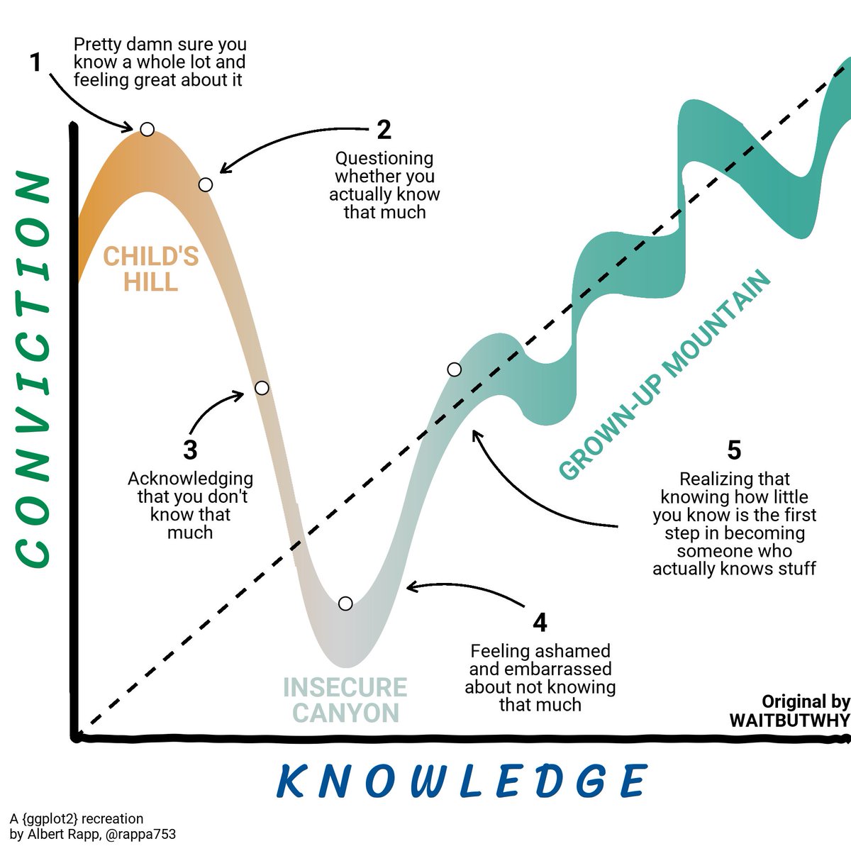
Here is the orginal tweet (check out his other tweets too if you get a chance).
I like to think that I came close to the original but the stick men were too tricky. Also, it turns out that the original uses its own font that I could not replicate.
I like to think that I came close to the original but the stick men were too tricky. Also, it turns out that the original uses its own font that I could not replicate.
https://twitter.com/waitbutwhy/status/1500490155987251204?s=20&t=sXmLYXmoxec26DJr_AUxhQ
For this visual, I used Bézier curves. I could try to explain them but I am not qualified to that, I think.
Rather, check out this visually pleasing video from @FreyaHolmer. It gives you a quick and beautiful rundown.
Rather, check out this visually pleasing video from @FreyaHolmer. It gives you a quick and beautiful rundown.
For Bézier curves all you need is {bezier} cran.r-project.org/web/packages/b…. [sidebar: bezieR would be a better name]
The rest of the drawing is all standard {ggplot2}.
Clearly, the thick flashy line was created with Bézier curves but that's not the only place where I used them.
The rest of the drawing is all standard {ggplot2}.
Clearly, the thick flashy line was created with Bézier curves but that's not the only place where I used them.
The axes are not perfect straight lines. This would be "too clean" for the comic-style of the original visual.
Thus, I simulated many random points along a straight line and then used these as control points for another Bézier curve.
Et voilà, the axes look a bit wiggly.
Thus, I simulated many random points along a straight line and then used these as control points for another Bézier curve.
Et voilà, the axes look a bit wiggly.
The font choice was hard. As mentioned, the original uses a custom font.
As always, fonts.google.com was an exceptional ressource to try out the feel of different fonts directly in your browser.
For more ggplot-related font stuff, see albert-rapp.de/post/2022-03-0…
As always, fonts.google.com was an exceptional ressource to try out the feel of different fonts directly in your browser.
For more ggplot-related font stuff, see albert-rapp.de/post/2022-03-0…
Next comes the color choice.
I have seen people use {magick} to extract color codes from a picture but so far I have preferred imagecolorpicker.com
They claim that everything happens locally in your browser, so that's a bonus privacy-wise.
I have seen people use {magick} to extract color codes from a picture but so far I have preferred imagecolorpicker.com
They claim that everything happens locally in your browser, so that's a bonus privacy-wise.
Speaking of colors, I tried geom_ribbon() to draw that flashy curve. But geom_ribbon() does not support a varying fill color.
Instead, I drew thousands of vertical lines with geom_segment() and mapped the col aesthethic to the x values.
Instead, I drew thousands of vertical lines with geom_segment() and mapped the col aesthethic to the x values.
Drawing segments like this is computationally slow but works. Just make sure that your verticel lines do not leave "gaps".
This is possible because {bezier} allows you to draw your curve on an arbitraily fine x-grid.
This is possible because {bezier} allows you to draw your curve on an arbitraily fine x-grid.
Then come the arrows. geom_curve() was perfect for that.
Unfortunatly, all arrows need different curvatures. And I certainly won't draw all of them by copy and paste. Here, functional programming helped.
In fact, this initially motivated this blog post:
albert-rapp.de/post/2022-03-2…
Unfortunatly, all arrows need different curvatures. And I certainly won't draw all of them by copy and paste. Here, functional programming helped.
In fact, this initially motivated this blog post:
albert-rapp.de/post/2022-03-2…
And this completes most aspects of the remake. Here it is again.
If you like this thread and want to stay in touch with my R endeavors, follow @rappa753
And don't forget to visit @waitbutwhy too. After all, without his great original I could not have practiced this remake.
If you like this thread and want to stay in touch with my R endeavors, follow @rappa753
And don't forget to visit @waitbutwhy too. After all, without his great original I could not have practiced this remake.

• • •
Missing some Tweet in this thread? You can try to
force a refresh