
🎓 Math PhD student & freelancer
👨🏫 Bite-sized insights on dataviz, web dev & data science with R at https://t.co/M34b5BzHTD
 1 // Wrap your subtitle into <span> tags

 0 // Where's the code?


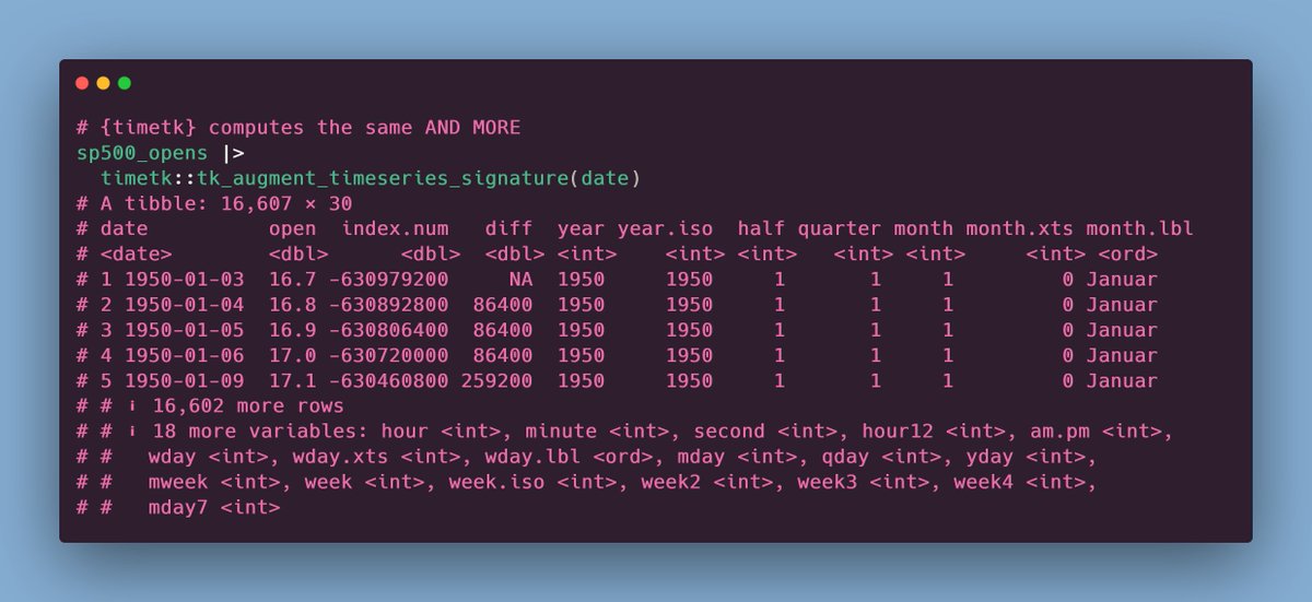 BONUS: Maybe you don't want use all of the stuff that {timetk} computes for you.


 Let's start with a not so great table and improve it.
 0 // Where's the code?
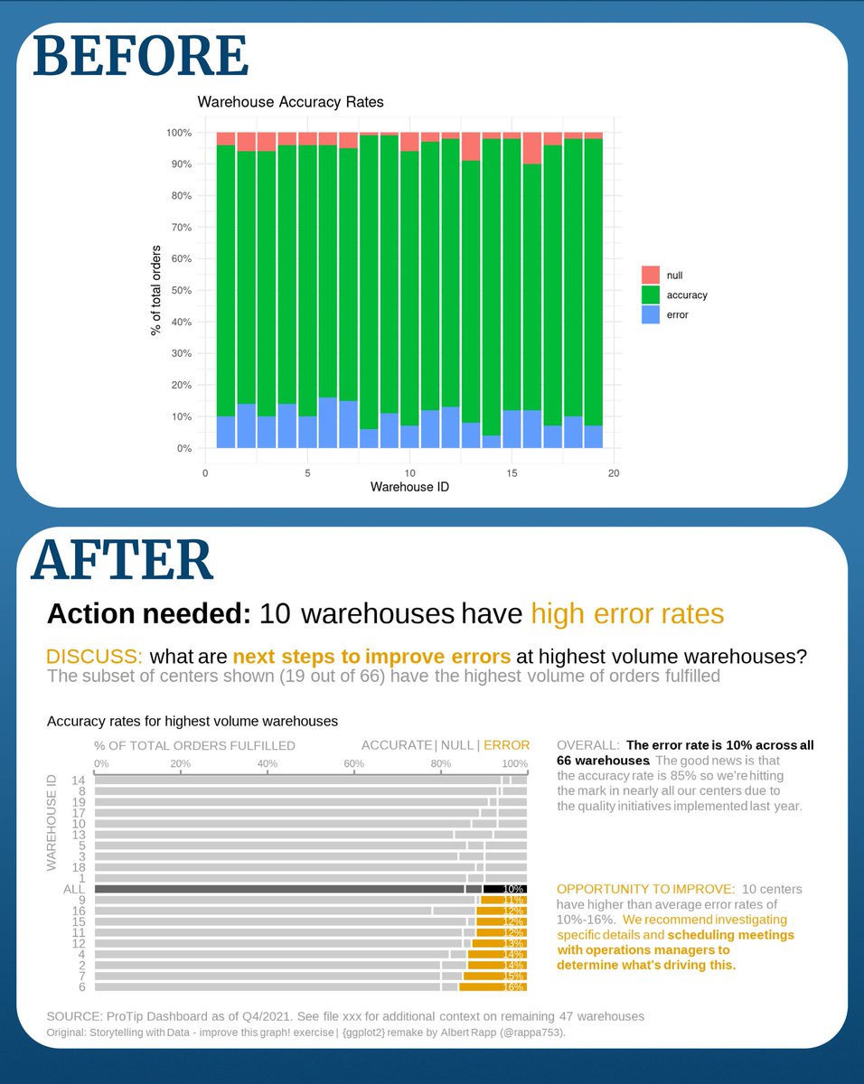 Here's our starting point.


 1 // Data
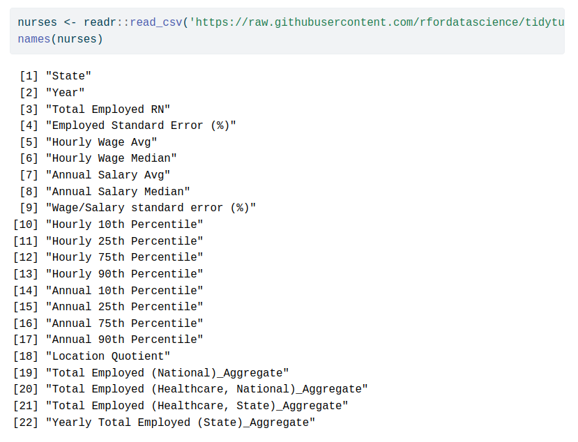
 0 // Find the data


