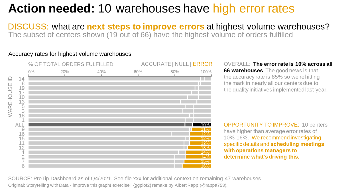
From standard output to powerful storytelling.
Here's how you can recreate the storytelling with data look in #ggplot2.
A detailed thread 🧵⬇️
#rstats #dataviz
Here's how you can recreate the storytelling with data look in #ggplot2.
A detailed thread 🧵⬇️
#rstats #dataviz
This thread is based on my newest blog post. Find it at albert-rapp.de/post/2022-03-2…
There, you will find more details and ressources than I can offer in this thread.
The blog post was inspired by a makeover video by storytelling with data. You can find it at
There, you will find more details and ressources than I can offer in this thread.
The blog post was inspired by a makeover video by storytelling with data. You can find it at
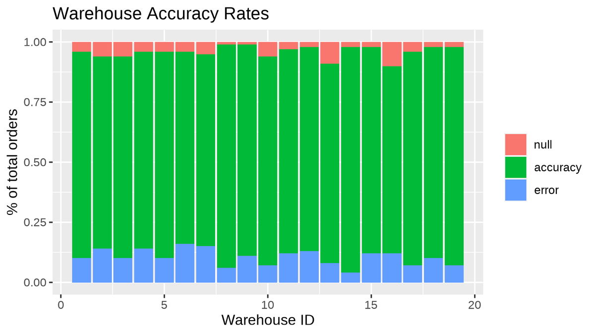
This is our original dataviz. We will improve it to tell a compelling story.

First, use the y-axis for names. This is more legible when names are more than an id.
And make sure that geom_col() understands that your labels are categorical (watch our for numeric IDs).
Also, use the group- rather than the fill-aesthetic. Reserve colors for storytelling.
And make sure that geom_col() understands that your labels are categorical (watch our for numeric IDs).
Also, use the group- rather than the fill-aesthetic. Reserve colors for storytelling.

Add a reference point to put your data into perspective. A simple average can be enough.

Order your bars for a quicker overview:
Important quantities on the left and right for easy comparison.
Order in increasing or decreasing order from top to bottom.
factor() and fct_reorder() get the job done for you
Important quantities on the left and right for easy comparison.
Order in increasing or decreasing order from top to bottom.
factor() and fct_reorder() get the job done for you

Bring color into play to highlight your story points.
Protip: Save your colors as variable names. You will try out different colors at some point. Copy and pasting the new color into multiple parts of your code is tedious.
Protip: Save your colors as variable names. You will try out different colors at some point. Copy and pasting the new color into multiple parts of your code is tedious.

Get rid of axes expansion to avoid clutter (the lines from id to bar).
Also, allow drawing outside the grid panel to set the stage for more changes to come.
coord_cartesian() is the place to make these changes.
Also, allow drawing outside the grid panel to set the stage for more changes to come.
coord_cartesian() is the place to make these changes.

Move and format axes. Get the x-axis to the top so that the readers see it early on. This is handled with scale_x_continuous().
The axes label does not need to be highlighted. Greying them out works too. theme() and element_*() functions will do that for you.
The axes label does not need to be highlighted. Greying them out works too. theme() and element_*() functions will do that for you.

Align labels.
The SWD look likes to create clear lines through aligning plot elements. Also, the SWD look emphasizes that important things like axes title are prominently visible in the top left corner.
Shuffle the labels with more of theme().
The SWD look likes to create clear lines through aligning plot elements. Also, the SWD look emphasizes that important things like axes title are prominently visible in the top left corner.
Shuffle the labels with more of theme().

Align manually.
The axes labels can only be set to a single hjust value in theme(). But to create "clear" lines 0% should be left-justified and 100% should be right-justified.
An annotation draws the labels manually. This works because we allow drawing outside the grid.
The axes labels can only be set to a single hjust value in theme(). But to create "clear" lines 0% should be left-justified and 100% should be right-justified.
An annotation draws the labels manually. This works because we allow drawing outside the grid.

Label your story elements directly.
Extract the highlighted data and use geom_text() for labelling.
Extract the highlighted data and use geom_text() for labelling.

Since we allowed drawing outside the grid, we can also annotate a description of the bars.
This time, we need a richtext annotation from the ggtext package because we want to highlight a single word.
This time, we need a richtext annotation from the ggtext package because we want to highlight a single word.

The bar plot is done. Time to add the story texts.
First, create a text-only plot. Using richtext once again, we can format the text in any way we want.
First, create a text-only plot. Using richtext once again, we can format the text in any way we want.

Finally, put together your bar plot and text-only plot with patchwork.
Use the (sub)title of your composed plot to add call to action messages.
Don't forget that with ggtext and theme() you can enable Markdown syntax for easier text formatting.
Use the (sub)title of your composed plot to add call to action messages.
Don't forget that with ggtext and theme() you can enable Markdown syntax for easier text formatting.


One final tip to get the text sizes right.
Use the camcorder package at the start of your visualization process. This will create and show plots as png-files in the dimensions you want.
This is not a definite cure for tedious size struggles but I found that it helps a bit.
Use the camcorder package at the start of your visualization process. This will create and show plots as png-files in the dimensions you want.
This is not a definite cure for tedious size struggles but I found that it helps a bit.

If you enjoyed this summary, check out the full blog post at albert-rapp.de/post/2022-03-2…
It contains way more details and some further ressources.
And if you want to see more of my content, stay in touch by following @rappa753.
It contains way more details and some further ressources.
And if you want to see more of my content, stay in touch by following @rappa753.
• • •
Missing some Tweet in this thread? You can try to
force a refresh