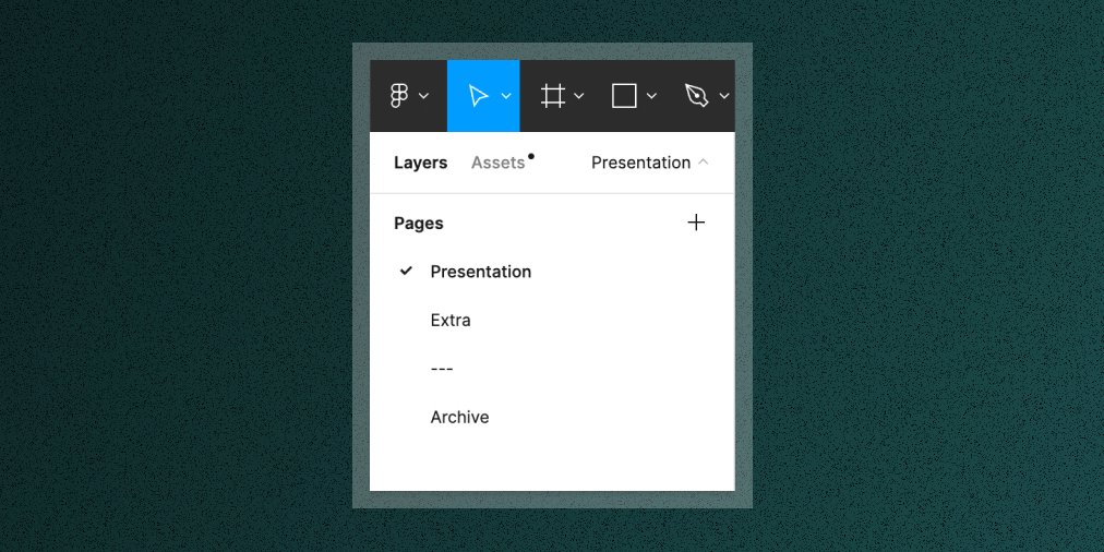
For those interested in my @figma project cover organization and workflow, here’s a quick intro to the library I maintain for my team to make designing in Figma even easier.🧵 

The Project Thumbnail - I use it across my files for organization. I have a primary light variant for most projects and a secondary dark variant for libraries. I nest a Status component in each alongside the @jupiterone logo which comes from our logo library.

The Doc Page - I use this as a backdrop behind individual components in our UI libraries. I prefer a page separated component library, so this helps me avoid unwanted nesting in the Assets panel when looking for components.

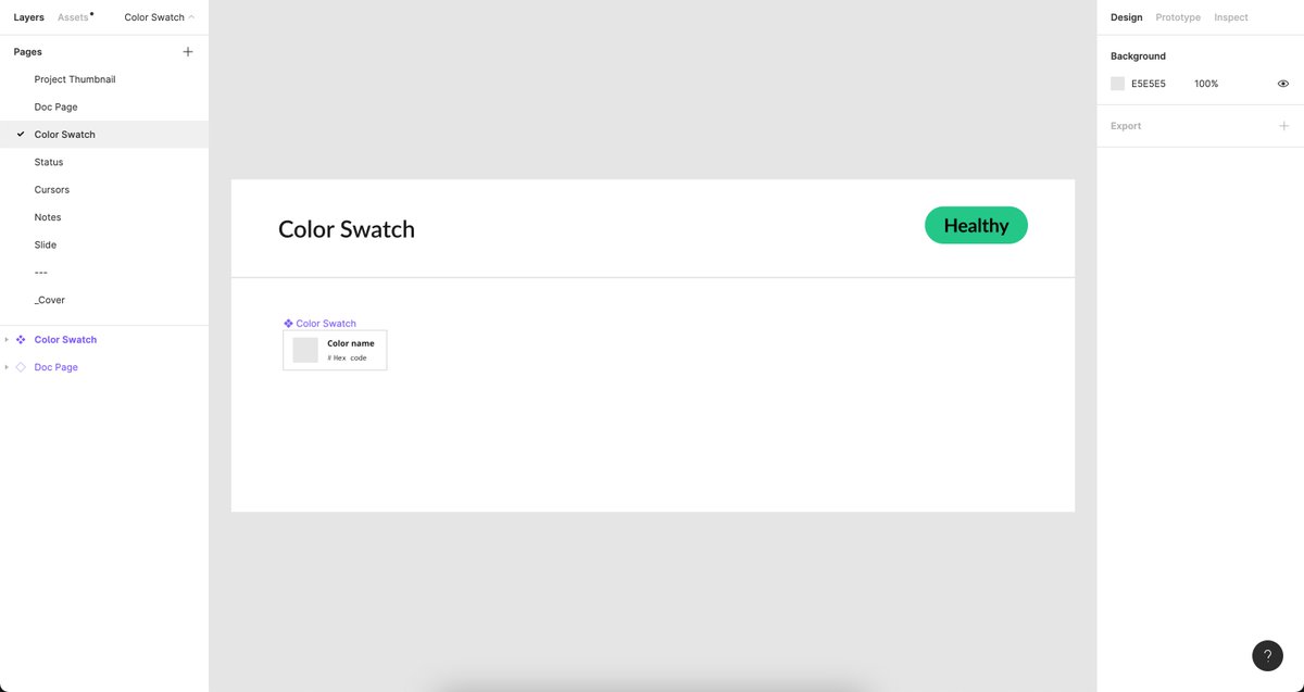
The Color Swatch - I use it to organize our color palette. Note that the actual pound symbol is separate from the hex value so that the team can copy/paste the values into the Figma style panel seamlessly.
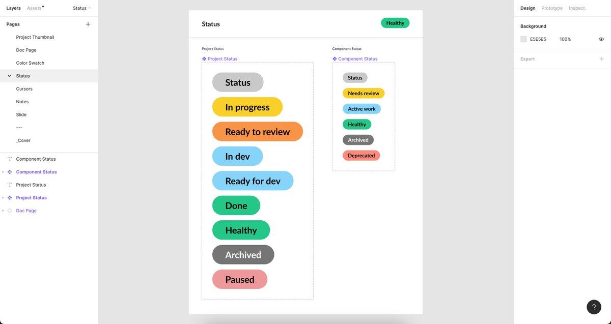
The status component - I use it to roughly keep track of what state a project or component is in. It’s not perfect, but works okay for me.
Cursors - All thanks to the team at @github & @githubdesign for this 🙏🏻 Super helpful for being more clear in showing certain interaction states in static screens.

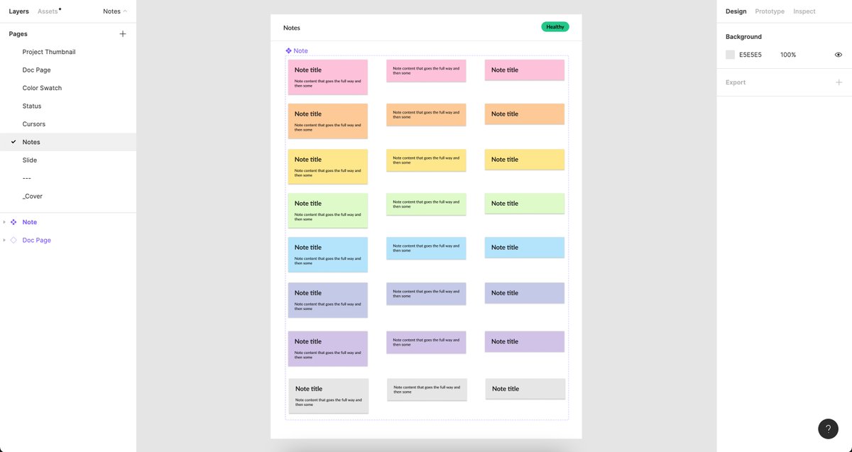
Notes - Wouldn’t be a designer if I didn’t bring some sticky notes, right?! And they’re ROYGBIV because why not. It’s just satisfying. 🎨
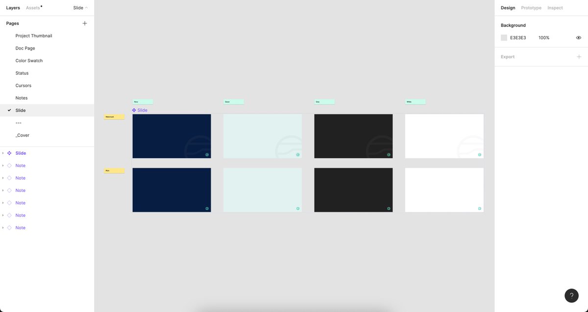
Slides - A small set of slide backgrounds in our JupiterOne brand colors. For presentations.
Hope that's a useful intro to making a library with the explicit intent of supporting your own design workflow. Will go into more detail on applications of each in the future.
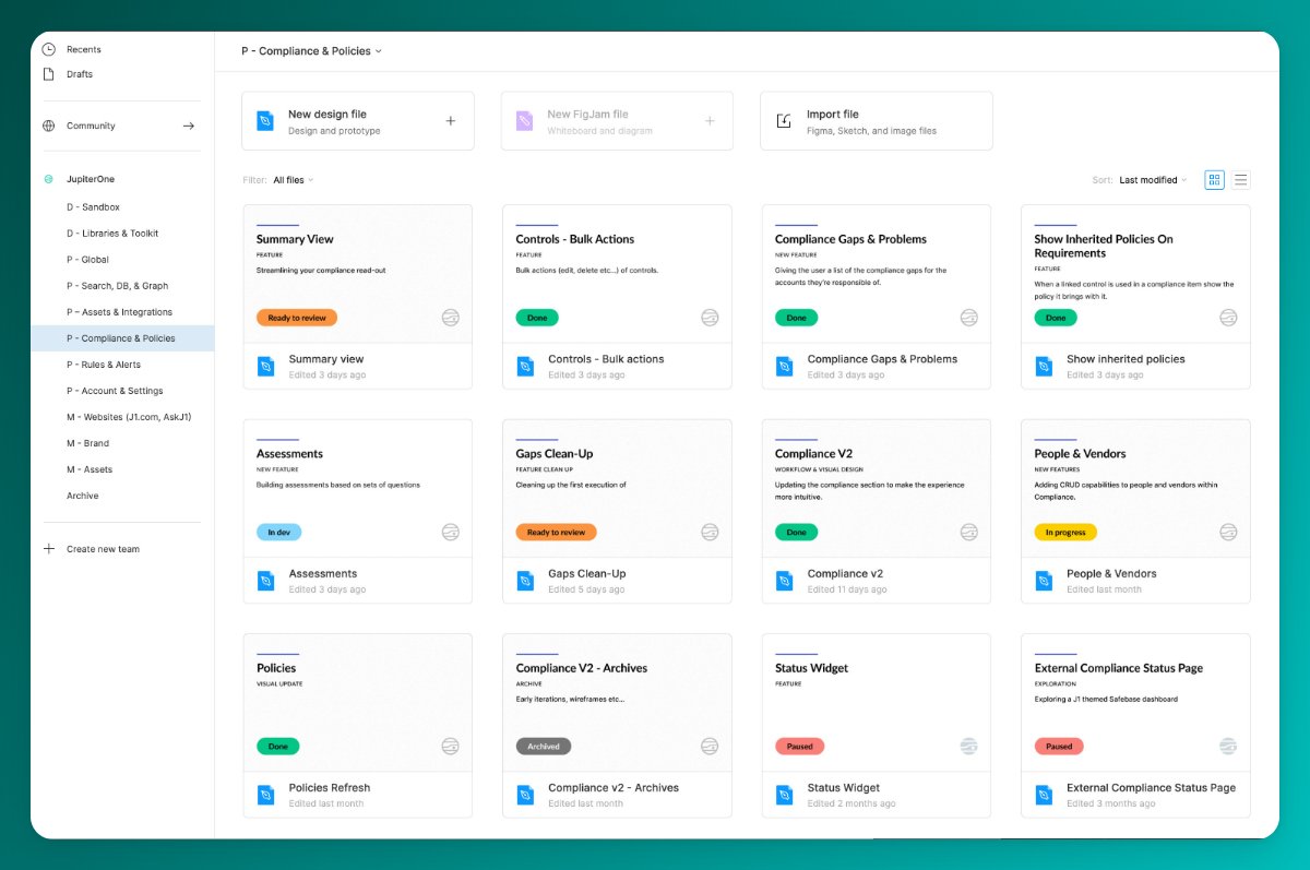
@figma For those asking about how I work inside my files, here's an intro to how I think about my file types.
https://twitter.com/itspatmorgan/status/1519457282580439053?s=20&t=vpn2kyelPIhF3Ma3vu65uQ
• • •
Missing some Tweet in this thread? You can try to
force a refresh