Product designer for @sublime_sec. Writing Unknown Arts: A field guide for creative builders in the age of AI.
How to get URL link on X (Twitter) App


 1. Make a Frame that's the right size (1600x960 suggested)


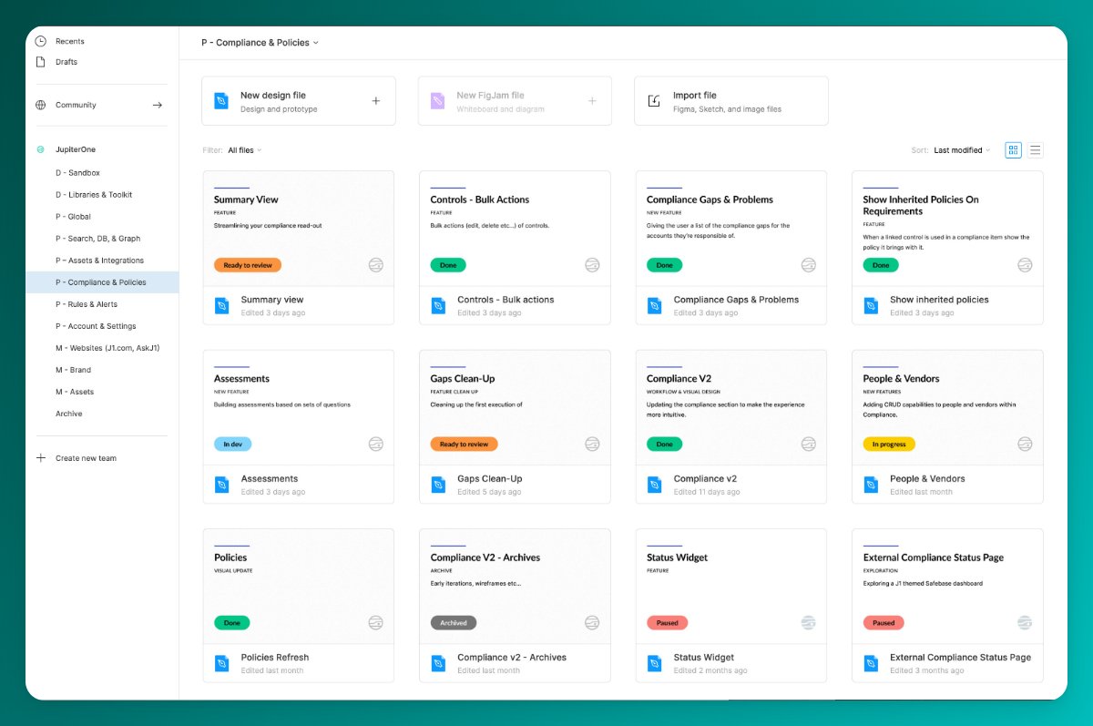
 The Project Thumbnail - I use it across my files for organization. I have a primary light variant for most projects and a secondary dark variant for libraries. I nest a Status component in each alongside the @jupiterone logo which comes from our logo library.