My team & I have helped over 💯 people design + build their video setup.
Here’s 7️⃣ things most people get wrong on camera
#HomeStudio #YoutubeSetup #ZoomBackground


Here’s 7️⃣ things most people get wrong on camera
#HomeStudio #YoutubeSetup #ZoomBackground


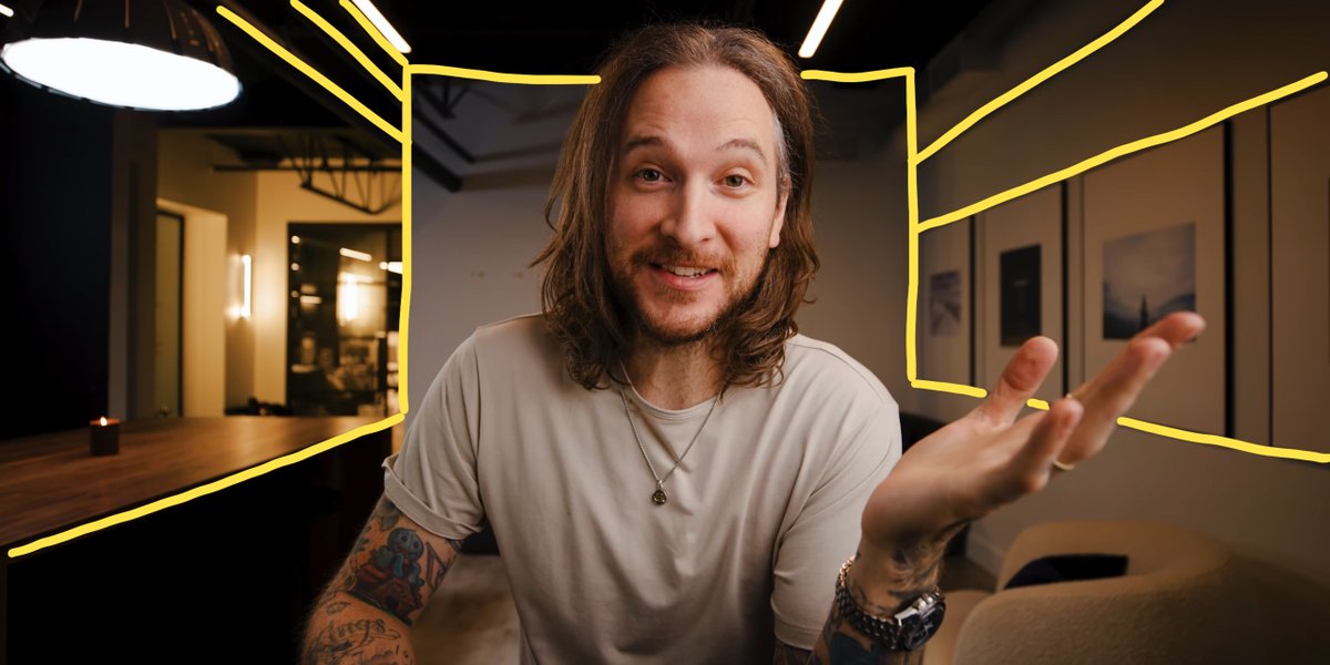
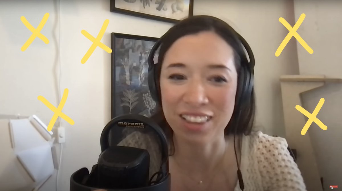
❌ Empty Walls
Nothing says "eww" like a blank beige wall 😬😄
Your background design can hurt you OR be your greatest asset online when done right ✨

Nothing says "eww" like a blank beige wall 😬😄
Your background design can hurt you OR be your greatest asset online when done right ✨


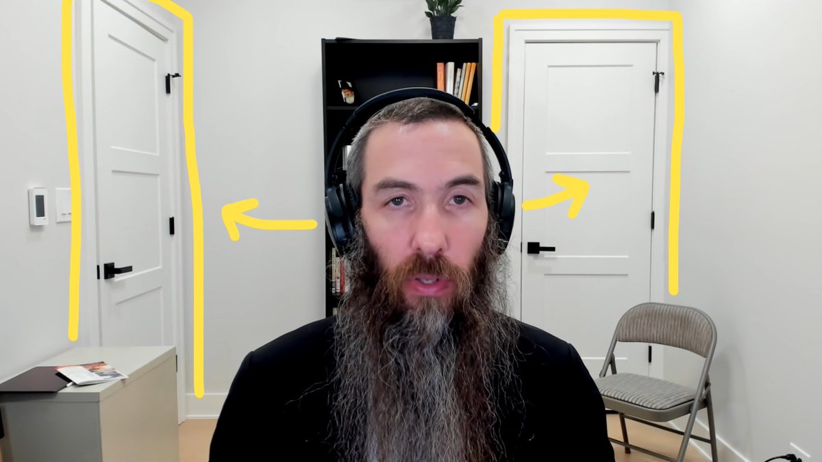
❌ Windows Behind You
Windows are great... but not in your shot (usually).
Instead, position yourself so windows are to the side.
Even better, learn to properly position lights for a flattering "shampoo commercial" look. 😜

Windows are great... but not in your shot (usually).
Instead, position yourself so windows are to the side.
Even better, learn to properly position lights for a flattering "shampoo commercial" look. 😜


❌ Generic Color Scheme
Don't settle for a generic wall color. Make your studio YOURS.
An intentional color palette works wonders.
Make sure there's enough contrast (brightness & color) so your skin tone stands out!

Don't settle for a generic wall color. Make your studio YOURS.
An intentional color palette works wonders.
Make sure there's enough contrast (brightness & color) so your skin tone stands out!

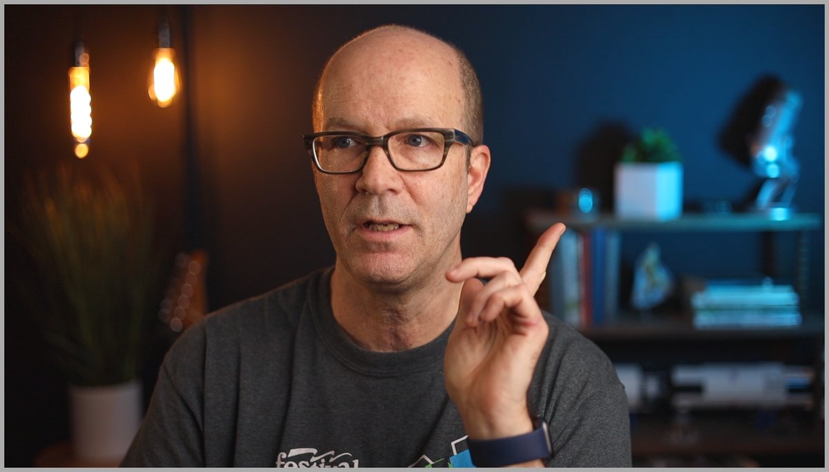
🧠 Here's a thread all about how to choose your color scheme.
https://twitter.com/theKevinShen/status/1503901368528130049?s=20&t=xk37EPoBJ6j2mmhpkm9dGQ
❌ Not designing for YOUR workflow
Your studio should:
- Be a productivity asset. Not a liability!
- Get you inspired to be on camera
- Fit any other needs you have for your space
Your studio should:
- Be a productivity asset. Not a liability!
- Get you inspired to be on camera
- Fit any other needs you have for your space
🔥 Here's @fortelabs sharing his workflow of the studio we built for him & @MarcKoenig_
https://twitter.com/fortelabs/status/1525548777599143936?s=20&t=0hhobFAgLEHf_ZRZCG4C8w
@fortelabs @MarcKoenig_ ❌ Harsh Desk Lamp Light
It can be tempting to swivel your desk lamps toward you for lighting.
But that creates unwanted shadows.
Instead, place your lights higher ☝️
Better yet, consider a larger diffuse light source to illuminate you properly.

It can be tempting to swivel your desk lamps toward you for lighting.
But that creates unwanted shadows.
Instead, place your lights higher ☝️
Better yet, consider a larger diffuse light source to illuminate you properly.


@fortelabs @MarcKoenig_ ❌ Camera Angle
This is literally how your viewer sees you.
Looking down at your webcam makes people feel trapped and small.
Place your camera at a more comfortable chin level for a better balance of authority + relatability.

This is literally how your viewer sees you.
Looking down at your webcam makes people feel trapped and small.
Place your camera at a more comfortable chin level for a better balance of authority + relatability.


@fortelabs @MarcKoenig_ ❌ Clothing Choice
You are the central element of your studio. Remember, 30% of your frame is you!
So pair your shirt color with your color scheme.
Also remember - shirt material, texture & reflectiveness affects how it catches the light.

You are the central element of your studio. Remember, 30% of your frame is you!
So pair your shirt color with your color scheme.
Also remember - shirt material, texture & reflectiveness affects how it catches the light.
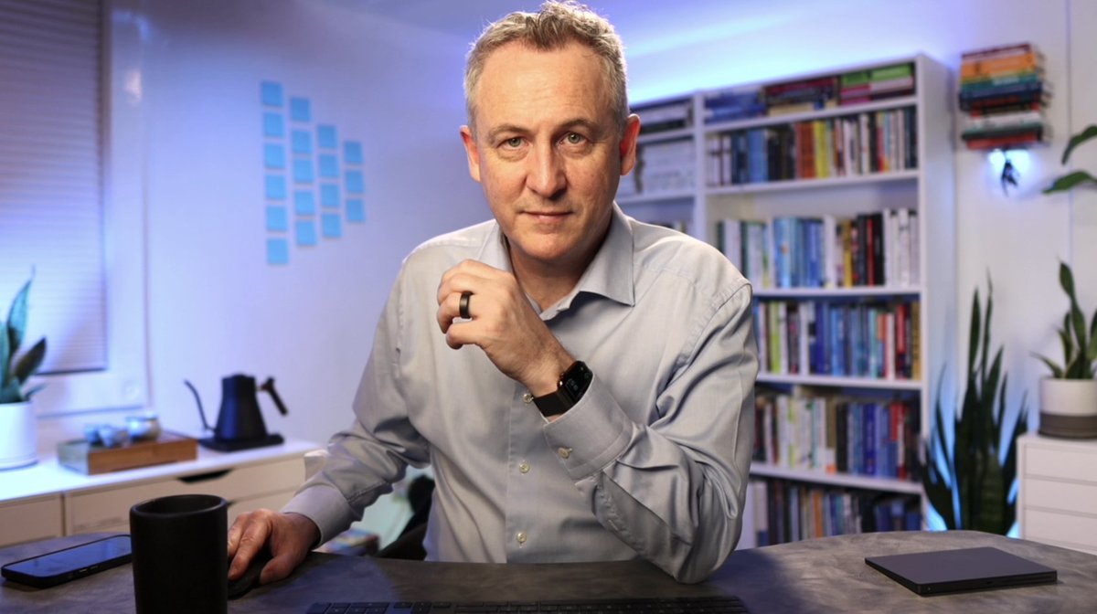

🧠 When done right, your studio becomes an asset for you.
Here’s @arturo_monge sharing how much a difference it made for him.
Here’s @arturo_monge sharing how much a difference it made for him.
👋 If you want to get your home studio designed + set up, we're here to help you :)
This is my favorite part 👇 You'll get personalized feedback on your studio every step of the way
This is my favorite part 👇 You'll get personalized feedback on your studio every step of the way
Spaces limited. And price goes up in 48 hours!
Thanks to our wonderful community for the test shots + testimonials 🙏🏼😊 @jayclouse @fortelabs @MarcKoenig_ @arturo_monge @maraldy @drrwinters @fromdavidlevin
That's a wrap!
If you enjoyed this thread:
1. Follow me @theKevinShen for more of these
2. RT the tweet below to share this thread with someone you think would benefit from a more professional video setup 🙏🏼😊
Much love, my friends!
If you enjoyed this thread:
1. Follow me @theKevinShen for more of these
2. RT the tweet below to share this thread with someone you think would benefit from a more professional video setup 🙏🏼😊
Much love, my friends!
https://twitter.com/theKevinShen/status/1527056395660627976
• • •
Missing some Tweet in this thread? You can try to
force a refresh


