I am rebuilding my #rstats blog from the bottom up with #quarto. This will let me use quarto's cool new tricks like tabs and easy columns.
I've already spent hours using quarto's great docs to build a custom blog. If you want to do the same, let me show you what I did.
I've already spent hours using quarto's great docs to build a custom blog. If you want to do the same, let me show you what I did.
Today, I will show you the first of many steps to your own quarto blog. First, create a new quarto blog project via RStudio.
Make sure to create a git repo as well. This lets you revert changes when you break your blog. You can follow along my repo at github.com/AlbertRapp/qua…
Make sure to create a git repo as well. This lets you revert changes when you break your blog. You can follow along my repo at github.com/AlbertRapp/qua…
You can render your blog with `Render Website` from RStudio's `Build` tab.
The first easy changes happen in the `_quarto.yml` file.
1⃣ Set `theme: default`
2⃣ Name your blog via `title`
3⃣ Link your GitHub profile etc.
This will change the navbar at the top of your blog.
The first easy changes happen in the `_quarto.yml` file.
1⃣ Set `theme: default`
2⃣ Name your blog via `title`
3⃣ Link your GitHub profile etc.
This will change the navbar at the top of your blog.


Now, make the about page into a landing page.
This let's you introduce your blog's highlights to your readers before they are flooded by a list of your blog posts.
Rename
`index.qmd` -> `blog.qmd`
`about.qmd` -> `index.qmd`
& change reference of `about.qmd` in `_quarto.yml`
This let's you introduce your blog's highlights to your readers before they are flooded by a list of your blog posts.
Rename
`index.qmd` -> `blog.qmd`
`about.qmd` -> `index.qmd`
& change reference of `about.qmd` in `_quarto.yml`


Once again, adjust your blog's navbar. Go to `blog.qmd` and change `title` .
You see, in `_quarto.yml` you reference to websites or other quarto docs. These will show up in the navbar. In this case, the title of the quarto doc decides the title in the navbar.
You see, in `_quarto.yml` you reference to websites or other quarto docs. These will show up in the navbar. In this case, the title of the quarto doc decides the title in the navbar.


Create a new blog posts by creating a blank `.qmd`-file in the directory `posts/new`.
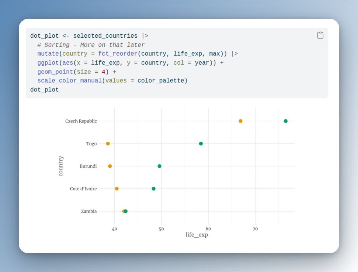
Here, I have populated the file's YAML header with a few basic properties. And I filled the file with a bit of text, code chunks, math parts etc.
You can find the file in my repo.
Here, I have populated the file's YAML header with a few basic properties. And I filled the file with a bit of text, code chunks, math parts etc.
You can find the file in my repo.


The new post was rendered by clicking `Render Website` in RStudio's `Build` tab.
This will render all `.qmd`-files that have not been rendered before. If you make changes to a blog post later on, then you will have to render the respective `.qmd`-file manually.
This will render all `.qmd`-files that have not been rendered before. If you make changes to a blog post later on, then you will have to render the respective `.qmd`-file manually.
During your active writing process, you can activate `Render on Save` in RStudio. Then, on every Ctrl+S your post will be rerendered.
Remember, all other blog posts remain unchanged by this. Let's take a look into the `posts/_metadata.yml` file to see why.
Remember, all other blog posts remain unchanged by this. Let's take a look into the `posts/_metadata.yml` file to see why.
You can see that this file sets `freeze: true`. This means that all `.qmd`-files within the `posts` directory will only be RErendered if done explicitly.
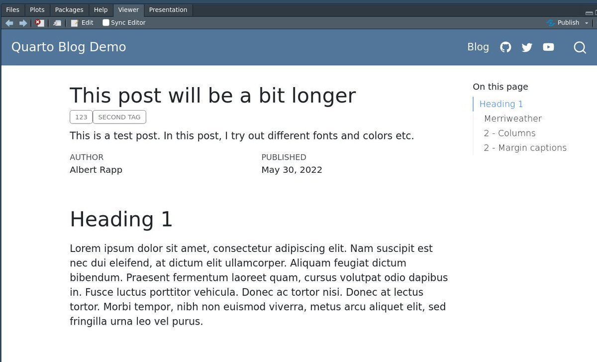
In `_metadata.yml` we can define more YAML options for all blog posts. For example, we can generate tables of content.
In `_metadata.yml` we can define more YAML options for all blog posts. For example, we can generate tables of content.


These were the first steps to build a #quarto blog from the bottom up. There is lots more to come.
We'll cover
- Custom colors/fonts/landing pages
- Comments
- Newsletter signups
- Build robust #rstats posts with {renv}
- More, more, more
Follow @rappa753 to not miss out.
We'll cover
- Custom colors/fonts/landing pages
- Comments
- Newsletter signups
- Build robust #rstats posts with {renv}
- More, more, more
Follow @rappa753 to not miss out.
• • •
Missing some Tweet in this thread? You can try to
force a refresh