
Introduction to imbalance charts (orderflow trading):
A 🧵
(1/n)
A 🧵
(1/n)
Orderflow charts essentially show the real time buying and selling happening in the markets.
In below chart, you can see how market sell orders are shown to the bid side and market buy orders are shown to the ask side.
(2/n)
In below chart, you can see how market sell orders are shown to the bid side and market buy orders are shown to the ask side.
(2/n)

Using this, one can identify big buying and selling happening at various prices.
Imbalance charts takes this one step forward. How so? Read on to find out.
(3/n)
Imbalance charts takes this one step forward. How so? Read on to find out.
(3/n)
Imbalance charts shows buying and selling imbalances at various price points. How does it matter?
Imbalance here implies to what extent is buying more than selling and vice versa.
(4/n)
Imbalance here implies to what extent is buying more than selling and vice versa.
(4/n)
Why is that important? As a trader, if we know that buying at a particular level is x times more than selling or vice versa, it would help us understand the strength of supply or demand coming into the market.
(5/n)
(5/n)
Imbalance charts highlights (as per user pref), those prices where imbalances happen in live markets
If bid side imbalance is highlighted, it means selling is x times more than buying and if ask side imbalance is highlighted, it means buying is x times more than selling
(6/n)
If bid side imbalance is highlighted, it means selling is x times more than buying and if ask side imbalance is highlighted, it means buying is x times more than selling
(6/n)
In below chart, orange blocks are where selling is 3 times more than buying (see arrow).
(7/n)
(7/n)
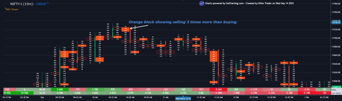
The default setting in most imbalance charts is 300%. It means, if buying or selling at a price zone is 3 times more than the other, chart shows it.
(8/n)
(8/n)
Now, is one imbalance important or more imbalances mean something else?
If we are seeing buying or selling pressure at one point, we would like to see it continue for trend confirmation.
(9/n)
If we are seeing buying or selling pressure at one point, we would like to see it continue for trend confirmation.
(9/n)
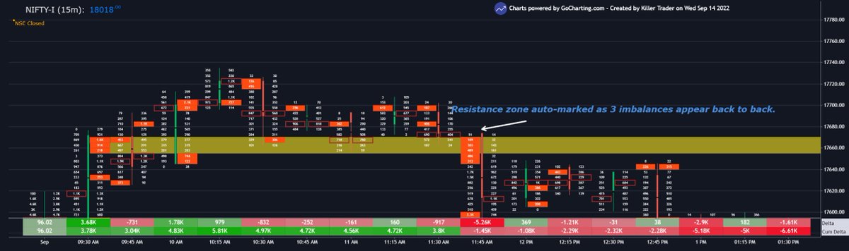
Now, this brings us to stacked imbalances. If 3 imbalances appear back to back on bid or ask side, we can set the chart to highlight it.
This implies a good area of support/resistance on intraday basis.
(10/n)
This implies a good area of support/resistance on intraday basis.
(10/n)
Chart automatically draws support/resistance if 3 or more imbalances appear consecutively.
(11/n)
(11/n)
Don't you think this kind of info can be used in real time to make trading decisions?
The imp part about using imbalances is to determine the tick size.
(12/n)
The imp part about using imbalances is to determine the tick size.
(12/n)
Tick size talks about the no of ticks you want to see the orderflow data for. This depends on preference of user.
Based on it, imbalance settings can be customized as per a trader's choice which will help them determine crucial intraday levels.
(13/n)
Based on it, imbalance settings can be customized as per a trader's choice which will help them determine crucial intraday levels.
(13/n)
If you find this info useful, please re-tweet and like this thread.
Follow me @KillerTrader_ and t.me/thekillertrader (telegram) for more such info.
Charts powered by @gocharting
#trading #nifty
Follow me @KillerTrader_ and t.me/thekillertrader (telegram) for more such info.
Charts powered by @gocharting
#trading #nifty
• • •
Missing some Tweet in this thread? You can try to
force a refresh


