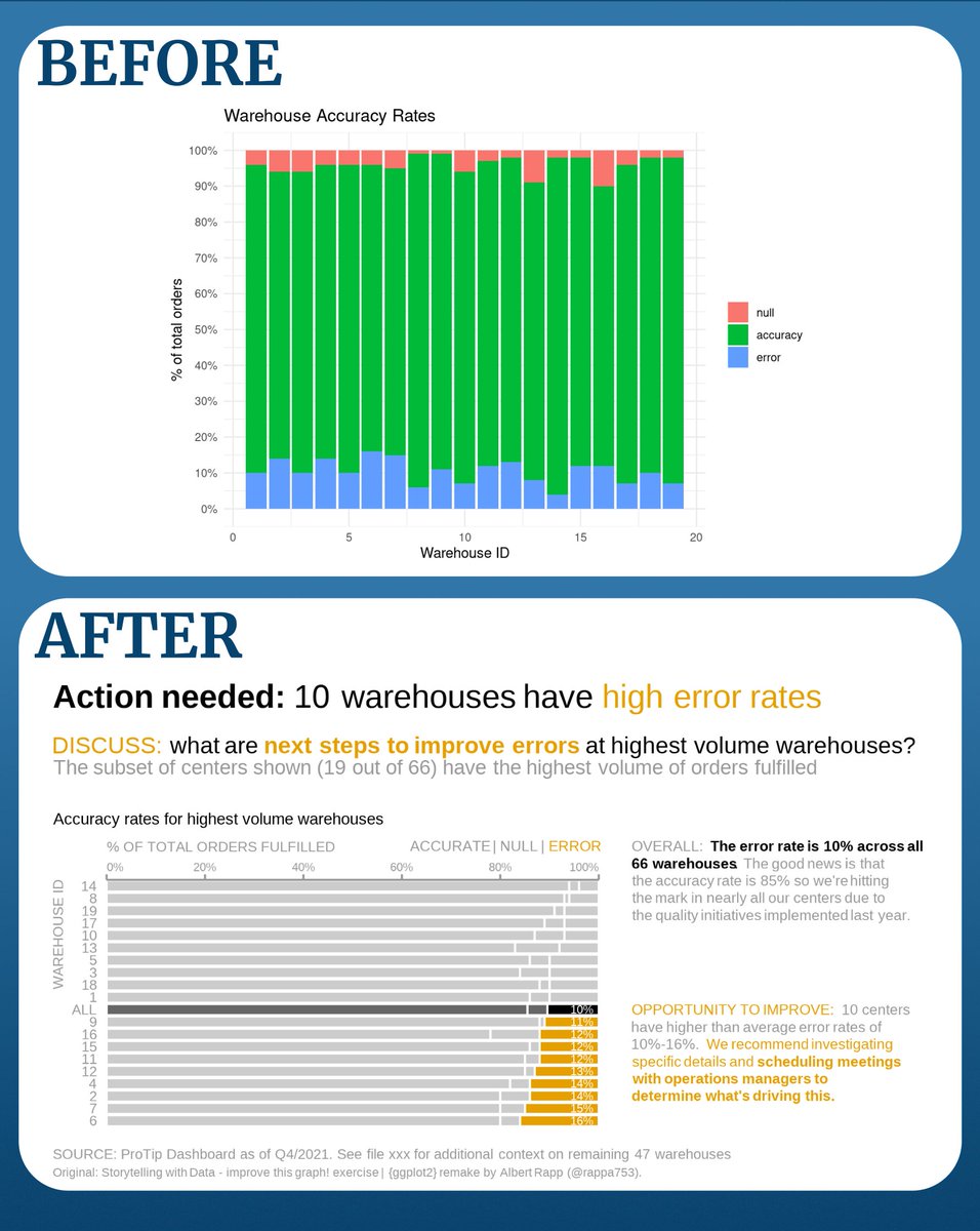
BEFORE
- Standard bar chart
- No clue what the message is
AFTER
- Bar chart with nuanced color use
- Informs your reader about key insights & actions
The latter is actually pretty easy to pull off.
At the end of this step-by-step guide, you can do that too. #rstats #dataviz
- Standard bar chart
- No clue what the message is
AFTER
- Bar chart with nuanced color use
- Informs your reader about key insights & actions
The latter is actually pretty easy to pull off.
At the end of this step-by-step guide, you can do that too. #rstats #dataviz
Here's our starting point.
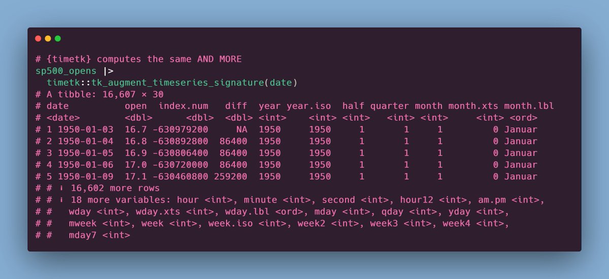
All code is available at albert-rapp.de/posts/ggplot2-…
Note that this tutorial is a ggplot2 recreation of
All code is available at albert-rapp.de/posts/ggplot2-…
Note that this tutorial is a ggplot2 recreation of

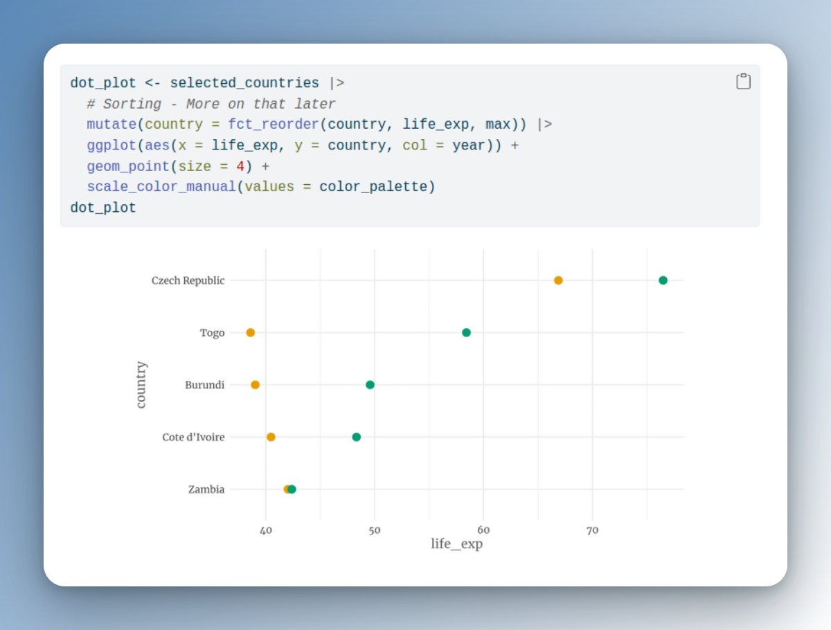
// Labels on y-axis
First, move the names to the y-axis.
This is important when the labels are real names instead of IDs.
No one likes to tilt their head for reading.
First, move the names to the y-axis.
This is important when the labels are real names instead of IDs.
No one likes to tilt their head for reading.

// Start with grey
Use the group aesthetic instead of fill.
Reserve colors for storytelling.
Use the group aesthetic instead of fill.
Reserve colors for storytelling.

// Reference points
Add a reference point to put your data into perspective.
A simple average can be enough. Here, you see the average as the new category "ALL"
Add a reference point to put your data into perspective.
A simple average can be enough. Here, you see the average as the new category "ALL"

// Order top to bottom
Notice that I also ordered the bars from top to bottom? fct_reorder() did that for me.
This way, your reference point can do its job perfectly.
(Ordering is also a good idea even without reference points)
Notice that I also ordered the bars from top to bottom? fct_reorder() did that for me.
This way, your reference point can do its job perfectly.
(Ordering is also a good idea even without reference points)

// Put important bars on the outside
I've also arranged bars with factor(). This way, important quantities are on the outsides (left and right).
This makes comparisons easier.
I've also arranged bars with factor(). This way, important quantities are on the outsides (left and right).
This makes comparisons easier.

// Highlight with colors
Use colors to highlight your story points.
Use colors to highlight your story points.

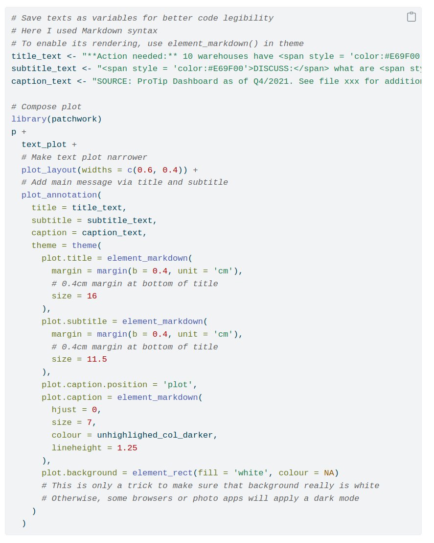
PRO TIP: Save your colors as variable names.
Usually, you will try out different colors.
Copy and pasting a new color into multiple parts of your code is tedious.
Usually, you will try out different colors.
Copy and pasting a new color into multiple parts of your code is tedious.
// Avoid clutter
Remove anything that clutters your plot.
This includes useless grid lines.
Do this by setting expand = FALSE in coord_cartesian()
Remove anything that clutters your plot.
This includes useless grid lines.
Do this by setting expand = FALSE in coord_cartesian()

Notice how I've also set clip = 'off'.
This allows drawing outside the grid panel.
We'll need that later.
This allows drawing outside the grid panel.
We'll need that later.
// Move and format axes
Move x-axis to the top with scale_x_continuous().
This way, your readers can see it early on.
Also, grey out the axes labels with theme(). Otherwise, they can be distracting.
Move x-axis to the top with scale_x_continuous().
This way, your readers can see it early on.
Also, grey out the axes labels with theme(). Otherwise, they can be distracting.

// Align labels
It's a good idea to move labels such that they form a clean line (e.g. with an axis)
Use theme() to move the axis titles to the top left corner.
BONUS: The reader can see the titles even sooner.
It's a good idea to move labels such that they form a clean line (e.g. with an axis)
Use theme() to move the axis titles to the top left corner.
BONUS: The reader can see the titles even sooner.

// Align manually
Not all things can be set in theme(). For example, the axes label can only use a single hjust value.
But "clear" lines need
0% label ➡️ left-justified
100% label ➡️ right-justified
An annotation outside the panel grid will do the trick.
Not all things can be set in theme(). For example, the axes label can only use a single hjust value.
But "clear" lines need
0% label ➡️ left-justified
100% label ➡️ right-justified
An annotation outside the panel grid will do the trick.

// Label directly
Use geom_text() to label your highlights.
Use geom_text() to label your highlights.

// Add a legend
We can add a small legend using another annotation outside the panel.
This will be a richtext annotation because we highlight a single word.
We can add a small legend using another annotation outside the panel.
This will be a richtext annotation because we highlight a single word.

// Create a story plot
The bar plot is finished. Time to create the story texts.
Create a text-only plot first. We'll combine it with the bar plot later.
The bar plot is finished. Time to create the story texts.
Create a text-only plot first. We'll combine it with the bar plot later.

// Combing bar plot and story
Use {patchwork} to put together your two plots.
Add the call-to-action prompts via a new title + subtitle.
Use {patchwork} to put together your two plots.
Add the call-to-action prompts via a new title + subtitle.

Done! That's a wrap. 🥳
Hope you found this guide helpful. You can follow @rappa753 for more content like that.
And don't forget to jump back to the first tweet below to like or retweet the guide. I'd appreciate it 👌🏻
Hope you found this guide helpful. You can follow @rappa753 for more content like that.
And don't forget to jump back to the first tweet below to like or retweet the guide. I'd appreciate it 👌🏻
https://twitter.com/rappa753/status/1575878220372594688
Want more helpful resources?
Every week, my newsletter shares insights on
- dataviz,
- Shiny web apps
- stats
Reading time: 3 minutes or less
You can join at
alberts-newsletter.beehiiv.com/subscribe
Every week, my newsletter shares insights on
- dataviz,
- Shiny web apps
- stats
Reading time: 3 minutes or less
You can join at
alberts-newsletter.beehiiv.com/subscribe
• • •
Missing some Tweet in this thread? You can try to
force a refresh