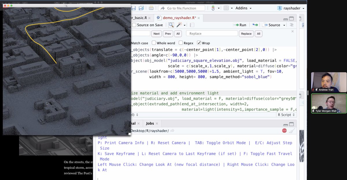
@tylermorganwall The DC building models were from openstreetmaps! And then he went and put us in the helicopter's point of view from that night going through Chinatown, passing the Portrait Museum and ending up in Judiciary Square. It reminded me of the trench run in A New Hope.
The army finally released their report on military helicopters used to intimidate protestors in DC nearly a year later. "Be loud … fly low over the crowds” Low-level soldiers were punished for following orders but no mention of commanders who issued them. washingtonpost.com/national-secur…
The report said one of the five helicopters circling DC that night “hovered under 100 feet.” When pressed, an official admitted that it was more like 55 feet. (That’s a big difference!) Here’s what I mapped from that night.
How many more people died in your state than was expected? Most of the excess deaths across the country occurred in April and March when covid-19 was peaking and before testing caught up. With @emmersbrown and @lmshapwashingtonpost.com/graphics/2020/…
It’s a challenge to even estimate what’s “expected” for deaths. @WeinbergerDan came up with a model that adjusts for flu, seasonality, as well as lag in reporting. The more recent the data, the more incomplete it is. See how many deaths were backfilled on April 11 over time?
Some states are really up-to-date with their provisional death counts— like New York. Others, like North Carolina and Pennsylvania are very much behind. Some are still reporting on paper and not electronically. So a downward trend in deaths might just be because of reporting lag.
Lack of early testing, inconsistent and incomplete reporting between states, as well as a lag in reporting from overwhelmed public officials hamper efforts to measure the severity of COVID-19 and determine who needs help where. washingtonpost.com/investigations…