Design is hard.
But I’ve come to realize that laying out texts properly is 80% of what makes something look clean, and is the easiest thing you can do to make your design much nicer and more usable.
Here are 10 practical tips for improving your text layout.
But I’ve come to realize that laying out texts properly is 80% of what makes something look clean, and is the easiest thing you can do to make your design much nicer and more usable.
Here are 10 practical tips for improving your text layout.
1. Use comfortable line heights.
What’s important is to not use the same line height for your titles and body texts.
- For title, a good range is 1.1 - 1.3x
- For body, it’s 1.3 - 1.5x
As a rule of thumb, larger texts should have smaller line height.
What’s important is to not use the same line height for your titles and body texts.
- For title, a good range is 1.1 - 1.3x
- For body, it’s 1.3 - 1.5x
As a rule of thumb, larger texts should have smaller line height.


2. When putting text in a box, there should usually be more horizontal padding than vertical padding.
This is because most letters don’t fill the full height, especially with line heights greater than 1. You need more horizontal padding than vertical to make them feel the same.
This is because most letters don’t fill the full height, especially with line heights greater than 1. You need more horizontal padding than vertical to make them feel the same.

3. Text on the same line should be baseline-aligned with each other, and center aligned with other elements.
But if the text is in a defined shape, it should be center aligned.
But if the text is in a defined shape, it should be center aligned.

4. When not sure, left align.
- Don’t center align title but left align content. That looks weird.
- Don’t center align content if it’s longer than a few lines.
- Don’t center align title but left align content. That looks weird.
- Don’t center align content if it’s longer than a few lines.

5. Don’t put more than 20 words on one line. It’s hard to read.
This means that with the standard ~16px font size, text blocks shouldn’t span the whole width of your page.
This means that with the standard ~16px font size, text blocks shouldn’t span the whole width of your page.

6. When everything is bold, nothing is bold.
Usually regular (400) weight should be used for main content. Contrast makes things look clean.
(That’s why most sites using Circular font are not very nice — Circular is thick.)
Usually regular (400) weight should be used for main content. Contrast makes things look clean.
(That’s why most sites using Circular font are not very nice — Circular is thick.)

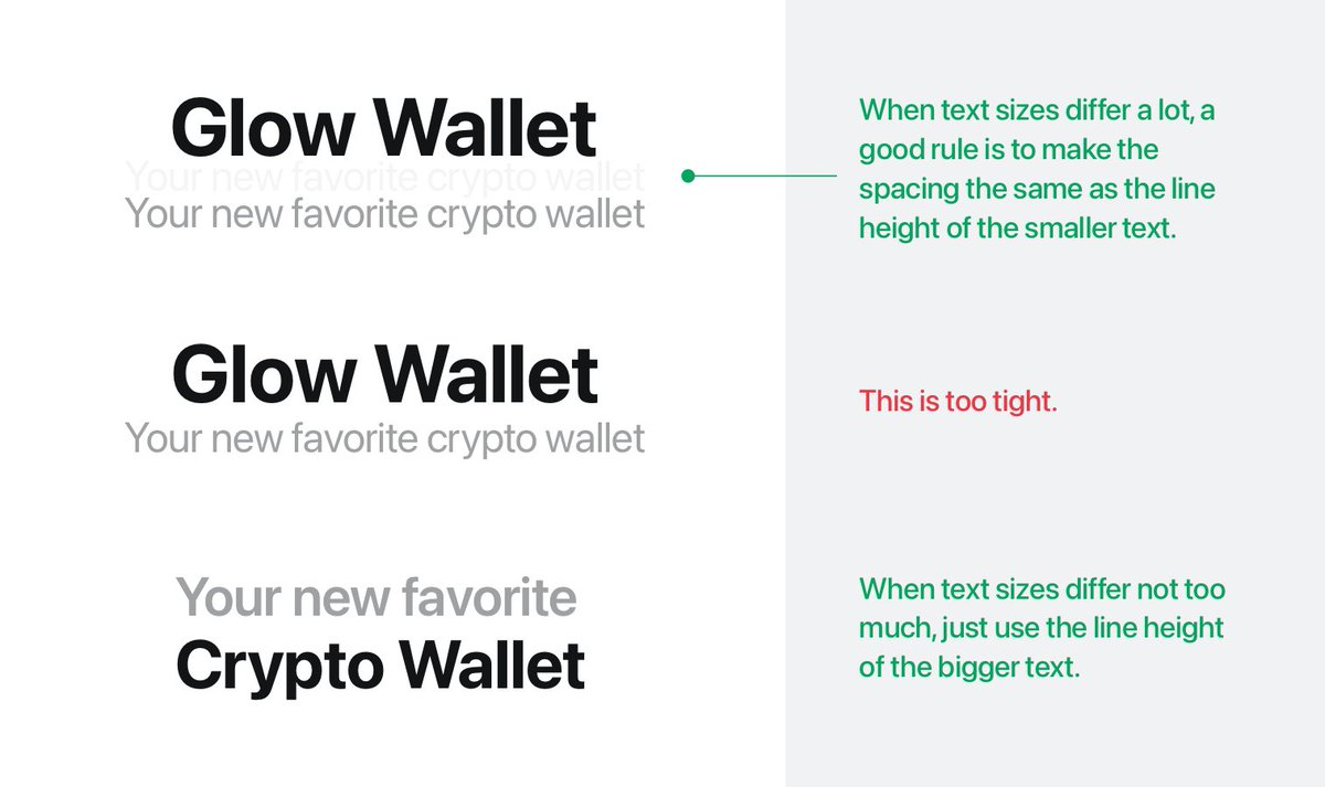
7. When laying out texts vertically, ensure there’s comfortable vertical spacing in between.
- A good rule of thumb is to use the height of the smaller text as spacing.
- If the texts are similar in size, lay them out with the line height of the larger text.
- A good rule of thumb is to use the height of the smaller text as spacing.
- If the texts are similar in size, lay them out with the line height of the larger text.
8. Spacing between text blocks should correspond to their relationship. The more related two blocks are, the closer they should be visually.
For example, section titles should have more top padding than bottom padding.
For example, section titles should have more top padding than bottom padding.

9. When putting text into a button or textbox, make sure the padding is comfortable.
As a rule of thumb, with a ~1.4x line height, the text should take up about half the size of the box.
(Don't forget to use more horizontal than vertical padding.)
As a rule of thumb, with a ~1.4x line height, the text should take up about half the size of the box.
(Don't forget to use more horizontal than vertical padding.)

10. For marketing pages, experiment with larger texts and more spacing.
They often make a page look cleaner and more focused.
If you have never used 100px+ text or 200px+ spacing, give it a try. People often don’t realize how large the text / spacing are on popular sites.
They often make a page look cleaner and more focused.
If you have never used 100px+ text or 200px+ spacing, give it a try. People often don’t realize how large the text / spacing are on popular sites.

I hope these tips are helpful! Next week, I’ll share some tips for choosing colors. Comment below if there’s anything you are particularly interested in!
• • •
Missing some Tweet in this thread? You can try to
force a refresh