
Design is hard (II).
A large part of this is choosing colors — *everything* you design needs a color.
I’ve realized that while true mastery takes years, there are simple, scientific rules that can make your colors much nicer.
Here are 10 practical tips for choosing colors.
A large part of this is choosing colors — *everything* you design needs a color.
I’ve realized that while true mastery takes years, there are simple, scientific rules that can make your colors much nicer.
Here are 10 practical tips for choosing colors.
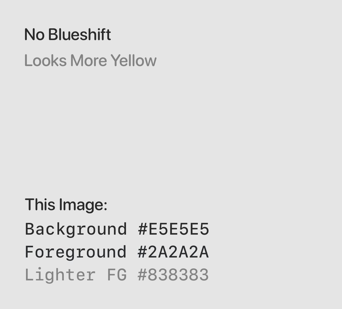
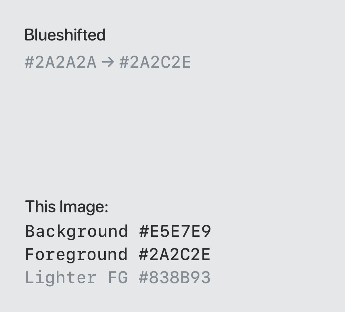
1. Use slightly blue-shifted gray instead of “perfect” gray.
This applies to both backgrounds and texts.
An easy trick: grab a gray (e.g. #d1d1d1) and make it #d1d3d5.
This makes the color less “yellow,” which feels more fresh and clean. (less “aging”)
This applies to both backgrounds and texts.
An easy trick: grab a gray (e.g. #d1d1d1) and make it #d1d3d5.
This makes the color less “yellow,” which feels more fresh and clean. (less “aging”)
2. Avoid black text on non-white background. That looks dirty.
Instead:
- Tint the text with the bg color if bg is light, or
- Use white text on darker background
How to tint correctly? Open the bg color in color picker, and drag to a darker color.
Instead:
- Tint the text with the bg color if bg is light, or
- Use white text on darker background
How to tint correctly? Open the bg color in color picker, and drag to a darker color.

(This is how you can use the color picker to quickly match hues.)
3. When doing themes or using multiple colors that should look similar in brightness, use HSLuv (hue, saturation, luminosity).
Colors have different perceived brightness. So if you are using standard HSL (lightness), results can vary significantly and some are not legible.
Colors have different perceived brightness. So if you are using standard HSL (lightness), results can vary significantly and some are not legible.

Bonus: why do colors differ so much?
In short, we have 3 types of colors sensors (cones) in our eyes, for red, green and blue.
We pick up green (middle of the spectrum) the most, followed by red and then blue.
That’s why yellow (R+G) looks the brightest (only behind white).
In short, we have 3 types of colors sensors (cones) in our eyes, for red, green and blue.
We pick up green (middle of the spectrum) the most, followed by red and then blue.
That’s why yellow (R+G) looks the brightest (only behind white).

4. Don’t use different hues of the same color. Colors with similar but different hues look off when combined.
e.g. if using 3 shades of blue, all 3 should have the same hue.
The new Gmail is a great counter example of this.
The color picker trick above comes in handy again.
e.g. if using 3 shades of blue, all 3 should have the same hue.
The new Gmail is a great counter example of this.
The color picker trick above comes in handy again.

5. Elements that are “above” should be lighter than those that are below (on the z-axis). Especially in dark mode.
This is because they are closer to the metaphorical light source and so should be brighter.
Dark mode isn’t simply flipping the colors in light mode.
This is because they are closer to the metaphorical light source and so should be brighter.
Dark mode isn’t simply flipping the colors in light mode.

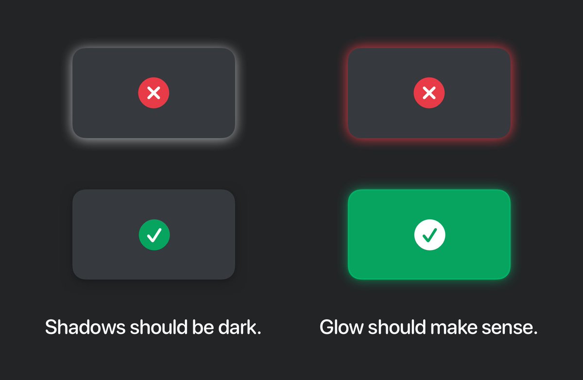
6. Shadows should be dark, even in dark mode. White / light shadows look weird because they don’t exist (in the real world).
If you are using “color shadow,” that’s really a glow. It must “make sense” — the object casting the shadow should be in that color (with more intensity).
If you are using “color shadow,” that’s really a glow. It must “make sense” — the object casting the shadow should be in that color (with more intensity).
Speaking of Glow, it is also the name of the most nicely designed crypto wallet (designed by me and other awesome designers ❤️).
Check it out: @glowwallet and you will find many of the rules applied over there!
Check it out: @glowwallet and you will find many of the rules applied over there!
7. Use opacity more.
- Shadows should be pure black + opacity, not a light color.
- Secondary text color can be primary + opacity.
- Border and background (esp. highlight) color can be an intense color + opacity.
Why? When you have a non-white bg, opacity works much better.
- Shadows should be pure black + opacity, not a light color.
- Secondary text color can be primary + opacity.
- Border and background (esp. highlight) color can be an intense color + opacity.
Why? When you have a non-white bg, opacity works much better.


8. Avoid simple linear gradients, esp. dual-color ones as background.
These feel unnatural and boring.
Instead:
- Use solid colors
- Use more interesting gradients
- Use gradients as masks of texts
These feel unnatural and boring.
Instead:
- Use solid colors
- Use more interesting gradients
- Use gradients as masks of texts

9. Use saturated colors sparingly.
- Don’t use them for large bg or blocks of text.
- Use enough whitespace and neutral content color.
Saturated colors are like spices in cooking. You want a little bit of them, but too much destroys the dish.
They hurt your eyes, too.
- Don’t use them for large bg or blocks of text.
- Use enough whitespace and neutral content color.
Saturated colors are like spices in cooking. You want a little bit of them, but too much destroys the dish.
They hurt your eyes, too.

10. High contrast makes a design clean, as well as usable.
- Use dark enough text colors + whitespace
- Color pairs on the opposite ends of the color wheel contrast better
- Use as few colors as possible — each additional color adds to the noise and decreases contrast
- Use dark enough text colors + whitespace
- Color pairs on the opposite ends of the color wheel contrast better
- Use as few colors as possible — each additional color adds to the noise and decreases contrast

I hope these tips are useful!
They all stem from one idea: comfortable colors resemble something nice and real in the physical world. Be it soft shadows, tints, or natural gradients.
We can all subconsciously tell if a color is “impossible.” Such choice often look unpleasant.
They all stem from one idea: comfortable colors resemble something nice and real in the physical world. Be it soft shadows, tints, or natural gradients.
We can all subconsciously tell if a color is “impossible.” Such choice often look unpleasant.
If you are reading this thread, you care about making what you make look pleasant.
The ultimate tip is to observe — sunrise, dusk, the lighting and shades of buildings and objects.
Observe and appreciate, and you will internalize them, which will reflect on your designs.
The ultimate tip is to observe — sunrise, dusk, the lighting and shades of buildings and objects.
Observe and appreciate, and you will internalize them, which will reflect on your designs.
Finally, be sure to check out the first part of this series, on text layout, if you haven’t.
As always, let me know what you think, if you have questions, or what you want me to cover next!
Happy designing ❤️
As always, let me know what you think, if you have questions, or what you want me to cover next!
Happy designing ❤️
https://twitter.com/danqing_liu/status/1576997489529344001
• • •
Missing some Tweet in this thread? You can try to
force a refresh


