
Make your design life 10X easier and use these 5 color contrast score ranges for specific UI elements.
👇Here's the breakdown...
(I started writing this after the recent @usecontrast launch)
👇Here's the breakdown...
(I started writing this after the recent @usecontrast launch)
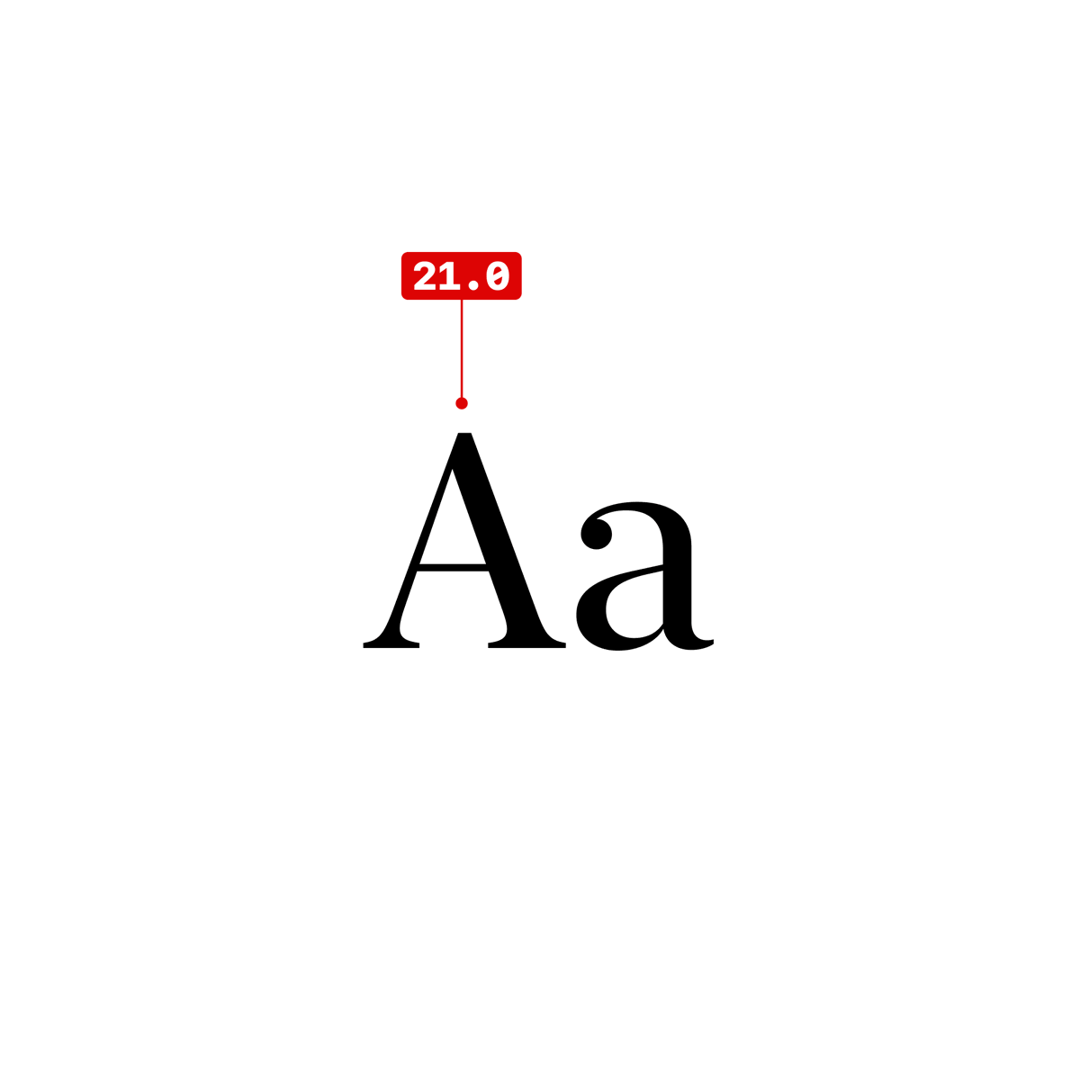
Full white on black and vice versa is the highest contrast—clocking in at 21 on a scale of 1-21. This is typically great for punchy headlines, but not for everything else. 

In general, AAA is best for long form body copy, titles, and important items, but more specifically a score of 12-21 is ideal for DARK body text on light backgrounds.
This will keep your text from looking too light and muddy.
This will keep your text from looking too light and muddy.


A score between 7-12 is ideal for LIGHT body text on dark backgrounds.
The human eye dilates (big pupils) in low light to let in more light. Because of this you will be more sensitive to bright lights on dark screens. 👁
The human eye dilates (big pupils) in low light to let in more light. Because of this you will be more sensitive to bright lights on dark screens. 👁


Notice on the examples above:
The light mode versions vary by 9 points, but the contrast difference is quite subtle.
Whereas the dark mode versions vary by 5 points and is MUCH easier to detect.
The light mode versions vary by 9 points, but the contrast difference is quite subtle.
Whereas the dark mode versions vary by 5 points and is MUCH easier to detect.
Ever had someone shine a flash light in your eyes at night and you feel blinded?
It's because your pupils were huge and your eyes did not expect that much light to pour in.
It's because your pupils were huge and your eyes did not expect that much light to pour in.
Bright white, long form, body copy on a black background (score of 21) is—in most cases—a bad idea. It will cause too much eye strain. Titles and short copy are fine as long as you know what you're not going overboard with high contrast.
This is why dark mode is MUCH trickier to design for.
Every border, every piece of UI, every interface element has much more power over your eyeballs than light mode—because of the large size of your pupils.
Every border, every piece of UI, every interface element has much more power over your eyeballs than light mode—because of the large size of your pupils.
A minimum score of 4.5 (AA) is great for secondary copy that plays a supporting role in your interface.
BUT if you use ONLY 4.5 for everything, it will feel washed out and flat.
BUT if you use ONLY 4.5 for everything, it will feel washed out and flat.


A flat style could mean that you've chosen a unique and interesting style, but it could also (very likely) mean that you've done a bad job at choosing colors. #shame
4.5 can be a great option for lots of the same items that need to be toned down to not feel overwhelming, eg. table data, list of features, small secondary headings, etc.


3.0 (AA Large) is the only score that has a size requirement of 18px bold or 21px regular. (roughly)
"Bold" and "Regular" vary greatly between typefaces because type designers can draw whatever they'd like in the letterform bounding box.
"Bold" and "Regular" vary greatly between typefaces because type designers can draw whatever they'd like in the letterform bounding box.


3.0 is the sweet spot for icons and other graphical interface elements, like button borders, etc.


3.0 also works well for primary CTAs and placeholder labels for input fields (with no external labels). These are two areas where getting the contrast just right is super important.

Lower than 3.0 is a failing score. These score get a bad rap, but they can actually be really useful.
You definitely shouldn't use a failing score for text that is critical to an interface, but anything decorative is fine.
You definitely shouldn't use a failing score for text that is critical to an interface, but anything decorative is fine.


In fact, a failing score of 1.2 – 1.5 works really well for secondary CTA background colors, borders and dividers, and disabled button text.


Failing scores can also work well for certain input placeholder text that have other external labels WITH passing contrast scores.
Going too dark for these can make it seem like there's already text in the input field.
Going too dark for these can make it seem like there's already text in the input field.

In summary...
12-21 for light mode body text
7-12 dark mode body text
4.5+ for supporting text
3.0+ icons and colorful primary CTAs
1.2 - 1.5 for subtle UI elements
12-21 for light mode body text
7-12 dark mode body text
4.5+ for supporting text
3.0+ icons and colorful primary CTAs
1.2 - 1.5 for subtle UI elements
Having quick access to these scores right in your design tool is clutch. That's why @gusso and I made the new @usecontrast for @figma. ✨
It's awesome and it's free! usecontrast.com
It's awesome and it's free! usecontrast.com
Spread the love by sharing the OG tweet. 🥹🙏
https://twitter.com/mds/status/1579953453673373696?s=20&t=bvBIgDZUCQAz0N15bIsFNg
Would it be helpful to publish these contrast examples as a @figma community file?

• • •
Missing some Tweet in this thread? You can try to
force a refresh


